Mapping local campaign cash

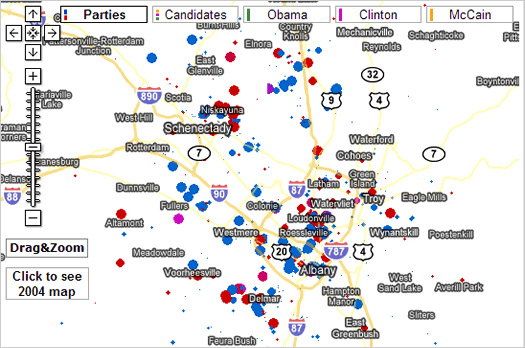
A screengrab of Fundrace's map for the Albany area.
A few weeks ago we worked out which presidential candidate had gotten the most money in campaign contributions from people in the Capital Region. We also broke the data down by zip code, which sounded like a good idea at the time -- but it had about as much spice as an actuarial table.
Thankfully, other people a way better at this, notably the people behind Fundrace. They've taken the campaign contribution data form the FEC and made cool color-coded maps out of it. Check out the one for the Capital Region. You can have the map display the data by party or candidate.
Fundrace also make it easy to search the FEC data for people's names, zip codes or employers. You know, just in case you're curious about who your neighbors are supporting.
... said KGB about Drawing: What's something that brought you joy this year?