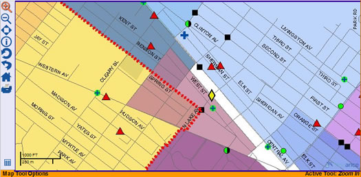
The Albany crime map: keep trying

Even with the map, we still feel a little lost.
The Albany Police Department debuted its online crime map last week. After checking it out, we had a few thoughts.
First off, this is a good idea and we applaud the effort made to get this information out to the public. People deserve to know what's going on in their neighborhood.
That said, there is a lot of room for improvement here:
+ The interface is cryptic. The map doesn't immediately plot the locations of crimes. You have to zoom in to do that and it's a little hard to figure that out at first.
+ It's great that different types of crimes are depicted using different icons, but where's the rest of the info? Why can't we click on an icon and get the info for the crime it represents?
+ We thought that maybe the "identify features" options would give us more info, but that just seems to draw a border around a neighborhood.
+ The "map themes" function under "map layers" seems to be broken. Turning off "streets" actually makes the plotted burglaries disappear. And turning off "boundary" makes the streets disappear.
+ We're completely baffled by the neighborhood search function. It doesn't seem to do anything.
+ The "tip line" form on in the right column looks like a search field. Breaking the tip form out onto its own page would probably be a good idea.
We hate to complain because we appreciate the effort, but this could be so much better. EveryBlock is a great example. Heck, even AOA has managed to map the last 30 days of its entries with pop-up information.
So, it is possible to do this kind of thing better. And while we applaud the initial effort, we're looking forward to seeing improvement.
Hi there. Comments have been closed for this item. Still have something to say? Contact us.
Comments
The Albany Police should look at the crime map on Gothamist. It rocks:
http://gothamist.com/labs/map
... said Rob on Apr 7, 2008 at 2:00 PM | link
I may be missing something, but I don't see a key to explain the icons on the map.
... said Julia Thorne on Apr 7, 2008 at 2:12 PM | link
I totally agree...I was expecting a lot more. The best way I could get to the legend that describes what crimes the symbols reflect was - mapping - layer control - legend. The "identify features" option is basically useless. I also thought more information about the crime would be displayed. I don't necessarily mean the identifying information (although other cities include gender, race, weapon used, etc.), but I would like to know when it happened (day and time) and if there was any resolution to the case. Also it would be great if there was a way to determine if a robbery happened at a business, residence. or a street. Finally, people may not necessarily know the definitional differences of robbery, burglary and larceny-theft. Just having a link to the UCR would help clarfiy what the map symbols are representing.
... said newbie on Apr 7, 2008 at 2:56 PM | link
man this is crap, how much of my tax money is being used for this? another example of useless 'transparency'
... said shawn on Apr 7, 2008 at 11:21 PM | link
This is terrible. According to this map, there were two incidents in Center Square this week (both on Hudson) and all I can see are the symbols; no explanation of what the incident actually was. I can't understand this thing.
... said Summer on Apr 10, 2009 at 1:21 PM | link