Next exit: illegibility
What's that say?
Updated Tuesday evening
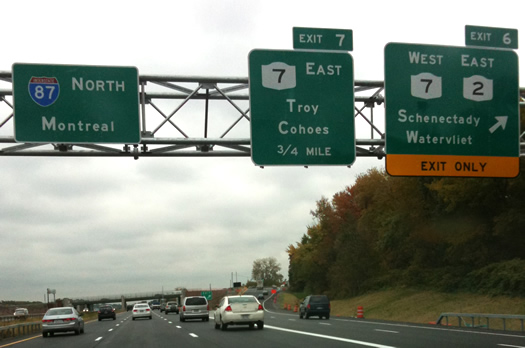
While we wouldn't exactly consider ourselves font nerds, we do notice typography. And the interstate signs that have gone up near Exit 6 on the Northway have been bugging us.
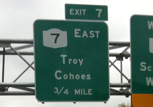
It just looks wrong to us. And we think it makes it hard to read the signs from a distance -- the letters look like they spell "Csomething."
To our casual eye, these appear to make use of a typeface called Highway Gothic, which has been around since 1945. This is odd, because highway signs around the country are being converted to a new typeface called Clearview, which has been designed for easy reading. Clearview uses lowercase letters -- but they're not so grossly out of scale with the capitals.
Update
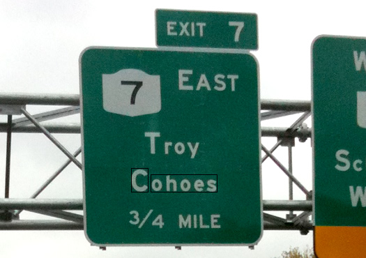
If we're reading this Federal Highway Administration document correctly (that's an if), the lower case o's in Cohoes should be 3/4 the height of the the capital C. That box around the the lower case letters in the photo above is approximately 75 percent of the the capital C's height (give or take a small fraction of a pixel). If that actually is the rule, it would appear that these letters are too small.
Thanks to everyone for the good comments. We'll try to follow up on this and get an official answer.
Say Something!
We'd really like you to take part in the conversation here at All Over Albany. But we do have a few rules here. Don't worry, they're easy. The first: be kind. The second: treat everyone else with the same respect you'd like to see in return. Cool? Great, post away. Comments are moderated so it might take a little while for your comment to show up. Thanks for being patient.
Comments
So glad I'm not the only one who is bugged by those signs..
... said cw on Oct 13, 2009 at 3:41 PM | link
You'll probably get a lot of comments like this (if you haven't already) but I'm glad I'm not the only one who's noticed. I've tried explaining this to other people, but they just look at me funny.
... said Mark on Oct 13, 2009 at 3:46 PM | link
Just be thankful that the New York State Department of Transportation hasn't requested that all the directional signs be reprinted in Comic Sans font.
... said Chuck Miller on Oct 13, 2009 at 3:48 PM | link
Aesthetically, the font reminds me of old school art-deco and I really dig it. But you make a good case against the practicality of it. It's like one step forward, two steps back.
... said Mrs. M on Oct 13, 2009 at 3:56 PM | link
I've noticed the font used on these signs is different from usual as well... I wonder what the reasoning is. Sounds like a question for that "Getting There" column in the TU.
... said Go Phish on Oct 13, 2009 at 3:58 PM | link
It does look like they are using Highway Gothic, but the typesetting is so so dreadful. The actual design of Highway Gothic's x-height isn't as terrible as those signs would have you believe. It appears someone somewhere made a decision to change the first letter a much larger point size than the rest of the word. FOR SHAME.
Also, the kerning.
Even Clearview would look awful with that sort of type treatment.
... said O. on Oct 13, 2009 at 4:02 PM | link
There are two types of people: those who can spot the difference between fonts, and those who see the world in Comic Sans.
These signs have been bothering me, not only for what O points out, but also because someone actually went to the trouble to change the signs from the usual typeface to something else and then made it worse.
I've found Germany's to be the most pleasing and practical. Clearview and Highway work fine but maybe they just seem bland because I see them so often.
... said Ellsass on Oct 13, 2009 at 4:14 PM | link
this has been bothering me since they went up almost 2 months ago? the signs going southbound are the same way.
... said John Jordan on Oct 13, 2009 at 4:36 PM | link
I'm just bugged because nowhere on the exit 7 sign does it say "to Rt 9/Latham. It's highly annoying and I'm not even an out of towner. Can't imagine what visitors think. You only see the sign AFTER you've gotten off the exit, hoping hoping it was the correct one!
... said rebecca on Oct 13, 2009 at 5:06 PM | link
Who needs to know where Cohoes is anyway?
... said Swell on Oct 13, 2009 at 5:21 PM | link
ugh those signs are AWFUL! In additional to the lowercase letters looking too small, don't the capital letters seem disproportionately thick? and is there a weird space between the capital and the rest of the word? Can you tell I drive past these 10 times a week?
... said Ashley on Oct 13, 2009 at 5:33 PM | link
I totally AM a font nerd... and have trained my husband to be one as well... and we HATE those signs. He has beyond perfect vision and still has trouble reading them.
... said Melissa Mykal on Oct 13, 2009 at 8:28 PM | link
I think that I also have "figure-ground" difficulties - but what's "wrong" with the signs? what dont I see that everyone else does?
... said the mother on Oct 13, 2009 at 9:08 PM | link
The signs aren't up to standard either.
http://mutcd.fhwa.dot.gov/htm/2003r1r2/part2/part2e1.htm#section2E13
... said CJ on Oct 13, 2009 at 9:17 PM | link
There's nothing wrong with title case and nothing wrong with Clearview -- well, not visually. The trouble is that some amateur's been freelancing with the metrics. A modern typeface, especially a safety-critical one, isn't just the letterforms but how they relate. In practical terms this isn't Clearview at all any more. It's a really bad mistake, especially considering that more such freelancing is probably already in the sign-manufacturing pipeline. I'd be interested to know who at NYSDOT thinks they're Einstein. Or Miedinger.
The one thing that does bother me about Clearview is that it's proprietary. Close as I can tell, this typeface was designed at public expense but isn't freely available to the public. What's up with that? More amateurs, I expect, this time on the procurement side.
More fun font talk:
http://diveintomark.org/archives/2009/04/21/fuck-the-foundries
http://blog.typekit.com/2009/05/27/introducing-typekit/
LQ
... said Lou Quillio on Oct 13, 2009 at 9:28 PM | link
I've been hoping they are temporary signs during the construction. I find them hard to read.
Maybe DOT is economizing on the amount of material they are using in the letters due to the state budget issues...
... said Wendy on Oct 13, 2009 at 9:32 PM | link
I think you should post photos of "normal" signs so the folks who don't quite get it can see the differences for themselves. Or, I could post a link to one: http://www.interstate-guide.com/images087/i-087_nt_01.jpg.
... said Mark on Oct 13, 2009 at 9:37 PM | link
I cant believe they have left Exit 10 SB sign all mangled it's been months- recession?
... said Gerri on Oct 13, 2009 at 9:39 PM | link
Lou said: "The one thing that does bother me about Clearview is that it's proprietary. Close as I can tell, this typeface was designed at public expense but isn't freely available to the public. What's up with that?"
I agree. That does seem odd.
... said Greg on Oct 13, 2009 at 11:07 PM | link
These signs have been bothering me something fierce.
... said James Cronen on Oct 13, 2009 at 11:18 PM | link
> Who needs to know where Cohoes is anyway?
Anybody looking for Dnipro Market (nice), or a really big U-Haul spot, or Pub Laurent.
Also, film buffs will remember it as the exteriors location for the art house feature "Gina Blows Cohoes." Most of the interiors were I think shot in Bayonne, or maybe Perth Amboy. Still, a piece of film history.
LQ
... said Lou Quillio on Oct 14, 2009 at 12:29 AM | link
What does everyone have against Comic Sans??? *duck*
... said Kari on Oct 14, 2009 at 8:50 AM | link
I was wondering if you guys were going to comment on this. It's been bugging me too!
... said S. on Oct 14, 2009 at 8:54 AM | link
I actually like the aesthetic quality of the new signs, although I do agree that they are impractical for people with less-than-good vision. I'm also disquieted by Lou's comment about the proprietary ownership of the font--crack the case, AOA!
More than anything, though, I LOVE that there are so many font nerds commenting on this. Suddenly, I don't feel quite so alone.
... said Siobhan on Oct 14, 2009 at 10:10 AM | link
"Highway Gothic" sounds like a literary genre to me: Jack Kerouac meets Stephen King.
... said Eric on Oct 14, 2009 at 10:23 AM | link
i HATE HATE HATE how these look. They make no sense with the rest of the signs - it actually looks like they used leftover letters that were hanging around.
... said nicole k. on Oct 14, 2009 at 11:26 AM | link
Lou and Greg: Clearview (Or, ClearviewHwy) is readily available to the public for personal use, it's just not *free* to the public. That doesn't bother me so much. If a photographer or painter or other artist was likewise commissioned using public funds to create a work for the people, I would expect to freely enjoy viewing the original art (in this case, the nice legible signs). I wouldn't, however, expect to get a print for my home for free.
... said O. on Oct 14, 2009 at 12:13 PM | link
> Lou and Greg: Clearview (Or, ClearviewHwy) is readily
> available to the public for personal use, it's just not
> *free* to the public.
When the public contracts for services or goods, it makes a solicitation containing all of its specifications and terms. The Clearview solicitation might have included not only tangible deliverables (likely OTF or TTF data) but also the purchase of all IP rights, or a right to sub-license without royalty. Evidently that wasn't part of the spec.
Obviously I doubt that the only way to secure a suitable typeface required license restrictions. Yes, such a contract should logically cost more than a restricted-license deal but, considering the many downstream public agencies (and individuals) who could then use the typeface without fuss or cost, somebody made the wrong call. Happens a lot.
Again, if you were to A-B test two solicitations where all typeface requirements are the same but "A" contains a narrow-use license and "B" contains an outright purchase of all IP rights, somebody would have to convince me that the winning "A" typeface had critically special magic that the "B" winner did not -- cost and other factors considered.
I don't see things turning out that way, and that's my point. It's a matter of what the public seeks to buy. The public needn't do business on Rembrandt's terms unless there's no choice. Trust me, in this world there's choice.
LQ
... said Lou Quillio on Oct 14, 2009 at 9:11 PM | link
while we're on the subject, has anyone else ever noticed how exit 10 of I-90 westbound has a sign that says "Exit 1O?" (yeah, O, not 0.) drives me nuts.
... said ticka on Oct 15, 2009 at 12:58 AM | link
Try driving in New Jersey some time.
http://everything2.com/title/getting+lost+on+NJ%2527s+highway+systems
... said Patrick on Oct 16, 2009 at 12:01 PM | link
I still think the signs for Exit 3 are the best.
... said bb on Oct 17, 2009 at 9:50 AM | link
I agree the signs don't look right and they are tough to read from a distance
... said mattyk72 on Oct 19, 2009 at 9:52 AM | link