Ghost signs

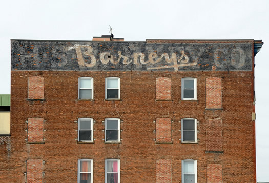
The former home of the Barney's department store in Schenectady.
Jessica's post about retro signs inspired Chuck to put together a photo collection of "ghost" signs from around the Capital Region. He explains:
Have you driven by a building in the Capital District, looked up at the building, and noticed what appeared to be a painted advertisement on the building's brick exterior? An advertisement for food or clothing or dry goods, the ad almost faded away with a century of age and neglect? You're trying to figure out what a Uneeda Biscuit is, or where someone actually can buy Bond clothes these days. I've seen several of these "ghost signs" in the Capital Region (also called "faded signs" or "brickads," according to Wikipedia), and I also came across a webpage called lostlandmarks.org that covers the phantom signs of a long-lost advertising run. So over the past few days I took my Nikon D700 and an assortment of lenses, and went out to go ghost sign hunting.
photo: Chuck Miller
Say Something!
We'd really like you to take part in the conversation here at All Over Albany. But we do have a few rules here. Don't worry, they're easy. The first: be kind. The second: treat everyone else with the same respect you'd like to see in return. Cool? Great, post away. Comments are moderated so it might take a little while for your comment to show up. Thanks for being patient.
Comments
I love it!
... said Summer on Jan 25, 2010 at 4:53 PM | link
This is a great topic. I recorded a podcast with James Howard Kunstler a while ago where we talked about these old hand-painted advertisements on buildings.
They really do display a high level of craftsmanship (and sometimes artistry as well).
One thing I've been talking about for a while is that I think it would be cool to set up an advertising service where present-day advertisers could have their ads painted on the sides of old buildings like we used to do. I'd want to work with a skilled painter to create "authentic" ads.
I'm not a huge fan of ads. And I despise billboards. But there's something nice about this type of advertisement.
There's a blank brick wall on a building just as you enter Troy over the Green Island Bridge, for example. It's across the street from Ryan's Wake. It's just a big blank painted over brick wall and it would actually look more lively with a well crafted advertisement on it, I think. I'm pretty sure that building had a coca cola ad painted on it about 100 years ago.
Obviously these new ads would have to be done with skill. But I think it could work. (There'd probably be lots of local ordinances to overcome and some public outcry. But in the end I think it could be good.)
... said Duncan Crary on Jan 25, 2010 at 4:58 PM | link
Brighter Choice for one. Not a great picture and there's also a bigger one on the top of the building facing Central Ave.
http://www.brighterchoice.org/uploads/pics/bccsBoysCurrent3.jpg
... said Save Pine Hills on Jan 25, 2010 at 5:47 PM | link
Nice, I saw these as Chuck was adding them to flickr. I like the theme, I'm sure there are plenty more to find, too. I snapped the Frear Building in Troy about a week ago, actually. Hope to see more additions, Chuck.
... said B on Jan 25, 2010 at 6:31 PM | link
If you like Chuck's subject, we have a group dedicated to these on Flickr - Faded Signage.
... said CJ on Jan 26, 2010 at 6:32 AM | link
B - I actually did get that sign yesterday morning. Got it from across the road, and used a long exposure to get the lights from a CDTA bus as it was going up the street.
http://www.flickr.com/photos/chuckthewriter/4310903807/
... said Chuck Miller on Jan 29, 2010 at 10:48 AM | link