Visualizing the arteries of the Capital Region

Commutes to 12210
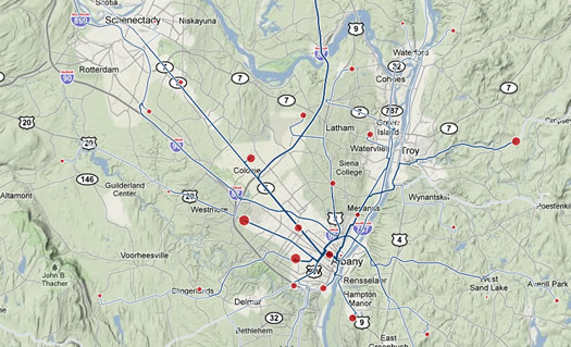
This is fun/interesting to play around with: a designer/engineer named Harry Kao has built a visualization of commuting data for metros all across the country. You can sort the data by both zipcode and whether people are commuting from/to the zipcode.
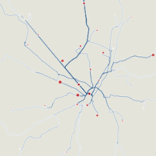
 It'll make sense when you see it. For example, here's the map of the data for people who commute to 12210, which is in downtown Albany. And here's a map of the data for people who commute from 12065, which is in Clifton Park. The size of the dot in each zipcode represents the number of people coming from/heading to there.
You can zoom the maps, and view them on different backgrounds. It's kind of cool to view with a blank background -- the network of commuting routes look biological, like you're viewing an angiogram of the Capital Region.
Kao's mashup uses Census survey data from 2000, so it's a bit out of date (and he includes a few other caveats). But it's an interesting rough picture.
(Thanks, Amy!)
visualizations by Harry Kao
Hi there. Comments have been closed for this item. Still have something to say? Contact us.
Comments
Does this include people who commute by train?
Hmm? Oh.
... said Ellsass on Sep 21, 2010 at 6:20 PM | link