Get the Message at Albany Institute

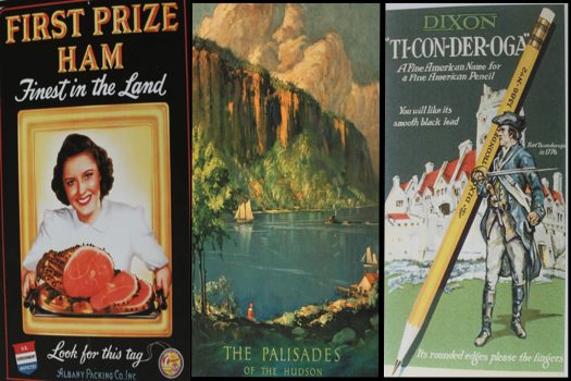
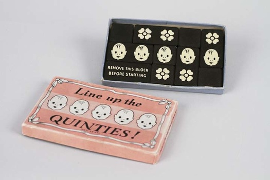
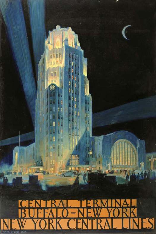
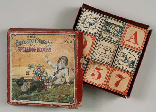
A few of the images from Graphic Design: Get the Message.
The Graphic Design: Get the Message exhibit at the Albany Institute of History and Art is definitely worth a visit for design nerds, it will also be interesting to anyone who's a critical consumer of media -- or just curious about the images we see every day.
Stay a little while and you'll see it's also about world history, innovation, how far we've come as a country, and how we absorb information...

Four rooms are filled with framed prints, paintings, newspapers, digital media, film, packaging materials and interactive art. There is a lot to take in at Graphic Design, but the exhibit moves in a fluid and organized way.
The exhibit explores graphic design through four different themes: materials, messages, commerce/graphic design and the creative process.
Materials
The first large room looks at typography and early printing. The significance of broadsides (pieces of paper that are printed on one side) and their creators (labeled as the very first graphic designers) are examined. Examples of those pieces include early almanack's (spelled with the "k"), as well as horse and farm announcements from the 1830s and 1840s.
Among other things, the room also highlights paper and type and how they both have evolved. Local history gets a nod with information on the Mohawk Paper Company and its influence in the graphic design world. Also, the Albany Gazette from 1784 is featured. It's the first newspaper that lasted more than a few years in the Capital Region.
Right before the doorway into the next room sits a large television screen that looks at much more modern materials: Flash graphics. The work of students from the ART356 class (a course on web and interactive design) at St.Rose is displayed. Quick animated pieces rotate through the screen. If I didn't read the fine print I would have assumed many of the images were created by professionals.
Messages
"Messages" were in the next room. Posters from World War I and II about buying war bonds and rationing food were a stark reminder of what my grandparents lived through. One of those posters depicted a young soldier and the words "Eat more fish, eggs, cheese and poultry - save the meat for the boys on the front." Another said "Do with less so they'll have enough."
More recent social "messages" were displayed too: ones from Amnesty International, Iran and Planned Parenthood.
The documentary Helvetica plays in a room (that's a piece of art itself; it has a large window where you view art in "storage") near those posters. The film is about typeface and how it affects our lives.
Commerce and graphic design

The commerce and graphic design section looks at why certain images were created for certain campaigns. For example: the scenic Adirondack settings were used in railroad campaigns to sell "a state of mind and train travel."
The creative process

The creative process section explores what it takes to get from idea to product, through artist/designers such as local Hajo Christoph. I ran into his son and daughter-in-law at the exhibit. They donated Hajo's work to the museum and while he's a part of this exhibit, his work will be shown in its own exhibition called Hajo: An Artist's Journey beginning March 5.
Albany-based Vicarious Visions makes an appearance in the exhibit as well. Screen shots of their Marvel Comics game are displayed near a video about how video games are made.
Graphic Design ends with the opportunity to interact. There are four pieces to play with: add borders to broadsides, make your own letter stamp art, match words with images and try to solve a rebus puzzle involving Benjamin Franklin.
It costs $10 to get into museum as an adult. The exhibit will run until June 12.
Next Sunday, February 27, Stephen Heller, "an American art director, journalist, critic, author, and editor who specializes in topics related to graphic design" will be speaking about the 1939 World Fair and its concept of "futurism."
Find It
Albany Institute of History and Art
125 Washington Avenue
Albany, NY 12210
Hi there. Comments have been closed for this item. Still have something to say? Contact us.
Comments
Fantastic Exhibit! Great job to all involved. I highly recommend.
Play a game of Track and Field put on by Spiral Design.
... said GetRichQuick on Feb 18, 2011 at 2:14 PM | link
The Helvetica documentary, as dull as it sounds is very captivating.
... said Mr Galt on Feb 18, 2011 at 4:23 PM | link
I found this exhibit to be a terrible disappointment. Sloppily conceived and ill produced. It didn't explain graphic design. It didn't give any perspective on the craft--and what makes design different from "graphics". I wouldn't waste time or money on it.
... said J on Mar 1, 2011 at 1:45 PM | link
Sounds great, can't wait to check it out.
... said Jon Huther on Apr 25, 2011 at 11:43 AM | link