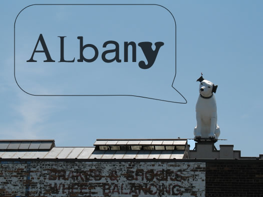
A typeface that says Albany
This caught our eye this week: there's an effort in Chattanooga, Tennessee to develop a signature typeface for the city. The effort is organize enough that it's produced a video explaining how the typeface could help the city market itself, and there's a Kickstarter project aiming to fund it.
This got us thinking about what an Albany typeface might look like. It'd be an interesting challenge -- finding a way to acknowledge the city's long history, but also working in the fact that city's most prominent architecture (the ESP) is more modern.
Or maybe even more fun: a collection of Capital Region typefaces -- for Albany, Troy, Saratoga, and Schenectady -- that could be used on signage and other related materials. It'd help reinforce the idea that each of those places is different, with their own unique feel.
[via TMN]
Hi there. Comments have been closed for this item. Still have something to say? Contact us.
Comments
Comic Sans.
I'm shocked by how often I see it on schools, businesses, flyers, and posters in Albany.
... said Daniel on Feb 9, 2012 at 10:56 AM | link
@Daniel: Heh. I can think we safely place Comic Sans on the "@#$%^, no!" list.
... said Greg on Feb 9, 2012 at 11:00 AM | link
Vote
for
Jerry
... said komradebob on Feb 9, 2012 at 11:04 AM | link
I was always under the impression that the Capital District was astonishing average when it came to things such as ethnicity, income distribution, education levels and economic patterns. Seeing how we're so average, wouldn't that make us Ariel?
... said Tim on Feb 9, 2012 at 11:12 AM | link
For Schenectady, I would recommend GE Inspira, it's the same font used by General Electric for their advertising.
For Troy, I found this Uncle Sam font, which would look nice when juxtaposed with the vintage architecture in the Collar City.
... said Chuck Miller on Feb 9, 2012 at 11:22 AM | link
Arial was the first one I thought of, too...
... said Jen on Feb 9, 2012 at 11:30 AM | link
For years, the NYS Department of Health AIDS Institute has used Comic Sans. I refuse to believe that I'm the only person who finds this inappropriate. Not just annoying or lame, but downright inappropriate.
... said Anonymous on Feb 9, 2012 at 12:30 PM | link
Albany can be Times New Roman because it's boring and unoriginal.
I kid.
Troy can be Wingdings because it's ridiculous and doesn't make sense.
I don't kid.
... said Save Pine Hills on Feb 9, 2012 at 12:39 PM | link
Yeah, I was going to say anything OTHER than Comic Sans. Glad to see we collectively ruled that one out first!
... said Alan B on Feb 9, 2012 at 12:44 PM | link
A great idea for expressing a locality's individualism. And a tool for marketing, as well. Once developed, the design could be introduced over time as current signage requires replacing, thereby mitigating costs.
This approach would require, though, an ongoing commitment from one city administration to another. Let's say that, after a suitable typeface was developed, promptly agreed upon by all, and everyone was happy (hey, this is my comment and I get to invent the particulars). What if the next mayor or city council decides that a new typeface better represented Albany and introduces Comic Sans or Marker Felt?
Could we then live with ourselves, knowing what we had made possible?
... said Bob on Feb 9, 2012 at 1:11 PM | link
The font I most associate with Albany is the one used in the signage at the Empire State Plaza. It always makes me feel like I am being transported to the 1950s.
Hmmm, maybe that's not what we want to associate with this area.
Second the GE Inspira idea.
... said Jessica R on Feb 9, 2012 at 1:45 PM | link
This topic just made me fall a little more in love with AOA.
I tried to watch Helvetica on Netflix, but had to turn it off after each expert suggested that it was Perfect and should be used for every project for eternity and then some.
Fonts convey more meaning than words.
I've always thought the Typewriter font (like you see on the I Love NY campaign) screamed the bureaucracy of Albany.
... said abby on Feb 9, 2012 at 2:03 PM | link
I would recommend looking to old Dutch fonts for inspiration. Could there be a Dutch-language printed Bible that had been brought to New Netherland and survived into the present time? I don't know a lot about what sort of typefaces Dutch printers would have used back then, but I'm thinking about how blackletter was common in Germanic areas.
A uniquely Albany font would probably be a Modernist reinterpretation of an old Dutch font like that.
... said Ed L. on Feb 9, 2012 at 2:06 PM | link
Since Van Benthuysen ran the first steam press in America right here in Albany on Liberty Street, AND ran the Albany Type Foundry (again, the first to use steam), it's entirely possible that there were some custom fonts designed just for that firm. It'll take some digging, but it wouldn't surprise me.
... said Carl on Feb 9, 2012 at 2:33 PM | link
Typefaces indeed have attitude and can be incredibly effective at helping to articulate the character of the content in a design, but generally are only as good as the people who use them.
... said Doug Bartow on Feb 9, 2012 at 2:48 PM | link
@abby, keep watching Helvetica -- not everyone sings its praises.
@Ed L, @Chuck Miller perhaps something like Dutch Mediaeval?
... said ajw93 on Feb 9, 2012 at 3:01 PM | link
ajw93 - I really dig that Dutch Mediaeval!
Chuck - re: the Uncle Sam font, ew. On behalf of the City of Troy, I would just like to say no thanks.
... said Kevin Marshall on Feb 9, 2012 at 3:24 PM | link
There is an Empire Font, it's awful to read but would work for Titles and Billboards.
... said Joe on Feb 9, 2012 at 4:07 PM | link
If Albany truly is still the most average city in the United States, then maybe we should consider Averia- http://iotic.com/averia/
Averia was made by taking the average of many fonts and has a sort of cozy, old fashion feel to it, kinda like Albany.
But we're more of a history town than an average town (in my mind at least) so anything that could be dug up from the Albany Type Foundry would be better. What typeset did the Argus use?
... said El Gucks on Feb 9, 2012 at 4:48 PM | link
I'll have some samples from Richard Starr's Albany Type Foundry up by morning. Sadly, no complete fonts, but some good examples from what was, in 1826, the largest catalog of fonts in America. Then I'll get to be the cranky old typographer who explains that a font is just ONE SIZE of a particular typeface.
... said Carl on Feb 9, 2012 at 6:03 PM | link
As promised (threatened?), I have some samples of the Albany Type Foundry's work up over at Hoxsie.org.
Someone has also reproduced the entire catalog of a later Albany type foundry, the Franklin Letter Foundry.
... said Carl on Feb 10, 2012 at 6:27 AM | link
There is a font called Constructivist (think 1930's Soviet poster art) that would reflect the "brutalism" of the Plaza architecture -- and our current Stalinist "strong man" governor.
... said chrisck on Feb 10, 2012 at 9:22 AM | link
Today's comic over at XKCD fits this discussion too perfectly. That's why @Doug is right about a font only being good if it's used properly.
I love GE Inspira for Schenectady and some very silly old font for Albany.. with any of those fonts @Carl posted as our Official Typeface nobody will be saying we're stuffy and boring anymore.
... said Emily on Feb 10, 2012 at 7:15 PM | link