Key
blue: white | green: African-American/black | red: Asian | yellow: Hispanic | brown: other race/Native American/multi-racial
Albany, Schenectady, Troy
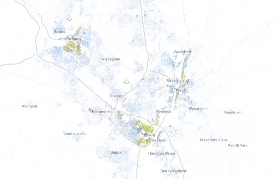
Albany
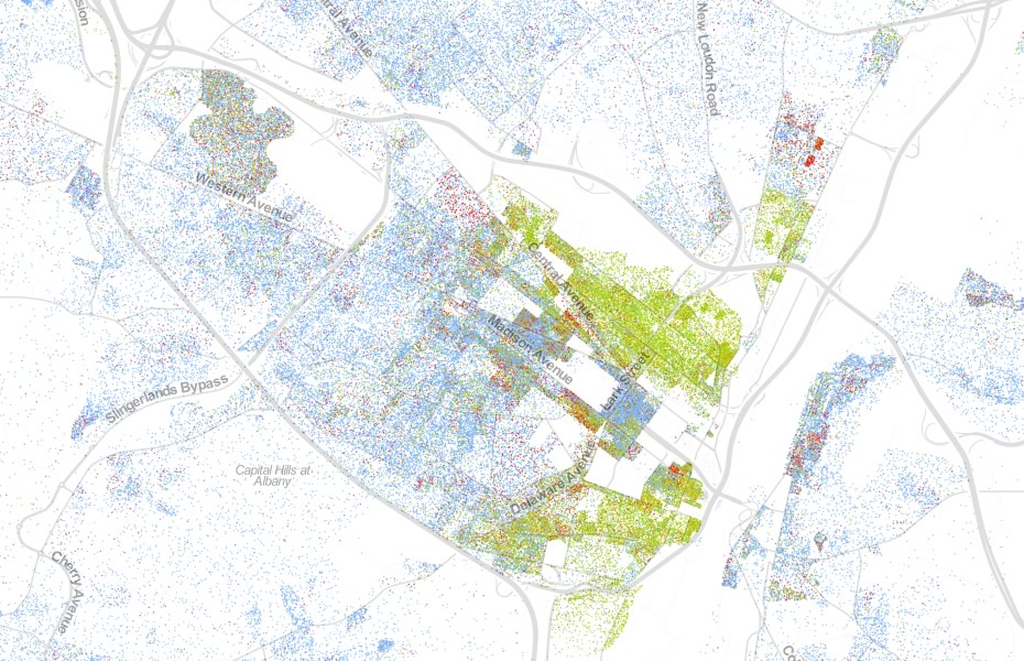
Schenectady
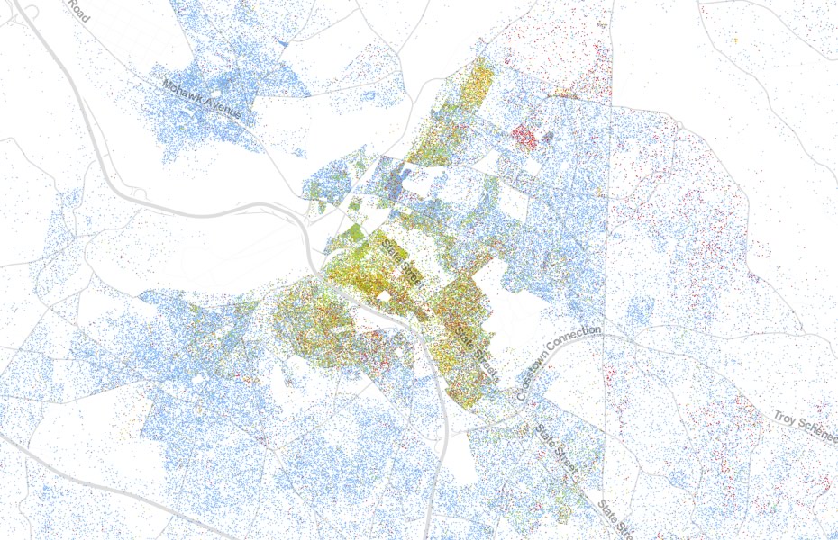
Troy
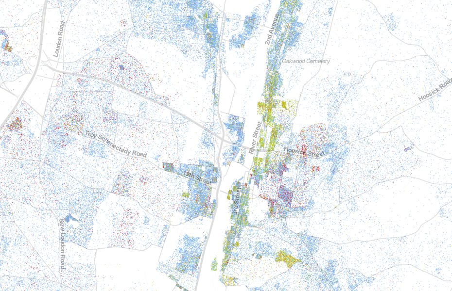
Diversity
AOA created this map last year, also based on 2010 Census data, that assigned diversity scores to Capital Region census tracts. The deeper the shade of green, the more racially/ethnically diverse a neighborhood. The top 6 most-diverse tracts in the area were in Schenectady. (Scoring explained below.)
We scored Capital Region tracts using a formula that measures how evenly distributed the population of that tract is by reported race. So a tract in which the population is evenly distributed among every group would be scored "1." A tract in which there were only people of one group would be scored "0." (The formula is from this paper about measuring diversity within a Census tract -- it's a bit technical, but there if you'd like to read it.) Also: for the purposes of scoring tracts, we dropped the "Native Hawaiian-Pacific Islander" group -- only a tiny number of Capital Region tracts included someone from that group, and the percentages in those tracts were very small -- many just .1 percent (dropping the group made running the calculation easier).
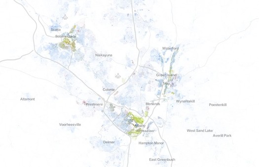
Albany, Schenectady, and Troy
Worth a look: This "dot map" of the United States -- it plots everyone in the country, color-coded by race and ethnicity, one dot per person, based on 2010 Census data. It was created by Dustin Cable, a researcher and statistician at the Weldon Cooper Center for Public Service at the University of Virginia.
From the explainer for the map:
This map is an American snapshot; it provides an accessible visualization of geographic distribution, population density, and racial diversity of the American people in every neighborhood in the entire country. The map displays 308,745,538 dots, one for each person residing in the United States at the location they were counted during the 2010 Census. Each dot is color-coded by the individual's race and ethnicity. The map is presented in both black and white and full color versions. In the color version, each dot is color-coded by race.
We pulled a few screen grabs from the Capital Region. They're after the jump, along with map we created last year that depicts local neighborhoods by a diversity score.
Maps are in large format above -- scroll all the way up.
All dot maps by Weldon Cooper Center for Public Service at the University of Virginia / Dustin Cable
This is via Slate, which has a look at other cities around the country.
(Thanks, Bob)
Earlier on AOA: The ___est neighborhoods in the Capital Region
The Scoop
For a decade All Over Albany was a place for interested and interesting people in New York's Capital Region. It was kind of like having a smart, savvy friend who could help you find out what's up. AOA stopped publishing at the end of 2018.
Recently on All Over Albany
When we started AOA a decade ago we had no idea what was going to happen. And it turned out better than we could have... (more)
This all feels like the last day of camp or something. And we're going to miss you all so much. But we'd like to stay... (more)
Working on AOA over the past decade has been a life-changing experience for me and it's shaped the way I think about so many things.... (more)
If winter ever gets its act together and drops more snow on us, there will be sidewalks to shovel. And shortly after that, Albany will... (more)
Last week we were fortunate enough to spend a few minutes with Jack McEneny -- former state Assemblyman, unofficial Albany historian, and genuinely nice guy.... (more)


... said KGB about Drawing: What's something that brought you joy this year?