New look for the Schenectady casino project
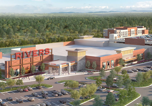
If you'd like to just jump to the new renderings, here you go...
Rush Street Gaming -- the company that will be operating Rivers Casino & Resort at Mohawk Harbor, AKA the Schenectady casino -- released new designs for the project Thursday.
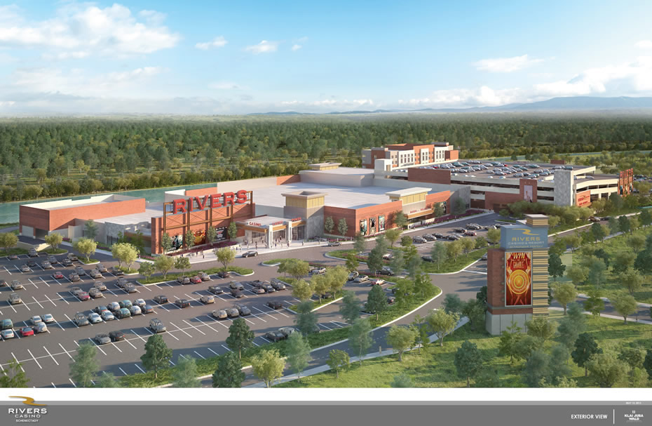
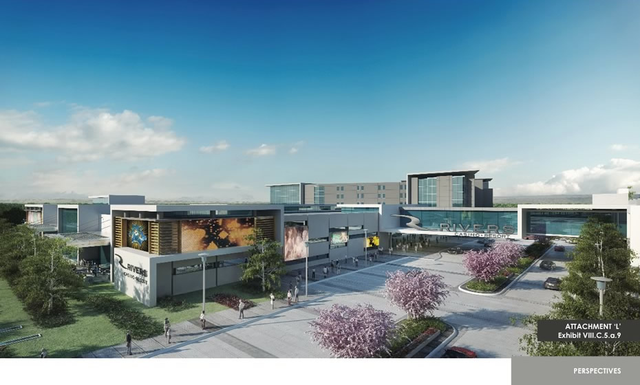
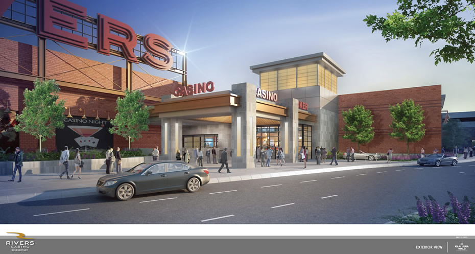
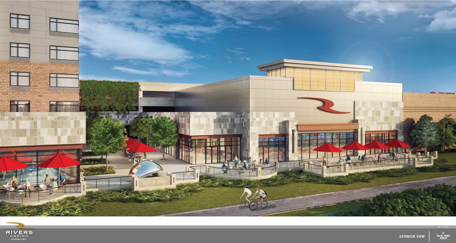
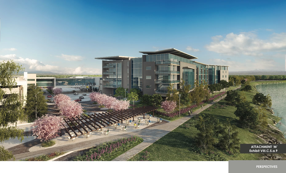
It's not surprising that the plans for the casino buildings would change in some way -- that happens frequently on projects both big and small. But the new designs are a significant aesthetic shift, from a sleek exterior that featured white cladding and lots of glass to a new look that prominently features brick.
The press release that accompanied the renderings notes the new plans "detail designs that reflect the look and feel of the Schenectady community." And it includes a quote from Rush Street Gaming CEO Greg Carlin: "We've arrived at a design to complement the City of Schenectady and the Capital Region. We're very proud of this vision and we are looking forward to starting construction." Extended blurbage:
Rivers Casino will be a $300 million gaming facility featuring a 50,000-square-foot gaming floor with 1,150 slot machines and 66 gaming tables. A high-end steakhouse, a "marketplace" with lite fare restaurants, an entertainment lounge, a banquet facility and a spa will also part of the project, as will a 150-room hotel and a parking garage, both to be attached to the gaming facility. Public outdoor open spaces and riverfront walking and biking trails will be part of the project.
The company says the plans have been submitted to the the city of Schenectady Planning Commission for review.
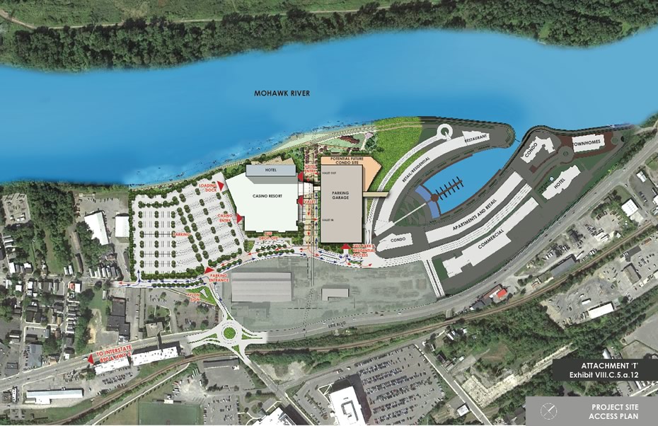
OK, let's have a look at the new renderings, along with some of the designs included in the initial application for comparison...
Renderings
They're above in large format -- click or scroll all the way up.
Earlier on AOA
+ Rivers Casino and Resort in Schenectady picked for Capital Region casino
+ What the proposed Capital Region casinos could end up looking like
Hi there. Comments have been closed for this item. Still have something to say? Contact us.
Comments
I get why they did that - the brick on the casino and the brown "rusted" steel on the proposed apartment building next door are supposed to pay homage to the site's industrial past, but I really wish they would go with the sleek, modern design in the original proposal. If they want to pay tribute to Alco by displaying one of their locomotives on site that would be cool, but otherwise let go of the past and build something that makes us consider the city's future.
... said Frank on Jun 4, 2015 at 5:01 PM | link
Looks like a strip mall. Kinda like Colonie Center. Sell the sizzle, and dumb it down for execution. Classic.
... said AddiesDad on Jun 4, 2015 at 9:33 PM | link
Great. A Cheesecake Factory combined with a Borders Bookstore. Innovation by people who confuse Reader's Digest with Architectural Digest.
... said Big 'Vic' Proton on Jun 4, 2015 at 11:32 PM | link
This is a radical change. It is borderline insulting that the design "reflects look and feel of the community." Outside of strip malls I can't think of any buildings in the city that resemble this.
I hope the plans for the Mohawk Harbor buildings don't follow suit. My interest in residing there would vanish.
I want the design that was pitched, or something in that vein at the very least. We don't need another Mohawk Commons/Mansion Square. The original renderings accentuated the riverside feel, whereas this one is literally a brick wall between the community and the waterfront.
... said Tim on Jun 5, 2015 at 6:29 AM | link
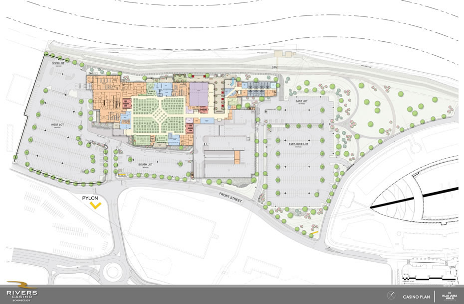
A third of that "photo" is parking lot. Priorities.
... said ethan on Jun 5, 2015 at 8:05 AM | link
Not impressed and I agree that it looks like a mall. I hope Schenectady pushes back and requests a revamp nearer to original projections. Among other things, the parking lot instead of the parking garage and the loss of the bridge element really lend the design to sprawling (depressing) mall. Are ugly dead casinos going to become the new blight in addition to ugly left behind malls?
... said jayme on Jun 5, 2015 at 8:26 AM | link
Thanks for sharing this.
If I had been the first to comment, I would have said I liked the use of brick. Having read the previous comments, I now know I am supposed to be agin it. No offense, but I am kind of tired of being against things.
As to parking, well, we drive. I also walk and bike, but not as far as Schenectady. If I go to check it out, I will be driving and will use and appreciate a parking space. I imagine I am not alone on this. I will not be holding my breath while waiting for a car free vegan LEED certified carbon neutral casino to open. Maybe in Portland, though.
I like that the release and renderings show bicycles. Not sure it advances the chains for pedalers, but getting a mention is probably a positive. Maybe I could put my bike on my car, drive there, have a couple of drinks and then pedal around the premises in a semi-irresponsible way. Hopefully they'd let me take my bike into a hotel room where I could sleep it off and then drive home the next day. #casino living
Happy Friday!
... said Randal Putnam on Jun 5, 2015 at 8:42 AM | link
And smack dab in the middle of it all - RPI's nuclear reactor!! Yeah!!!
... said -R. on Jun 5, 2015 at 9:04 AM | link
I'm not one to get drawn into the arguments about parking, but I can't believe this! One thing you notice from the original renderings is there are very few cars. The new renderings have more cars prominently placed,. Further, they removed what appeared to be a walkable path through the center of the site as well as the grand entrance. Now it looks like the entrance to a mall...
This is bait and switch territory.
... said Jay on Jun 5, 2015 at 9:41 AM | link
This completely lacks any imagination whatsoever, it looks like the garbage Columbia/BBL churn out everywhere in Albany. It has the feel of a suburban office park. I agree with Tim that this design is insulting to the area. They are essentially saying that this is the best the area deserves.
While I wasn't a fan of the initial proposal (I was hoping Rensselaer would be chosen), it was far superior to this. This looks like the type of building someone in their first year of architectural school would design. You can hardly even see the hotel, it is so small.
Another thing I don't get: why the need for such a large surface lot if they are also building a parking garage? That space could be much better utilized.
Not what I would expect for something that is supposed to be a destination.
... said Kman518 on Jun 5, 2015 at 10:00 AM | link
This new "vision" looks like a grocery store! This is a huge change from the look of the casino they proposed. We need something with a new look/modern feel in Schenectady - let's not get stuck in the past when trying to move into the future.
... said Kate on Jun 5, 2015 at 10:11 AM | link
Bait & switch? That design is subpar.... how many casinos feature red brick?! Why not make something unique and attractive instead of some refurbished industrial zone.
... said John on Jun 5, 2015 at 10:17 AM | link
This is a huge disappointment, but will, of course, save the developer lots of money. Nice touch to say that it pays respect to the industrial past of the area (read rustbelt). The sleek design that was originally pitched is what gave this project a spark. It was something that allowed it to exist on its own and challenged future construction in the area to play upon its design elements. All that is proposed now is a second rate box structure with a brick facade. Perfect for converting into low rent housing when the casino goes bust.
... said ace on Jun 5, 2015 at 10:18 AM | link
Sure looks like a big-box store. And what happened to the boat basin?
... said Chuck on Jun 5, 2015 at 10:47 AM | link
David Giacalone has done a helluva job watchdogging this and his blog is worth a look:
http://http://stoptheschenectadycasino.com
And I totally agree with AddiesDad and others; bait and switch. Well played Schenectady.
Think this looks like a mall? Welp, the developers are gamblers, and smart gamblers hedge their bets. Good to have a Plan B for, ah, 5 years down the road?
... said ChuckD on Jun 5, 2015 at 11:03 AM | link
Why is just everything a scam. This design is an insult. I dont agree with the casinos as a long term economic solution, but the original design might at least have use after the casino fails. Or maybe they are already planning for its repurposing into a mall.
I would like to see the cost difference in designs and the final taxpayer grant bottom lines. Are the developers making millions before the place even opens?
... said AlbRes on Jun 5, 2015 at 11:07 AM | link
Hideous. A replica of the Palisades mall! Here the developers had a chance to really put something wonderful forward, and perhaps a wild design would have offended a few folks but *wow!* they've managed to put together a design that's SO pedestrian it would appear to offend everyone!
No green roof? Surrounded by acres of surface parking? In an area already prone to flooding? splendid.
On the bright side I'm ever so happy that Schenectady "won" this proposal and not my home town. Phew!
... said daleyplanit on Jun 5, 2015 at 11:24 AM | link
Everyone's a critic. Oh look, Mohawk River access!
... said Andy Gregory on Jun 5, 2015 at 12:26 PM | link
@Andy Gregory
In case you didn't notice, the original design had Mohawk River access too.
Why should Schenectady have to settle for this uninspired dreck, when the original was so much better? It almost seems as though they WANT this to fail.
... said Kman518 on Jun 5, 2015 at 2:19 PM | link
Booooooooooooo. Try again.
... said Dave on Jun 5, 2015 at 3:01 PM | link
How serendipitous the NYT published an article today "Seven Leading Architects Defend the World’s Most Hated Buildings." Albany make this list (I got a bit of push back on my appreciation of the 'Plaza after writing about it here).
The ubiquitousness of urban design has got to stop. I'm not saying every developer has to hire Frank Ghery (please don't) but please don't leave a legacy of yawns in your wake.
... said daleyplanit on Jun 5, 2015 at 3:36 PM | link
Looks like every other ugly strip mall around here. Let the lies begin to be revealed about what casinos actually bring to towns. I'm so glad that the proposal surrounding my house didn't win.
... said Sarah on Jun 5, 2015 at 6:27 PM | link
Remember that a casino needs to make as much money as possible. Cheaper design means more money. A facny design with walkability outside will not bring people back into the casino to throw away all their money. The fact that anyone thought the original design was really going to go forward is laughable.
... said Blergh on Jun 6, 2015 at 12:39 AM | link
I sort of get what they're trying to do- this area (out of necessity) is embracing the re-used factory and warehouse aesthetic. That's a praiseworthy thing.
These guys are trying to build an ersatz version of that- squint your eyes & drink a few cocktails & you might think you're in an old locomotive plant or something. That's pretty bogus.
... said Eric Scheirer Stott on Jun 6, 2015 at 8:01 AM | link
aww...it's so quaint and charming that people think this monstrosity will actually come to fruition in our life time. Once they have the ceremonial groundbreaking/ribbon cutting (with the BIG scissors) I don't for a minute think this will move forward before the developers start squawking about needing more tax breaks to "afford" the project etc. resulting in the whole thing being abandoned once Cuomo leaves office.
... said World's Biggest Cynic on Jun 6, 2015 at 8:20 AM | link
Everyone is acting surprised - yet this region (Albany, Schnectabdy, etc) is always the first to promise big things and then deliver little. It's like the M.O. here. Tempt everyone with a great idea, and then come back with something so radically different. Bravo RSG, Bravo, you sold NYS on a Casino and in turn you are delivering a strip mall.
... said Cheese on Jun 9, 2015 at 1:39 PM | link
What a great disappointment, embarrassing site to our community!!!
Schenectady we want change not another "Target" or "Walmart" as one of my very successful friends of this city commented to me.
Saving dollars??? Changing plans once all gets passed, then bang!
Not SURPRISED!!!
... said Grammer4 on Jun 15, 2015 at 10:18 AM | link
Very drab looking design!!! We have the opportunity to set the bar very high in Schenectady with this project.....Please don't settle for this hideous design... All you have to do is go online and view other designs for Casino's and Buildings around the Country, and you will see what I am talking about.... We are better than that!!!
... said Michael on Oct 2, 2015 at 4:23 PM | link