Comparing transit service both within the Capital Region and beyond

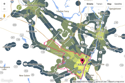
Check out the map clip above -- it's from a new site called AllTransit and it shows the number of transit routes within mile for places around the Albany-Schenectady-Troy area. (There's an interactive version at that link.) The brighter the yellow, the higher the number of routes.
AllTransit has all sorts of maps and rankings and data like this for metros all around the country. Here's a whole bunch of potential uses for info, broken out by type of person who might be using it (city residents, business owners, elected officials, and so on).
The maps might first draw your eye, but the rankings and scores are interesting for getting a bit of context about relative levels of transit services both (with)in the Capital Region and elsewhere. For example, the Albany-Schenectady-Troy metro ranks #42 among metros with more than 500k people for AllTransit's Performance Score, "an overall transit score that looks at connectivity, access to jobs, and frequency of service," with a score of 3.39. But, as you might expect, if you look within the metro area, there is a lot of variation. For example: The city of Albany's performance score is 7.8, the city of Schenectady's is 6.3, and areas of Clifton Park range from 1.4 to 0.
[via CityLab]
screengrab from AllTransit
Say Something!
We'd really like you to take part in the conversation here at All Over Albany. But we do have a few rules here. Don't worry, they're easy. The first: be kind. The second: treat everyone else with the same respect you'd like to see in return. Cool? Great, post away. Comments are moderated so it might take a little while for your comment to show up. Thanks for being patient.
... said KGB about Drawing: What's something that brought you joy this year?