
Mapping a history of inequality in Albany, Schenectady, and Troy
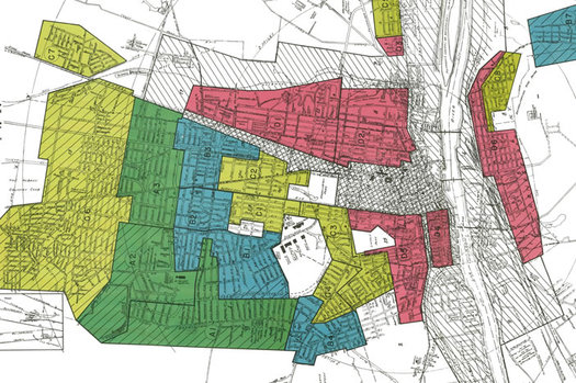
A clip from the HOLC map for Albany.
You've probably heard of the term "redlining" -- it refers to the practice of denying services, such as mortgage lending, to people in certain neighborhoods based on the race or ethnicity of the people who live there. It's one of the ways discrimination became incorporated into economic systems in this country.
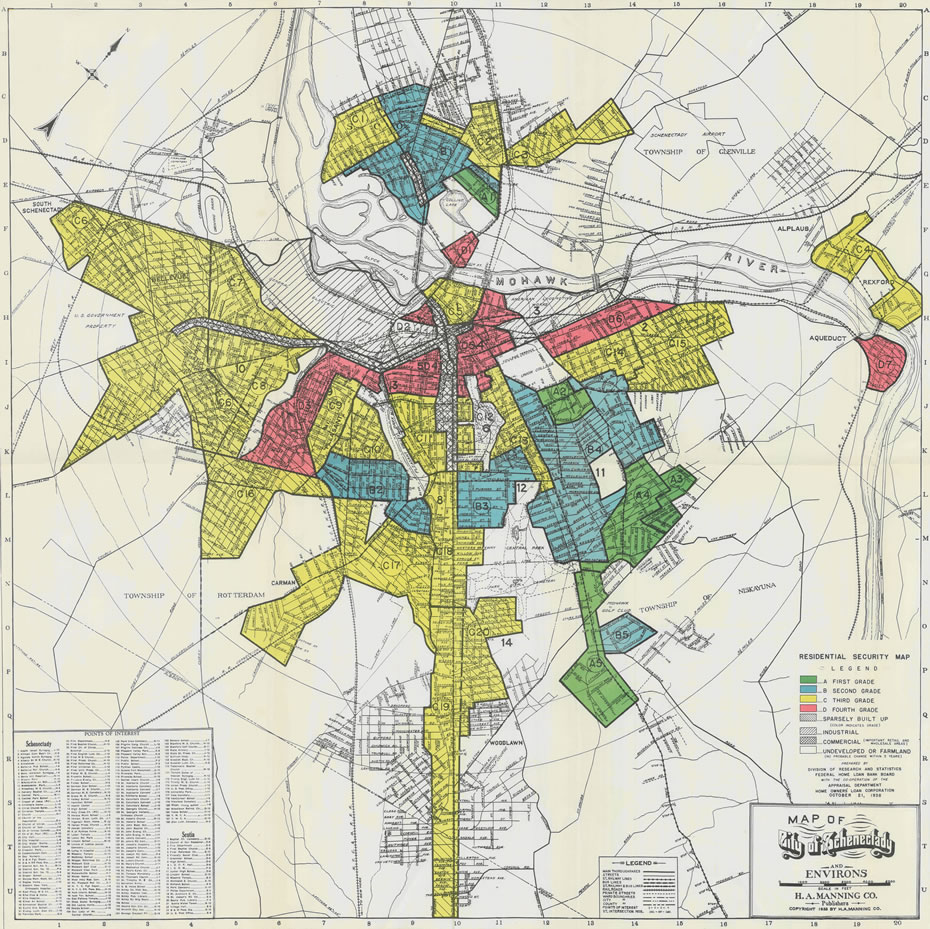
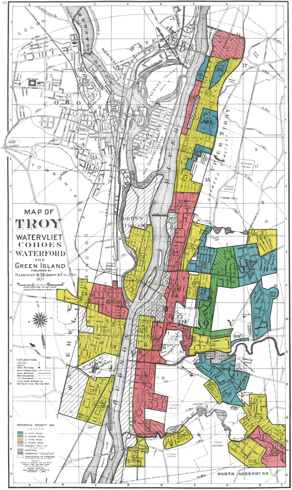
The practice and the term have roots that stretch back to the 1930s and a federal program called the Home Owners' Loan Corporation (HOLC), which surveyed cities and graded sections of them based on perceived "security" of investments there. From those surveys came maps -- with redlined sections.
A project based at the University of Richmond and involving researchers from a handful of institutions -- Mapping Inequality -- has gathered up these maps and made them accessible online.
So we pulled out the maps for Albany, Schenectady, and Troy.
Maps are above
If you'd like to have a quick look, the historical maps are above in large format -- click or scroll all the way up.
Really, though, the best way to view the maps is at the Mapping Inequality site, where they've been overlaid on zoomable present-day maps. And in some cases, the site allows you to actually see the profiles for individual neighborhoods.
A bit more about these maps
From the intro to Mapping Inequality:
HOLC recruited mortgage lenders, developers, and real estate appraisers in nearly 250 cities to create maps that color-coded credit worthiness and risk on neighborhood and metropolitan levels. These maps and their accompanying documentation helped set the rules for nearly a century of real estate practice. They have also served as critical evidence in countless urban studies in the fields of history, sociology, economics, and law. Indeed, more than a half-century of research has shown housing to be for the twentieth century what slavery was to the antebellum period, namely the broad foundation of both American prosperity and racial inequality. Through offering a digital library of the state's role in housing development, Mapping Inequality illustrates vividly the interplay between racism, administrative culture, economics, and the built environment.
Mapping Inequality introduces viewers to the records of the Home Owners Loan Corporation on a scale that is unprecedented. Visitors can browse over 150 interactive maps and roughly 5000 individual area descriptions to get a view of Depression-era America as developers, realtors, tax assessors, and surveyors saw it--a set of interlocking color-lines, racial groups, and environmental risks. (Nearly all of the maps and area descriptions are available here, though a handful haven't yet been added.) They can also use the maps and area descriptions to draw connections between past state actions (and inactions) and contemporary American problems.
A few years ago at The Atlantic, Alexis Madrigal wrote about these HOLC maps and highlighted the way the descriptions of the map categories referred to neighborhoods in cities around the country.
Another aspect of this project worth mentioning is the way recent research has pointed to a complicated history on this topic. Again, from the Mapping Inequality site:
In the 1980s discovery of the HOLC security maps changed the way historians thought about HOLC and New Deal housing policy. Housing activists in the 1960s and 1970s had criticized and protested discrimination in real estate lending and buying, coining the term "redlining" to illustrate the geographic dimensions of housing discrimination. Historian Kenneth Jackson found the maps in the National Archives, stating in his award-winning book Crabgrass Frontier that HOLC "devised a rating system that undervalued neighborhoods that were dense, mixed, or aging," and rather than creating racial discrimination, "applied [existing] notions of ethnic and racial worth to real-estate appraising on an unprecedented scale." Federal housing policy simply blocked African Americans from accessing real estate capital, leading to the creation of segregated mass suburbia and, neighborhood by neighborhood, opened residents to opportunity and wealth accumulation or closed citizens off from the American dream. Following Jackson's work, historian Thomas Sugrue wrote of the legacy of federal housing policy in Detroit: "geography is destiny." Outside of history, scholars and journalists, including sociologist Douglas Massey and writer Ta-Nehisi Coates, point to HOLC redlining as a key factor in racial disparities in wealth and opportunity that continue to the present day.
When historians incorporated new data technology in their research, they began to draw new conclusions about HOLC's legacy. Mapping with geographic information systems (GIS) and quantitative statistical methods from the social sciences, scholars including Amy Hillier and James Greer have countered Jackson's initial assessment. Some African Americans did gain access to HOLC financing, and a neighborhood rating was neither a blanket guarantee nor proscription for New Deal aid--"C" and "D"-rated neighborhoods often received more mortgages than nearby "A" neighborhoods. The ability to work with digital data and to transmit information over the web has opened many new avenues for scholarly inquiry, including assessing the importance of restrictive covenants and asking research questions about the whole program, rather than just individual cities. Managing massive amounts of real estate and demographic data has been a herculean task up until recently but is now possible with mapping, visualization, and statistical tools.
One of the goals of the project is to make these materials accessible to more people for further research.
Specifically about this area
You can see for yourself how the maps categorized Albany, Schenectady, and Troy and nearby areas. And while it wasn't necessarily unexpected, we were struck by how closely these maps -- made almost a century ago -- delineate racial and economic divides that persist to this day.
Hi there. Comments have been closed for this item. Still have something to say? Contact us.
Comments
Thank you for posting this!
... said AlbanyJen on Oct 21, 2016 at 9:12 AM | link
I appreciate your articulate description of this long standing, institutional and systemic component of racial injustice/discrimination within The HOLC. I look forward to future writings with solutions
... said Chris George on Oct 21, 2016 at 5:09 PM | link