Clickable county by county results for 2016 presidential election in New York State
There's a clickable map after the jump.
Updated
In a presidential election marked by polling surprises, the voting in New York State pretty much shook out as expected.
Here are county-by-county clickable maps of the results, along with a few notes about some geographic voting patterns around the state...
Look up
Maps are above in large format -- click or scroll all the way up.
Notes
Numbers discussed below and used for the maps above were gathered from the NYS Board of Elections website Wednesday morning, with 15,294 of 15,391 election districts reporting.
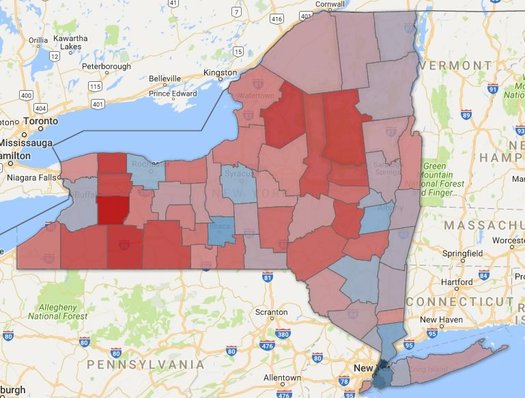
+ Hillary Clinton ended up taking New York State 58-37 over Donald Trump. That's a little bit larger than the margin forecasted by the last Siena poll, released this past weekend, which had her up 51-34.
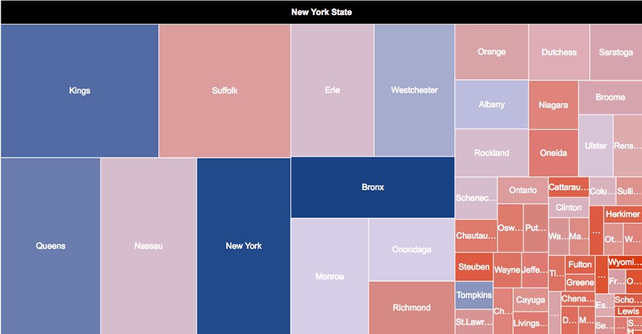
+ Clinton won the largest vote total in 16 of New York State's 62 counties. But that relatively small group of counties made up more than 66 percent of the total votes cast in the state for the presidential election. And as you can see from the map, Clinton won victories in the state's large urban areas -- especially New York City.
+ One almost-exception to the urban/non-urban division of counties among Trump and Clinton: Erie County, which includes the city of Buffalo. Clinton won the county, but it was close -- 49.21-44.51.
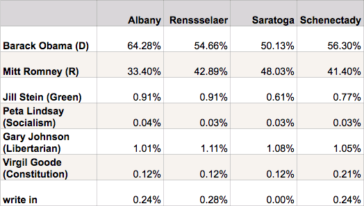
+ If the Capital Region's four core counties were their own state, Hillary Clinton would have taken it 50-42 over Trump. And she would have done so in large part because of Albany County, where she beat Trump 58-34 (and the county represented 35 percent of the votes cast in the Capital Region).
+ Clinton lost to Trump in both Rensselaer (45-48) and Saratoga (44-48) counties.
+ Here are the Capital Region core results from the 2012 election:
+ If Upstate was its own state, Trump would have won it 48-44. (In this case, "upstate" is every county north of Rockland and Westchester.)
+ If the greater New York City area was its own state, Clinton would have won it 67-29. (In this case, the "NYC area" is Rockland, Westchester and everything south of there.)
____
Earlier on AOA: Quick-scan general election results 2016
Hi there. Comments have been closed for this item. Still have something to say? Contact us.
Comments
What a wonderful breakdown. Its really interesting to see the various shades of red.
... said karnerblu on Nov 9, 2016 at 10:52 AM | link
Why don't you just show a simple map showing which candidate won which county in red or blue? All your shading stuff is obscure the fact that there are only 10 counties where the popular vote was for the democratic candidate.....
New York is a Red State with only 10 blue counties..... you are spin doctoring and propagandizing.....
... said Buck on Nov 9, 2016 at 10:57 AM | link
@Buck It is a simple map bud, I think we can handle the additional information that the shading provides.
... said Sean on Nov 9, 2016 at 11:54 AM | link
I understand where you're coming from Buck, but even on a national level this is how everything is broken down now.
... said karnerblu on Nov 9, 2016 at 12:43 PM | link
@Buck One should not look at the vast geography splashed in red, against the tiny islands of blue and claim this is a red state, for this grossly misjudges the distribution of the population in this state. The fact is, nearly 57% of the state voted Democrat, and if you want to throw in the socialist Green Party into the mix, it’s closer to 60% of the state’s vote. Last time I checked, this a tad more than a simple majority and would imply we are pretty comfortably tucked within the Democratic column. If anything (since it sounds like you are dang proud of the upstate conservative makeup), if we simply went blue and red based on who got the most votes within the respective counties, the map would have 16 blue counties. If we, as you put it, “obscure the map by shading stuff†we see that Clinton really only solidly one a clean majority in a handful of counties; in the rest, Trump got pretty darn close resulting in a much redder map overall than if we used simple majority method your begging for.
... said Bill on Nov 9, 2016 at 1:52 PM | link
Hey Buck, just for you, here's what New York's vote looks like when we eliminate all those obscure county boundaries and stuff and things. No spin or propaganda!
... said -B on Nov 10, 2016 at 9:42 AM | link
The Capital Region core results from 2012 election is not public. I must have a google account and request access?
... said S on Nov 10, 2016 at 11:15 AM | link
@S: Thanks for the heads up. I swapped the 2012 table for a different way of displaying it. It should show up for everyone now.
... said Greg on Nov 10, 2016 at 12:52 PM | link