
Capital Region income distribution
 With all the talk about 99 percents and 1 percents, we were curious about the income distribution in the Capital Region.
So, we looked up the data. Let's go to the charts, graphs, and discussion...
(You know you want to see where you rank.)
The grains of salt
There are a lot of ways to figure income. We used household income.
We used Census Bureau estimates for 2010 household income. The Census publishes the data in ranges, and the ranges aren't all the same size. Some of the bands are $5k "wide" and others are $10k (or a lot more). So that limits how fine-grained we can get about some of this (we don't know about the income distribution within bands) -- and why we have seemingly weird percentile ranks. (It also kind of borked our attempt to just make a simple graph of the distribution.) If you know of better sources and/or ways to present some of this, let us know -- we'll work it up.
The percentile ranks have been rounded.
The numbers
Here's a table with breakdowns of how many people are in each income range -- in the nation, the state, and the Albany-Schenectady-Troy metro area:
Percentiles
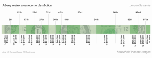
Right, but what about 99s and 1s? We calculated percentile ranks for the Capital Region distribution. Don't squint -- check out the large-format graph all the way at the top (or scroll all the way up).
The percentile ranks are based on the upper end of each range. What does that mean? Each division line is marked with a rank (6th, 12th, and so on) that represents what percent of the population is below that level of income. Or, to put it another way, the upper end of the $50k-$59,999k range is ranked at the 53rd percentile -- that means a household making $59,999k has more income than 53 percent of the households in the Capital Region.
Let's discuss
A few things:
+ We weren't able to figure out the cut off for the top 1 percent in the Capital Region, but could draw the line for the top 3 percent -- it's household income of $200k.
+ Definitions of what it means to be "middle class" vary widely. But if we just say it's roughly the middle 50 percent of people, the cutoff on the low end in the Capital Region would be about $25k and the upper end would be about $100k. [MoneyWatch]
+ OK, but here's the thing about that: the number of people in your household makes a big difference when thinking about this whole "middle class" definition. A single person making $25k a year -- not doing great, but you could probably argue they're hanging onto the very low end of the middle class. A family of four making $25k? Borderline official poverty (and, we would argue, actual poverty).
+ And about being in the upper 25 percent... two people with $60k/year jobs would drop a household pretty firmly in the upper 25. In the Capital Region, that's a rather comfortable living. If people in that range feel a serious crunch in some way, it's probably from educational debt (most people have to go college -- and grad school -- to get a job to put them in that range). In fact, student loan debt recently exceeded credit card debt nationally. [USA Today/CNBC]
Earlier and elsewhere
+ Albany poverty widens [TU]
+ Capital Region 2010 census population totals
Hi there. Comments have been closed for this item. Still have something to say? Contact us.
Comments
I love when you guys do the number-crunching for the rest of us. It gives me much more accurate information to scream at people during drunken arguments.
... said SiobhanGK on Oct 25, 2011 at 2:06 PM | link
Personally, I don't care if my information is accurate. I only want to be the loudest drunk in the room.
... said Tim on Oct 25, 2011 at 2:34 PM | link
I totally agree with SiobhanGK, I am a huge fan of these kind of geeky but practical info articles that not only talk about what the numbers mean but show them at the same time.
... said Alex on Oct 25, 2011 at 2:55 PM | link
You can also plot the Albany percent against the US and NY percent per brackets. There are 22% less people in Albany making less than $10,000 than in the whole US (27% less compared to NY). Starting $50,000 Albany has consistently more people in the above brackets than in the US/NY except the last one. For example, Albany has 31% more people in the $100,000 to $124,999 interval than the US (18% relative to NY), and 28% more in the $125,000 to $149,999 than the US (respectively 8%). Is this because of the state workers? Or maybe an average salary for people working at the Capitol? Albany loses a big chunk in the last bracket, it has 18% less people in the $200,000 or more bracket than in the US (and a big 45% less than in NY), so I guess the wealthy households are not in Albany...
... said -S on Oct 25, 2011 at 3:05 PM | link
60k is actually right in the average range for RPI grads, so sometimes you don't have to go to grad school.
I think the poverty vis a vie household size issue is enormous, and I'm glad you highlighted it. 25k and single is light years from 25k a year between you and 4 kids.
... said Wanttobeanonymous on Oct 25, 2011 at 3:08 PM | link
I'm with SiobhanGK. Though my arguments aren't usually drunken, I still like to sound smart. :)
... said Sue on Oct 25, 2011 at 4:07 PM | link
There are a couple of things that make this kind of comparison more difficult than it used to be, even within a single band of "income." One is that if I'm making $100,000, but I'm paying my own health insurance (such as a self-employed person has to), that's a massive cut right off the top. For me when self-employed it was more than $15,000 a year, so that would make me equivalent to someone making much less who was only paying a small portion of health insurance. You used to be able to assume everyone's insurance cut was roughly the same, but that's no longer remotely true . . . for those who can even get insurance. I can control most other costs in my life, one way or another, but that insurance nut just is what it is. And then you get to pay taxes, including a tax for being rich enough to have health insurance, which you pay no matter what your income level is.
This also masks the payments made on top of that reported income -- employer contributions to healthcare, retirements, etc. My point is that one person making $X may not have the same amount of income as another person also making $X.
... said Carl on Oct 25, 2011 at 5:41 PM | link
@-S: I guessed that Albany's clustering around the upper middle class/lower upper class ranges is due to the fact that there are a lot reasonably well paying jobs here -- state government, colleges, medicine -- but not necessarily jobs where people make insane money. I think that's why New York State's distribution is shifted toward the top -- there are a lot of people in NYC -- investment bankers, for example -- who make extremely large amounts of money. (But it is interesting that's Albany +$200k number is smaller than that of the nation. I'm not sure I would have expected that.)
@Wanttobeanonymous: You're right about some technical fields paying that well straight out of undergrad. Of course, RPI is also among the nation's most expensive schools -- so there's going to be the student debt issue for some people. I bet it's manageable for most of them, but it's still something that cuts into how wealthy a household might feel.
@Carl: You make an excellent point about healthcare. A bunch of people have argued over the last few years that wages haven't been increasing because the gains are being eaten by increased healthcare premiums.
@Alex: Thanks!
@Siobhan: To know that we can assist you in a drunken argument is to know that we are doing our job. ; )
... said Greg on Oct 26, 2011 at 12:24 AM | link
Love this -- a lot.
... said Kristi on Oct 26, 2011 at 7:27 AM | link
I've always aspired to be middling and once again I've succeeded in landing in that meaty middle for Albany income.
... said chrisck on Oct 26, 2011 at 9:55 AM | link
I work at a college, make less than 30 K a year supporting 2 people. Rent is 50% of my take-home pay because Albany is NOT cheap to rent an apartment/house due to, you guessed it, the student population. Got a 2% raise this year - that is $11.00 a week. What is wrong with this picture?
... said Uncle Laurie on Oct 26, 2011 at 1:12 PM | link
@ Uncle Laurie - I know the point you're trying to make is that you should be paid more, but I'll try to give you some constructive financial advice that you can enact in your own life.
First of all, 50% is way too much. If your take home pay is 25k that means you’re paying about $1050 a month. There are many safe places around Albany where you can get a 2 bedroom apartment for $750. If you go for a one bedroom (I can’t tell if the 2 people you support includes yourself or another dependant) that cost can drop to $600. If that means that a dependent child or adult has to sleep on a fold away bed in a common room, then so be it. The age-old formula for determining appropriate levels of housing expense is one-quarter of your salary. Granted, that formula got a little screwy with the recent real estate bubble and collapse. Ideally, you should be renting a place closer to $625 given your income. I know that may be a difficult transition, but it’s something you should consider doing.
Back in 2001 I lived in a great 1 bedroom apartment in Guilderland for $475. How can you beat that? Up until 5 years ago I rented a 3 bedroom in Waterford for $575. Neither were palatial manors (the one in Waterford was 30 feet from the railroad tracks), but it’s how I lived within my means when I was making 28k. Both places had easy cdta access so work was not a problem.
Just some friendly advice. Feel free to ignore it.
... said Tim on Oct 26, 2011 at 2:45 PM | link
you should be renting a place closer to $625 given your income
I would really like to rent a 1 BR for $625.
The problem is the lack of this middle-range housing.
One can either rent a ghetto 1 BR for $400 or suburban 1 BR for $800.
... said Lu on Oct 27, 2011 at 3:54 PM | link
This post is just one of the many reasons I love you guys.
... said celinabean on Nov 1, 2011 at 11:39 AM | link
Remember that the figures shown in this article are for household, not individual income. In this day and age, the trend is toward 2 wage-earners per household. In some cases, the female wage-earner has the higher income. The biggest percentile of shown income groups lies between 75,000 and 100,000 dollars annually. This could very well be interpreted as between 37,500 and 50,000 dollars annually per wage-earner in that household. Perhaps this little bit of information will help the bulk of us feel a little better about ourselves.
... said mattv on Jan 1, 2013 at 1:22 PM | link