Political yard sign design primary, part I
In this primary, your stance on kerning can make all the difference.
The primary elections for state and local offices is this Thursday. And that means lawns, medians, parking lots, and other spots all over the Capital Region are currently adorned with political signs. So. Many. Political signs.
You can't help not seeing them. They're everywhere. So we thought it'd be fun to look at the signs a little differently, a little more fundamentally -- as design objects. And we got a trio of accomplished local designers to critique the design of signs from a handful of local races.
Because of the vast herds of signs this year, we've broken the design primary up into two days.
Today: design primary results from races for Albany County DA, State Senate 43rd, and State Senate 44th...
Quick note: These critiques are solely of the sign designs, not of the candidates.
Designers
First up, the designers critiquing the yard signs:
+ Doug Bartow is the principle and design director at Troy-based firm id29. Before co-founding id29, he was the design director at MASS MoCA for eight years.
+ Mark Gregory is an illustrator and designer who's done design work for many businesses in the Capital Region -- including identity design, advertising for print and web, billboards, packaging, and caricatures.
+ Phil Pascuzzo is an award-winning designer and illustrator who's designed everything from book covers to posters to the Twitter bird.
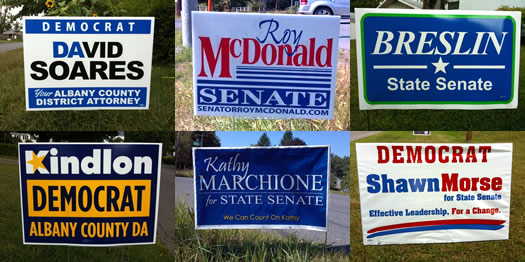
Albany County DA
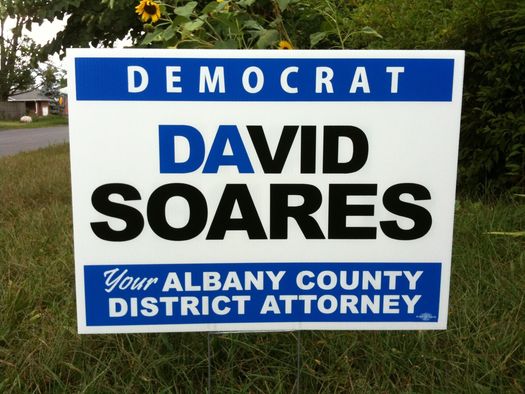
Doug: I really like how cleverly the "DA" in "David" (set in blue) lets the reader know immediately that this is a candidate for the District Attorney's position. Legible and not too fussy, blue and black on a white ground provide good readability from distance quickly--this is critical for political yard signs, just like it is for billboard design. The letterforms would benefit from a bit of kerning--which is optically adjusting the spacing between pairs of individual glyphs. For instance, the "A" and "V" in "DAVID" need to be a bit tighter together, especially given the color shift used in the name. The script face used for "Your" seems a bit out of place formally with the rest of the sign, but overall a pretty good effort.
Mark: Strong royal blue and black on white text for high contrast. San serif, bold, angular, all capital text suggesting that this candidate is serious, no nonsense. The DA of DAVID is blue for District Attorney - Brilliant. Also, no bleed around the border, everything is contained on the sign, nice and neat, black and white, right and wrong, just like the law (depending on how you see it of course).
Phil: The clear winner for the Albany County DA primary sign primary is David Soares. The very simple two color design using plenty of white space feels fresh compared to the dark blue and yellow palette of Kindlon. Also, the "DA" concept in David is much more clever and less forced than the awkward star in the "K" of Kindlon.
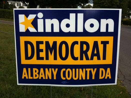
Doug: [The typeface] Futura is drawn based on the utopian ideology of pure geometry--many of its letterforms use straight lines and perfect triangles and circles. This makes forcing a 5-pointed star into the capital "K" an interesting, although clunky, visual choice. It's surprising that Lee Kindlon, battling the better known incumbent DA David Soares, would choose to omit his first name from his yard signs. Viewed from a distance, the word "DEMOCRAT" challenges "Kindlon" for hierarchy one--or the first thing a viewer will read when engaging a text. This results from the word being "knocked out" of the large yellow rectangle in an all caps blue text. I would argue that the proper hierarchy for this sign should read: Lee Kindlon, Democrat, Albany County DA. A bit of typographic love and better use of scale could accomplish this rather easily. Also, let's lose the yellow star in the "K," it affects readability in a negative way and adds little to the design as a whole.
Mark: Watch out, this guy uses a star, we have star power here. Nice orange blue combo to suggest his connection to the making of NYS license plates by people he's put away maybe? Maybe not?What the hell do I know, after all they are just colors right. What's this guys first name? Is it a guy? This signs not telling me any of that, but I have a feeling he's a DEMOCRAT!
Winner: David Soares
State Senate 43rd
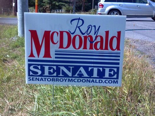
Doug: I was hoping to find some questionable shading around the edges of this particular image against the grass on the ground to prove that this sign is simply a retouched fake, and doesn't exist in reality. I was unable to find those clues of a visual forgery, so I'll have to assume this design is actual, and not only did someone typeset it, but someone else approved and paid for it. This is troubling to me.
Mark: What is up with the overlapping first names on these Senate signs? Scribble McDonald underlined thin to thick is running for Senate. Go ahead, read that website fast... you can't do it, can you.
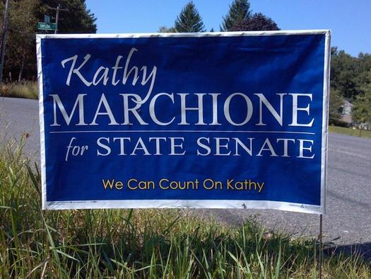
Doug: Unfortunately for candidate Marchione, the designer of her political yard sign decided that anamorphicaly scaling--or stretching the letterforms in her last name would be a good method to increase legibility. ZZZZZTT! Bad idea; typefaces are not designed to be stretched in one direction, ever. This is Typography 101. To add insult to typographic injury, throw in a non sequitur informal script face for her first name, and finish off this sign with a slogan set in Century Gothic, one of the clunkiest sans ever created. I'm going to have a hard time sleeping now.
Mark: What do you do with a 'y' that just won't stop overlapping your last name no matter where you put it? You make the first name all caps. But then someone on Kathy's team (or Kathy herself) tells you that 'Kathy' really needs to be in lower case, and in a fun curvy font. So you get this, an 'R' getting it's eye poked. Can we really count on this font... can we?
Phil: Sorry, but there are no winners in the State Senate 43rd category. They both try and connect with us on an emotional level by putting their first names in a poor handwritten typeface. I'm not buying it.
Winner: no one
State Senate 44th
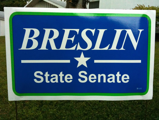
Doug: In theory, I should dislike this particular application: two inappropriate, poorly-kerned typefaces [Times New Roman-bold and Arial-bold] knocked out of a blue field with a predictable white star and overly thick linear elements. There's something about it, however, that makes me want to try to attempt to work out a way in which I might be able to, after a while, begin to like this. It's simple, legible, to the point, and--given the aesthetic many of the other signs this year have taken--somewhat distinctive. It's not asking the reader to do too much, just remember "Breslin, State Senate." I've kerned those glyph pairs in my mind, and imagined the star and lines 25% smaller. OK, I like it now. Am I softening in my old age? The horror...
Mark: Another hypnotizing star sign, but this is simple, easy to read, and willing to introduce a whole new bright green into the color scheme. No website or first name needed apparently.
Phil: Breslin's sign for 44th State Senate has a huge lead over Shawn Morse. It's a very nice, centered layout with knock-out type that successfully combines serif and sans-serif typefaces. The word Breslin is the obvious anchor in this design unlike Morse [below] where you feel lost and confused what to focus on. Just don't look at the wacky red and blue stripes at the bottom, they suck.
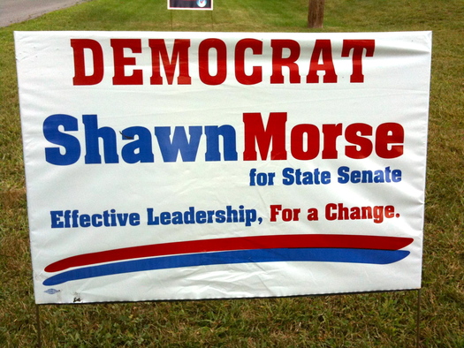
Doug: This is not a good design, let me explain: 2 weights of the same typeface [Aachen-bold], some all-caps, some mixed case, predictable colors, etc... but what really makes this a formal disaster is the scale. Establishing a messaging hierarchy in signage applications such as these is paramount. As viewers drive by, the designer must engage them and make their eyes move to the messaging, reading the words in the intended order. There are numerous methods at the designer's disposal to accomplish this, such as type style, location and color, but what's noticeably missing here is proper scale. All the elements in this design are roughly the same size on the sign blank. By 'filling' the space, the viewer is unsure where to enter the piece, or where to exit. This lack of messaging hierarchy will cause the text to be read less, with significant less comprehension.
Mark: Some signs a just plain ugly. This one wins the most conflicting message through design award. Democrat is in red. The font reminds me of a wanted poster from the old west. The only change here is from red to blue with a headache inducing non predicting pattern. Two big underlining marks with the red on top. Thankfully this is the last sign, I need a nap. Wake me on election day please.
Winner: Neil Breslin
Part II
Here's the second part of the design primary with results for the Assembly 108th, Assembly 109th, and Assembly 110th.
Many thanks to Doug Bartow, Mark Gregory, and Phil Pascuzzo for their time and critiques.
Senate 43rd yard sign photos: Peter O'Toole. (Thanks!)
Say Something!
We'd really like you to take part in the conversation here at All Over Albany. But we do have a few rules here. Don't worry, they're easy. The first: be kind. The second: treat everyone else with the same respect you'd like to see in return. Cool? Great, post away. Comments are moderated so it might take a little while for your comment to show up. Thanks for being patient.
Comments
I know this piece was meant to be a fun look at primary signs, but as an untrained graphic designer who's doing it anyway for work (such is life in the nonprofit world), it's really interesting to read what these designers have to say about these pieces. I'm looking forward to the next batch of critiques! (And now I have to give myself a wedgie for dorking out over this piece.)
... said SiobhanGK on Sep 11, 2012 at 1:34 PM | link
I saw that Shawn Morse sign yesterday for the first time and thought someone was having HVAC work done on their house until I got up right next to it & was able to read it. Awful.
I love the Soares signs - clean, simple and clever.
... said WrigsMac on Sep 11, 2012 at 1:39 PM | link
Great idea for a feature! Breslin's sign definitely is my favorite from the group, despite the lame font choices, and the fact that the B is about to fall off his name.
Simplicity is the key for tiny signs meant to be seen at 30+ miles per hour!
... said Paul on Sep 11, 2012 at 1:52 PM | link
This is the coolest commentary I've seen on the local elections. Tomorrow's episode should be wild -- there are so many candidates in those Assembly races. Tonight on my way home I'm going to try to look at the signs for the 109th with a fresh eye for the graphics and see if I can predict any of tomorrow's critiques.
... said chrisck on Sep 11, 2012 at 2:15 PM | link
Great article! I'm looking forward to tomorrow, particularly their thoughts on the Coyne signs.
... said Ski on Sep 11, 2012 at 2:40 PM | link
I know these guys are design experts, but I have to disagree on that David Soares sign. That sign has been bothering me since I saw it. All I see is "da," which sounds like "duh" or reminds me of "dada" the art movement or "dada" the babyspeak, plus it makes me want to pronounce his name "Dah-vid."
I know, I get it. He's the District Attorney. Just because it's clever doesn't mean it doesn't suck.
... said Ryan on Sep 11, 2012 at 2:40 PM | link
thank you - this is good.
... said Jonathan on Sep 11, 2012 at 2:42 PM | link
This is very interesting. Can we also find out how much a sign costs, how many signs a candidate purchases and where (company, town) the signs are made?
... said Harold on Sep 11, 2012 at 2:47 PM | link
Can't wait to hear the verdict on Jim Coyne's signs...
... said Fred on Sep 11, 2012 at 2:59 PM | link
So, I kind of like the minimalism of Breslin's sign. Simple. clean. Doesn't make my eyes bleed/hurt like the Morse sign... Really, instant headache.
So far, this is my favorite election coverage. :)
... said Andy on Sep 11, 2012 at 4:10 PM | link
Great piece. I'm looking forward to the upcoming installments.
(I bet you could have had a field day with the signs at the national political conventions.)
... said Bob on Sep 11, 2012 at 4:54 PM | link
The critics are as boring as the signs. Meh.
... said Welf on Sep 11, 2012 at 5:22 PM | link
I am very happy that political party is coming back to lawn signs. For the longest time it seemed like everyone was avoiding that. But it helps me organize the names of candidates a lot faster, because it tells me whether or not someone is on my team. I know most politicians want to brand themselves as middle-of-the-road and not tied down to any rigid ideology, but c'mon now. God forbid you tell us where we can find you on the ballot.
.
... said Mama Blue on Sep 11, 2012 at 9:01 PM | link
I love this post, but I hope we hear from some other designers on the next installment. Mssrs Bartow and Pascuzzo make some very specific and helpful critiques, but Mr Gregory chooses to take the snarky, derisive angle instead of actually demonstrating any technical expertise. His comment about the Kindlon sign is useless. At least try to be clever about it.
I think highlighting the "DA" on Soares's sign is neat, but the sign could have been much nicer. No comment on the fact that it's set in Arial? The star and "K" on the Kindlon sign is clunky, but the Kindlon campaign is using a blue and yellow monogram of the star-K that's quite handsome. The colors on the sign don't help.
... said Gertie on Sep 11, 2012 at 10:02 PM | link
hey, how about the 46th Senate District? Great signs!
... said tom on Sep 11, 2012 at 10:24 PM | link
Interesting piece. Looking forward to the next installment.
... said kathy on Sep 12, 2012 at 12:46 PM | link
Any thoughts about the Frank Commisso Jr. signs? They really rub me the wrong way.
... said Kerosena on Sep 12, 2012 at 12:56 PM | link
Excellent piece, now please take on the mailers!
... said Elizabeth on Sep 12, 2012 at 1:37 PM | link
There's something familiar about that Breslin sign...
http://content.sportslogos.net/logos/1/29/full/283.gif
Go Canucks!!
... said Tom on Sep 12, 2012 at 4:46 PM | link