Political yard sign design primary, part II
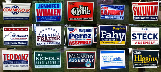
Oh, the polarizing typefaces.
Yesterday we started our political yard sign design primary with a look at signs for Albany County DA, and a few local state Senate races. Today, we move onto a handful of local Assembly races. And there a lot of signs. So let's get to it.
As in part one, we got a trio of accomplished local designers to critique signs. Here are the results...
Quick note: These critiques are solely of the sign designs, not of the candidates.
Designers
Once again, the designers critiquing the yard signs:
+ Doug Bartow is the principle and design director at Troy-based firm id29. And he was the design director at MASS MoCA for eight years.
+ Mark Gregory is an illustrator and designer who's done design work for many businesses in the Capital Region -- including identity design, advertising for print and web, billboards, packaging, and caricatures.
+ Phil Pascuzzo is an award-winning designer and illustrator who's designed everything from book covers to posters to the Twitter bird.
Assembly 108th
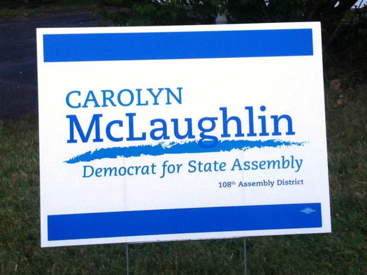
Doug: Typographically, I really like the selection of Caecilia for this yard sign, it's kick ass, legible and not too masculine. The rest of the design elements, however, pale in comparison. If you were to remove the gestural and large blue lines altogether and simply use scale and color with this type treatment, you could improve this design substantially. It's got potential, it just needs a bit of massaging.
Mark: This lady has laugh in her name but the sign is a little sad. Pick a blue, please! One or the other, lets make a decision here.
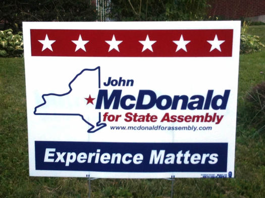
Doug: We have stars, we have stripes, we have red, white and blue, and now we have John McDonald's State Assembly political yard sign. It's a good thing we have a red star over the Capital Region to draw the viewer's eye, because residents of Long Island would certainly have some issues with half of the island missing in this illustration. Looking beyond the visual clichés used here, I must give credit where it's due for proper typographic hierarchy as well as a strong clarifying statement that "Experience Matters." I'm not sure which party this candidate represents, but If I stop in traffic long enough, I might be able to read that tiny URL and visit his www site to find out. Also, props for not filling every available space with art and/or messaging here. A bit of white space can be a beautiful--and most welcome--thing to a reader's eye.
Mark: I'm voting for mister stars over here. Red white and blue I love you baby, yeah! This guy is not running in Nebraska that's for sure, I can tell by the picture! He is a member of the Experience party too, that's good to know.
Phil: The sign for Carolyn McLaughlin only marginally wins over that of John McDonald for 108th Assemble District seat. McDonald's is so tired looking and way too busy. The use of slab serif Caecilia on McLaughlin's sign is effective but that stock illustrator brush stroke underneath brings it down.
Winner: headed for a re-count
Assembly 109th
Editors' note: Yes, we realize not all of those candidates are in the same party. But the design primary doesn't recognize party.
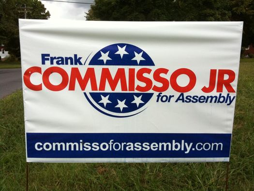
Doug: This yard sign gets points for trying; the hierarchy is good, and the designer has placed a large www address at the bottom to give the viewer a chance to learn more about the candidate. One could argue a well-placed QR code here could really help wi--ERR just kidding. I'm a bit confused by the faux rotating tumbler full of stars at the center of the design. This creates a bit of visual chatter, and detracts from the readability of the primary messaging, which is the candidate's name recognition. Overall, a pretty good use of the expected color palette.
Mark: A unique man. He comes from the plane star as indicated here on his campaign sign. He's all about the USA color scheme though, it's a good scheme.
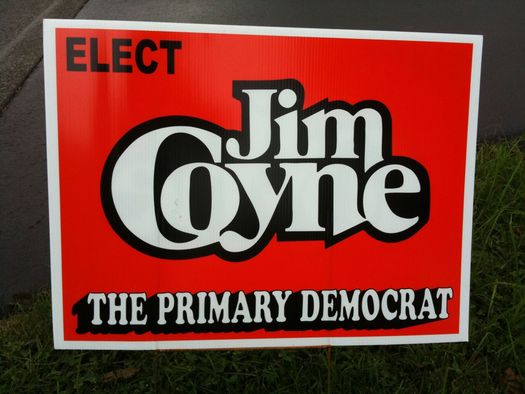
Doug: Cooper Black is a fairly polarizing typeface, many designers love it, while others loathe it. I can think of no other font that would look nearly as good for setting first names on the left breast of, for example, a bowling shirt. Unfortunately for candidate Coyne, this is not a bowling shirt, and Cooper Black's swollen and informal letterforms are doing little to help him gain political credibility with this particular yard sign. Add in an overly-stylized--and difficult to read--treatment of his last name and some anamorphic all-caps scaling at the bottom, and you've created quite a mess. The parts are there (maybe) but the execution is seriously lacking. I have the strange urge to blow off the afternoon and go bowling now...
Mark: Careful, That 'C' is hungry! And nothing says Democrat like an all red sign.
Phil: I just love Jim Coyne's sign for the 109th Assembly Seat. It sort of falls in the category of so bad it's good. It's the Michael McDonald of primary signs. It has this 1970's Herb Lubalin feel that somehow humanizes the candidate more so than the cliche red, white and blue 'merica sign of Perez or Commisso.
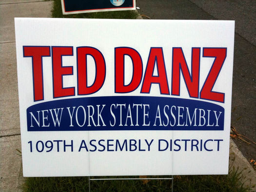
Doug: This assemblage brings me back to the bygone era of creating "Happy Birthday" banners using Broderbund's PrintShop on my trusty Apple II+ in 1983, and printing them to continuous folded paper on my state-of-the-art Okidata dot matrix printer. Typefaces were scaled, stretched and bent to fit any and all shapes, and the massive gaps between the 1s and 0s in monospaced numerals--like 1 09th--were never kerned.
Mark: All caps with some type effects that look a bit like a used auto sales sign.
Phil: Ted Danz is kerned in way too much making it hard to read, and looks like a ketchup label.
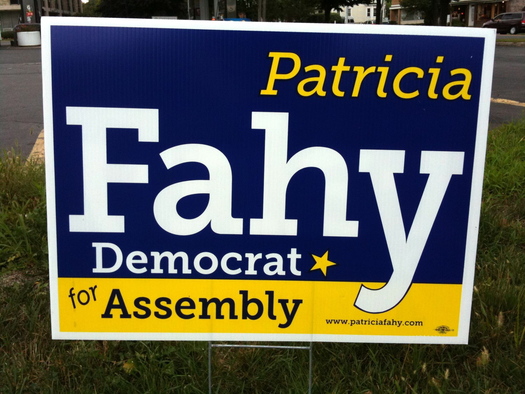
Doug: Typographically this sign is a breath of fresh air in the doldrums of sameness that represent most political yard signs in the 518 this election season. Museo Slab is a contemporary slab-serif face popular in print as well as on the web due to its availability as a web font. By utilizing the true italic version of this typeface for the candidate's first name, the designer has softened the masculine attitude usually projected by strong slab-serifs. I like the different approach to colors used here and the hierarchy seems correct as well. The design could be improved a bit overall by removing the slant on "for" and thickening the blue stroke on the descender in the "y," but pretty solid effort overall.
Mark: The blue and yellow combo works here. It's bright with a strong font, easy to read. The star is slightly rotated indicating movement... nice.
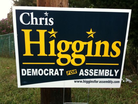
Doug: Primary typeface used: Adobe Garamond--bold. It would be impossible to have a conversation regarding influential typefaces without featuring the life work of French punch-cutter Claude Garamond (ca. 1480-1561.) The classic old-style serif typeface which bears his name is one of the most read--and most legible designs--in history. I fear Uncle Claude might not approve of the formal layout for Chris Higgins' political yard sign, however. Replacing the dot on the lower-case "i" with a stylized star in one location? Maybe. In 3 separate locations in 2 different colors? No, I don't think so. Any props I might hand out here for correct messaging hierarchy are nullified by the extra space typo in the URL. (i.e., 404 Page Not Found.)
Mark: His stars are cracked! This sign is what a lot of the others lack. Big friendly name with a double "g."
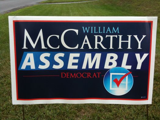
Doug: this is a bastardized version of Trajan (also know as The Movie Font) as the bezier points are inaccurate and the once-beautiful curves found in these glyphs are clunky in this 'revised' version. Adding a bit of anamorphic scaling to this all-caps typeface and ignore the kerning are certainly not going to help the design as a whole either. It's ironic that this Democratic candidate for local assembly would choose the same typeface being utilized on a national scale by Republican Presidential candidate Mitt Romney. I have little doubt that doing a qualitative typographic study on voter recognition would find many viewers aligning William McCarthy (local Democrat) with Mitt Romney simply based on letterforms used. Yes, the details matter -- type nerds rejoice!
Mark: Oh man, I could look at that check all day. It's so bubbly and bright and reflective like a water drop... who was it for again? ASSEMBLY?
Phil: McCarthy's sign looks like the team over at The Daily Show did it.
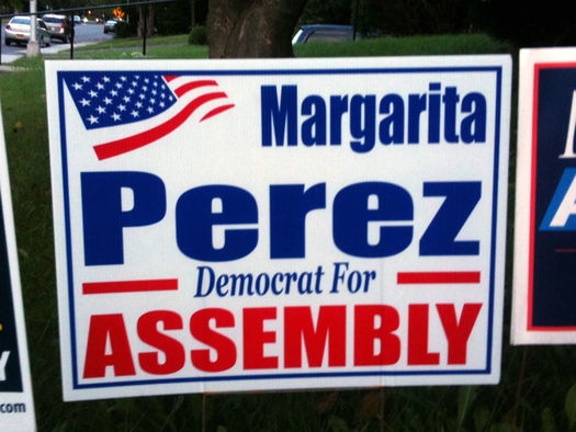
Doug: The Impact meme typeface strikes again, this time with a clip art American flag cropped off the page. Methinks I need a margarita after viewing this yard sign, BARTENDER!
Mark: Wins [for] the most Americana sign. (Nice flag!)
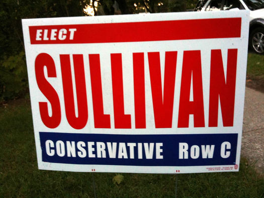
Doug: If this font looks familiar to you, it's due to the fact that Impact is the typeface of choice for the ubiquitous internet memes that seem to fill email inboxes and Facebook timelines everywhere. Stretch the last name to fill all available space, add red, white and blue, and voilà , you've just meme'd your political yard sign. Now, where can I find a picture of a cat sleeping on a keyboard? #Lolz.
Mark: I picture a very tall Irish man with bright red checks. He's wearing a three piece suit and sitting in an old leather arm chair reading the paper. He shakes his head in disgrace, looks up and says, "I can do better." (Row C by the way).
Phil: The Sullivan sign is kind of iconic in that parental advisory sticker way.
Winner: Patricia Fahy and Jim Coyne headed for an instant run-off.
Assembly 110th
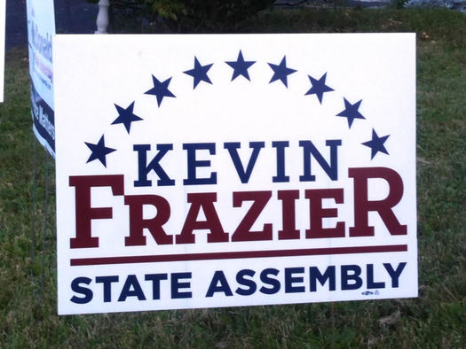
Doug: I was wondering how long it would take to see Obama's primary 2008 typeface--Gotham--utilized in local political signs this year. Gotham-bold is used in Kevin Frazier's yard sign for "STATE ASSEMBLY." I'm fairly certain its sparse usage here is more of a function of Gotham's lack of availability at sign shops--as the typeface itself is not inexpensive. The good news? Clip art stars are free! Lots of stars. It's full of stars. Dancing with the Stars.
Mark: This sign is a little bottom heavy, but it has those stars, and it can be made into a button in a snap!
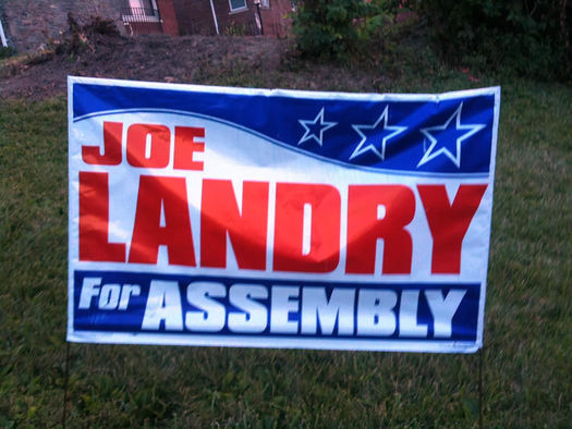
Doug: As tough as I want to be on the questionable type, color and design choices used in many of these signs, sometimes you need to give credit where credit is due for a simple approach that just works. Joe Landry's yard sign isn't pretty, the colors aren't great, and the letterforms have been squashed, but as a political yard sign, this does the job it's designed to do.
Mark: In the land of straight lines Joe has a nice prominent curve. The stars just get bigger and better from left to right. It's all there, nice and big, easy to read, all in God bless America flag colors.
Phil: Most of these primary signs are so hard to read, especially when driving by. Look how Whalen [below] and Landry's signs fill up every bit of white space making is so busy and congested.
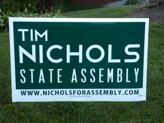
Doug: When snooty graphic designers look down their nose over the bridge of their expensive Warby Parkers and make esoteric statements like, "The world already has too many typefaces..." this sign is what they're referring to. This appears to be a modified version of Verlag--designed by Hoefler & Frere-Jones in NY for the Guggenheim Museum. That customized capital "S" however, has no right to be in that design whatsoever. It's difficult to mix Art Deco-style letterforms with something that you might see in the remake of the movie Tron. Actually, it's not difficult, it's impossible. Props for the color usage, though. We haven't seen anything like that year this year.
Mark: One color, and it's not red or blue! It's a fresh approach with a modern font. The State Assembly text is stretched vertically which is a bit distracting, but I know where to find out more about this green guy, just follow the www.
Phil: The Tim Nichols sign makes an interesting typeface choice but overall looks rather bland and insipid.
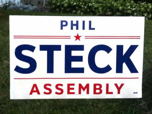
Doug: Hey look, more Gotham! In this case, Gotham is used like it should be; tracked out a bit on a white ground to project all its hard-working goodness. Sure it could use a bit of kerning love, but the message hierarchy is perfect and the the use of just a bit of white space makes this sign a pleasure to read. That sounds nerdy, but it's true. Well played, candidate Steck.
Mark: Look into the star and say this name... you are getting sleepy...
Phil: The winner for the 110th District State Assembly sign, and best in show award, goes to Phil Steck. Hands down this is the most powerful, well designed, and most legible sign overall. It uses the red, white and blue star elements very tastefully and took a page out of Obama's amazing branding by using a clean sans-serif like Bree or Gotham.
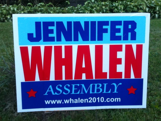
Editors' note: It appears we caught a recycled sign from Whalen's run two years ago. Her sign this year is very similar, except for the url.
Doug: The design of this political yard sign is a disaster on so many levels: woeful typographic choices, awful execution. Once again, scale could be used to affect reading hierarchy, but in this case, all space must be filled; red, white and blue must be used. Resistance is futile, you will be assimilated.
Mark: This light and dark blue combo works. "Whalen" is the first thing you see and then "Jennifer," I like the signs with the full name. I don't know this candidate but her sign tells me that she's strong and up to the challenge for the fancy Assembly job (fancy text). And there is a website that is big enough to read!
Winner: Phil Steck
____
Here's part one of the political yard sign design primary.
Many thanks to Doug Bartow, Mark Gregory, and Phil Pascuzzo for their time and critiques.
Patricia's Fahy campaign advertises on AOA.
Hi there. Comments have been closed for this item. Still have something to say? Contact us.
Comments
These designers are hilarious! I really enjoyed this serious.
... said alissa on Sep 12, 2012 at 2:57 PM | link
Doug nailed those fonts.
... said Tim on Sep 12, 2012 at 4:15 PM | link
I'm assuming Ted Danz is somehow related to the Family Danz heating and air conditioning business, and therefore modeled his sign off their logo. If not, props to him for utilizing the logo of a well-liked local business. That takes balls.
http://familydanz.com/
... said Jessica R on Sep 12, 2012 at 4:16 PM | link
@Jessica: You're correct about Ted Danz having a connection to Family Danz. He owned the company until recently. He said at the candidate forum at Albany Law that he's sold to business to his sons.
... said Greg on Sep 12, 2012 at 5:18 PM | link
I was particularly interested in how many of these I got wrong in terms of my own assessment (as a consumer of the signage, not a graphic designer). I drove around my Albany neighborhood last night and my main objective was to determine which signs I could more or less read at 30 mph with my aging eyesight. McDonald's and McLaughlin's were almost impossible for me to take in unless I was right next to them at a stop light. At least Fahy's name is gigantic. So Fahy gets the AARP vote simply because we can read her name.
... said chrisck on Sep 12, 2012 at 5:21 PM | link
Just when you think there's absolutely NOTHING to be said about political yard signs, except that they litter the roadside, these guys take the time to critique them.
Well done.
Now, back to work!
... said Carolyn on Sep 12, 2012 at 5:48 PM | link
this was hilarious and enjoyable...the font nerdery, the kerning, serif/sans serif...all of this took me back to the first job I had in Albany at an ad agency. This all makes me wonder if David Carson is still around...
... said rebecca on Sep 12, 2012 at 7:43 PM | link
Love the Steck sign, but that's definitely not Gotham. Looks a little more humanist, especially the C.
... said Brian on Sep 12, 2012 at 7:53 PM | link
Coyne's design *is* the same logo he used in the 1970's, I know this because my mom worked at that firm, and knows the guy who designed it.
... said Justin on Sep 12, 2012 at 7:56 PM | link
Steck's sign is so much better it makes even the best of the other candidates look like crap. It is interesting that no political party is mentioned on Steck's sign, but like Doug pointed out, Gotham is so easily identified as the 'Obama font', it can be (correctly) assumed that he's a Democrat.
If Higgins had dropped the star-dot over the eye in his first name (but kept them in the larger, yellow last name)... and removed the space in his URL, he'd be my second place pick.
... said Paul on Sep 12, 2012 at 10:32 PM | link
I love the 70s-ness of the Jim Coyne sign. I'm pretty sure the font used for the name is Grouch.
... said Eric on Sep 13, 2012 at 1:11 PM | link
This is such a great idea for a story! It was hilarious to read!
... said Wendy on Sep 13, 2012 at 8:39 PM | link
Where is "no fracking" guy?
I don't remember his (or anyone else's) name from those signs but I would totally vote for him!
... said Lu on Sep 14, 2012 at 1:54 AM | link