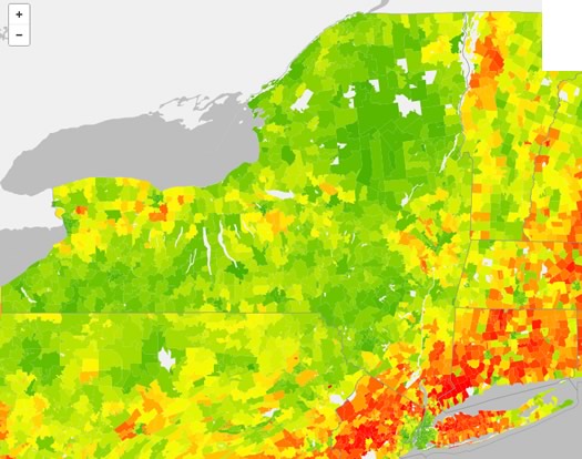
Carbon footprints, by ZIP

The greener the ZIP, the lighter the carbon footprint.
Check it out: The map above depicts the estimated average annual household carbon footprint in New York State, by ZIP code. It's from the UC Berkeley CoolClimate Network, and is based on data from the network's "CoolClimate Carbon Footprint Calculator."
If you head over that first link, you can use a clickable version of the map, along with two other maps for household energy carbon footprint and transportation carbon footprint.
Poking around the Capital Region, it's kind of what you might expect: the more urban areas of the Capital Region tend to score lower carbon footprints than the suburban areas. One of the main reasons? Transportation.
Here's an example, from the calculator (second link above): The ZIP codes 12203 (mostly the city of Albany) and 12065 (Clifton Park) are tagged as having roughly similar estimated household carbon footprints for home, food, goods, and services. But there's a relatively large gap for transportation -- specifically car fuel. As a result, 12203 is pegged at 41 tons of C02 per year and 12065 at 49.5.
Here's an FAQ about the methodology.
New York State
The thing that really jumped out to us in all this wasn't the Capital Region, but New York State itself. The Empire State stands out on all three national maps, especially the household energy carbon footprint.
One reason: New York State uses very little coal to generate electricity. That's important because electricity from coal has a big carbon footprint. The state's three biggest sources of electricity (in descending order): natural gas, nuclear, hydroelectric.
Also helping: New York State had the second lowest energy consumption per person (as of 2010), according to the US Energy Information Administration (that link just above). The EIA notes New York's ranking was "due in part to its widely used mass transportation systems" (mostly in the NYC area, of course).
[via @AndyArthur]
map source: UC Berkeley CoolClimate Network Average Annual Household Carbon Footprint (2013)
Earlier on AOA: Charting the Capital Region's workday population tide
Say Something!
We'd really like you to take part in the conversation here at All Over Albany. But we do have a few rules here. Don't worry, they're easy. The first: be kind. The second: treat everyone else with the same respect you'd like to see in return. Cool? Great, post away. Comments are moderated so it might take a little while for your comment to show up. Thanks for being patient.
Comments
Check out those red bands around the larger metropolitan areas.
... said Jason on Jan 8, 2014 at 1:02 PM | link
This map would have looked differently when Buffalo, Rochester, Syracuse and Troy-Schenectady were bustling prosperous industrial centers...now the state's industries have been destroyed! At least I have clean air and water when I ride my bike to get my snap benefits card! Ever see North Korea at nite from a satellite.....completely black....and it's not because a bunch of environmentally conscious people live there!
... said Brian on Jan 8, 2014 at 3:50 PM | link