Campaign Yard Sign Design Election 2014, Part I
Election Day is next Tuesday, and that means campaign yard sign season is at its peak. Front lawns, street medians, parking lots, and many other spots are now filled with the signs -- they're everywhere.
So we thought it'd be fun to get together a few designers again to critique this year's crop of campaign yard signs as design objects. (Alternately, you might view this as test of how much questionable typography it takes to make a designer's spleen start throbbing -- and we now have an answer.)
Because it's a campaign yard sign bumper crop, we've split the signs into two batches. First up: governor, state Senate, and Schenectady Family Court.
The designers
The two designers critiquing this year's signs:
Caroline Corrigan is an Albany based creative specializing in print design and branding for small businesses and makers. She also is the co-owner of Fort Orange General Store, an independent lifestyle and home goods shop on Delaware Avenue in Albany.
Doug Bartow is the principal and design director at Troy-based firm id29. Before co-founding id29, he was the design director at MASS MoCA for eight years.
We asked Caroline and Doug to critique the signs -- not the candidates -- and pick their design winner in each race.
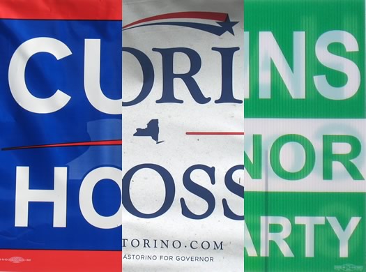
Governor
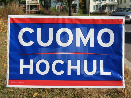
Caroline: This sign immediately hits you. There's no need to explain through subtext, stars or stripes who this guy is at this point, right? He's like the Cher of New York State politics. Been around a while, mixed reviews at this point in terms of favorability, but he's clearly not going anywhere. The sans serif typeface is bold, modern and well done. The text is super readable from a distance. The state silhouette in the background is pretty faint and oversimplified though, and therefore probably not necessary. But my guess is Cuomo isn't too worried about name recognition, or the outcome of this race, and his sign definitely evokes that sentiment. I think this one is the winner.
Doug: Being the incumbent means you can get away using minimal messaging. In this case it's just the last name of the current Governor and his new running mate set in a slight variation of the typeface Interstate-bold, a font used on our ubiquitous green highway signage. Fittingly, this yard sign is about as exciting as an toll booth, with the requisite red, white and blue color palette and and poorly drawn outline of New York State in the background (featuring an enormously large Long Island.)
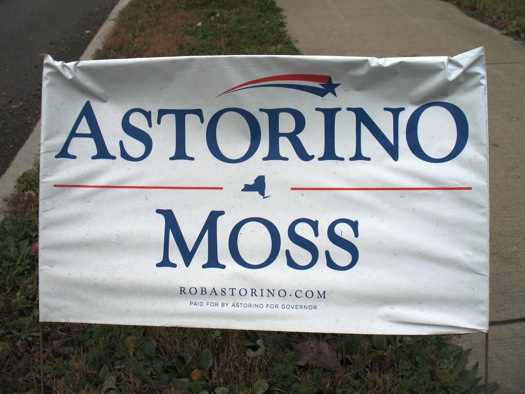
Caroline: The white background and classic serif typeface in this sign has a tasteful, professional feel. The large amount of white space around "Moss" is a little awkward, though, and draws more attention to his name than the gubernatorial candidate, Astorino. The New York State silhouette seems a little small, but the red lines flanking the state help. The shooting star over Astorino's name just reminds me of "The More You Know" commercials from the early 90s. Not bad overall, but there are just a few awkward things that stand out and aren't entirely necessary.
Doug: What's this? A perfectly legible campaign yard sign set in the typeface Goudy Catalog SB, drawn in 1919 by type design legends -- and two of my personal typographic idols -- Frederic Goudy and Morris Fuller Benton? An accurately drawn silo of New York State and a decent use of white space? This voter approves.
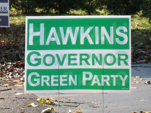
Caroline: It must be hard having to be the green party. You kind of have no other option but to stick to that color, right? Points for keeping it simple and straightforward, but the small caps don't really work, and the design leaves something to be desired. It almost feels as if the Green Party is admitting their own defeat before the results are even in. Where's your team spirit, guys?
Doug: Anamorphically scaled Arial-bold faux small caps is no way to go through life; it hurts my eyes just to look at this sign. I'll give Howie credit for stating his party affiliation clearly, however. Not mentioning political party seems to be a growing trend in 2014 political yard signs -- perhaps because the American voting public equally distrusts both parties at this point.
Design winner:
Caroline: Cuomo
Doug: Astorino/Moss in a landslide
State Senate 43rd
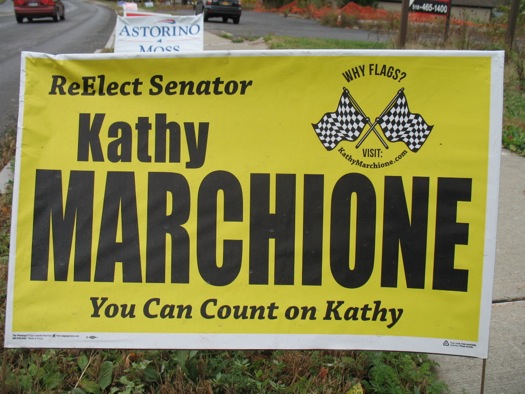
Caroline: Kathy Marchione asks us, "Why Flags"? Few have the attention span to look this up on a smartphone while sitting at a red light. Also, the typeface Impact has been unfortunately adopted by most internet memes (see example), and therefore makes the signage look a bit meme-like. The colors are a too jarring, also.
Doug: Black on yellow is certainly an outlier among the other signs in this review. This is another ugly sign with a grammatical error in "ReElect," but why flags? I was intrigued by this call-to-action, so I visited the website that's nearly impossible to read on the front of the sign. Kathy Marchione's late father was a stock car racer, and she uses racing flags as a mark to honor his memory. Now that's a feel good story in this virtual sea of disappointing political yard sign designs.
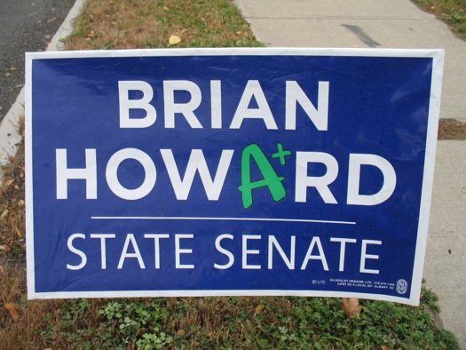
Caroline: Brian Howard is giving himself an A+. Perhaps he's putting the cart before the horse, but I think the typeface used in his name looks good. I think something a little more unique from the sans serif could have been used for "State Senate" but this one comes out ahead for this race.
Doug: This yard sign has decent potential; set the candidate's name in all-caps Gotham-bold, center it, and knock it out of a blue field. Then, the wheels fall right off the wagon. Brian Howard has a 42-year teaching career on his résumé, but the child-like "A+" in this design is too gestural, and does not help with political credibility.
Design winner:
Caroline: These two are in the running not only for State Senate, but also the race for the most clever symbolism! Howard's sign comes out ahead.
Doug: Marchione takes the checkered flag
State Senate 46th
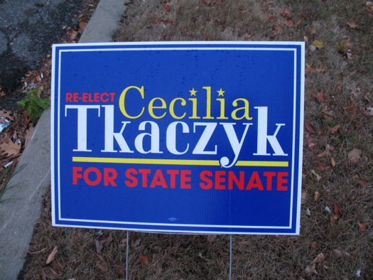
Caroline: The red type on royal blue in Tkaczyk's sign is too hard to read and makes the colors vibrate. This designer was more creative in the terms of the use of space, getting all of the pieces to fit just right. There's a little too much variety being used, though. The typeface for her last name is kind of wonky compared to the others used, especially in the "k" letter forms. I actually like this, but I think it just needs some tweaking.
Doug: With the last name Tkaczyk, you would think the responsibility of the designer is to bring simplicity to the layout. Instead, we get multiple typefaces that don't play well together, difficult-to-read red text on blue, and stars substituted for the dots in two lowercase letterforms.
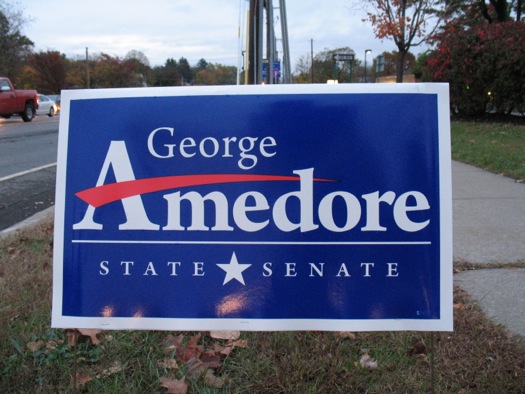
Caroline: Good use of space and scale. It's all readable. Amusing to see the return of "The More You Know" star, but it's well done. The space between "state" and "senate" is a little too big, though.
Doug: This design starts out well, with type designer Robert Slimbach's beautiful Arno-bold as at the primary typeface. Strong letterforms and icons in white on a navy field lend legibility and elegance to the composition. Before anyone gets too excited, though, there is that gestural red swash replacing the cross bar in the "A." Why? Why, I ask. Is he secretly trying to sell us Amway?
Design winner:
Caroline: This is kind of a close call, but I think George Amedore takes this one.
Doug: Amway
State Senate 49th
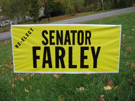
Caroline: This designer is a purist, and maybe doesn't have a computer. So, I find this take pretty refreshing. It has a vintage quality and is super utilitarian. No frills, here, just the facts.
Doug: You might call me crazy on this one, but I like this sign. Let me re-phrase: I love this sign. No superfluous clip art nor letterform stretching. No useless graphics nor minuscule www address. Strong color. Decent scale. Good white space. Great use of what appears to be a slightly modified version of Benton's typeface Alternate Gothic 2. Looks hardworking and honest to the eye. A bit of a vintage feel is tamed by the color choices. Solid.
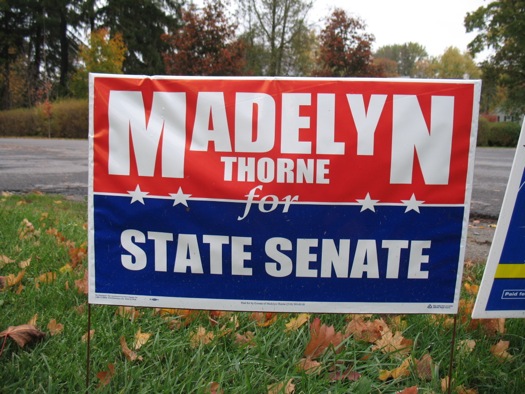
Caroline: Thorne's sign is trying too hard to be clever, and not trying hard enough to convey information clearly. The giant M and N aren't styled very well here; the "for" essentially has a strike-through line dividing the word; and the kerning throughout isn't great.
Doug: Take a quick glimpse at this sign; do you see barbed wire? Do you think the word "Thorne" adds to that effect? Do you think people who drive by this sign and only have enough time to read "Madelyn" will remember the much smaller last name of "Thorne" on Election Day? Do you think the white line in the middle of the word "for" looks like strike-through characters? Have you ever spent time in a Turkish prison?
Design winners:
Caroline: I'm going to give it to Farley.
Doug: Far and away Farley.
Schenectady County Family Court
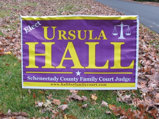
Caroline: The awkward tilt of the word "Elect" in Hall's purple sign brings down the rest of this design, which is already too cramped. Website listings aren't necessary, everyone can Google you now! Also, I'm going to date myself here as a child of the 90s, but I feel like using purple for a person named Ursula will likely remind your under-30 constituents of the antagonist from The Little Mermaid. Anyone? Just me?
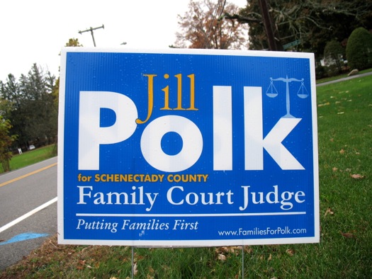
Caroline: I think Jill Polk gets points for using some good typefaces and using scale marginally better than the others, but they overdid it. Using Futura in title casing for "Polk" creates a challenging composition, especially at that size. Perhaps shrinking the name a bit and using all caps would have worked better. The "Schenectady" line is too close to her name. Why is little scale graphic aligned left? A good start, but not quite nailing it.
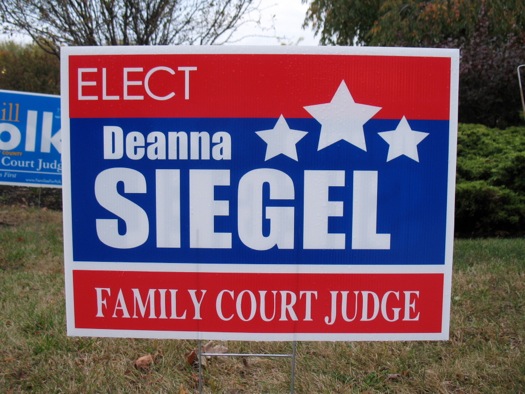
Caroline: Siegel's sign needs one or two less fonts. And the stars are little too cute looking. Not awful, but not really tugging on my civic duty heartstrings.
Doug: Sometimes when I view really bad typography and design, the non-essential organs in my body start to hurt. All three of these Schenectady County Family Court Judge signs are design disasters. Awful typography, flimsy clipart... my spleen is now throbbing. I cannot continue.
Design winners:
Caroline: It's important to remember that these designers are all at the mercy of their campaign managers and candidates. There's a lot of information and ideas to pack into one small sign. I feel for them. That said, I'm not sure I can pinpoint a winner here.
Doug: DQ
Next up
Part II of the campaign yard sign election will be posted on Monday with races for US Congress, state Assembly, and Rensselaer County DA.
Many thanks to the Caroline Corrigan and Doug Bartow!
Hi there. Comments have been closed for this item. Still have something to say? Contact us.
Comments
I love campaign sign reviewing season. Senator Farley is definitely my favorite. It's true vintage, whether they were going for that or not. Reminds me of the "Dewey Defeats Truman" headline.
... said Ryan on Oct 30, 2014 at 11:12 AM | link
From a copy perspective, is elect, or re-elect really necessary? Yes, we know you're asking for our vote, you don't need to explain.
Cheers to the Cuomo campaign for being bold and simple.
... said Rob on Oct 30, 2014 at 12:29 PM | link
I'm a big fan of these sign-reviews!
I have to disagree with Ryan, though. While Senator Farley's sign is rich with some kind of vintage, nostalgic essence (which I DO like), that's not the message I'd want to send to voters.
It's weird seeing Cuomo's running mate's name on the sign. I don't want to say "who cares", but it kinda feels like being introduced to Peyton Manning.. and on here's his brother Cooper Manning, also!
George Amedore's sign is my favorite. Very well executed!
... said Sean on Oct 30, 2014 at 2:03 PM | link
A couple of points I'm disappointed weren't addressed:
(Maybe the "O" isn't actually larger, but it sure looks that way from the photo shown here.)
Still, this review has made my day.
... said James Cronen on Oct 30, 2014 at 3:33 PM | link
@James:
Disappointed? Well we certainly can't have that. Allow me to address the points you brought up.
Initial and final capitals in a word (or wordmark) are often an attempt by the designer to create visual symmetry. I'm not sure a final capital "S" is necessarily required in "Moss" to accomplish this. Furthermore, I would wager that "MosS" would look awkward in that context due to the small number of letters in that last name. i.e.: it looks awkward as typed above, so it would probably look as such on the sign itself.
Yes, the kerning on "FARLEY" could use a bit of massaging by a trained typographic eye, but the imperfection there is part of the allure. The vernacular "hard working" look and feel that those letterforms project is augmented by that imperfection, not visually hindered by it. Old school, hand-painted signs are revered by designers and Muggles alike for this very type of authentic imperfection. I would much rather revel in the nostalgia that this sign produces than pick apart its minute typographic deficiencies. Amirite?
... said Doug Bartow on Oct 30, 2014 at 6:27 PM | link
Hi - I loved this column last year and looked at it closely when working on my lawn sign for this year. I hope you are going to include Albany School Board in the second batch, love to hear your thoughts on my sign! - Anne
... said Anne Savage on Oct 31, 2014 at 12:35 PM | link
Thanks, loved that feature last year, love it this year.
What is also fascinating (and a bit frightening) to me is that both contributors use very articulated arguments that I feel compelled to agree with... only to end up in complete disagreement a fair amount of times. I'm "yup, yup, that makes sense, ... wait, the winner is who??". Not unlike the "Worst Dress / Best Dress" articles that follow award ceremonies (psshh, of course I don't read that, who? me?). It has the nice smell of a science, but you can't but wonder if it's only just a matter of taste. Love it nonetheless.
... said -S on Oct 31, 2014 at 1:20 PM | link
Hilarious. and also, I think I might love Doug.
... said Rebecca on Nov 1, 2014 at 4:21 PM | link