Jump to the intro.
Household median income
The estimated household median income is the point at which half the households in a tract are estimated to have a higher annual income and half are estimated to a have a lower annual income.
Of the 10 tracts with the highest estimated median household incomes, five are in Saratoga County. The highest is the tract that includes the south and east sides of the city of Saratoga Springs.
People in poverty
This is an estimate of the number of people were considered to be in poverty at some point during the 12 months leading up to the survey. (It's also worth noting that percent of people in poverty is calculated based on the number of people for whom the Census Bureau can determine poverty status. That number is sometimes smaller than the estimated total population.)
Child poverty
While there's a lot of overlap between areas with high estimated rates of poverty and the estimated rates of children in poverty, some of the rates of child poverty in neighborhoods around the Capital Region are striking and sobering.
Age
This map is straightforward: It's tracts coded by the estimated median age of the people who live in each tract. The median is the point at which half the people are estimated to be older, and half are estimated to be younger.
The tract with the highest estimated median age is the one that covers the western "panhandle" of the city of Albany. That's not really surprising -- that tract includes a number of retirement homes. On the flip side, the tracts with the youngest estimated median ages tend to the be the ones with colleges.
Housing
Monthly owner costs
This is a map of estimates for what the Census Bureau calls "selected monthly owner costs" for housing with a mortgage. It's an attempt gather stuff like mortgages, property taxes, and utility fees into one cost number.
Gross rent
This next map is like monthly owner cost map, but for rent and utilities.
One small, quick thing that caught us about this map: The city of Albany neighborhood with the highest estimated gross rent is the Helderberg neighborhood on the south side of New Scotland Ave.
Owner occupied housing
This is a map of the percent of housing units in each tract estimated to be owner occupied.
The tract with the highest estimated owner-occupancy rate is one in the city of Albany right by SUNY Poly and UAlbany. Here's the thing, though: That tract is estimated to have 7 housing units (yep, total). And it looks like those units are on Loughlin Street -- which is the street right next to SUNY Poly that was bought up by a developer and is no longer occupied.
Which Capital Region neighborhoods are the most expensive in which to rent? Which tend to have households with the highest incomes? Which neighborhoods have populations that skew younger or older?
Those are some of the questions for which we can get an answer from new numbers released by the Census Bureau recently. This new data -- the American Community Survey 2010-2014 -- includes estimates for 210 census tracts in the Capital Region core counties. So we can focus not just on a city or town, but sections as small as neighborhoods.
There are a lot of things you can do with these numbers, and we're hoping to dig into them, but we figured we'd start out with putting together a handful of Capital Region maps that look a range of general topics, from income to age to whether people own or rent.
An important note
The numbers from the American Community Survey are estimates not actual counts, so there's going to be some smudginess. And even though the five-year estimates include tract-level estimates, some of the figures include relatively large margins of error. So we've included those margins along with each number. And it's important to keep these margins in mind, especially when comparing two or more tracts.
The bottom line here is that, like a lot of stuff of this type, these numbers are more like a place to start than a place to end. They can help us get a sense of the state of things and provide some insight into what sorts of questions to ask.
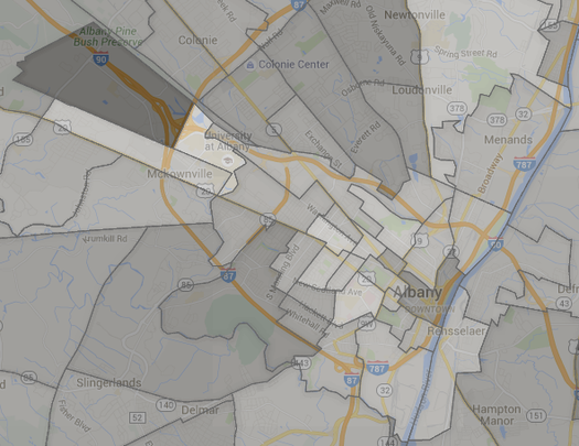
Maps
They're above in large format -- click or scroll all the way up.
The Scoop
For a decade All Over Albany was a place for interested and interesting people in New York's Capital Region. It was kind of like having a smart, savvy friend who could help you find out what's up. AOA stopped publishing at the end of 2018.
Recently on All Over Albany
When we started AOA a decade ago we had no idea what was going to happen. And it turned out better than we could have... (more)
This all feels like the last day of camp or something. And we're going to miss you all so much. But we'd like to stay... (more)
Working on AOA over the past decade has been a life-changing experience for me and it's shaped the way I think about so many things.... (more)
If winter ever gets its act together and drops more snow on us, there will be sidewalks to shovel. And shortly after that, Albany will... (more)
Last week we were fortunate enough to spend a few minutes with Jack McEneny -- former state Assemblyman, unofficial Albany historian, and genuinely nice guy.... (more)
... said KGB about Drawing: What's something that brought you joy this year?