FYI
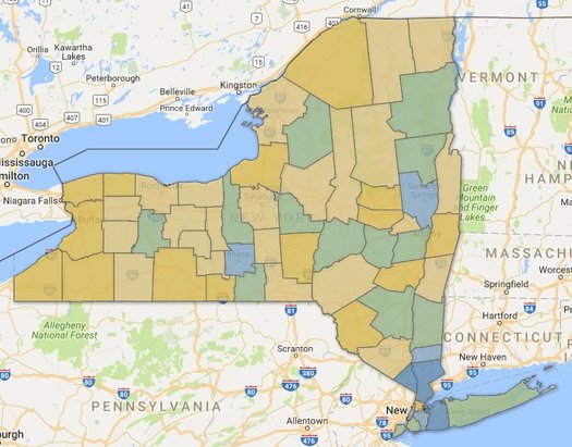
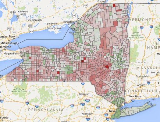
Albany tightened its rules for shoveling snowy sidewalks last winter -- so how'd that work out?
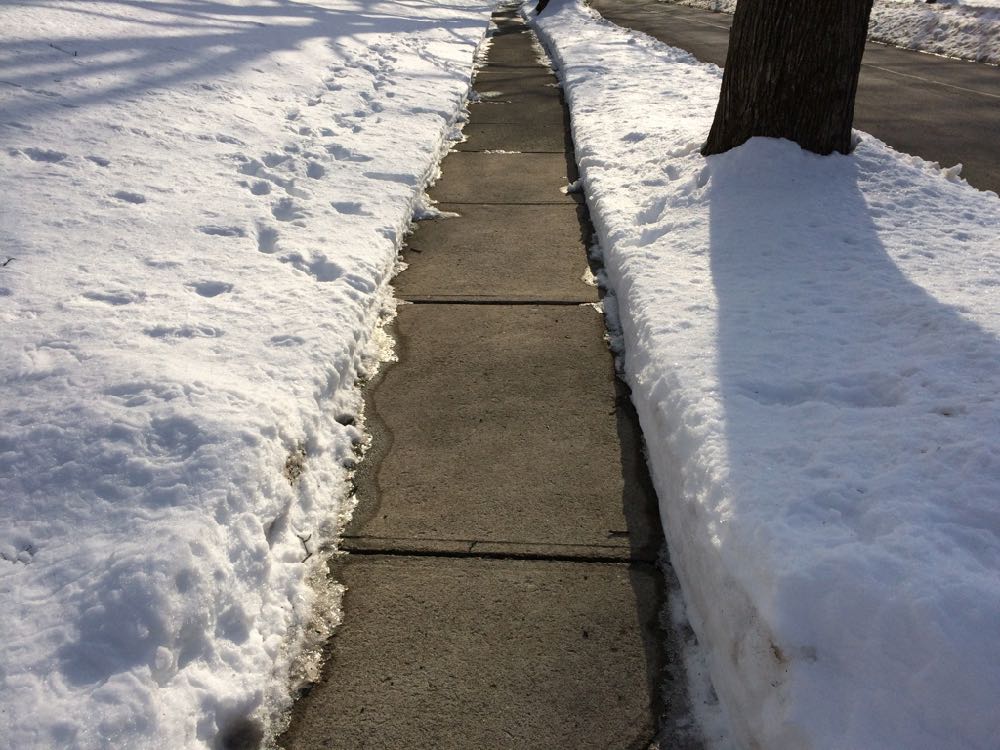
It should look like this.
If winter ever gets its act together and drops more snow on us, there will be sidewalks to shovel.
And shortly after that, Albany will no doubt engage in another round of its annual discussion about the fact that some sidewalks don't get shoveled.
It's an important quality of life issue for everyone in the walkable city, and it's even more important for people who have some sort of disability that makes it hard to get around. (Also: Shoveling is the neighborly thing to do.)
At the start of last winter the city of Albany tightened its rules so that the Department of General Services can now issue violations for unshoveled sidewalks directly after the 24-hour grace period following a snowfall. Ahead of that change we looked at violations the city had issued in previous winters to get a sense of where violations were being handed out, and to what sorts of properties.
Now we've had a whole winter with the new, stricter rules. So, was there a blizzard of violations issued?
Let's have a look.
(Yes, there are graphs and clickable maps, because of course there are.)
Albany winters have been getting warmer
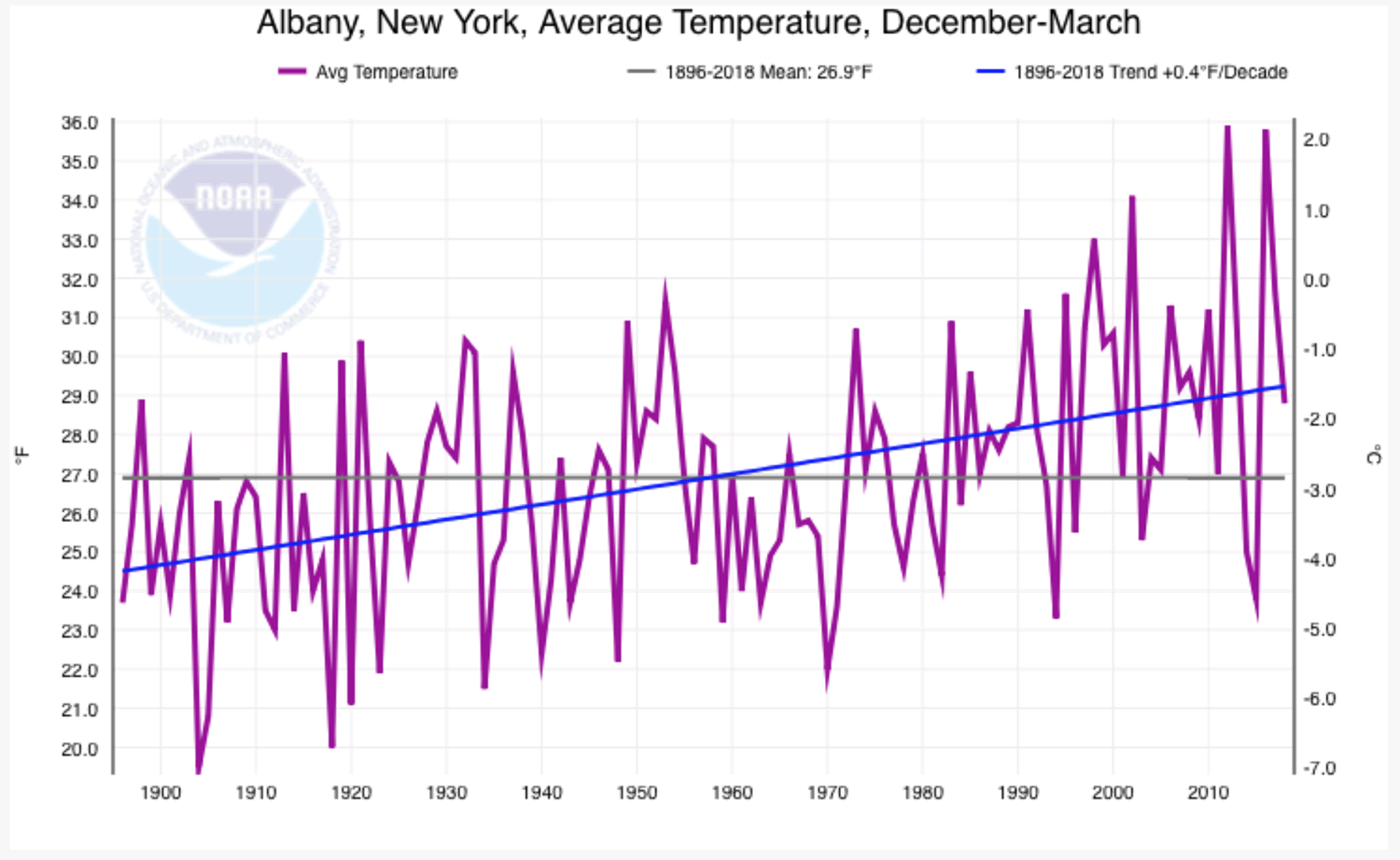
Here's a larger version.
A lot of people seemed to enjoy last week's post about when it's "actually" winter here -- that is, the part of the year here that tends to have the coldest temperatures rather than the standard definitions of the season. We looked at it two ways, and the best way (in our opinion) pegged winter in the Albany area as being from December 1 to March 20.
So here's the B side to that track: On average, winters in the Albany area have been getting warmer over the last century (plus). And not by a little -- the average December-March temperature here has been trending up by .4 degrees Fahrenheit per decade.*
That graph above was generated by an interactive tool on the website for NOAA, the federal agency. It shows the trend for average December-March temperatures in Albany between 1896 and 2018.
Here are a few more bits.
Here's when the seasons really start and end in the Albany area*
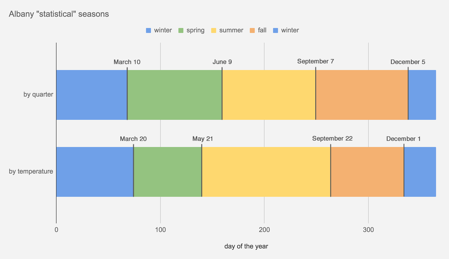
* On average. And by these definitions, which are just one or two ways of looking at this topic. Really, it's winter whenever you decide to switch to the big coat and put the shovel in the car. | Also: Here's a larger, easier-to-read version of this graph.
Winter starts December 21 -- by the astronomical definition. And it starts December 1 by -- the meteorological definition.
But when does it really start in Albany?
Inspired by a chart and discussion on Twitter today attempting to mark the start of seasons in various places around the country based on normal temperatures, we figured it'd be interesting to look at the daily temperatures in Albany in order to define what you might call the "statistical" seasons. That is, when the seasons start based on what the temperatures actually are and not what the calendar says.
Of course, you can interpret numbers all sorts of ways. And in this case we ended up doing it two ways:
+ Breaking the year up into (roughly) four quarters according to normal temperatures. Winter's the coldest 25 percent of the days each year, summer's the warmest 25 percent, and spring and fall are what's in between. Looking at it this way, winter starts December 5 and lasts until March 10.
+ Looking at the distribution of temperatures here throughout the year and defining winter and summer as the days when temperatures are either in the bottom or top 25 percent of the distribution. Spring and fall are everything in between. Looking at it this way, winter starts December 1 and lasts until March 20.
And: See resulting chartage above. Don't worry, we've included a larger version here, along with a bonus graph.
Here's a bit more explanation and weather nerding...
Where the Capital Region's younger adults live
Maybe you saw that new list this week that ranked a ZIP code in Guilderland as the "best" neighborhood in Upstate New York for young adults.
The ranking was the result of some crunching by Buffalo Business First of Census numbers related to population, education, employment, businesses, housing, and income. That link includes an explanation of the methodology.
That a ZIP code in Guilderland would take the top spot in this sort of ranking raised some eyebrows. And we'd argue the list's methodology is basically a way of filtering for upper income people in their 20s and 30s.
Also: "Best" for whom? People in their 20s and 30s are a huge, diverse population group. Using a word like best is probably an overreach.
Anyway, the list got us curious about neighborhoods in the Capital Region that do have a lot of people 40 and under. So we rolled together some of our own clickable maps...
The Capital Region's home ownership rate ticked upward last year for the first time in a while
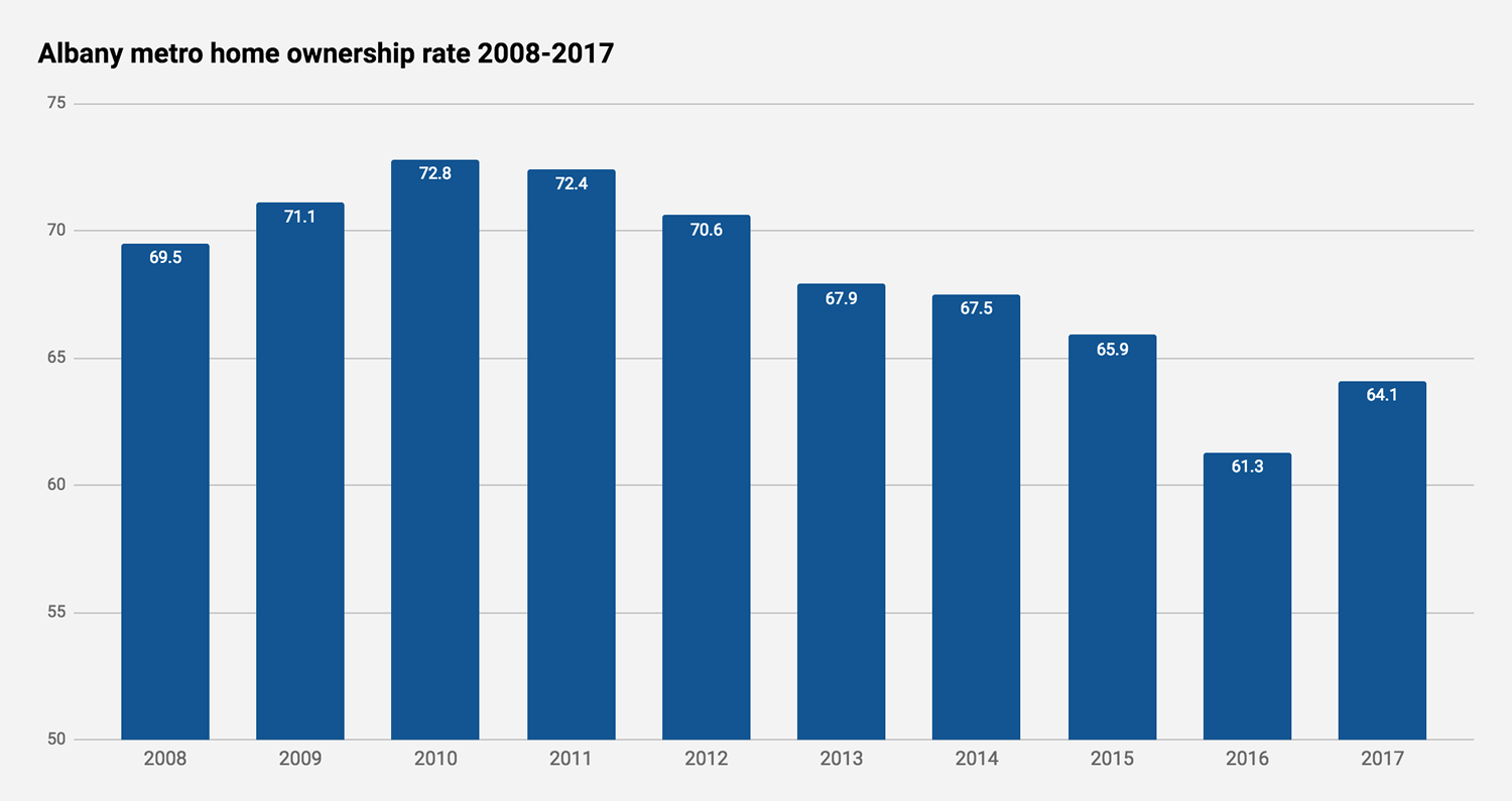
The Capital Region's home ownership's most recent peak was in 2010. It ticked up for the first time since then in 2017. Do note that the scale for the rate starts at 50. There's a chart with a from-0 scale inside. / data via US Census Bureau
Another few bits for the apartments / rents discussion...
The home ownership rate in the Albany-Schenectady-Troy metro area ticked upward for the first time since 2010 last year.
The Albany metro's rate was 64.1 percent, according to the Census Bureau. That was up from 61.3 the year before.
That's interesting, in part, because there's evidence that the upswing in rents in the Capital Region also flattened out last year. Maybe it's a matter of demographics as the population peak of Millenials grows older. Maybe rents have just risen to a point where it makes more financial sense to buy a house. (As with any complicated topic, it's probably some of those things and a bunch of other stuff, too.)
Anyway, you know that we have an additional chartage, because of course...
Apartments, apartments, and more apartments
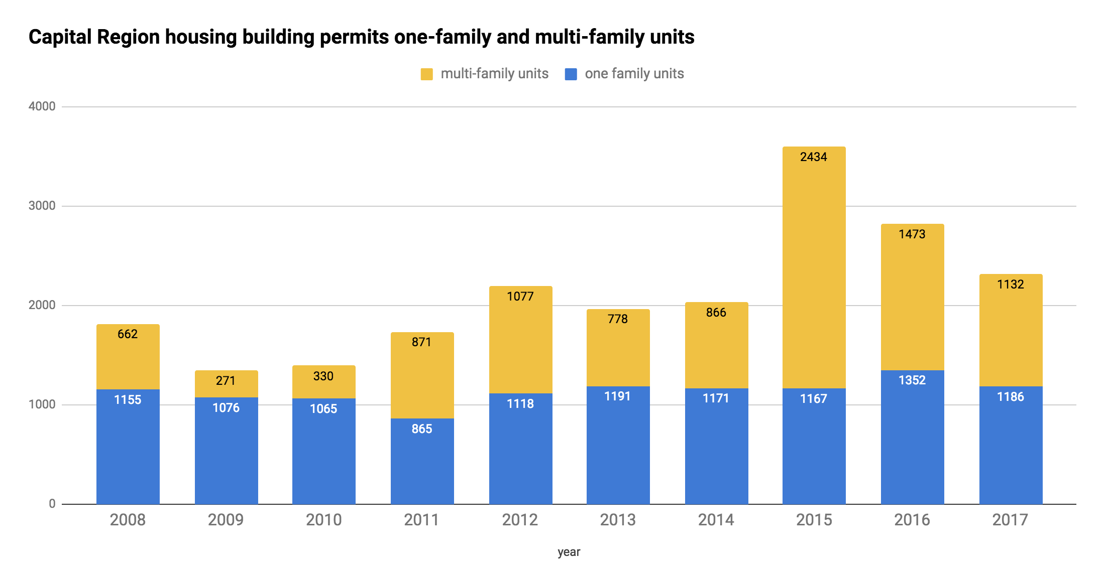
Capital Region building permits for residential units over the last decade -- for single family homes and units in multi-family buildings.
Sometimes during episodes of Exciting Tales of the Albany Planning Board and related whatnot, we refer to the apartment building boomlet that's been going in Albany and around the Capital Region.
Right, so about the specifics of that boomlet... The Census Bureau collects data on the number of building permits for housing units issued each year in each municipality. And those numbers help draw the outline of this trend.
For example: The chart above shows the number of overall units covered by building permits issued for the four core Capital Region counties over the last decade -- along with how many of those units were in multi-family buildings (yellow). And as you can see, there's been an upswing in multi-family units in that time, especially the last few years.
More context? More details? OK, let's have a look...
Capital Region rent, relatively speaking
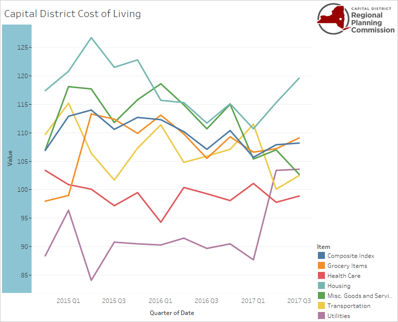
This graph is from the Capital District Regional Planning Commission and the Council for Community and Economic Research. It tracks a Capital Region cost of living measure relative to the national average quarter by quarter. That teal line running along the top is the cost of housing.
Speaking of residential develop and rents and related whatnot...
+ The median gross rent for Albany-Schenectady-Troy metro area was $931 (+/-21) in 2016, according the Census Bureau*. In the city of Albany it was $895 (+/-29). That is, half the rents (plus utilities if not included) were above that mark and half were below.
+ In 2007, the median gross rent for the Albany metro was $779 (+/-18) and for the city of Albany $746 (+/-37). The 2016 rent levels mentioned above are an increase of almost 20 percent in both cases. That increase outpaced general inflation for the United States -- if both had risen at the pace of general inflation, they would have been at $900 and $862.**
A breakdown of the voting in the Albany Democratic mayoral primary, up close
The Albany mayoral primary, one more time: Here's an up-close geographic breakdown of the voting in the Albany Democratic primary, which was won by Kathy Sheehan. As you know, it is the de facto election for the office because of the large Democratic enrollment in the city.
Above is a clip from a map of individual election districts and unofficial vote counts (that now include absentee ballots).
Are there clickable maps? You know there are clickable maps.
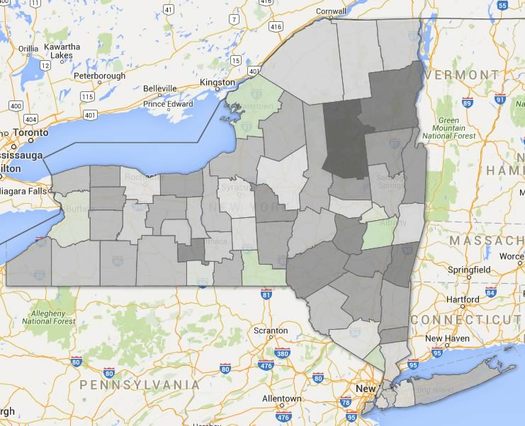
Life expectancy in New York State by county
New York counties by estimated life expectancy. Green is roughly the state average -- yellow below, blue above. (There are two clickable maps after the jump.)
Life expectancy at birth was a little more than 80.36 years in New York State in 2014, according to a new study out this week.
That was good for 6th best in the nation. And it's up 73.19 years in 1980.
Those estimates are from a study published in JAMA Internal Medicine this week looking at how life expectancy varies across counties in United States. And as the researchers reported, there was wide variation -- some 20 years of difference between the high and low ends.
Here's a good interactive map of the numbers. And here are a few articles in the popular press about the overall study -- at FiveThirtyEight and The Atlantic.
New York counties didn't exhibit such a wide range, but there were some differences.
Another look at New York State's population change, this time along the urban/rural split
There's a clickable map inside, because of course there is.
Here's a bonus track from last week's post about the slow population growth of the Albany metro area -- and the melting populations of many upstate counties.
That map above depicts counties by population density. The deeper the blue, the more people per square mile of land. It's pretty much you'd expect. But we had the numbers leftover so we figured we'd roll the map together.
As we mentioned last week, there's been an urban/rural split in the state over the last handful of years for population growth -- basically, counties with higher population densities have added people, while counties with lower population densities have lost. (With a few notable exceptions)
So we grouped the state's population by county density and it makes this divide very clear -- let's have a look, along with a clickable map...
The Capital Region is growing very slowly -- which is better than many other parts of the state
The deeper the green, the higher population gains by percentage. The deeper the gray, the higher the losses. (Here's a large, clickable version of the map.)
The population of the Albany metro area was up slightly in 2016 compared to the year before, according to new Census Bureau estimates out this week. The Census figures the Capital Region had 881,839 -- up about 1,000 from the year before.
But compared to other large metros, this area's population has been falling behind. In 2010, the Albany-Schenectady-Troy metro was the 60th most populous among the nation's 382 metros. In 2015 it was 61st. And in 2016 it was 63rd.
Between 2010 and 2016, the Albany-Schenectady-Troy metro area's population is up 1.28 percent, according those estimates. During that same span, New York State population is up almost 1.8 percent and the national population is up 4.65 percent.
Here are a few more bits from the new estimates for metros and counties -- declining populations, immigrants, and Donald Trump.
Capital Region high school graduation rates 2016

The state Department of Education recently released its annual collection of data about high school graduation rates around the state. The four-year statewide graduation rate for 2016 (that is, the 2012 cohort of students) was 79.4 -- up almost 1.5 percentage points from the year before.
As we do every year, we've pulled out the stats from Capital Region school districts.
Sorted stats (including notes and qualifications) after the jump.
Yep, winter's been odd in recent years

That this sort of sight has been more familiar in recent winters than what we're seeing Thursday is odd.
It's fair to say that winter hasn't been itself for a while, going almost two full seasons now.
Last winter was extraordinarily warm and un-snowy. And this winter has also been... underwhelming. As of February 8, this winter is almost 18 inches behind the normal pace for snow (though it should pick up some of that during Thursday's storm). And the January we just finished had an average temperature 8 degrees warmer than normal.
Winter, we're starting to worry about you, old man.
It's felt like winter has been acting strangely for years now. But memory can be a blurry thing, a picture where the unusual events stay sharp and the ordinary fades into the background.
So we thought it'd be interesting to look at more than a century's worth of winters in Albany to get a sense of whether things really have been weird lately.
Albany snowfall seasons

So, it snowed. In October.
And, as it turns out, that's not all that unusual. In fact, the average start date of the snowfall season for this area is October 28, according to the NWS Albany office. (And average end date: April 16.)
Here's a look at the length of every snow season on record for Albany...
Does Albany get a fair share of state aid?
Fair might depend on your perspective.
Albany mayor Kathy Sheehan released her proposed city budget for the next year on Monday. Among the many points that will surely end up being discussed is that her administration is again seeking $12.5 million from the state in what it's calling "Capital City Funding."
Whether the city of Albany gets a fair deal from the state is a contentious topic. On one hand, the city is the capital and gets all the benefits of that -- jobs, attention, associated economic activity. It also has to bear the costs and complications associated with all that activity. And much of its land is untaxable (63 percent according to the Sheehan admin) because it's owned by the state (more than half the value of that untaxable land). City leaders have long argued the state's funding for the city comes up short when everything is taken into account.
One of the main arguments the city has made is that it gets much less state aid than other big upstate cities -- and it's not even close. How big is the gap? And what would the gap look like if Albany got that $12.5 million? Or what it if got aid that was about the same as those other big cities?
Let's take a quick look at the numbers.
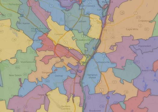
The Capital Region's transit arteries
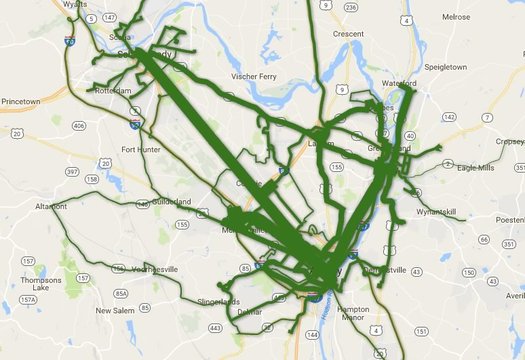
Total ridership per route during the last fiscal year. Is there a clickable, zoomable map inside? You know there is...
Which CDTA bus lines get the most riders?
The news earlier this year that CDTA set another annual ridership record -- and the recent batch of service changes on some of its most popular routes -- got us curious about ridership across the whole CDTA system.
So, of course, we had to make some clickable maps. Let's have a look.
Comparing the latest batch of Capital Region property tax rates
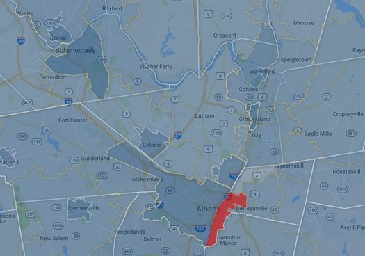
A clip from a map of the Capital Region's various overlapping tax areas -- counties, cities, towns, villages, school district. There's a larger, zoomable version after the jump. (And Rensselaer's marked in red because of missing data.)
The cities of Schenectady and Albany have some of the highest property tax rates in the Capital Region.
Saratoga Springs, Bethlehem, and Niskayuna have the highest estimated monthly payments for a median home.
Those bits are from our latest scan of Capital Region property taxes -- the numbers for the year 2015 are now out.
So, let's have a look.
What's new? Apartments.
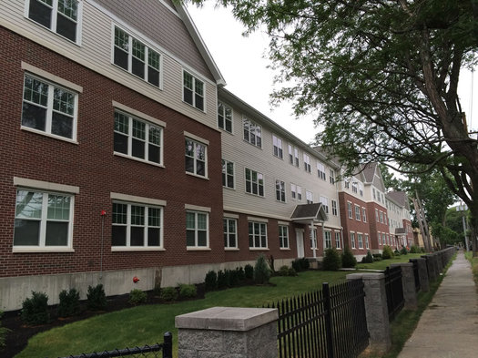
The Elefteria on South Allen Street in Albany, one of the recent apartment projects in the Capital Region.
It seems like every month or so there's an announcement of some new apartment project around the Capital Region. And, as it turns out, the numbers are pointing toward a recent shift in what sort of housing gets built around here.
Last year there were permits issued for 3,601 new housing units in the Capital Region's core counties -- and 2,434 of those units (68 percent) were for homes in multi-unit buildings. And as the latest issue of the Capital Region Planning Commission's Capital Region Data points out, it is the first time in three decades the number of multi-unit homes has so drastically outnumbered single-family homes.
Here's a quick look at some of the numbers...
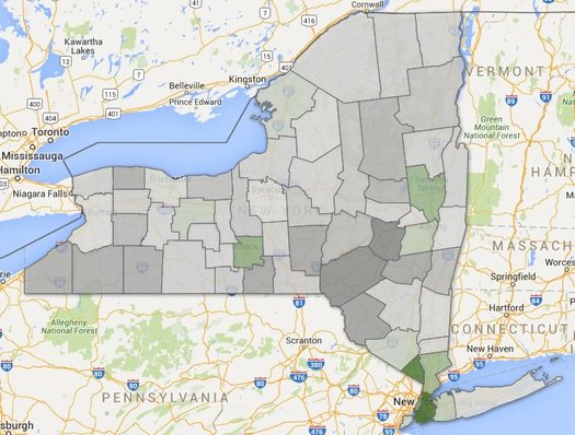
A generational shift
Just a handful of New York counties had lower median ages in 2015 (green) compared to 2010. Albany County was one of them.
Quick: Guess which 5-year age group has the most people of any age group in the Capital Region.
OK, got your answer? Hold onto it for a second.
The Census Bureau recently released new estimates for the populations of counties by age. And those numbers can help us get a sense of the age distribution of people here in the Capital Region -- and answer questions like which age group has the most people.
Plenty of graphs and maps are the jump.
But first, let's answer that question at the top...
A quick look at city and town population changes
There are large, clickable maps after the jump. (Because of course there are.)
The topic of changing population popped up in comments earlier this week, so we figured it'd be interesting to whip together a clickable map of some new numbers for city and town population changes both here in the Capital Region and across the state.
And it turns out the Capital Region is a bit of an outlier.
Let's have a look...
Getting some sense of New York's upcoming minimum wage increases
As you know, New York State's minimum wage -- or, really, its minimum wages -- are set for large increases over the next handful of years. Areas downstate will eventually hit $15 an hour, and upstate will rise to $12.50, with continued increases planned after that.
Last year during the debate about whether the state should take this path, we tried to get some sense of the proposed increase by comparing the minimum wage to the wages of everyone else in the state. And we did this by region, because making $15 an hour in New York City isn't necessarily the same as making $15 an hour in Utica.
So now that the increases are set, we thought we'd run that comparison again. And we added a new one -- using the cost of housing as a yard stick.
5 bits about jobs in the Capital Region -- and how much they pay
We hear George does this job for free.
Which jobs in the Capital Region pay the most? Which pay the least? Which are the most common? Which are much more common here than other places?
Those are the sorts of questions to which we can an answer from a set of numbers of published by the federal Bureau of Labor Statistics. And, as it happens, the BLS released a new batch of those numbers this week.
And given all the recent discussion about New York State increasing its minimum wage, it seemed like a good time to pick out some bits from the new numbers.
The Capital Region is growing. Slowly.
The deeper the green, the higher the percent population growth between 2010 and 2015. The deeper the gray, the higher percentage of population loss. There's a clickable map after the jump (actually, multiple maps).
The population of the Albany metro area was 881,830 as of last July 1, according to Census Bureau estimates released Thursday. That's up 1,739 people -- 0.2 percent -- compared to the same point in 2014.
The Capital Region is up 11,117 people -- 1.28 percent -- from 2010, according to the estimates. Its population growth (by percent) during that time ranked #260 among the 381 metro areas.
So what makes up that modest growth?
Breaking down the Albany High School vote
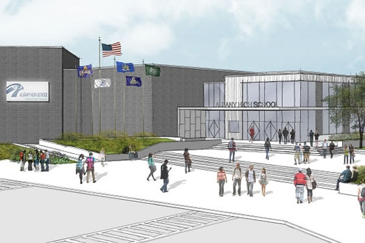
A rendering from the revised plan that passed by a small margin this week (unofficial results).
Updated Friday morning with better maps.
The vote on the reformulated $180 million plan to rebuild/expand Albany High School has gotten a lot of attention this week not just because it passed (unofficially) by a small margin after another round of contentious discussion -- but also because of problems at many polling places around the city.
Now there's talk of holding yet another vote -- with some local elected officials outright calling for one (such as Albany County exec Dan McCoy) and others (such as Albany mayor Kathy Sheehan and state Assembly member Pat Fahy) saying the state should look into what happened. So, stay tuned. [TU]
In the meantime... We were curious about the patterns of votes around various parts of the city -- and how the vote this time compared to the vote last fall when the first proposal was narrowly defeated.
So, we pulled the voting numbers and sifted them. Are there maps? Come on... you know there are maps.
Capital Region high school graduation rates 2015
The state Department of Education released its annual collection of data about high school graduation rates around the state on Monday. The statewide graduation rate for 2015 (that is, the 2011 cohort of students) was 78.1 -- up almost two percentage points from the year before.
As we do every year, we've pulled out the stats from Capital Region school districts.
Sorted stats (including notes and qualifications) after the jump.
New York State is #4 -- again
It's not looking good for catching Florida anytime soon.
The Census Bureau released new state population estimates this week and the Empire State was pegged at 19,795,791 people as of July 1, 2015. That's up an estimated 46,933 from the same point in 2014, an increase of .25 percent.
But that small increase wasn't enough for New York to catch back up with Florida, which passed New York for the #3 spot in the national population ranking last year. Florida's population grew an estimated 1.84 percent between July 1, 2014 and July 1, 2015.
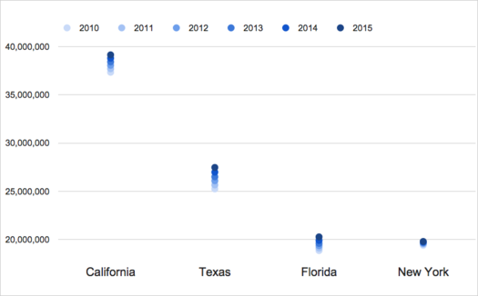
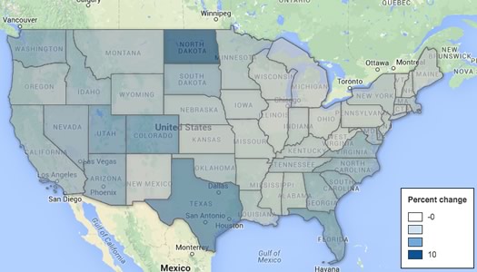
And that's the overall story for New York's population -- it's growing, but very slowly, especially compared to California, Texas, and Florida. The Empire State's population is up an estimated 2.02 percent between 2010 and 2015. But over that same period California is up 4.85 percent, Texas is up 8.81 percent, and Florida is up 7.54 percent. (The graph above illustrates the change for each state since 2010.)
The drag on New York's overall population growth is that it's losing a relatively large number of people each year to other states. It lost an estimated 628,672 people between July 1, 2010 and July 1, 2015 to what the Census calls domestic migration.
So, what's propping up New York's population? People coming to the state from outside the United States -- international migration to New York is an estimated +606,667 between 2010 and 2015. And New Yorkers are having babies at a much faster rate than people here are dying -- New York is an estimated +441,603 over that same period for births and deaths.
There are a handful of clickable national maps (and another graph) after the jump. Because of course there is.
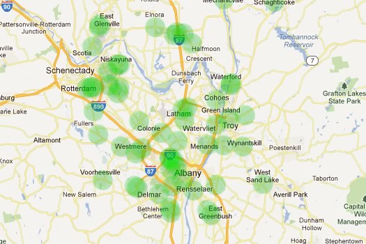
A few quick statistical snapshots of Capital Region neighborhoods
Which Capital Region neighborhoods are the most expensive in which to rent? Which tend to have households with the highest incomes? Which neighborhoods have populations that skew younger or older?
Those are some of the questions for which we can get an answer from new numbers released by the Census Bureau recently. This new data -- the American Community Survey 2010-2014 -- includes estimates for 210 census tracts in the Capital Region core counties. So we can focus not just on a city or town, but sections as small as neighborhoods.
There are a lot of things you can do with these numbers, and we're hoping to dig into them, but we figured we'd start out with putting together a handful of Capital Region maps that look a range of general topics, from income to age to whether people own or rent.
Degrees of difference between women and men
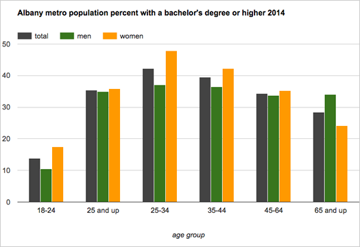
More women than men in the United States had a bachelor's degree or higher in 2014 -- 30.2 percent of women, compared to 29.9 percent of men, according to Census Bureau estimates. And as the bureau pointed out today, it's the first time that's happened nationally since the bureau started tracking the number in 1940.
We were curious about about the numbers for the Capital Region, so we looked 'em up for the Albany-Schenectady-Troy metro area. They're smashed into the chart above.
And here's a bit more...
A snapshot of Capital Region income
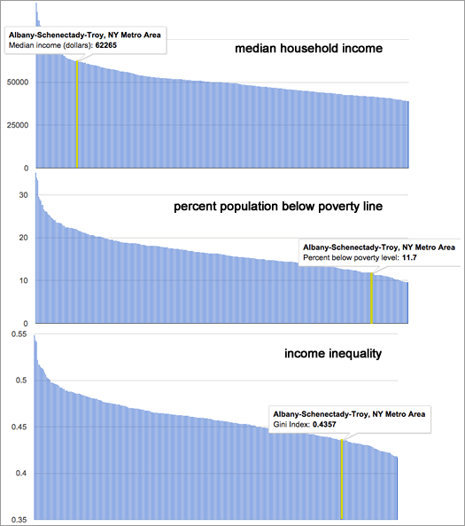
How the Albany-Schenectady-Troy metro compares to the nation's 381 other metro areas.
The Albany metro area continues to have one of the nation's higher median household incomes, and one of the the lower rates of poverty, according to the newest estimates from the Census Bureau.
Household income
The median household income in the Albany metro -- the point at which half the households had more income, and half had less -- was an estimated $62,265 (+/-1,494) in 2014. That's up just a bit from 2013 -- $59,626 (+/-1,981) ($60,593.25 in 2014 dollars). And it ranks 41st among the 381 metropolitan statistical areas the Census tracks.
Poverty rate
The Albany metro area's poverty rate was an estimated 11.7 percent (+/- 0.9). (It was 12.5 percent (+/-1.0) in 2013.) The metro's poverty rate was the 51st lowest among the 381 metros, lower than 87 percent of them. The Capital Region's poverty rate for kids wasn't quite so low -- an estimated 17.1 percent (+/-2), lower than 76 percent of metros.
Income inequality
Another angle on income and poverty is income inequality. And for that the Census Bureau publishes a figure called the Gini index -- a Gini index of 1 means only person has all the income, and 0 means everyone in a group has the same level. The Capital Region's Gini index for 2014 -- an estimated .4357 (+/-0.0119) -- was the 80th lowest (that is, toward the more equal end) among metropolitan areas.
Even if those three measure look relatively good for the Capital Region, there are still some troubling parts to the picture.
Getting some sense of a $15-per-hour minimum wage
When Andrew Cuomo recently proposed raising the state's minimum wage for all industries to $15, it created a big stir -- in large part because that's a big jump from the state's current minimum wage of $8.75 (soon to be $9). And it highlights the question: What is the "right" minimum wage?
Here's one way of thinking about that question for different parts of New York State...
Where the commuters are from
The city of Albany draws commuters from a wide area.
Each weekday in the Capital Region a large tide of people wash into the area's urban centers for their work days, and then stream back home. So large is this tide for the city of Albany that its daytime population during the week rises by 2/3.
So, where do all these people come from? Well, thanks to some recently released Census data, we can some sense of an answer to that question. And to extend the water metaphor a bit further, we can map out the "commuter sheds" that drain into each of the Capital Region's urban centers each weekday.
So let's have a look.
Where the "weekend house" is

Updated with maps that now include Connecticut.
The question this week about good weekend getaways + the gawking at various "weekend" houses around the region on Airbnb = us being curious about where seasonal/vacation/weekend homes are located in this part of the country.
So, we looked it up. (Because, of course, there's information on that.) And we map a map. (Because, of course, we can't help ourselves.)
Solar continues to grow around New York

More common.
The Capital Region had the second-highest amount of installed solar energy generation capacity in the state as of 2014, according to numbers released by the Cuomo admin Monday. The eight-county region had 51 megawatts of capacity -- up 500 percent since 2011. (The region with the highest total was Long Island, with 96 megawatts.)
For some perspective, a megawatt of installed solar is estimated to be capable of powering about 155 homes a year in New York State.
New York State has a whole had almost 315 megawatts of installed solar capacity as of 2014, according the Cuomo admin. That's up 300 percent since 2011.
A few individual Capital Region counties also ranked highly. Albany County had 13.66 megawatts of installed capacity -- the fifth-highest total among all counties. And Columbia County ranked #1 for installed capacity per capita.
Are there clickable maps? You know there are...
New York popular baby names 2014
Say hello to Arian(n)a, Madelyn, Mila, Nora, Nathaniel, Luca, and Jaxon.
Every year the Social Security Administration publishes a list of the 100 most popular baby names for each state from the previous year. The lists for 2013 were released this week, so we pulled the results for New York State.
And here they are, the 100 most popular female and male baby names, along with which names are rising -- and falling -- compared to 2013.
We're #61
But still #1 in your heart.
The Albany-Schenectady-Troy metropolitan area* had a population of 880,167 as of July 1, 2014, according to new estimates released by the Census Bureau this week. That ranks the Albany metro #61 for population among the nation's almost-400 Census-designated metro areas. (The same ranking as in 2013.)
The metro population is up 1.1 percent -- 9,447 people -- since 2010. But its ranking is down one spot since that year, because other parts of the country have gained population faster. (Population in metro areas was up 3.9 across the nation during that time.)
The Census Bureau also released new population estimates for cities, towns, and villages.
Can you guess which place in the Capital Region has gained the most people since 2010?
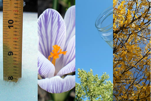
Growing seasons in Albany

The lettuce likes it cool, anyway.
With the, um, rather brisk weather this week (56 on Wednesday) -- and frost advisories around some parts of the Capital Region -- we were curious about growing seasons here in Albany over the years.
Thankfully, the National Weather Service Albany office publishes that info dating back to 1874. And because we have an easier time scanning this sort of stuff when it's in graphical form, we flipped into an interactive chart...
A ZIP code map of New York State
This is just a clip -- the clickable map is after the jump.
As it says on the label, here is a clickable map of ZIP codes (roughly) in New York State.
A while back we had planned to include this map with some discursive post about ZIPs and maps and perceptions of place that was related to the Halfmoon-wants-its-own-ZIP thing, but that post ended up only half baked and unpublished (thankfully -- no one needed to be subjected to that). We were reminded of the map again this week because of the wealthiest ZIP code ranking over at the Biz Review.
Anyway (oh no, here we go...), ZIPs are kind of interesting because of what they started as (a way for the US Postal Service to arrange its routes) and what they've ended up being used for (a way for the rest of us to also identify places). As the ZIP data website ZIP Boundary highlights, a ZIP code doesn't really define an area for the USPS, but rather a collection of delivery points.
And then there are the issues related to the fact that ZIPs are only loosely associated with municipalities -- that's how a place like Crossgates, which is in the town of Guilderland, ends up with a postal address that is Albany (because it's in the 12203 ZIP). Here's an interesting history of ZIPs, again from ZIP Boundary, that touches on that issue.
One of the things that's reinforced for us by looking around the map of Capital Region ZIPs is that the codes aren't necessarily a good way of defining areas (well, unless you're delivering mail). Again, using the 12203 ZIP as an example: it stretches from Washington Park in Albany west along Western Avenue, with lobes that include Guilderland, Bethlehem, and New Scotland -- that's an odd collection to group together.
Right, so... on to the map...
People are riding the bus more often
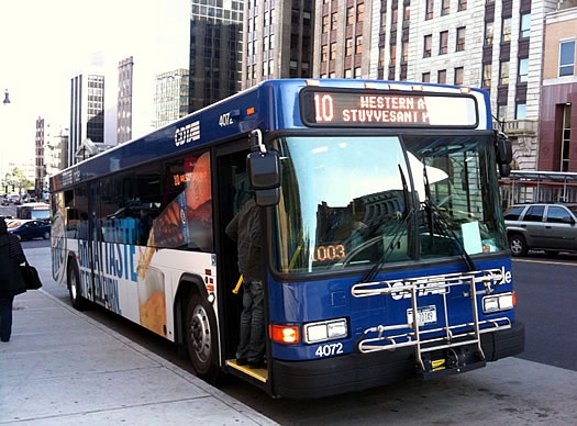
CDTA announced this week that is had more than 17 million boardings in the fiscal year that ended this past March -- that's the highest total in the transit org's history. And it's the second straight year that CDTA's ridership number has set an all-time record.
The org reports that ridership is up 23 percent over the last five years. And a large chunk of its ridership now falls under "universal access" agreements it's struck with local colleges and employers during the last few years. CDTA says riders using the system under these agreements represented more than 4 million boardings last year.
So, put simply, people are riding the bus more often.
We were curious for some historical context, so we got a hold of CDTA ridership numbers over its history and did a few comparisons...
A few ways of thinking about the minimum wage
The "Fight for 15" rallies got a lot of attention around the country this week, including here in the Capital Region, as people pushed for an increase in the minimum wage.
The current minimum wage in New York State is $8.75 per hour. It's scheduled to increase to $9 at the start of next year.
A lot of numbers get thrown around in these discussions, and sometimes it can be hard to keep in them context. So we put together a few easy-scan charts in an effort to get a better sense of things...
Monthly house payments by Capital Region place
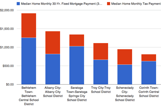
A handful of places pulled from the list -- the highest (Bethlehem-Bethlehem Central), the lowest (Corinth town-Corinth Central), and a few in between.
Some follow-up on that post a few weeks back about comparing Capital Region property tax rates: Matt emailed us hoping we could send along the numbers because he was curious about the monthly payments -- mortgage + taxes -- for the median home in each municipality around the area. That sounded interesting to us, so we bounced a spreadsheet back and forth and came up with a different look at the topic.
The results aren't exactly surprising, but it does highlight some things differently.
For example: The city of Schenectady tops the chart for property tax rate (per $1k value). But looking at the monthly payment for the median house there, Schenectady is way, way at the bottom of the list at just about $919 (of which about 45 percent is property taxes).
Based on the monthly payment figure, we were also able to make a rough guess at about how much a household would have to make each year to afford the median house in each place. Example: Bethlehem, in the Bethlehem Central School District, topped the list at about $82k. (Caveats? You bet. They're explained inside.)
OK, let's have a look at the whole (new) list...
Comparing Capital Region property tax rates
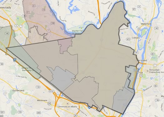
This map doesn't really show anything beyond how complicated listing tax rates can become. As you know, the bold-outlined area is the town of Colonie. Each of the sections within the town depicted above have a different entry in the tax rate listing because of some different combination of town, village, or school district.
The cities of Schenectady and Albany have the highest property tax rates in the Capital Region, according to numbers shared this week by the Empire Center.
The tax rates are for 2013 and include county, city/town, village, and school district taxes. The think tank also figured median tax rates by region around the state. And in that category, the Capital Region did well -- it had the state's lowest median at $24.68 per $1,000 of value. (The Empire Center didn't include New York City or Nassau County on Long Island in that review.)
As has been highlighted in years past, there's wide variation in tax rates around the Capital Region.
Here's the whole list, sorted and ranked...
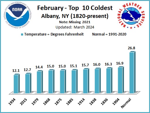
So, that was February
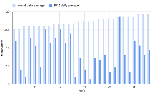
Average daily temperatures for this February 2015 versus the typical daily temps for each day.
For the (almost) record: the past month was unusually cold.
This February was the second coldest February on record, according to the National Weather Service. The average daily temperature was 12.7 degrees -- 13.2 degrees colder than a typical February. (The record for February is 12.1 degrees, set in 1934.) That mark also tied for 4th coldest month on record for Albany. There were 12 days during February on which the minimum temperature dipped below 0.
It also happened to be the fifth snowiest February on record, with 30.6 inches of snow. (As of this morning we're at 72 inches of snow for this winter -- about 25 inches more than the typical amount by this point.)
Temperature record date back 1820, snowfall records to 1885.
In related news: It's now March.
Leaning toward renting
Home sweet (rented?) home. / photo: Flickr user Joelk75 (CC BY 2.0)
Last week we wrote about one of the residential conversions in progress in downtown Albany. As is so often the case, a prominent thread in the comments was the rental price. And then chris capped things off with this comment:
Hey, when people start buying houses again this place will be half-empty and they'll have to drop the rent. Have patience...
We were thinking about how chris framed the situation -- essentially, people are leaning away from buying houses right now and toward renting -- and wondering if we could get a better sense of the situation.
Are there numbers on that? Of course. Did we look them up? Of course. Are we now going to share some of the numbers with you, with graphs? Of course.
Measles in New York, before and after the vaccine
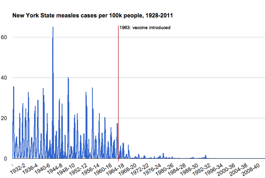
With all the news about the recent upswing in measles cases -- and the all discussions about kids not being vaccinated -- we had been curious about details regarding how a big a difference the measles vaccine made when it was introduced.
A recent Wall Street Journal data visualization illustrates this before/after across the country beautifully. It's based on numbers collected and organized by Project Tycho, a health data project at the University of Pittsburgh.
Project Tycho includes data for many states, including New York. So we pulled out the data for measles cases in New York State between 1928 and 2011. There's a graph above.
There's a bigger version after the jump, along with a few notes.
Not in the driver's seat
An increasingly uncommon spot?
A theme that's popped up often in recent years among developers, planners, cultural observers, whoever: more people -- younger adults (the Millenials), especially -- don't like to drive. You see it mentioned in national articles, and we've had developers and planners mention it to us locally.
We had that idea in mind this week when we came across some numbers about vehicle use over the last few decades, both nationally and here in New York State. One thing led to another and we ended up calculating driver's licenses per capita for counties around the state. (Because of course.)
A few interesting bits floated by along the way. Among them: Of New York State counties that are not part of New York City, Albany County has one of the lowest levels of driver's licenses per capita in the state -- and the rates for all of the Capital Region core counties in 2013 were down compared to 2007.
Here are a few quick graphs, and a few thoughts.
Is Albany getting the short end of the stick?
The amount of aid the state distributes to cities might sound like a topic straight out of Snoresville, but it's an important -- and recurring -- topic related to Albany's finances. And Albany's finances are related to all sorts of other topics that do get a lot more attention: stuff like taxes and new development.
For years, Albany leaders have argued that city gets hosed on the amount of municipal aid the city gets from the state, especially compared to other large upstate cities. And, in the annual tradition, Kathy Sheehan has been raising this point again as the machinery of the state government budget process starts whirring. Over at the Times Union, JCE recently had an article detailing some of the mayor's arguments that Albany should be getting more from the state.
The longtime argument in favor of Albany getting more state aid has essentially boiled down to this point: When compared to other large upstate cities, Albany gets much less in aid per capita.
So, with the topic in circulation again, we figured it'd be interesting to look at exactly that -- how much the capital city is getting per capita versus other cities.
The Empire State is now #4
States by percentage population change between 2010 and 2014, according to Census Bureau estimates. Here's a clickable version of the map.
New York has slipped to #4 in the national population rankings, according to new Census Bureau estimates for 2014 out today. Florida edged past New York to take the #3 spot behind California and Texas.
It's not that New York lost population, it's just that didn't grow as fast as Florida (and many other states). The Census Bureau estimates the Empire State had 19,746,227 residents as of this past July. That's up about 50,000 residents from the year before (about .2 percent). In that same time Florida is up approximately 293,000 residents (about 1.5 percent). The difference between New York and Florida is now about 147,000 in the Sunshine State's favor.
Zooming out a bit and looking at the numbers since 2010 highlights some of the trends. The nation's total population grew an estimated 3.3 percent between 2010 and 2014. But New York's population grew 1.9 percent (roughly 368k people) -- and Florida was up 5.8 percent (roughly 1 million people). The Empire State ranked just 31st in the country for population gain.
So, what's contributing to these totals?
Capital Region high school graduation rates 2014
The state Department of Education released its annual collection of data about high school graduation rates around the state on Thursday. The statewide graduation rate for 2014 (that is, the 2010 cohort of students) was 76.4 -- up a little more than a percentage point from the year before.
As we do every year, we've pulled out the stats from Capital Region school districts.
Sorted stats (including notes and qualifications) after the jump.
The busiest Thruway exits
Very busy.
Holiday travel around Thanksgiving got us curious about the busiest Thruway exits.
So we looked it up.
And it turns out one of the exits here in the Capital Region is the busiest toll exit on the Thruway. Exit 24 -- at I-90 and I-87 -- averaged more than 26 million Thruway vehicle entrances and exits between 2008 and 2013. In fact, it was wayyyy ahead of the #2 exit.
Are there rankings? Is there a clickable map? As if you have to ask...
How the Albany metro area accesses the internet
Common.
Roughly 3/4 of households in the Albany metro area have a broadband internet subscription. But almost 20 percent of households don't have any internet access at all.
Those are a few bits from a recent Census Bureau release of data about internet access around the country. Last year was the first time the Census collected this sort of information. So we thought we'd have a look.
Capital Region neighborhoods with the most trick-or-treaters
Well, potential trick-or-treaters.
After a recent conversation about popular trick-or-treat neighborhoods, we were curious about which Capital Region neighborhoods have the most trick-or-treaters.
And while we can't really say without some sort of trick-or-treater census, there are numbers are which neighborhoods have the most potential trick-or-treaters.
So we looked it up. Is there an orange map? You know there's an orange map.
Poking at some numbers for New York school districts, graduation rates, and income
Two things (indirectly) prompted this post:
1. The discussion around that Miss Pearl question about moving out of Albany for the school district.
2. Another one of those school district rankings.
If anything, both of those items highlighted for us our desire to better understand what people are talking about when they talk about "the schools" -- and how factors such as income and poverty fit in.
So we pulled a whole bunch of numbers on New York State school districts -- specifically graduation rates, household income, and poverty rates -- and did some sifting. And we came across a few things we expected -- and few things we didn't.
The nicest weather days of the year, ranked

(So far.)
We've been on a pretty great run of whether the last month or so. And just last week, while sitting on a restaurant's deck, we said something to the effect of, "This has gotta be the nicest weather day of the whole year..."
We got to thinking about that idea -- the "nicest weather day" -- and whether (ha) we could somehow rank the days of this year by how their weather.
And that's exactly what we did...
Thinking about red light cameras
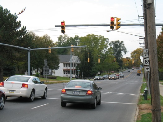
Talk to a lot of people in Albany about red light running and you'll probably get many stories about drivers blatantly blowing through lights. It is, anecdotally at least, a pervasive and persistent problem.
In an attempt to address the issue, the city of Albany is considering an ordinance that would allow it to place red light cameras at 20 intersections around the city. It's an interesting topic because the situation surrounding red light cameras ends up being a bit more complicated that you might at first think -- and because of the way the issue is pushing a lot of buttons for people. Opinions seem to span a range of something like "yes, the city needs this" to "no, this is a very bad idea."
Here's a walk through of the issue...
How New York and the Capital Region compare on income inequality
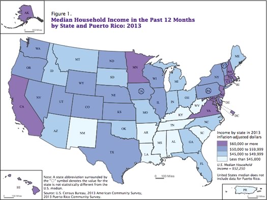
States by median household income in 2013. / map: US Census Bureau
Income inequality has been a much-discussed topic over the last few years, so some new numbers about income -- and income inequality -- out this week from the Census Bureau caught our eye.
As part of the income data from the 2013 American Community Survey, the Census Bureau released Gini coefficients for various places -- these numbers are the result of calculation intended to give a sense of how income is distributed within a group of people, usually a nation. It's a very common of income inequality when comparing countries.
So we were curious to see how New York -- and the Capital Region -- compared to the rest of the nation...
Our time in the sun

Worth savoring.
A string of brilliantly sunny days + walking by a house getting solar panels installed = our curiosity about how much sun Albany gets, and how it compares to other cities. (Of course, it had to be cloudy today.)
So we looked up the numbers -- and found a few things you might expect, and a few things you might not.
New York has a big economy, but...
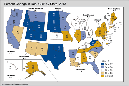
New York State has one of the biggest GDPs in the country. But its GDP didn't grow much last year. / image: US Bureau of Economic Analysis
Macroeconomic fact of the day: New York's gross domestic product (GDP) was $1.3 trillion in 2013, according to figures out this summer from the federal Bureau of Economic Analysis. That ranked #3 in the nation behind California ($2.2 trillion) and Texas ($1.5 trillion).
So, that's very Empire State-ish, having one of the country's largest economies. And New York's GDP per capita ranked 7th in nation (8th if you count DC and its otherworldly rate). Again, pretty good.
But here's the not good: New York's 2013 GDP grew by just .7 percent compared to 2012, according BEA estimates. That was ranked 46th in the nation.
A table with numbers for New York and the other states is after the jump.
Capital Region high school graduation rates 2013
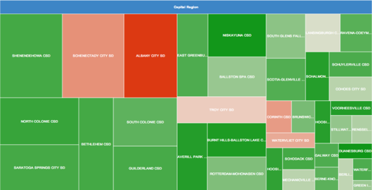
A "tree map" of how each Capital Region school district's high school class fit into the region's overall cohort. (Don't squint, there's a larger version after the jump.)
Corrected.
The state Department of Education recently released its annual collection of data about high school graduation rates around the state. The statewide graduation rate for 2013 (that is, the 2009 cohort of students) was 74.9 percent, up slightly from the year before. (That counts kids who finished up by June 2013).
As we do every year, we've pulled out the stats from Capital Region school districts.
Sorted stats (including notes and qualifications) after the jump.
How New York State generates electricity
That air conditioner compressor isn't going to spin itself.
The biggest source of carbon dioxide emissions in the United States -- almost 40 percent -- is electricity generation. So the Obama administration's announcement this week that the EPA is proposing new emission targets for states in order to reduce CO2 emissions from power plants by 30 percent by 2030 is a big deal.
New York State is line for one of the largest percentage cuts in the nation: a 44 percent decrease in the amount of CO2 emitted by Empire State power plants per megawatt hour of electricity produced. As it happens, New York is is line for such a big cut because it's already moving in that direction, thanks in part to its participation in the Regional Greenhouse Gas Initiative here in the Northeast and the fact that it doesn't rely much on coal for generating power. If New York hits its target, it would be among the states with the smallest carbon emissions per unit of electricity produced. (The EPA rule gives states some flexibility on how to meet their goals.)
Anyway, the news got us interested in how New York State generates electricity -- what are the sources, what are the trends in those sources, the biggest power plants.
So we pulled together some numbers, and here are five charts about the topic (along with a map... because maps).
The Capital Region's biggest employers are...
Can you guess? (This photo isn't really making it hard.)
Something we came across while doing research for that post earlier this week about the Capital Region jobs picture: The top 10 private sector employers for the Capital Region, as counted by the state Department of Labor.
Can you guess which companies are on the list?
How people get to work in the Capital Region
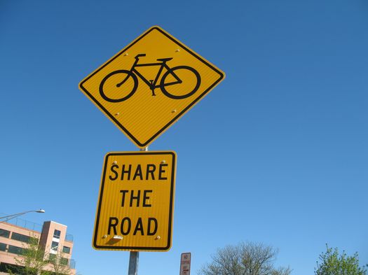
The way to get to work? Not for many, but it is for some people.
This Friday, May 16 is Bike to Work Day, which seemed like a good excuse to take a look at how people get to work in the Capital Region. And, thanks to the Census Bureau, there are some numbers that can give us some sense of that.
So, let's have a look -- at how people get to work, how long it takes them, and when they leave...
A look at airfare prices out of Albany
How high? It depends on how you measure.
The Albany airport ranked #17 in the nation for highest average domestic roundtrip airfare among the top 100 busiest airports during the fourth quarter of 2013, according to numbers recently released by the federal government. The average fare out of ALB: $434.60. The national average was $381.05.
But, like most numbers, that average airfare figure only tells one part of the story. So let's take off with a few more numbers and see if we can get a better sense of how airfare from Albany compares...
Thinking about high-speed rail in New York
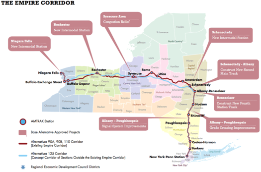
A map detailing some of the options on the table. (Don't squint, here's a bigger version.)
High speed rail in this country is one of those things that always seems to be happening just over the horizon. And for the Northeast -- and the Capital Region specifically -- this somewhere-out-there future holds all sorts of potential. Imagine what it would be like to hop a train at Albany-Rensselaer -- the 9th busiest station in the nation -- and be in NYC in a little more than an hour.
The thing is, for all the talk, we never seem to get closer to actually arriving at high speed rail. But that might be changing. Slowly.
The state Department of Transportation is currently working to sort out plans for higher speed rail service through New York. And there was a public information session Tuesday at the NanoCollege about the options, the first of series of sessions around the state.
We stopped by, checked out the presentations, and talked with one of the people involved in the planning. Here's a breakdown of the state's current route toward high-speed rail.
Capital Region median home prices 2013
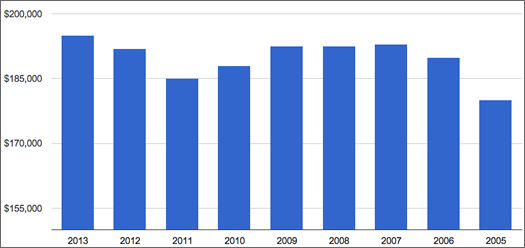
Capital Region median home sale price 2013-2005.
The Capital Region housing market approached its pre-recession level in 2013, according to data out today from the Greater Capital Association of Realtors.
The median price for homes sold in the Capital Region was $195,000 in 2013, up more than 1.5 percent compared to the year before according to GCAR's numbers. And it's the first time the median sale price has risen above the pre-recession crest of $193,000 in 2007.*
The local market also posted 9221 closed sales in 2013, up almost 12 percent from the total in 2012. GCAR says 2013's total was the highest since 2007.
Another sign of a rising tide in the housing market: The average number of days it took to sell a house was 90 in 2013, the lowest number since 2008, according to GCAR. (That figure was 98 days in 2012, and 102 in 2011.)
(* That's not accounting for inflation. Depending on how you account for inflation, the price would have had to be around $216,000 to equal the 2007 mark.)
A more detailed look at the numbers is after the jump.
All of New York State's cities, lined up by size
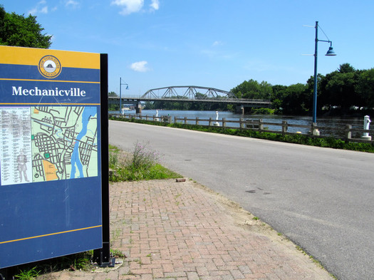
Did you know you can fit all of Mechanicville in a shoe box? (OK, that might not be technically true.)
From the Annals of Facts of Limited Utility: While editing last week's in-between places feature about Mechanicville and Stillwater, we did some research on the claim that Mechanicville in the smallest city in the state. And based on Census data about geographic size, it's true -- M'ville's land area is just .84 square miles, more than half a square mile smaller than the next city on the list.
Anyway, that got us curious about the size of cities around the state -- which are the biggest, the smallest, how big or small they are relative to each other.
So we pulled the numbers and sorted them for easy scanning. And is there a map? Oh, you know there's a map...
Temperature vs. power
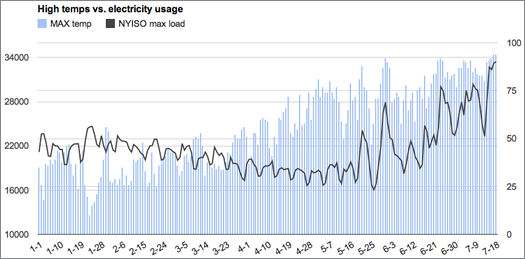
There's been a lot of talk this week about how the heat wave is putting a strain on the state's power grid. The org that oversees the state's grid predicted that cranking up all those air conditioners would push the state's electricity usage up to or beyond the all-time record. And on Thursday Andrew Cuomo was urging New Yorkers to conserve energy so as to lessen the chances of power outages.
Update: The state's electricity demand broke the record Friday, NYISO reported late that afternoon.
All that talk got us curious about the relationship between temperatures outside and power usage. So we pulled the data for both daily max temps and max "load" on the state's power grid. There's a graph above -- but don't squint, there's a large format version after the jump (along with some notes).
Charting the Capital Region's workday population tide
That is a lot of office space...
Most of the time when we talk about "population" it's in reference to how many people live in a place. But that doesn't necessarily give the best sense of how many people frequent that city/town/village.
For example: the city of Albany's population on weekdays increases almost 67 percent during weekdays, according to Census Bureau estimates.
So, to get a better sense of how the population "tide" drifts around the Capital Region on a weekday, we thought it'd be interesting to pull daytime population numbers for cities, towns, and villages around the Capital Region -- and then rank and map them.
Capital Region high school graduation rates 2012
 The state Department of Education released its annual collection of data about high school graduation rates around the state on Monday. The statewide graduation rate for the 2008 cohort of students was 74 percent, the same as the year before. (That counts kids who finished up by June 2012. The rate was almost 77 percent if students finished by August 2012 are included). And as NYSED notes, this was the first cohort in which the "local diploma" option was not available to general education students, requiring them to graduate with a more rigorous Regents diploma.
We pulled out the stats from Capital Region school districts. As in years past, there continues to be a sobering gap in graduation rates among some school districts and groups of students.
Sorted stats (including notes and qualifications) after the jump.
Watching for cicadas

An adult periodical cicada. The red eyes really make the look.
Perhaps arriving soon: the periodical cicada. A "brood" of the fantastically weird insects -- that climb from the ground every 17 years to molt, sing, mate, lay their eggs, and die -- are emerging along the East Coast this month. And we could see some of them in the Capital Region.
This particular cohort of cicadas -- Brood II, or "The East Coast Brood" -- last emerged in 1996. In previous appearances, its range has stretched from North Carolina to northern New York.
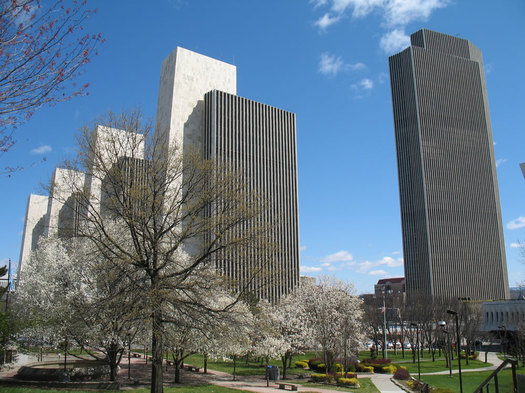
Albany is average. Really?
We saw today this assertion that the Albany metro is the "most average city in America." And our first thought was: "Really?"
That claim is based on market research on how metros compare/contrast to the whole United States "on age, marital status, home ownership and estimated income." And Albany was at the top of the list.
But. Those rankings are from... 2004 -- which is like a whole other decade (actually, it is a whole other decade). Considering how much the United States has change demographically during the last 10 years or so, we kind of doubted that Albany could still hold the claim to being unusually average (an odd claim).
Here's the thing, though: We're not going to run the numbers for every metro in the country (yes, we're missing out on quality time with spreadsheets). But we did run them to see how the Albany of now compares to the rest of the United States of now. You can make your own judgement about whether it's a good representative for the whole.
Capital Region's most popular baby names
Updated
Because we were thinking about birthdays this week, we thought it'd be fun to look at Capital Region baby names. (A name is one of the first birth day presents you ever get.)
So we pulled together the numbers for the past handful of years for the four core counties of the Capital Region.
And away we go...
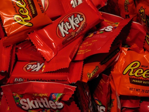
Proof that the peanut butter egg is better than the peanut butter cup
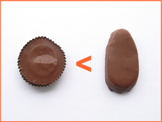
Friday morning on AOA's Facebook page we blithely asserted that the Reese's peanut butter egg is vastly superior to the peanut butter cup. And while there were some who agreed with us, we did later in the day realize the error of our ways.
We didn't have data to support our claim.
So, because it's Friday afternoon, here is definitive proof that the peanut butter egg is better than the peanut butter cup.
Zooming out on Capital Region unemployment
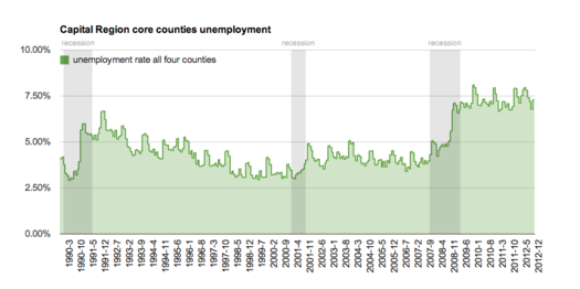
Don't squint. Here's a large-format version.
The state Department of Labor released unemployment data today for areas around the state -- and they were remarkably familiar, in a bad way.
The Albany-Schenectady-Troy metro area's unemployment rate was 8.4 percent in January. That was up from 8.2 percent in January 2012 -- though DOL reported there were about 2,000 more people employed this past January compared to the previous January. (The local area unemployment data isn't seasonally adjusted, so the best comparison is the same month the year before.)
Compared to the rest of the state, the Albany metro isn't doing so badly. It had basically the third lowest rate in the state, behind Ithaca (6.7) and the NYC suburbs/Long Island (7.9). Among the areas at the other end of the spectrum: Elmira (10.5), Glens Falls (10.3), and Utica/Rome (10.2). (The metro and county breakdown is post jump.)
The state's overall unemployment rate was 8.4 percent in January, the same as it was in January 2012. And it was up from 8.2 percent in December. (The statewide rate is seasonally adjusted, so month-to-month comparisons are OK.) The national unemployment rate was 7.9 percent.
A wider perspective
OK, the Albany metro's rate -- 8.4 percent -- seems high. How high? To put it in perspective, we pulled the unemployment data for the Capital Region's four core counties for 1990-2012. Large-format chartage is post jump.
Even with home court advantage, Siena to the "Catholic 7" seems like a long shot
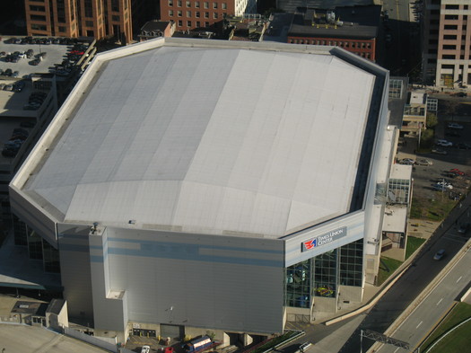
Attractive because of its ample... seating.
Surprising bit from a recent John Feinstein report in the Washington Post about plans for the new college basketball conference being formed by the seven Catholic schools exiting the crumbling Big East: Siena is in the conversation for the new conference. From the article:
The conference leaders want six eastern and six western -- really, midwestern -- schools. The eastern division of the league will consist of Georgetown, St. John's, Seton Hall, Villanova, Providence and either Richmond (also a non-Catholic school) or Siena -- a late entry but a potentially appealing one because it's a Catholic school that (more importantly) plays in a 15,500-seat arena in Albany, N.Y.
Being picked for your gym probably isn't the reason most schools hope they'll draw suitors -- though, hey, if you got it, flaunt it. Also: it's nice to be considered.
But Siena's athletic director has already poured cold water on the speculation. [TU]
And that's not surprising, because the move would be a stretch, for a few reasons...
Another look at Capital Region income distribution
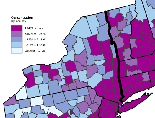
Clipped from a Census Bureau map of the concentration of high-income households by county.
Updated
The Census Bureau released a breakdown of high-income households this week. It defined "high income" as households with income in the top 5 percent of the nation -- $191,469 and higher.
The report only ranked the top-50 largest metro areas (by population), so the Albany metro didn't get its percentage of high-income households listed. But the Washington Post has the county-by-county data, along with an interactive map -- five percent of households in Albany and Saratoga counties are in the high-income category, four percent in Schenectady County, and three percent in Rensselaer County. (WP has more info.)
And by the way: the lower limit for the top five percent of households by income in the Albany metro area is $184,514.
Anyway, we thought this would be a good time to look at income distribution in this area again. We did that in 2011, and there's some updated data now. And we've also pulled together some other numbers that we hope will provide a bit more context.
And, yep, if you just want to see where your household ranks -- there's a quick chart to do that, too...
Capital Region median home prices 2012
 The number of homes sold in the Capital Region took a big jump in 2012 compared to the year before, according to stats out this week from the Greater Capital Region Association of Realtors. The number of closed sales across the region increased 15 percent, the first increase in years.
Median prices were also up, but the increase was smaller. The median price across the region was up 4 percent, to $192,000.
Here's GCAR's report for 2012. The average number of days it took for a house to sell last year was 98, down from 102 in 2011. And this past December, "inventory" -- the number of homes for sale -- hit its lowest point since 2008, as did "months of inventory."
GCAR also provides breakouts for individual counties and a group of cities/towns. We've collected those 2012 numbers in an quick-scan table post jump.
The airport, photographs, and free speech
Updated
You probably saw the video this week from ALB -- two people recording their effort to hand out flyers about opting out of the full body scan, an airport official asks them to stop, they say no, and an Albany County sheriff's deputy tells the airport official the two people are exercising their rights. The video has racked up more than 100,000 views on YouTube.
The airport released a statement saying its "concern -- as it always is -- was for the safety of the passengers and the public who were in the airport." [TU]
So, what exactly are a person's rights in this sort of situation?
Well, like most things, it's complicated.
On being a lucky location
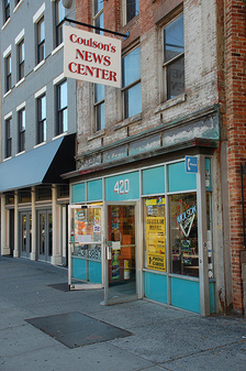
A tweet we saw today wondering -- hoping -- if lottery lightning would strike twice at Coulson's in downtown Albany for the huge Powerball jackpot got us thinking about the probability of that happening.
As you might remember, Coulson's sold a winning Mega Millions ticket last year that was worth $319 million. A seven-person pool of state employees bought it, and each of them ended up with about $19 million after taxes. Yeah, lucky.
So, what are the chances of that happening at Coulson's again? The short answer: better than it probably would have been without the Mega Millions winner. Not that it will help you.
What?
Capital Region college president compensation

UAlbany's uptown campus.
When it was announced last week that Robert Jones will become the next UAlbany president, there were a few eyebrows raised about his compensation -- he'll receive a total of $555,000. That includes salary, money from the Research Foundation, and a housing allowance.
That's a lot, no matter what job you're doing. And given that the SUNY system has faced budget cuts recently, it's understandable that the figure would catch attention.
But is it too high? That's a hard question. And people are going to have different answers based on their own perspectives.
To get some context, we pulled data about presidential compensation at UAlbany, RPI, Union, Skidmore, St. Rose, Siena, and the Sage Colleges -- and broke it down to see how it compares across multiple categories.
Here's the result...
Capital Region high school graduation rates 2011
The state Department of Education released data Monday about high school graduation rates. The statewide graduation rate for the 2007 cohort of students was 74 percent (that counts kids who finished up by June 2011).
We pulled out the stats from Capital Region school districts. As in years past, some of the results are sobering and frustrating.
Sorted stats (including notes and qualifications) after the jump.
Most popular baby names New York 2011
 As it does every year, the Social Security Administration today released
So we pulled the list -- the 100 most popular names for boys and girls born in New York State last year are after the jump. We also looked at how the top 10 names this year ranked during the last few years.
One name in particular has skyrocketed in popularity...
Here's your diploma -- and a payment schedule
One of the interesting things in a recent NYT package about student debt is an interactive listing that includes school-by-school breakdowns of the average student debt for each school.
We were a bit surprised by the numbers from Capital Region schools (above). Even though Skidmore and Union College both have expensive sticker prices (both locally and nationally), their average graduate debt figures were among the smallest in this area -- and they had the lowest percentage of grads carrying student debt.
That result probably speaks to a few things about those schools: a) a not insignificant share of the students attending come from families that can help them cover the price and/or 2) many of the students whose families can't cover the cost probably aren't paying the full sticker price. In fact, Union says more than 60 percent of its students "receive some kind of financial assistance."
Contrast that to St. Rose and UAlbany. CSR had the highest average graduate debt -- with 86 percent of its graduates carrying debt. And UAlbany, though having one of the lower debt numbers probably as a result of its relatively inexpensive tuition, had by far the highest debt-to-tuition ratio.
The NYT interactive feature has more info and is worth checking out.
Noted: Americans now owe more in student debt than they do in credit card debt -- the total amount of outstanding student debt in the country is roughly $1 trillion. [USA Today]
Fine print: All the tuition and debt total numbers are for 2010 and via NYT, with one exception: NYT didn't have a tuition number for Union. So we pulled it from College Grotto's rankings for 2009-2010. It appears NYT pulled the numbers from The Project on Student Debt, from which we pulled the "grads with student debt" percentages. The debt:tuition ratio is our own calculation.
Capital Region property tax rates
Schenectady has the highest property tax rate in the Capital Region, according to the Empire Center report. The property taxes on this house -- the "oldest" house in Schenectady -- assessed at $247,600 in 2010: $10,078. [Zillow]
The Capital Region has the lowest median effective property tax rate in the state, according to a report from the Empire Center. This area's median rate was $23.14 per $1000 last year. Western New York had the highest rate at $35.58 per $1000.
The Empire Center's analysis did not include New York City or Nassau County, which it says impose rates in a way that makes them hard to compare. And in this case, the Capital Region extends beyond the four core counties to also includes counties such as Warren, Washington, and Greene.
Within the Capital Region's core there are wide differences. The effective total property tax rate in the city of Schenectady is $40.75 per $1,000 of property value. In the town of Edinburgh it's $7.70 per $1,000.
We pulled all the numbers for municipalities in the Capital Region's core. They're sorted after the jump.
New York's (now lost) native parrot

From an 1825 illustration by John James Audubon.
As strange as it might sound, there were once parrots -- parakeets, specifically -- that were native to New York State. The range of the Carolina Parakeet stretched as far north as the Great Lakes, and there are historical reports of them in Albany.
They were brightly colored. They were loud. And by the late 1800s, they were gone from here. After the early 1900s, they were extinct.
How walkable, relatively, is Albany?
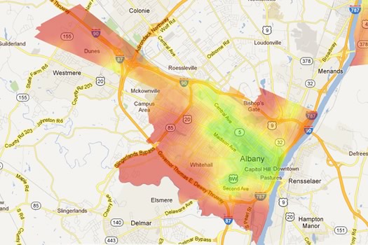
A heat map of walk scores for Albany. Here's the interactive map.
A post over at Atlantic Cities about the "most walkable cities" in the United States has been circulating locally on Twitter because it mentions that Albany is among the top 10 most walkable cities in the country, according to data from Walk Score.
It turns out that's not actually true.
But that doesn't mean Albany -- and a few other local cities -- don't fare well in the rankings.
Where the supermarkets are -- and aren't
There's a much bigger, interactive version.
Prompted by a discussion earlier this week about chain supermarkets and food deserts, we figured it'd be interesting to see how supermarkets in the Capital Region are distributed geographically. It might give us a better sense of what sort of supermarket access there is for each part of the area.
The resulting map -- along with another map of officially designated food deserts -- and some quick discussion, after the jump.
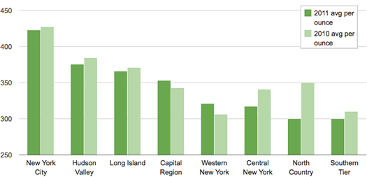
Capital Region rents
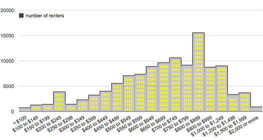
The distribution of rent prices in the Albany-Schenectady-Troy metro area in 2010, according to Census Bureau estimate. Here's a larger version.
After seeing that the Capital Region had one of the lowest apartment vacancy rates in the nation last year, we were curious about rents here -- how they're distributed and how they stack up against other metro areas. [Biz Review]
Bring on the charts and graphs...
Capital Region median home prices 2011
The median sale price of single family homes in the Capital Region was basically flat in 2011 compared to 2010, according to numbers from the Greater Capital Association of Realtors.
The median price for sale price for a home in the greater Capital Region was $186,032 in 2011. It was $203,511 in the Capital Region's four core counties. Both of those medians were down about 1 percent from 2010.
GCAR (as it's known) recently posted its annual market report for 2011. It includes stats for individual counties, cities, and towns in the Capital Region -- we've broken those out into a table after the jump.
While prices were basically flat for the region as a whole, the average time it took to sell a house increased. GCAR says the average number of days on the market until sale was 101 days in 2011, up from 92 in 2012. (For some perspective, the average was 79 days in 2007. It's been rising each year since.)
Onto the table...
2011 weather: wet, snowy
Winter, spring, summer, fall.
The National Weather Service's climate summary for 2011 is out. Here are a few of the highlight from the wet, snowy year...
(normals in parenthesis)
average temperature: 50 (48.3)
highest temp: 99, on July 21
lowest temp: -13, on January 24
precipitation total: 53.68 inches (39.35) -- the third wettest year on record
largest 24 hour precipitation total: 4.81 inches, August 27-28 (that would be Irene)
snowfall total: 80.3 inches (59.1) -- 14th snowiest on record
largest 24 hour snow total: 12.8 inches, January 12 (some spots recorded much higher totals)
days with precipitation: 142 (137.8)
days with rain: 64
days with snow: 76 (34.8)
While we're on the subject of weather... This recent cold snap aside, winter is totally falling down on the job this year (so far). A few quick facts about this winter and it's less than impressive effort...
The best November ever?
Something's missing from picture. Oh, right, cold. And snow.
As far as the weather goes, this is one of the best Novembers we can remember in some time -- warm, with only a few traces of snow.
Or, to put it another way: It was 63 today! And 60 yesterday!
Curious about how unusual this warm November is, we looked up the temperature data.
Are there charts and graphs? Oh, you know there are charts and graphs...
Pot prices around New York State
This is all really hazy, so, you know, grain of salt and all that. Dude.
About a year ago we pulled data on marijuana prices in New York State from a site called Price of Weed. Yep, it's pretty much what it sounds like -- it's a crowdsourced database of pot prices.
We came across some research recently on these prices, so we figured it was a good time to light this topic back up.
Let's roll the numbers. Here are pot prices from around New York State, broken out by region...
The first, last, most, and least snow
 Yep, there's snow in the forecast for Thursday. From the National Weather Service:
Thursday Night: Rain and snow showers, becoming all snow after 11pm. Low around 29. North wind between 6 and 10 mph. Chance of precipitation is 80%. New precipitation amounts between a quarter and half of an inch possible.
Thursday sounds generally unpleasant. Highs in the 40s. Rain. Then snow. So it goes.
Anyway, the question came up the other day about what's the average day for the snow of the season around here. Here's the first, last, most, and least...
August 2011: historically wet
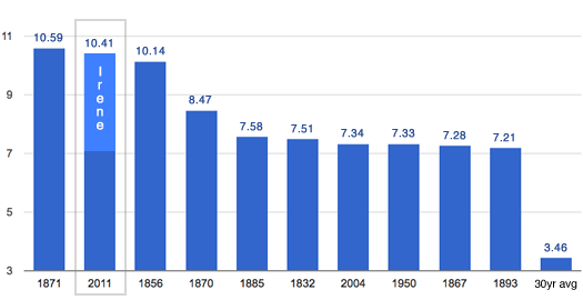
The top 10 wettest Augusts on record in Albany since 1826.
August 2011 was one of the wettest Augusts (by total precipitation) on record in Albany. In fact, this past August ranked #2 all time (or, at least, going back to 1826).
The rain from Irene made up a good a portion of that total. The NWS reported 4.69 inches of rain in Albany on August 28. Even without Irene, the month would have been unusually wet -- though not in the top 10.
Of course, your Irene total probably varies depending on where you were measuring. The NWS precipitation map reports heavier rainfall to the south -- especially in parts of central/south Greene County (probably one of the reasons the flooding was so bad there).
The map might even underestimate a bit -- its total for much of Albany County seems a bit low compared to the official report. And the Gazette reported this week that a rainfall total of 13.3 inches was recorded in East Durham (northern Greene County).
The rainfall map is after the jump.
(Thanks, Justin)
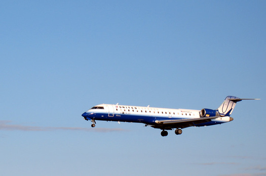
Getting there, directly

Its direct flight to Atlanta may be "direct" -- not direct.
After seeing this week that Southwest is adding a direct flight from ALB to Atlanta, we were curious about how many places we (or you or anyone) could fly directly from the Albany International Airport -- and how much it costs (versus a non-direct flight). [Southwest] [TU]
We're now boarding with the answer...
Capital Region elementary school test scores 2011
The state Education Department released results from the English and math proficiency tests for grades 3-8 this week. NYSED reports that, on average, scores are down slightly for English and about the same for math.
The state also makes the test score data available by school district, so we pulled out the results for Capital Region districts. A compact, easy-skim version is after the jump -- along with expanded presentations of the data -- after the jump...
What are those holes by the ESP?
Helloooo?
Joe emails (with the above photo):
Re: The Mystery Hole at Empire State Plaza
I figured you guys might know - I can't even speculate as to what the hell this structure is and its always puzzled me. The view is looking east over the side of ESP near the egg. Why are the walls so high? What in the blue blazes is this thing??
We've wondered about those holes, too. (You can see them very clearly in satellite photos.) And we had some guesses.
But to get the word straight from the source, we contacted the New York State Office of General Services, which runs the ESP.
Why you should tip your pizza delivery guy more
A map of attacks on food delivery people, 2008-2011.
This past weekend in Albany's Center Square neighborhood a pizza deliveryman for Soho Pizza was the target of what must have been a terrifying attack. From the Albany Police Department press release about the incident:
At approximately 1:10 a.m. James Kehoe, 25, was attempting to make a food delivery for Soho Pizza to 172 Jay Street. He was approached on the street by the first suspect who told him "hold on my brother will be right out with the money". A second suspect came from across the street and wrapped his arm around the victim's throat and threw him to the ground. A third suspect then walked up behind Kehoe and placed what appeared to be a handgun to his neck and told him not to scream or he would get shot. The first suspect then reached into Kehoe's pockets and stole his money and cell phone.
The APD says the suspects fled the scene after getting the money and phone. A search of the area, including a sweep by a K-9 team, came up empty.
You might not think that being a food delivery person is a dangerous job, but attacks on them are not uncommon in Albany and other Capital Region cities. In fact, there have been six incidents just this year.
Concerned and curious about about the frequency and locations of these attacks, we gathered reports of the crimes from the past four years, organized them by date, and mapped them.
Capital Region high school graduation rates 2010
The state Department of Education released data today about high school graduation rates. The statewide graduation rate for the 2006 cohort of students was 73.4 percent (that counts kids who finished up by June 2010).
We pulled out the stats from Capital Region school districts. As in years past, some of the results are frustrating.
Sorted stats (including notes and qualifications) after the jump.
Should I text a pic of my junk?
 You would think that people -- especially public figures -- would have figured out by now that texting or messaging explicit photos of themselves to other people is a generally bad idea.
You would also be wrong.
There is, of course, Anthony Weiner. And on Thursday it came out that Saratoga Springs police chief Christopher Cole had texted an explicit picture of himself from his office in city hall. Not so bright, chief.
Clearly, people still have a few things to learn. Even people who should know better. So, at Siobhan's urging, we have created a flow chart -- a public service announcement, of sorts -- to answer the all important question:
Should I text a pic of my junk?
Which way to IKEA?
There's a lot more to consider than distance.
One thing is clear from the recent discussions about chain stores: people around here love IKEA. And AOA very often gets search referral traffic for the query "closest IKEA Albany."
There are two primary IKEA options for the Capital Region: Paramus, New Jersey and New Haven, Connecticut.
So, which IKEA should you go to? We've broken down the decision...
Capital Region age distribution
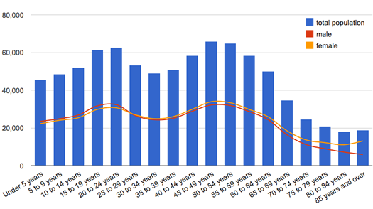
Boom. Echo boom.
The Census Bureau reported today that the median age of people in New York State is 38. (That is, half the people here are older than that, half are younger.) That's up from 35.9 in the 2000 Census.
Here are the median ages for the four core counties of the Capital Region (and medians from a decade ago):
Albany: 38.5 (36.8)
Rensselaer: 39.2 (36.7)
Saratoga 40.8 (36.9)
Schenectady: 39.8 (38.6)
The graph above is the age distribution for the Capital Region.
After the jump: the median ages for a handful of Capital Region cities and towns. Also: everyone's favorite game -- can you guess the local municipality by its age distribution?
Most popular baby names in New York 2010
 As it does every year, the Social Security Administration today released a list of the most popular baby names in 2010, sorted by state.
So we pulled the list -- the 100 most popular names for boys and girls born in New York last year are after the jump. We also looked at the top 10 names this year ranked during the last few years...
The Capital Region's snowiest winters (that includes the one that just ended)
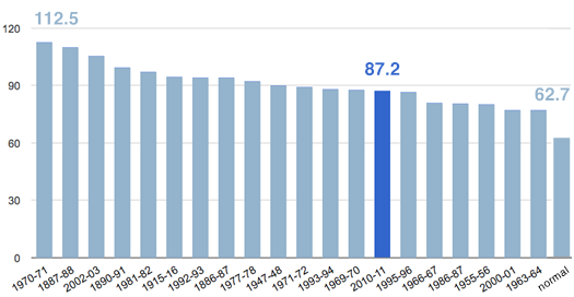
Now that it's May, we're going to call an end to the snowfall season. Yep, we're aware it could snow some more -- we're just going to act like that's not possible.
OK, so how does this past snowy winter stack up against the records?
The final total was 87.2 inches. That's good for the #14 spot on the chart of snowiest winters. Of course, that has to be taken with a few chunks of rock salt -- the chart only goes back to 1884-85.
By the way: The latest snowfall on the books for this area is May 28, 1902. The average last snowfall is April 20.
Earlier on AOA: The Giant Snowman of Guilderland
Data from National Weather Service
Capital Region 2010 census population totals
The Census Bureau released 2010 populations totals for places in New York State Thursday afternoon.
The population of the Capital Region's four core counties was up more than five percent since the last census in 2000, which made this area an outlier for upstate. Breakouts for the individual local counties are above (breakouts for all the cities and towns in the Capital Region are after the jump).
New York State's population was up about two percent, as was New York City's population. Officials there are already arguing there was an undercount.
Breakouts for Capital Region cities and towns -- as well as a few notes -- after the jump.
New York is third most populous state again, but it's losing two Congressional seats
There's a bigger version of this interactive display embedded in wide screen after the jump.
New York State had 19,378,102 residents on April 1, 2010, according to data released by the Census Bureau today. That ranks the Empire State third overall among states for population.
New York was the third most-populous state during the 2000 decennial census, too. The state's population has grown by 401,645 people since then. But its slice of the nation's overall population declined in that time. In 2000, New York counted as 7 percent of the US population -- now it's 6 percent.
And, as expected, New York is losing two Congressional seats. After re-apportionment, the state will have 27 members of the US House. (A House seat will represent about 710,767 people this time around.)
The total national population was counted at 308,745,538. That's up 9.7 percent since 2000.
Tables with number candy are after the jump.
It's winter. Your dog has pooped. What now?
 Now that the winter weather has gotten cranked up, we figured it would be a good time to address an issue that seems plop down around the end of each year: dog poop.
Uh, why are you bringing up dog poop? Good question! As the cold weather sets in each winter and the snow accumulates, we notice that piles of dog poop start gathering along streets in the Capital Region. (It's kind of hard to miss, given that it's a high-contrast item in the snow.) And these forlorn turds then freeze into unfortunate poopsicles -- which are a real treat come spring.
Well, we've thought a lot about this issue. And we finally came to the conclusion that winter somehow impairs the ability of some people to make good decisions about whether they should pick up their dog's poop.
So, we're here to help. We've constructed a flow chart to assist citizens of the Capital Region in their decision-making process on the all important question: "It's winter. My dog has pooped. What now?"
Warm weather bang for your airfare buck
To warmer climes?
The arrival of actual winter weather this week had us thinking about warmer places -- specifically, about places that are warm in February. Because it's right about that time of the year that we usually become officially sick of winter.
With that in mind, we curiously scanned Southwest's winter fare sale this week for ALB-to-(insert other place) specials. There were a lot of warm-weather options -- but which was the best non-winter value?
So, we did some quick math to determine which spots would get us the most degrees for our airfare dollar.
Prices from a market where they're not advertised
 We're always curious about everyday patterns or odd markets that aren't necessarily easy to get a handle on. So we had to exclaim, "Dude!" when we recently came across a new site called Price of Weed.
Yep. It's exactly what it sounds like. The site touts itself as "a global price index for marijuana." It relies on user submitted prices to compile a price index, broken down by state and quality. For example, here's the index for New York State. Here's an article about the anonymous creators.
The site includes reports by town. So, naturally, for journalistic purposes, we were immediately curious about prices in the Capital Region and how they compared to other parts of the state.
So we rolled the numbers.
The hottest month?
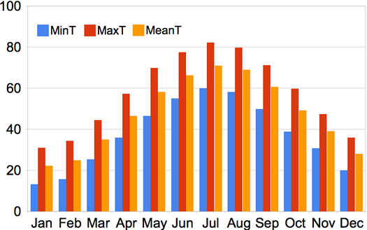
August was crushed to find out that the NWS says July is hotter.
After seeing some chatter (chirping?) about today's temperature on Twitter (essentially: it shouldn't be this hot), we figured we'd look it up to see what the typical temps are for August (and every other month, for that matter).
The chart above shows the monthly normal temps as recorded by the National Weather Service in Albany for the years 1971-2000 (so, yep, it doesn't include the last decade of data). As you can see, July is typically the hottest month, though August is close behind. The numbers are also in a table after the jump.
The average high so far this month has been 81.5, which is a few degrees warmer than usual.
About today... The highest temp on record here for August 31 came in 1953, a day that topped out at 93. As of 3 pm today, the temp was 91. The average high for this date is 76.
Capital Region elementary school test scores
The state Education Department released results from the English and math proficiency tests for grades 3-8 this week.
So, we pulled out the results for Capital Region school districts. A compact, easy-skim version is after the jump -- with links to more detail. (If you want a school-by-school breakdown, NYSED makes that available, too.)
On to the data, some of which are sobering...
New York's least-smoky counties
The Capital Region's four core counties have some of the lowest adult smoking rates in the state, according to data distributed by the state health department today.
The full rankings are after the jump. Among Capital Region counties, Albany County had the lowest smoking rate at 16.5 percent.
We were also curious about how smoking rates might associate with income -- so we whipped the two sets together. The result is also in there.
Eww: The DOH released this data as part of push to get people to stop smoking. Part of the campaign: two new TV spots of which a DOH officials says: "Some viewers may complain the ads are too graphic or emotional..." The one embedded above is pretty gross. Here's the other.
Up in smoke
 A bill passed by the state legislature last night will increase the state tax on cigarettes from $2.75 to $4.35 per pack. That's the highest in the nation.
We were kind of curious about how much higher New York's tax will be compared to other states -- especially states that are right next door. And yep, you guessed it -- the inevitable chart is after the jump.
With the tax increase, a pack of cigarettes will now go for a little more than $9 -- and almost $11 in NYC (which has its own excise tax). [NYT]
The American Lung Association figures the tax increases will "encourage" about 120,000 adults to quit smoking. About 18 percent of adult New Yorkers were smokers in 2009 (around the median for all states), according to the Centers for Disease Control.
Most popular baby names in New York 2009
As it does every year, the Social Security Administration recently released a list of the most popular baby names in 2009. You can break the list out by state, which is exactly what we did.
The list of the most 100 popular names for boys and girls born in New York last year is after the jump.
Listomania
A list of lists: from beer to frowns to development to on-time arrivals.
Updated June 8, 2010
Everybody loves a good list. And it seems like every month or so, the Capital Region or New York State (or something around here) ends being ranked on some sort of list.
We got thinking about this recently -- and came to the only logical conclusion: there needs to be a list of lists.
And here it is.
How much sushi is too much?

A plate from Mr. Fuji in Clifton Park.
Local sushi list updated Wednesday at noon.
After yesterday's post about the new Mr. Fuji going into Stuyvesant Plaza, a few people commented on the abundance of sushi places in the Capital Region now. And we had the same thought (thus, the headline "Yet another sushi place").
So, it seems like there are a lot of sushi places. But how many is "a lot"? Or, for that matter, too many?
Well, there are a few ways to answer that question. One of them is to compare the Capital Region's number of sushi places per capita versus that of other cities.
And that's exactly what we did.
Projected Capital Region school district per-pupil spending
The Empire Center released a rundown of projected school budgets across the state for 2010-2011, along with project per-pupil spending.* The think tank reports that the Capital Region has lowest projected increase in per-pupil spending at 1.1 percent.
We pulled out the numbers for the Capital Region (the data are embedded after the jump). The tiny Menands school district (enrollment 230) topped the list of highest per-pupil spending at $32,956.00. The Mohonasen school district (Rotterdam) was the lowest at $13,993.00.
Ballston Spa had the highest per-pupil spending increase at 6.4 percent. The Brunswick school district had the biggest decrease at -7.7 percent (followed by Albany at -3.7 percent).
Earlier on AOA:
+ Capital Region high school graduation rates 2009
+ Capital Region school spending
Supermarket Showdown III
Three-peat?
AOA's annual comparison of local supermarket chain prices is back. Walmart is the two-time defending champ -- and it hasn't even been close.
Can Hannaford or Price Chopper close the gap this year?
Capital Region high school graduation rates 2009
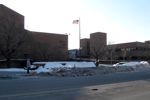
The Albany school district doesn't fare well in these rankings.
The state Department of Education released data about high school graduation rates this week. The statewide graduation rate for the 2005 cohort of students was 74 percent (that counts kids who finished up by August 2009).
We pulled out the stats from Capital Region school districts. As we mentioned last year, some of the results are sort of shocking. Sorted stats (including notes and qualifications) after the jump.
A tough year for local snowmen
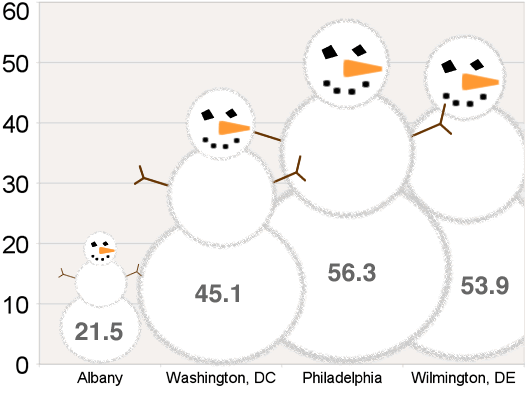
Even DC is beating us this year.
As cold as this winter's been at times, it has not been snowy. In fact, the Capital Region has gotten just 21.5 inches of snow this season -- that's off more than 18 inches from the usual total by this time of year.
But while we've been relatively snow-free, other parts of the East Coast have been in the middle of Snowmegeddon. So, indulging in a bit of wetterschadenfreude, we thought it would be fun to see how our snowfall totals stack up (or down) to these other normally not-so-snowy climes. (Yes, DC -- that's very unfortunate. Very.)
A few select cities are compared above in the snowman graph. More totals -- with normal totals -- after the jump.
By the way: we've actually noticed lately a few people lamenting the lack of snow this year. Gotta say we didn't see that coming.
Snow is forecasted for Wednesday...
Stacking up beer prices
So many choices...
Ahead of last year's Super Bowl, we checked a bunch of stores to see who had the lowest beer prices.
Well, this year's Super Bowl is just a few weeks away -- and you know what, we're feeling thirsty.
So let's go beer shopping...
The best way to get from Albany to NYC?
The Megabus wasn't an option the last time we did the math on this.
To New York City and back is a pretty common trip for people in the Capital Region. So... what's the fastest way? What's the cheapest? What's the best?
We ran the numbers almost two years ago -- but things change. So we did the math again, this time with even more detail.
The full breakdown after the jump.
The "intense" flu wave
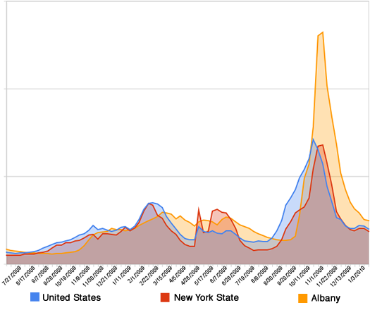
Much calmer now.
Google Flu Trends is now breaking out data for a bunch metro areas in the United States -- including the Capital Region. So we pulled the numbers for last flu season and the current one.
The graph above charts flu activity as measured by the Google Flu algorithm. The system characterized that late October peak as "intense" activity.
Google's formula is based on search activity, not actual reported lab or doctors' office data (it appears to do a pretty good job). The New York State Department of Health does track those reports -- and its data roughly match Google's.
Even though the current flu activity level is characterized as "low," it's still probably not a bad idea to get a flu shot. Influenza is hard to predict. This season could be over early -- or there might be another peak ahead. There's plenty of vaccine now available -- and a bunch of opportunities to get the jab.
Chart data from Google Flu Trends
How many cornings is that?
Temporarily overcome by the nerdy fun that is measuring things in cornings (that is, using the Corning Tower as a unit of measurement), we put together this handy meters/feet/cornings converter:
It might be more fun than it should be. For example, we just used it to figure out that Otto is .007 cornings from nose to tail.
The code for this calculator was adapted from Ada Shimar's cm/inch/feet converter at JavaScript Kit
New York's still #3
 New York is still the country's third most populous state, according to new estimates out from the Census Bureau (it's the last estimate before next year's census).
The Empire State was estimated to have 19,541,453 people in July 2009. That's .4 percent more than July 2008.
The bureau reports that population growth in many Sun Belt states slowed considerably during the past year (a demographer says the recession probably played role in the slowdown). That helped keep Florida behind New York at #4. The top two continued to be California and Texas.
The breakdown on New York's population growth last year (births, deaths, migration) is after the jump.
Earlier on AOA: Where's everybody going?
Turning of the tide?
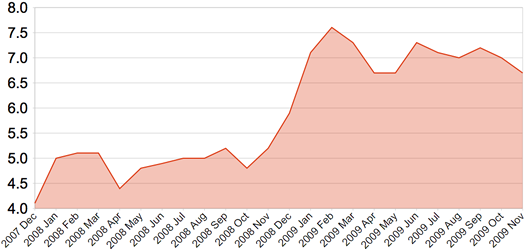
The Capital Region unemployment rate since the start of the recession.
The New York State Department of Labor today reported that the Capital Region's unemployment rate was 6.7 percent in November, down .3 percent compared to October. The rate was 5.3 percent in November 2008.*
The number that caught our eye this month was the raw number of people employed. The labor department reports that 419,900 people were employed in the Capital Region in November -- that's almost 11,000 fewer people with jobs than a year ago.
The state unemployment rate was 8.4 percent in November, down .3 percent from October (it was 6.1 percent in November 2008.) The national unemployment rate was 9.4 percent - down .1 percent from October (it was 6.5 percent a year ago).
* Capital Region data is not seasonally adjusted.
A lull in flu season?
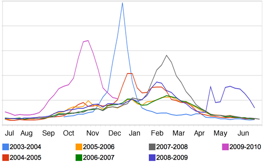
The last seven flu seasons in New York State
First updated Tuesday at 11:55 pm and then again Wednesday morning
The chart above depicts flu activity in New York State over the last seven flu seasons as measured by Google Flu. As you can see, this year's season got off to an unusually early start.
So, we're in the clear? Maybe.
It appears that the H1N1 wave has passed through the area. But if you dig through the surveillance reports from the CDC, you'll notice that almost all the samples that have been sub-typed are H1N1. This is the case both for New York's region and the nation as a whole.
What's that mean? Well, it could (emphasis on the could) mean that the "regular" flu season -- with its "typical" after-December peak -- is still ahead of us. (Or it might not -- the flu season in the southern hemisphere this year appeared to be mostly H1N1.)
So if you've been thinking about getting a flu shot, it's still probably a good idea.* That's true for the H1N1 jab, too (it's been so long since a flu virus similar to H1N1 has bounced around that most people don't have built-up immunity to it).
The feds have put together a flu shot locator for both seasonal and H1N1 shots (the box on the right). Albany County is giving free H1N1 shots through the end of the year by appointment (447-4505 to register). And also try your doctor for seasonal flu shots.
Update Wednesday morning
Saratoga County says it will start giving H1N1 shots to people not in priority groups starting January 1. [Saratogian]
Also: it looks some of the re-called doses of H1N1 vax did make it to the Capital Region. Schenectady County says 73 kids got the less-potent shots at its clinics. And Albany County says it got 200 doses, but didn't distribute them.
The shots, which were intended for kids, were recalled because tests indicated their potency had declined. [NYT]
* We are not doctors. Talk to your doctor.
chart data: Google Flu
A dossier on our crow invaders

Don't be fooled -- there's a lot going on in that bird brain.
Troy and Albany have resumed hostilities in the War on Crows. Anti-crow trucks are trolling through Albany this week firing off flares, lasers and amplified crow distress calls. And the crows appear ready to retaliate.
So if it's going to be like this, maybe we should understand our opponent a little bit better. Here are a few crow facts to keep in mind.
The best November ever?
 We heard someone say recently that this past November was "the best ever." And we would agree it was pretty great -- warm, sunny, snow-free. Downright autumnal.
So we were curious about the stats for this November. According to the National Weather Service...
+ The average temperature was 43.3 -- a little more than four degrees warmer than an average November.
+ The high temps were about five degrees warmer than usual.
+ There were 128 fewer heating degree days than normal.
+ It only rained on eight days (about four fewer than usual) -- and only two of the days got more than half an inch of rain.
The big difference this year was snowfall -- or, rather, the lack of snowfall. The NWS didn't record any snow last month. A typical November has about five inches.
By the way: We thought the first snowfall of the season hadn't occurred yet, but we were wrong. According to the NWS, the first flakes of the season -- just a trace -- fell on October 16.
People have been tweeting today about seeing snow. And this week's forecast includes a few days with a chance of snow.
Hello, December.
City, town or village?
Colonie Town Hall
After we posted Monday about Colonie being named the "safest" city in the country in an annual crime ranking, Jackers pointed out in the comments:
Colonie is not a city. There's a town, and a village, but no city.
He is, of course, correct. We would argue it doesn't make much difference in this context. The list ranks areas of local jurisdiction with populations larger than 75,000 -- it doesn't really matter what you call them (whether it makes sense to rank municipalities in this way is a whole other, worthwhile discussion). But substituting "municipality" for "city" would make the sentence more accurate.
This got us wondering about what exactly differentiates a city from a town in New York State. So we looked it up.
Sideways
The Capital Region's unemployment rate since the start of the recession.
The Capital Region's unemployment rate was 7 percent in October, according to NYS Department of Labor data released today. That's up from 4.9 percent during the same period last year. It's basically unchanged from last month.
The labor department reports that the number of nonfarm jobs has decreased by 12,100 (2.7 percent) and the number of private sector jobs has decreased by 9,200 (2.7 percent) in the region over the last year.
The Capital Region is still doing better than both the state and country as a whole. The overall unemployment rate for New York State was 9 percent in October (8 percent everywhere except NYC) and 10.2 percent for the US.
We've updated our 10-year graph of Capital Region unemployment -- it really gives you perspective on how unusual the current labor market is.
The federal government reported last month that the national economy has begun growing again (well, GDP has).
Job growth often lags GDP growth, though. During the last national recession, the Capital Region's unemployment rate didn't start falling until three months after the recession ended. The state labor department reported that NYS lost 15,300 non-farm jobs last month.
Capital Region school spending
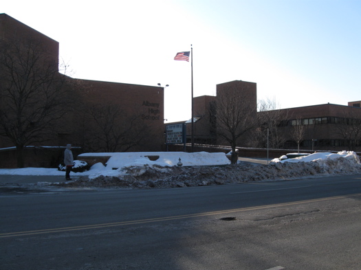
The Albany school district spent $22,628.36 per pupil in 2007-2008.
The Empire Center has added a school districts component to its SeeThroughNY web site/databse. From the site description:
This searchable database includes spending, debt and revenue levels of counties, cities, towns, villages and school districts throughout the Empire State, excluding only New York City. You can use this search form to find useful data for any single government or school district, to create categorical rankings statewide or by region, and to compare several entities to one another.
So we exported the school district data from the site and pulled all the entries for Capital Region districts. A chart is after the jump, along with a few quick notes and observations.
Stimulating statistics
New York State released a breakdown this week of federal stimulus funding per county. (The state has gotten $18 billion in stimulus money.) The state breakdown (xls) also includes how much money has gone to education, Medicaid, infrastructure, etc.
We thought it would be interesting to see how the slices for each of the four core counties of Capital Region compare per capita and per square mile.
| County | Total | Per Person | Per Sq Mile |
| Albany | $303.1 million | $1,048 | $579,541 |
| Rensselaer | $103.3 million | $665 | $158,436 |
| Saratoga | $89.8 million | $414 | $110,988 |
| Schenectady | $150.9 million | $997 | $739,706 |
We got population and area numbers from the US Census Bureau (the populations were from 2008 estimates). Numbers have been rounded.
After the jump, all the New York counties (plus NYC) ranked by federal stimulus funding per capita. Saratoga County is close to the bottom.
Capital Region job market still scuffling
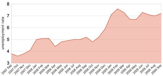
The last two years.
The Capital Region's unemployment rate was 7.2 percent last month, according to the state Department of Labor. That's up .2 percent from August -- and 2.1 percent from September 2008.
It's still better than both the state and the nation. The state's seasonally adjusted unemployment rate was 8.9 percent in September -- the same as August. The national rate was at 9.8 percent last month.
Earlier on AOA: A chart putting the Capital Region unemployment rate in a 10 year context (not good)
Chart data for the last two months from the NYS Department of Labor. Data for the other months is from the federal Bureau of Labor Statistics. The numbers are not seasonally adjusted.
On time, most of the time
A few interesting local bits from a Brookings Institution report out this week about air travel delays:
Arrivals
ALB was on pace for about 1.3 million arriving passengers this year. That's down more than 5 percent from last year and almost 6 percent from five years ago. But it's up 42 percent from 10 years ago.
On time
Arrivals at ALB were on pace this year to be on time 78.5 percent of the time. That ranks #54 among the top 100 metros. And it was just about even with the national average (78.9 percent)
Delays
The average time of delay for a late arrival was on track to be 54.2 minutes this year -- that ranks 37th best among the top 100 metros.
Brookings also figured out the top 10 air corridors linking to the Capital Region. That list is after the jump...
Flu season is here. Already.
 Flu activity in New York State is already at "high" levels, according to Google Flu Trends. That's a good month or two before it usually hits that mark. And Google's algorithm has the national level pegged even higher right now.
The CDC reports that New York's flu activity level is "regional" -- that's the second-highest level. Many parts of the country are already at "widespread."
It could be simple coincidence, but amid all the talk about the flu we noticed on a recent trip to the Colonie Target that the hand sanitizer section been pretty well picked over (photo on the right). And as Matt noticed, people are putting the stuff out there.
The American Lung Association maintains a listing of local flu shot clinics -- the Capital Region has a bunch scheduled. It might be easier to score a shot at a clinic than your doctor's office -- WNYT reported that some local practices are saying their shipments have been slow to arrive.
And if you're looking for an H1N1 shot -- that could be harder to come by. The Capital Region received its first shipments of that vax yesterday.
Update Thursday at 1:30 pm: the ASP reports that two cases of H1N1 have popped up at UAlbany this week. RPI and Sage have already reported cases this school year.
Where the federal recovery money is going
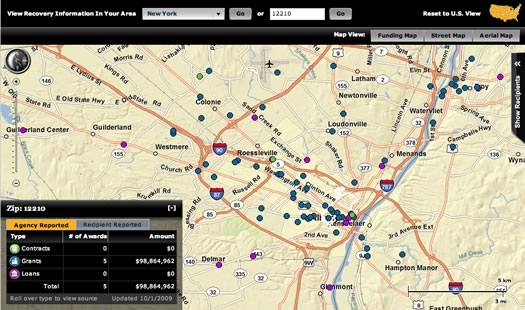
A screengrab from the Recovery.gov
Check it out: Recovery.gov -- the federal government's web site for "providing easy access to data related to Recovery Act spending" -- has a map function that lets you see where stimulus money is going locally.
As it happens, recovery money has ended up in a lot of spots in the Capital Region. Some of the places you'd probably expect -- some you might not. A few examples from dots on the map:
- HVCC - $3.3 million in grants through the Department of Education
- Web development firm Twin Technologies - a $700,000 loan from the Small Business Administration as part of a program that provides small businesses with financing they couldn't obtain in the private marketplace.
- Arizona Pizza in Clifton Park - a $950,000 loan from that same SBA program.
New York State's reported recovery money total is now more than $13 billion, according to the site.
(Thanks, Stephen!)
screengrab: Recovery.gov
A historically wet July
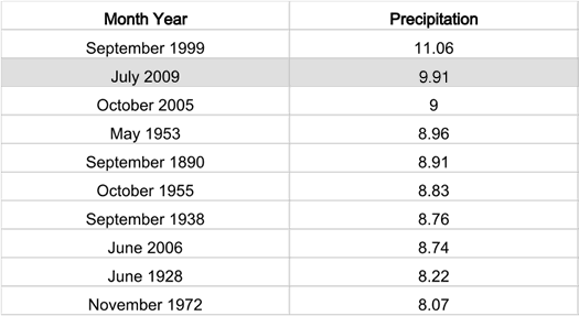
We're now finished talking about the weather.
Update! It's not official yet, but it looks this July will end up being the second wettest month on record in the Capital Region. This past July was the rainiest on record in the Capital Region.
Friday's deluge (2.42 inches) brought the month's total to 9.91 inches. Not only does that set the mark for the rainiest July -- it's also one of the wettest months ever recorded in the Capital Region.
July's total ranks #2 all-time on the list kept by the National Weather Service, which dates back to 1874. Though as commenter Rainman points out, there are records of a handful of even rainier months before that.
Earlier on AOA: A damp decade
(Thanks to jwk and Rainman.)
Data from National Weather Service. Records start in 1874.
A damp decade
 The seemingly constant rain this summer prompted us to look up whether July 2009 is shaping up to be a historically wet July. At 7.27 inches of rain so far (as of the end of Wednesday), we're more than 3 inches above the average -- but we're still not quite into the top 10 wettest Albany months on record. (We'd need another .75 inches or so to make the list.)
But we came across something interesting while looking up the numbers: a historically wet year has become common during this decade. Check it out...
Albany mayoral race: campaign expenditures
Apparently they're both fans of Dale Miller.
As promised, here are the sortable lists of expenditures for the campaigns of Jerry Jennings and Corey Ellis. If you see anything interesting or notable, please share in the comments.
We posted sortable lists of campaign contributors yesterday. (JVG noticed that DiCarlo's (the strip club) had made a contribution.)
We were able to break out these lists thanks to a package of campaign finance data put together by NYPIRG. That package, which includes data for candidates from Albany County, is available for download (it's an xls file). Thanks to NYPIRG for its help.
We've also put together a few notes based on the lists. They're also after the jump.
To the data...
Albany mayoral race: who's donating
Corey Ellis and Jerry Jennings
Thanks to to a major helping hand from NYPIRG, we've broken out the campaign contributors for the two leading candidates in the Albany mayoral race. Sortable lists after the jump.
Tomorrow we'll post lists of campaign expenditures.
NYPIRG provided AOA with a spreadsheet listing all the campaign contributions and expenditures for Albany County during the first half of 2009. If you'd like to check out that spreadsheet, we've posted it for downloading (it's an xls file).
Thanks to NYPIRG spreadsheet savant Bill Mahoney for his help.
On to the lists...
To the suburbs
Where did they go?
The Census Bureau recently released its breakdown of population estimates for 2008. And while it's interesting to see the bureau's best guess about how many people are living in a place right now (well, recently), we figured it'd be more interesting too look at the longer trends.
So we looked up the population stats over the last two decades for a bunch of Capital Region cities and towns.
To the data!
The story behind those red and white stickers
 For whatever reason we recently started noticing these stickers, like the one to the right, in the windows of strip malls around the Capital Region -- mostly in suburban areas (OK, fine... we kept noticing them while going to Five Guys). And we weren't quite sure what to make of them. Type of business? Association affiliation? A message to aliens?
So we asked around and did some research. Here's the answer...
Foxes and fishers and bears, oh my!
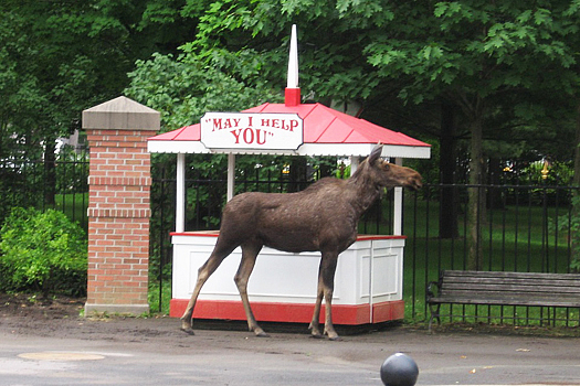
A moose at the Saratoga Race Course in June.
Where are the wild things? Lately, it seems the answer is here. And by here, we mean our backyard. And your backyard.
Over the last month, there have been moose sightings in Saratoga and East Greenbush, a bear spotted in Troy and reports of rabid foxes. Every few weeks someone drops into AOA to post a comment about a fisher sighting. And we seem to be hearing about coyotes a lot more, too.
So, what's going on? We called up Roland Kays, the mammal curator at the New York State Museum, for some answers. He studies urban wildlife.
Roland says some of these sightings are probably just part of the cycle of young animals heading out on their own for the first time. But he says there's a bigger story here, too: wild animals are moving into our neighborhoods. And that's a good thing.
Recommended mechanics listing and map
There were suggestions from all over the Capital Region
People posted a lot of good suggestions to last week's car mechanic question. There were so many good suggestions that we decided to collect them all in an easy-to-skim listing/map. Check it out -- if there's a way we can make it better, please share.
Thanks to everyone who posted a suggestion. And watch out for potholes.
Capital Region high school graduation rates
Albany High School has some room for improvement
The state Department of Education released data about high school graduation rates this week.
We picked through the data to pull out the relevant info about Capital Region schools. Some of the numbers are a little shocking.
Who has the best weather forecast?

Hmm... is this partly sunny or partly cloudy?
Weather forecasts are everywhere these days: TV, radio, the internet -- even those electronic billboards along I-90 now include forecasts. But how do you know that the forecast you're getting is any good?
There's only one way to find out who really gives the best forecast: put them to a head-to-head test.
Blame the Listerine?
 There was a weird -- and sad -- story in the TU today about a guy in Rensselaer County who failed a court-ordered sobriety test -- and his attorney blamed... Listerine.
The excuse apparently didn't go over well with the judge. And it seems laughable. But it got us wondering: is apparent-intoxification via mouthwash possible?
Hot in here
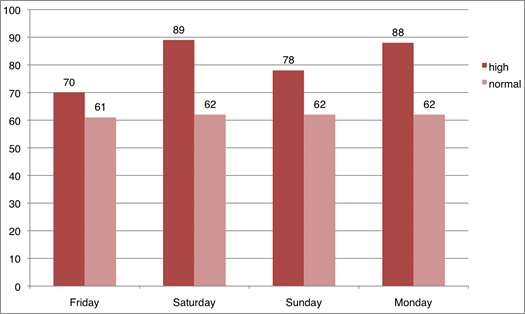
We'll leave it up to you about whether it's time to take off all your clothes.
So it's been a little warm in the Capital Region the last few days -- unusually warm, in fact.
The chart above lists the actual high temps from the last four days against the normal average high temps for those dates (data from the National Weather Service). We've been running 15-20 degrees warmer than a typical late April week. Saturday's high temp was a record.
Bonus weather nerdage: the National Weather Service has a year-long climate chart that tracks actual temps against the average.
Today looks like the last hot day for a while. After today's forecasted high of 86, we're looking at 64, 69, 70 and 63 as highs for the rest of the week.
Capital Region Wi-Fi Map
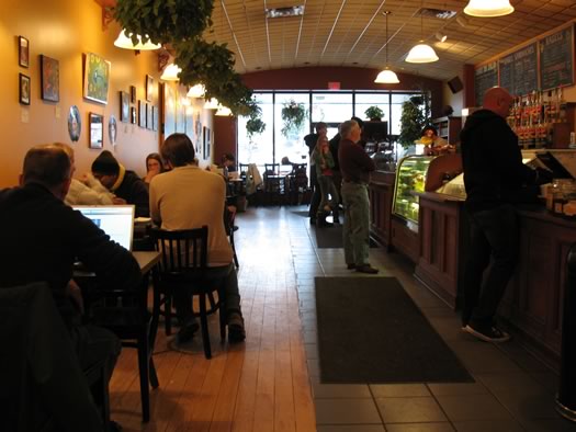
Our favorite wi-fi spot is Uncommon Grounds in Albany.
Check it out: we've put together a map and listing of free wi-fi spots around the Capital Region.
Know of a place we missed? Share in the comments please.
This is sort of a first draft of this map. If you have suggestions about how to make it better, we'd love to hear them.
Thanks to Liz Paola for her help in compiling this info.
Capital Region college tuition
Union's Nott the most expensive.
After hearing recently that the cost of attending both Skidmore and Union had crossed the $50k mark, we were curious about how the local colleges stack up when it comes to cost.
So, we looked it up. The list and a few notes are after the jump.
Blowing smoke into the budget gap
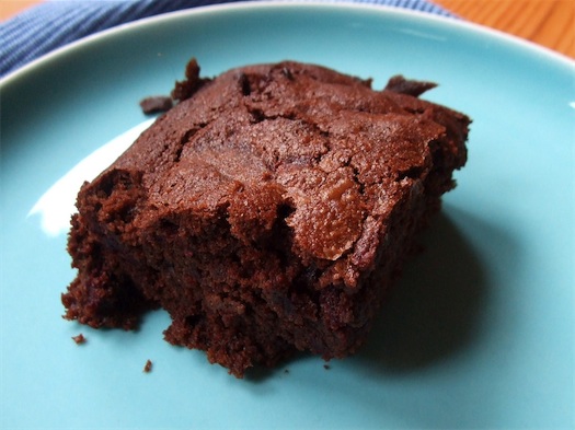
A new source of revenue for the state?
With New York State scraping to cover a seemingly ever-widening budget gap, state leaders have been exploring all sorts of options for new revenue. But here's one that, as far as we know, hasn't come up, yet: taxing marijuana.
Ha! That's a joke, right? Well, in California -- which is facing a $42 billion budget gap -- a state assemblyman has proposed doing just that. And by some estimates, the Golden State could bring in more than a billion dollars that way.
OK. If New York started taxing pot, how much could it bring in?
It's CSA sign-up time

You can get these -- and a lot of other great stuff -- from a local CSA
OK, yes, it's only March but it's not too early to start thinking about signing up for a CSA (community supported agriculture) farm share. In fact, now's the time the slots are filling up fast.
If you're not familiar with the CSA model, here's how it works: individuals or families sign up for a farm share through one of the many participating farms in the area. Then each week during the growing season, you'll be able to pick up a "share" of fresh produce, depending on what's in season.
Some farms focus solely on vegetables, while others include fruit, baked goods, eggs and even meat, depending on what type of program you're looking for. It's a great way to get lots of wonderful healthy food and support an area farm at the same time.
But how do you know which CSAs have what, how much they cost, and where to find them? The Web site localharvest.org has a thorough listing of CSA farms searchable by zip code and provides some of the basic details of what each farm provides.
Lucky for us, there are many CSA farms in the area, so AOA's put together a mini guide to several of the local CSAs to help you decide which share program would work best for you.
Yep, the job picture is not good right now
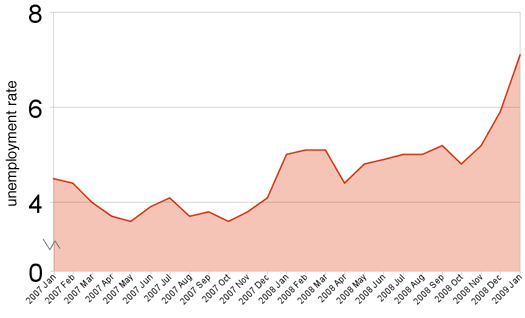
The last two years. (Data from NYS Dept of Labor)
The state Department of Labor released unemployment figures today -- and they were not good. "Flabbergasted" was the word used by the state labor commissioner.
The unemployment rate in the Albany-Schenectady-Troy metropolitan area was 7.1 percent in January. That's up from 5.9 percent in December and 5.1 percent last January.
The numbers appear a little worse than they might otherwise look because the labor department includes Schoharie County in the Capital Region's metro area -- and Schoharie's unemployment rate was 11.3 percent in January. The other counties were all between 6.7 (Albany and Saratoga) and 7.6 (Rensselaer).
Statewide, the unemployment rate was 7 percent. Nationally, it was 7.6 percent.
For some perspective, we've put together a 10 year chart of Capital Region unemployment. It really shows how far outside "normal" we are right now.
Supermarket Showdown II
Walmart was the champ last time.
A year ago we price-checked a "basket" of 40 items in an attempt to figure out which local supermarket chain has the lowest prices. Walmart came out on top -- it wasn't even close -- followed by Hannaford and then Price Chopper.
But, things change: prices go up, prices go down, economies go into recession.
So, this past weekend we checked the same basket again. Here's what we found...
Sick time
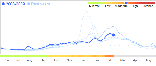
It looks like we're in the thick of this year's flu season. (Google Flu Trends)
We've noticed a lot of sniffling going on around us recently. And it seems like every third of fourth tweet we've read on Twitter from people around the Capital Region includes some reference to sickness.
Coincidence or has "the sick" really taken over?
What's the price of a little extra style?
People love these Spanish-style houses.
The TU looked at the backstory on the Spanish-style houses that are somewhat unexpectedly clustered on a few streets around Albany (Hansen, Woodlawn, Main, Rosemont, Greenway).
People seem to really love these houses -- and how could they not? They're stylish. They're cute. And judging from the few we've been through, they have some great (if small) spaces in them.
OK, so people dig these houses. But how much? Well, we can make something like an educated guess by running a few numbers.
Who has the best prices on beer?
It doesn't grow on trees you know.
Maybe you're rooting for the Steelers. Maybe you're rooting for the Cardinals. Maybe you don't so much -- you know -- care. But you will care if there's beer at the Super Bowl party.
According to the folks at the Beer Institute (yeah, there is such a thing) 3.5 percent of beer sales come from Super Bowl weekend. So how will you get the best bang for your beer buck this weekend? AOA went beer shopping to help you out. (Yay, beer shopping.)
Who has the best egg nog?
The nog lineup.
We got an email from Meagan last week:
Every holiday season, I find myself in an egg nog debate with a friend/coworker/stranger about who makes the best egg nog. My family and I are loyal fans of Stewart's egg nog (the premium one, not that "light" crap). I've always immediately dismissed anyone else's rebuttal. I have given a couple other egg nogs a try, and in my opinion, they were nowheres near as delish as Stewart's.
So you know what this means? Yeah, that's right: egg nog taste test!
Albany's biggest parking ticket scofflaws
Let three of these slip and the city considers you a scofflaw.
So when we were looking up info on the Albany Parking Ticket Amnesty, we noticed a link at the bottom of the Parking Violations page: "CITY OF ALBANY TOP 20 SCOFFLAWS." And what do you know, there are some people who really need amnesty.
The list is after the jump.
Does this count as "Indian Summer"
 It is unusually warm today -- like early Fall warm (the average high temp this time of year is around 50 degrees).
So does this count as "Indian Summer?"
Why there wasn't a line to vote

Obama had to have done better than Kerry here, right? Yes and no.
Despite all the talk about huge voter turnout across the country on Tuesday, we didn't notice especially long lines (or any lines, really) here in the Capital Region. Well, after taking a look at vote totals from this year and four years ago, it starts to make some sense.
In fact, the way the Capital Region voted this time around was kind of weird compared to the rest of the country. Let's take a look at the totals...
Snow days
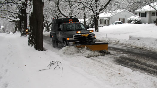
Let's hope we don't need the plows just yet.
The forecast for tonight includes the possibility of snow accumulation (and it's snowy big fluffy flakes as we post this). It's being described as "rare" and "early" snow.
OK, so when's a typical first snow around here?
How does pay-as-you-throw smell?
The Albany landfill is running out of space. In fact, it's expected to be full by the end of next year. The city has been trying to get the state DEC to approve an expansion of the facility, but the DEC bounced the first few proposals and said something along the lines of "Come on. You're not even trying."
So the latest draft proposal includes a few strategies for reducing the amount of garbage thrown into the landfill. Among them is something called "pay-as-you-throw." It's pretty much what is sounds like -- the more you throw out, the more you pay.
OK, so does that actually work? We went dumpster diving for answers.
Comparing Capital Region dry cleaners
Four shirts. Five stains.
So you spilled something on a dress shirt -- does it matter which cleaner you take it to? Will one place do a better job than another at getting the stain out?
We were curious if the cleaner made any difference. So we bought four identical white dress shirts, stained them with five different substances, and took one each to dry cleaners around the Capital Region.
New York is for neurotics
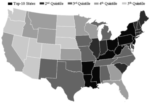
Hey, look, we're at the tip of the "anxiety, anger and guilt" belt.
A few months ago we posted a map that identified the NY/CT/MA area as a hot spot for neuroticism. Well, there's new research out this week that not only confirms that map, it conveniently ranks just how neurotic people in New York are (among other things) compared to people in other states.
Here's how New York stacks up against other states on each of the "Big Five" personality traits...
A (young) single guy isn't so hard to find here
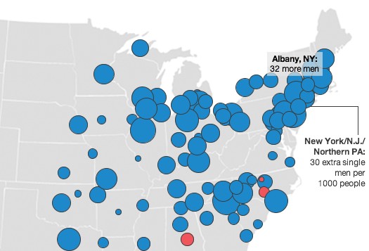
The relative numbers of single men and women 25-34 in the Northeast.
A while back, prompted by a map we saw, we looked at the relative numbers of single women to single men in the Capital Region. The bottom line was that things didn't look so great for single ladies looking for a guy here.
But, wait! There's a new, probably better, interpretation of the data. And things are looking up for the ladies!
Capital Region houses by the square foot
This house in Albany is currently listed at $399,000 -- that's $200/square foot.
Pretty much whenever you hear people talk about how much a house costs, the figure used is the total sale price. And that makes a lot of sense -- that's how much someone's going to be spending.
But another way to think about housing prices is the amount people are paying per square foot. When you break it down that way, it's a little easier to make comparisons between different houses and locations.
In fact, real estate agents do this all time. Sure, you won't usually see it on a house listing, but ask an agent and they'll almost always be able to tell you what a house's price is per square foot and what the average per-square-foot price is for the neighborhood.
We were kind of curious about how the different cities around the Capital Region stack up on per-square-foot house prices. And as it happens, Trulia -- a real estate site -- makes it easy to find out.
Here are how the towns rank, highest to lowest.
The best bang for your library buck
You're paying for all the good stuff in here. Whether you use it or not.
We're all about supporting authors and musicians and stimulating the economy when you can, but with prices going up on basics like fuel and food, it's harder to justify splurging on extras like movies, magazines or the latest best seller.
But here's the thing: we're all paying for that stuff already. Whether you live in Albany, Saratoga, Guilderland or Schenectady you're paying for these things with your library tax. And no, renting doesn't release you from paying library taxes. Your landlord just builds the tax into your rent.
So if you're paying this tax anyway, how can you make the most of your library tax dollars?
Which supermarket has the best deals?
Our last supermarket price check was so popular, we decided to give it another go. But to shake things up a bit this time around, we decided to find out which store has the best bargains.
So we picked a "basket" of 20 items that come in both name brand and store brand so we could find out how much we could save by going generic. And to make things a little more interesting, we tossed discount market Aldi into the mix. Here are the results...
How big is a scoop of ice cream?
After a few people posted comments about "underscooping" at Emack and Bolio's (the owner responds), we got curious about scoop size. And that prompted us to ask the question: when you walk into an ice cream shop and tell them to give you a scoop of ice cream, how much should you expect to get? Hmm. It probably depends, we thought.
So, we decided to collect some data. The AOA crew hit up five different ice cream shops yesterday and ordered one scoop of vanilla ice cream in a cup at each. Then we weighed those scoops with a digital food scale.
Who had the biggest scoop, the smallest, the most expensive, and much more subjectively -- the best tasting? Here's what we found...
Albany, where women put their college degrees to work... and don't sit in traffic
If you're a married woman with a college degree in the Capital Region, there's a good chance that you have a job outside the home. In fact, the chances are better here than pretty much any other place in the country.
A trio of researchers recently released a working paper (pdf) that looked at census data related to women and education for the top 50 metro areas (fine print). And according to this study, 80 percent of the women with a college degree in the Capital region were in the workforce. That ranked first among the 50 studied metro areas. The region ranked almost as high for women with a high school degree -- it was 5th.
A comparison with other cities over time -- and a little bit about why things shake out this way -- after the jump.
Yep, that is a lot of paper
 There was that story this week about how city council meetings in Saratoga Springs are going paperless. And as part of that story, one of the city commissioners mentioned that city hall uses 475 cubic feet of paper every year.
That sounded like a lot of paper to us, but really, how much is it? So we decided to measure that figure against something we could relate to. And this being Saratoga Springs, we picked the track. The result, with how we got it, after the jump.
How much is New York's gasoline tax?
After hearing about the most-likely-only-for-show debate going on in the state legislature over a "gas tax holiday," we wondered where New York State's gasoline tax ranks nationally. So, we looked it up. Here's the top 5, which -- surprise! -- includes the Empire State:
Does it pay to ride the bus?

Now that gas prices have reached "Are you frakking kidding me?" levels, we were curious to find out if you could save a few bucks by taking the bus to work. And the answer is yes, sort of, maybe, it depends.
Next stop: the details.
You have a long time to live
There's been some brow furrowing this week in the public health community after a study reported that life expectancies have actually started to go down in parts of the United States.
Thankfully, the Capital Region isn't one of those places. But how exactly does this area stack up when it comes to living a long life? We picked through the excel file so you don't have to...
No, really, a good (single) guy is hard to find
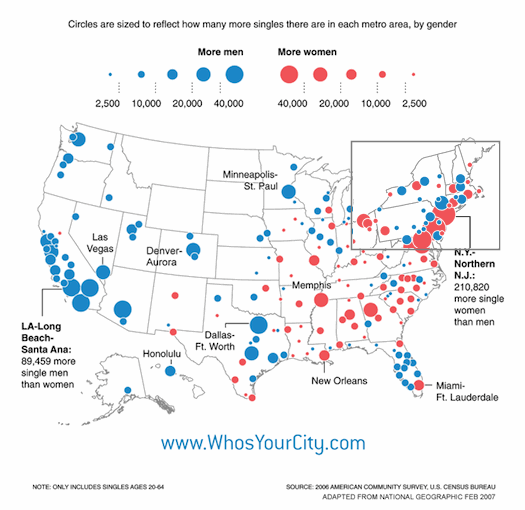
It's been said that a good man is hard to find. And while we're not in a position to comment on the quality of single men in the Capital Region, we can say this about the quantity: ladies, if you're looking for a single guy, the numbers are against you.
The map above, from Richard Florida's WhosYourCity.com, lists the relative counts of single men and women in cities around the nation. As you can see, there are quite a few more single women here than men. But how many exactly? We looked up the census data to find out.
Getting from Albany to New York City
Update! We ran the numbers in 2010 with updated figures and even more detail!
____
It's a pretty common trip for people in this area. But what's the fastest way? What's the cheapest? What's the best? We've done the math so you don't have to. The full details, including explanations, after the jump.
Hannaford milk mystery solved!
Who's Carl?
If you've ever bought milk at Hannaford, you might have noticed the person's name printed on the upper right part of the carton. It changes from week to week -- the last carton we bought said "CARL."
So, what's that about? Is the cow taking credit? (Unlikely. What sort of female cow would be named Carl?)
Well, we've finally gotten to the bottom of this mystery.
How walkable is your neighborhood?
There's this interesting site called Walk Score, which tries to assign walkability scores to neighborhoods. So, we decided to drop 10 Capital Region locations into the site. Here's how they ranked:
(Scale is 1 to 100, the larger number, the more walkable)
10. Guilderland: 25
9. Clifton Park, Clifton Park Center: 25
8. Ballston Spa: 63
7. Delmar, Four Corners: 69
6. Albany, uptown: 71
The top 5 after the jump...
Where has the Capital Region put its money in the presidential race?

AOA was curious about how much money people in the Capital Region have contributed to presidential campaigns. So, we looked up the data from the Federal Elections Commission and broke it down according to zip code groups (120, 121, 122, and so on) and candidates still left in the race (Clinton, Obama, McCain -- sorry, no Huckabee). Probably not surprisingly, the Capital Region has bet its money on Hillary...
Which supermarket has the lowest prices?
We were curious, so we decided to find out. AOA put together a "basket" of 40 items that we thought could reasonably end up in most shopping carts in any given week. Then we checked the prices of these items at Price Chopper, Wal-Mart and Hannaford. Here are the results:
... said KGB about Drawing: What's something that brought you joy this year?