
Poking at some numbers for New York school districts, graduation rates, and income
Two things (indirectly) prompted this post:
1. The discussion around that Miss Pearl question about moving out of Albany for the school district.
2. Another one of those school district rankings.
If anything, both of those items highlighted for us our desire to better understand what people are talking about when they talk about "the schools" -- and how factors such as income and poverty fit in.
So we pulled a whole bunch of numbers on New York State school districts -- specifically graduation rates, household income, and poverty rates -- and did some sifting. And we came across a few things we expected -- and few things we didn't.
Ingredients
This particular chart stew is made up of:
+ New York State school district graduation rates for 2012 -- that is, the 2008 cohort (plus a summer). Not included: New York City.
+ Census data from the American Community Survey 2012 5-year estimates for the median household income of families in these school districts with children younger than 18, and the poverty rate for children in these school districts.
+ Why 2012? The short explanation: That's the latest year for which the Census Bureau has estimates for all the districts in the state.
+ Also: a small handful of districts in the state were dropped from this look because one of the sources above lacked info for that district in some category. These were mostly small school districts.
Caveats
There are a bunch. First and foremost, this was a superficial look at some broad factors. And it would have been a lot better to put together many years of data from the different school districts. Also: The Census Bureau estimates are for all the people in the school district, which is going to include kids not actually in the schools -- and kids not in the cohort.
In other words, this doesn't necessarily mean much. If anything, it's just a prompt to keep thinking about what's involved.
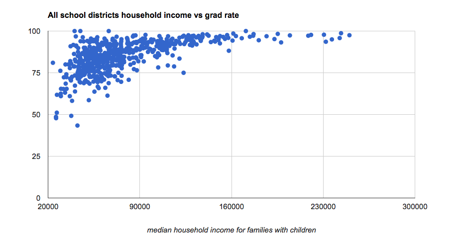
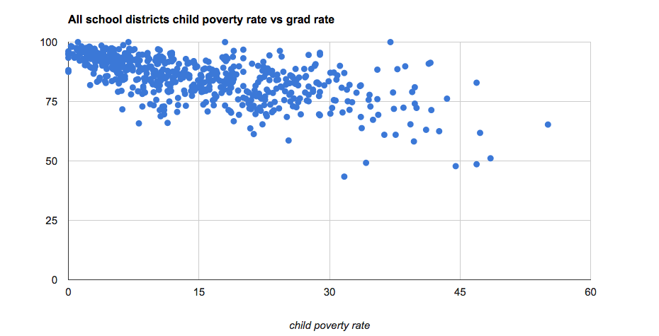
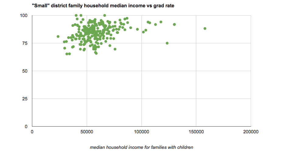
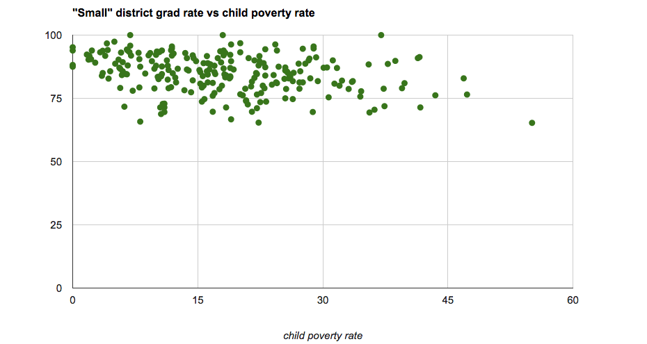
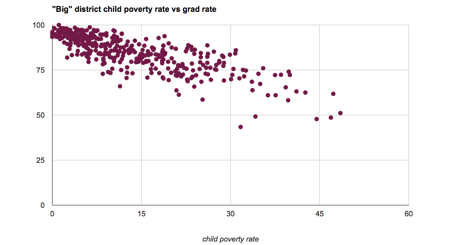
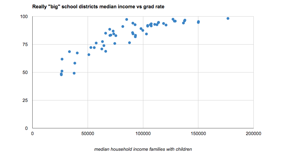
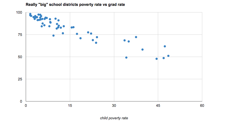
Charts
This post is basically a bunch of charts, plus a little bit of discussion. The charts are above in large format -- click or scroll all the way up.
A few things
And... we're back.
+ We had guessed that there would be some semblance of a pattern indicating some sort of relationship between graduation rates, income, and poverty across all sizes of districts. We were also wrong.
+ But it's maybe not so surprising that small districts wouldn't necessarily fit into a pattern. In a small group -- and some of these districts are very small -- a few people can shift the numbers a lot. Also: on the whole, the small districts have relatively high graduation rates.
+ Does that mean that small districts are better? That's an interesting question, one that is way beyond the scope of this crude look at things. (It also gets at one of the flaws in looking at things the way did: graduation rate is a blunt measure that doesn't really say a whole lot beyond some general sense about the education a student gets.)
+ If anything, seeing how things shook out in this look was a reminder to us that, when possible, it's usually best to compare like to like. And one way is size of the district. But there are more -- and probably better -- ways.
Capital Region
Here are the numbers for Capital Region districts. A reminder: these are from 2012.
Earlier on AOA: Capital Region high school graduation rates 2013
Hi there. Comments have been closed for this item. Still have something to say? Contact us.
Comments
Stop changing your vertical axis ranges. That's a rookie move.
Editors: You're right. That graph shouldn't be like that. We'll fix it. Thank you for pointing it out.
... said Jeremy on Oct 23, 2014 at 9:53 PM | link
It'd be nice to release the google spreadsheet(s) that you used to create these images. That way people could explore the data on their own and could mouseover to see which schools are performing better than we'd "expect".
... said Dan on Oct 24, 2014 at 8:42 AM | link
Why does the "capital region" stop at the Greene County line?
... said Randy on Oct 24, 2014 at 9:56 AM | link
Great charts--would like to use them in a newsletter. How would I get permission?
... said Bruce Fraser on Oct 24, 2014 at 11:21 AM | link
Another factor: how graduation rates are calculated. When people move in and out of districts, or transfer to private schools, some areas have a hard time maintaining that data so it doesn't affect their graduation rate. For example, if 20% of Albany freshmen transfer elsewhere before they graduate, and Albany doesn't know what happened to them because they use their resources for things other than paperwork, that lowers their published graduation rate by 20%.
... said Sarah on Oct 24, 2014 at 11:23 AM | link
@sarah This would only be true if the state lost track of these students. Albany doesnt necessarily need to know where they went. If the students show up at other schools and graduate, these students will get matched up with their state ids via the states data collection portal.
... said Paul on Oct 24, 2014 at 3:06 PM | link
So it appears that rich is better than poor, and small is better than huge.
It would be interesting to see disaggregated data for the urban school districts. I wonder what the graduation rates would be for subsamples of families in these districts with higher vs lower incomes. Probably not possible, but perhaps would highlight the relationship between school achievement and poverty, which is often missing from the discussions that are so quick to point out the deficiencies of the urban districts.
... said KM on Oct 25, 2014 at 9:10 AM | link
Do you have the data on classroom size? I.e. number of students.
... said matthew on Oct 25, 2014 at 7:02 PM | link
@KM I think you are right on the money and many activists have rightly claimed that this isn't a "school" issue, its a poverty issue (granted "poverty" is a broad term, which really covers a whole host of socio-economic issues that pull kids down from their true potential). Unfortunately, I don't think schools can track this stuff legally, or if they can, aren't there yet with specific intra-district data. However, in Albany at least, you can use the elementary schools as a proxy for highlighting the effects on poverty on student performance. Those schools in the "wealthy" sections of the city tend to do much better than those in the "poorer" sections. Its a shame, especially when you have families moving their wealth to the suburbs and exacerbating the issue because they look at one number (aka graduation rates), which is one of the worst indicators to use for your own student's performance.
... said Rich on Oct 26, 2014 at 5:51 AM | link