Capital Region rents

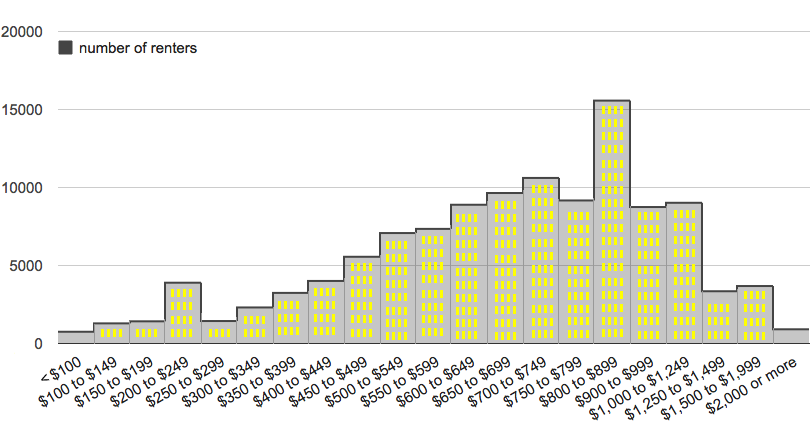
The distribution of rent prices in the Albany-Schenectady-Troy metro area in 2010, according to Census Bureau estimate. Here's a larger version.
After seeing that the Capital Region had one of the lowest apartment vacancy rates in the nation last year, we were curious about rents here -- how they're distributed and how they stack up against other metro areas. [Biz Review]
Bring on the charts and graphs...
The rent data we pulled are from the Census Bureau's 2010 American Community Survey estimates.
+ The median monthly rent in the Albany-Schenectady-Troy metro area in 2010 was estimated to be $710.
+ That ranked #112 among 525 metro/micro areas across the country. The highest was $1336 for the San Jose-Sunnyvale-Santa Clara, California metro area (that's Silicon Valley). The lowest (not in Puerto Rico) was the Opelousas-Eunice, Louisiana micro area at $312.
+ But a simple ranking of median rents doesn't necessarily give the best picture. To get a sense of how "affordable" the median rents were, we also ranked the metros by median monthly rent as a percentage of median yearly household income (xls). When we did that, the Albany-Schenectady-Troy metro ranked #275 -- indicating rents here maybe aren't so bad (if you have income around the median).
The #1 spot in the median rent/median household income ranking (among non Puerto Rico areas) was Key West, Florida. And Jefferson City, Missouri was in the very last spot.
And here's the Capital Region distribution of rents.
There's a larger version of the distribution chart embedded at the top of this page.
Earlier on AOA: Capital Region income distribution
Hi there. Comments have been closed for this item. Still have something to say? Contact us.
Comments
I'd be curious to see this normalized for apartment size.
... said Slacker on Feb 7, 2012 at 3:23 PM | link
Today I learned that I pay a lot of money for rent.
... said Bill on Feb 7, 2012 at 3:49 PM | link
@Slacker: That would be interesting. I was thinking about price per square foot -- or even by bedroom -- but I don't know where to grab that data (it'd be easier for home sales).
... said Greg on Feb 7, 2012 at 3:58 PM | link
Right, this is pretty useless if it doesn't consider anything beyond total rent cost.
Are those $0-300 renters reporting their split of a multi-occupant apartment? Are some of those at $800 and up possibly reporting the total rent of a multi-occupant apartment as their own (thus effectively double/triple counting in some cases)?
A breakdown by square footage or number of bedrooms would be nice, but even that doesn't tell the whole story. Square footage of a 3BR doesn't exactly tell you if the unit has huge bedrooms and relatively little common area or vice versa. What about amenities? Electric/heat included can mean a difference of hundreds of dollars a month. Washer/dryer, dishwasher, complex perks like gyms? And the condition of apartments in the area can vary pretty wildly, I think everyone I know who's ever apartment hunted has their own horror story.
Raises more questions than it answers, but that's not a bad thing.
... said B on Feb 7, 2012 at 4:10 PM | link
normalized for apartment size
There is some strange pricing going on. One can rent a 2 bedroom in our apartment complex for $800 but a much smaller 1 bedroom is $750. Other apartments in the area have similar pricing distortions.
I would rather rent half of the space we have for half of the price but it's not an option here.
... said Lu on Feb 7, 2012 at 4:14 PM | link
This is why so many rentals look like garbage in Albany... because there's no incentive for landlords to keep anything up due to demand being so high. It's up to the city government to start actively enforcing codes! The ugliness of the properties in Albany is a serious deterrent to further investment and has created a vicious cycle of slumlords profiteering while true capital improvement steers clear in favor of suburbs.
... said Ben on Feb 7, 2012 at 4:28 PM | link
The other issue in our area is the strongly segregated nature of the neighborhoods in the cities, with the majority-black areas being pretty cheap for rent, but also more problematic as far as quality of life and crime issues, with scary cops that we were wary of depending on (and who felt more like occupying troops from a hostile nation than community members). So, those cheaper rents may skew things unrealistically when you look at where most median income or above households would choose to live.
We moved up from a majority-black neighborhood in Brooklyn to the South End in Albany in the late 90's, and were really freaking depressed in short order with the whole scene, and when we had kids we gave up and moved to the sticks. Less hassle crime and dysfunction-wise, but more expensive due to transportation (two cars are necessary). We did manage to find some diversity, and the small town we live in has been very welcoming to my husband and kids despite it being majority white. Seems that education, social class and values, etc. matter more here than race did in our case, which was interesting.
... said Gina on Feb 7, 2012 at 4:38 PM | link
I'd be interested to see a price of rent vs location map, or even something like a heat-map of rent prices! yes, I am an oddball, but... somebody has to be! :) I guess I should learn some more about GIS integration with google maps or something... :(
... said Andy on Feb 7, 2012 at 4:52 PM | link
Very interesting data...our apt. rent of $810 is in the middle on this chart, but we are paying less than the average rent in our neighborhood (just west of Manning between Western & Washington) @Andy there is 2010 census data available for apartment rents by location. That's how I learned we were paying less than average rent for this neighborhood.
... said mock5turtle on Feb 7, 2012 at 9:54 PM | link
All I can say is, when I moved here, my rent came down by 40%. That's a lot of kale. (Yes, I came from larger and more expensive metro area, but...40%!)
So, when I decided to change jobs, I could absorb that 14% pay cut, which was something I could never have done before.
... said ajw93 on Feb 8, 2012 at 10:11 AM | link
Shenanigans!
The author used variable X increments to manipulate the visualization of the data. The increment at $800-$899 was changed to visually imply that that was the most common rent with 15570 people reporting it. If you do the same grouping for the other ranges you'll find that the other ranges are more frequent. Both $600s and $700s are more frequent than the $800s range. The end result is that this graph visually implies that the average rent in the Capital District is $100-$200 higher than it actually is. See the numbers below:
$000-$099 - 753
$100-$199 - 2712
$200-$299 - 5337
$300-$399 - 5555
$400-$499 - 9569
$500-$599 - 14427
$600-$699 - 18541
$700-$799 - 19782
$800-$899 - 15570
$900-$999 - 8748
I repeat.... Shenanigans!
... said Tim on Feb 8, 2012 at 11:08 AM | link
Good call Tim, hadn't noticed that. A graph with equal price ranges would be more "visually accurate"
... said Slacker on Feb 8, 2012 at 12:05 PM | link
Good call Tim!
I'm apartment hunting at the moment, so this was somewhat useful. I guess just because *I* don't want to pay more than $x doesn't mean it's realistic in this market. ::grumble::
... said Diana on Feb 8, 2012 at 2:18 PM | link