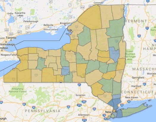
Life expectancy in New York State by county

New York counties by estimated life expectancy. Green is roughly the state average -- yellow below, blue above. (There are two clickable maps after the jump.)
Life expectancy at birth was a little more than 80.36 years in New York State in 2014, according to a new study out this week.
That was good for 6th best in the nation. And it's up 73.19 years in 1980.
Those estimates are from a study published in JAMA Internal Medicine this week looking at how life expectancy varies across counties in United States. And as the researchers reported, there was wide variation -- some 20 years of difference between the high and low ends.
Here's a good interactive map of the numbers. And here are a few articles in the popular press about the overall study -- at FiveThirtyEight and The Atlantic.
New York counties didn't exhibit such a wide range, but there were some differences.
The difference between the New York county with the highest life expectancy -- Rockland, at 82.54 years -- and the lowest -- Sullivan, at 78.03 years -- was a little more than 4.5 years. Here's how the Capital Region core stacked up (state county rank):
+ Albany: 80.07 (18)
+ Rensselaer: 78.78 (49)
+ Saratoga: 81 (7)
+ Schenectady: 79.51 (30)
The authors of the JAMA paper report that the differences in counties across the nation can be explained by socioeconomic and race factors, behavior, and (to a lesser extent) health care differences.
So it's not really surprising to see which counties around New York ranked the highest for life expectancy: Manhattan, the NYC suburbs, Saratoga, Tompkins (Ithaca) -- all places that have generally done well economically in recent years.
Maps
The numbers for the New York counties are rolled into a couple of clickable maps at the top in large format -- click or scroll all the way up.
Earlier
+ Saratoga County ranked as the "healthiest" county in New York State
Say Something!
We'd really like you to take part in the conversation here at All Over Albany. But we do have a few rules here. Don't worry, they're easy. The first: be kind. The second: treat everyone else with the same respect you'd like to see in return. Cool? Great, post away. Comments are moderated so it might take a little while for your comment to show up. Thanks for being patient.
Comments
I'd love to see the information further broken down by income level. I remember seeing some data that life expectancy is actually trending down for lower income Americans while those at higher incomes continue to rise.
And maybe some comparison with a country with universal healthcare, maybe say Canada or Australia?
... said Sean on May 10, 2017 at 3:53 PM | link