Another look at Capital Region income distribution
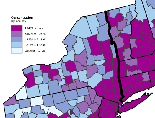
Clipped from a Census Bureau map of the concentration of high-income households by county.
Updated
The Census Bureau released a breakdown of high-income households this week. It defined "high income" as households with income in the top 5 percent of the nation -- $191,469 and higher.
The report only ranked the top-50 largest metro areas (by population), so the Albany metro didn't get its percentage of high-income households listed. But the Washington Post has the county-by-county data, along with an interactive map -- five percent of households in Albany and Saratoga counties are in the high-income category, four percent in Schenectady County, and three percent in Rensselaer County. (WP has more info.)
And by the way: the lower limit for the top five percent of households by income in the Albany metro area is $184,514.
Anyway, we thought this would be a good time to look at income distribution in this area again. We did that in 2011, and there's some updated data now. And we've also pulled together some other numbers that we hope will provide a bit more context.
And, yep, if you just want to see where your household ranks -- there's a quick chart to do that, too...
Before we dive in
The Census Bureau report mentioned above uses data from the 2011 American Community Survey 5-year estimates, so we did the same. The ACS isn't a comprehensive count like the decennial census, so the numbers it produces are estimates. And as you narrow the field -- like, say, to one group of people in one metro area -- you start to get rather large margins of error. It's something to keep in mind while looking over these numbers.
Also, the Census publishes the household income data in ranges, and the ranges aren't all the same size. Some of the bands are $5k "wide" and others are $10k (or a lot more). So that limits how fine-grained we can get about some of this (we don't know about the income distribution within bands) -- and why we have seemingly weird percentile ranks. (It also prevents us from making a simple distribution graph.)
And just to reiterate, these are household incomes -- and in many households have income from more than one adult. (For example: in the Capital Region, roughly 47 percent of households are married couples.)
Some of these numbers -- like the percentile ranks -- have been rounded.
The numbers
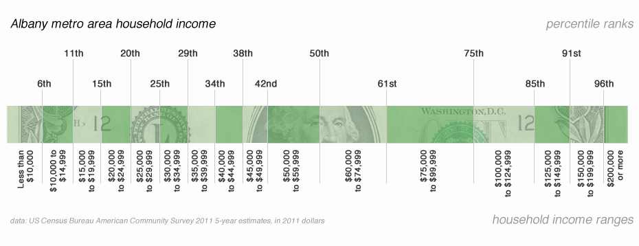
Percentiles
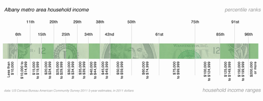
Don't squint -- there's a large format version above.
The percentile ranks are based on the upper end of each range. What does that mean? Each division line is marked with a rank (6th, 11th, and so on) that represents what percentage of all the households is below that level of income. Or, to put it another way, the upper end of the $50k-$59,999k range is ranked at the 50th percentile -- that means a household making $59,999k has more income than 50 percent of the households in the Capital Region. (As it happens the median household income for the Capital Region -- the point at which half the households make more and half make less -- is $59,339, according to the Census estimates.)
Some context
To add some context, we pulled the numbers for the median household income for a bunch of different types of households -- people with kids, single parents, a few different ethnicities, and so on. We also included -- just for some perspective -- the median income for individuals in this area by education.
These figures highlight that there are some significant disparities in the Capital Region. For example: there's a wide gap between the median household income of white and African-American households. And the median for households headed by single women with kids ranks in the bottom quarter for the Capital Region distribution.
A few things
+ Everybody seems to have their own definition of what it means to be middle class, but let's just say it's the middle 50 percent of households. In the Capital Region, based on these estimates, that means households making between $25,000 and $100,000.
+ Here's the thing about that definition -- it's a very wide range. And as we've mentioned before, the number of people in your household makes a big difference. A single person making $25,000 a year is probably just hanging on -- but a family making that is right on the border of the official poverty line. (And whatever the official line is, we would argue they're in actual poverty.)
+ The median incomes for individuals by education highlight how important school can be. And it's another indication why people keep shelling out for college -- despite how dramatically the price has increased over the last few decades.
+ We didn't include it in the charts above because it's a different sort of number, but a person making minimum wage would make $15,080 in a year (that's 40 hours a week, 52 weeks, no adjustments for taxes or credits). That would land them just about in the 11th percentile for this area.
If the minimum wage increases to $9/hour, as Barack Obama proposed in the State of the Union, that would increase to $18,720. (And, of course, this topic is also circulating in the New York legislature.)
+ Here's the link to the basic household income data from the Census, for the ACS 5-year estimates (2007-2011).
+ And, again, here's the breakdown from 2011 -- it used a different sort of estimate, so comparing it to this new breakdown is like comparing oranges and tangerines.
map clipped from "The Geographic Concentration of High-Income Households: 2007-2011," US Census Bureau
Say Something!
We'd really like you to take part in the conversation here at All Over Albany. But we do have a few rules here. Don't worry, they're easy. The first: be kind. The second: treat everyone else with the same respect you'd like to see in return. Cool? Great, post away. Comments are moderated so it might take a little while for your comment to show up. Thanks for being patient.
Comments
A range of $25,000-$100,000 to be considered middle class goes to show how meaningless that term is. Just like the "99%" takes in too wide a range of economic realities. An individual or family trying to scrape by on $25,000 in this area is living an entirely different life than households bringing in $100,000, with the opportunities that kind of money brings.
And note -- the Capital Region is going as well as it is (the big chunk of households between $50,000-$125,000) thanks to unionized state work.
... said chrisck on Feb 14, 2013 at 10:28 AM | link
As a follow-up to yesterday's thread on AOA's 5th anniversary, I believe posts like this are the absolute best thing about AOA. This site is the best journalism in the region, hands down.
... said Erin T on Feb 14, 2013 at 10:58 AM | link
Nice work AOA, this is exactly the type of reporting that makes me a loyal reader of this site. Some of our other local "news outlets" should pay attention. Keep up the good work!
... said Josh on Feb 14, 2013 at 2:02 PM | link