New set of renderings for the Schenectady casino

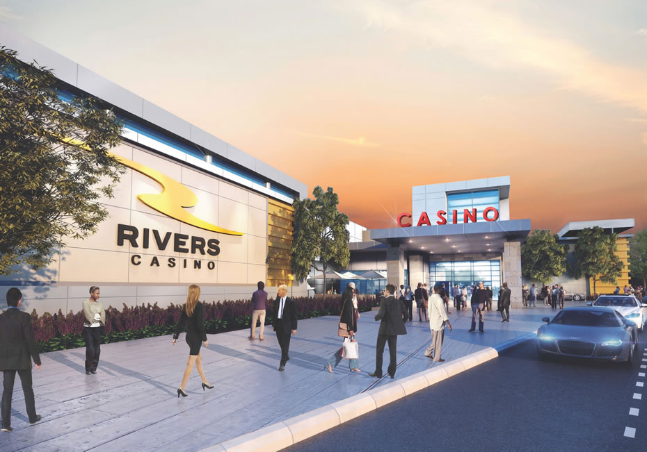
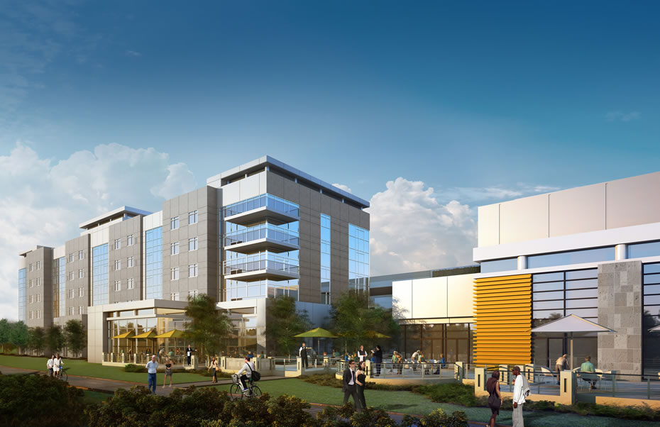
The backers of the Rivers Casino & Resort project at Mohawk Harbor in Schenectady released a new set of renderings for the project today. If you'd like gawk, they're after the jump.
The exterior look of the venue has been a point of discussion over the past year as the design shifted from the sleek look white panels and glass in the original proposal, to a more factory-like red/orange brick, and then after criticism from the public, back to something more like the first design. The exterior renderings released today look like those version 3 rendering from last summer.
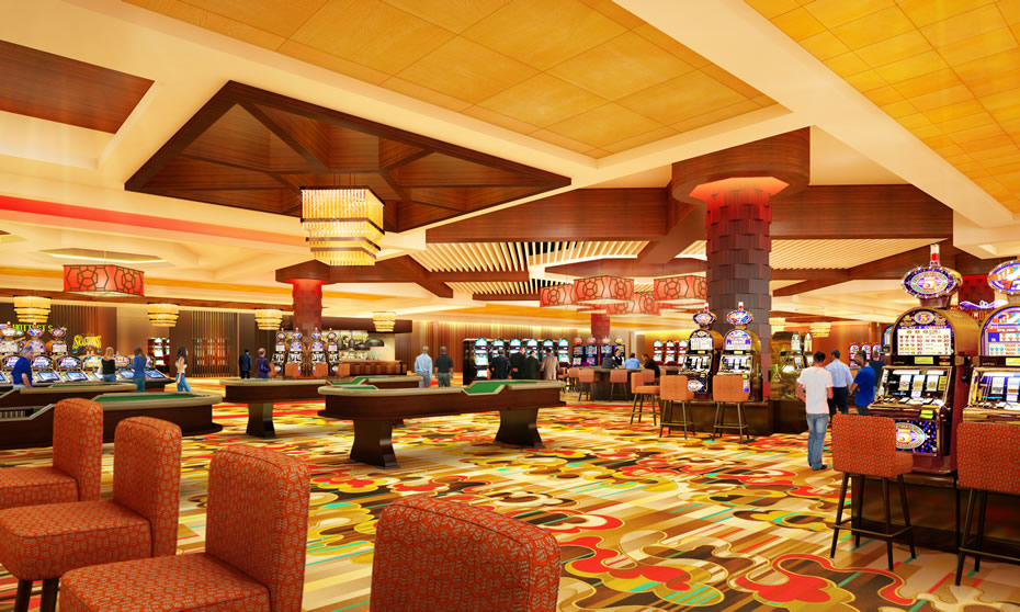
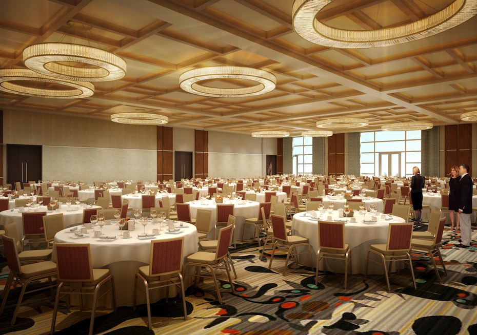
Today's package of renderings also includes a few interior scenes. And they look like, well, a casino. There's also a look at the casino's "events center," which very much looks like a convention center ballroom.
The casino is currently projected to open in the first quarter of of 2017. [Biz Review]
Photos
Look up, they're above in large format -- click or scroll all the way up.
Say Something!
We'd really like you to take part in the conversation here at All Over Albany. But we do have a few rules here. Don't worry, they're easy. The first: be kind. The second: treat everyone else with the same respect you'd like to see in return. Cool? Great, post away. Comments are moderated so it might take a little while for your comment to show up. Thanks for being patient.


Comments
Garish and awful, right down the line. The people of Schenectady deserve better. The Mohawk River deserves better. Compulsive gamblers and alcoholics across the Northeast deserve better.
And a little old nuclear reactor right next door. How could they make this project worse?
... said Dot Beech on Mar 16, 2016 at 5:39 PM | link
@Dot Beech
What exactly do you expect a casino to look like? They are generally pretty gaudy.
At least the exterior is an improvement over the factory look they tried changing it to early last year.
... said Kman518 on Mar 17, 2016 at 11:19 AM | link
But will there be a roulette table?
... said Andrew on Mar 17, 2016 at 11:36 AM | link
Think of how great it will look filled with eager players looking for a big score!
... said Rob on Mar 17, 2016 at 12:10 PM | link
So, it looks like every other casino on the planet? Shocker.
The whole project is a disappointment. From the nearsightedness of the Schenectady campaign to the backhandedness of the "revised" aesthetic plans, it has been a mess since the beginning. While I appreciate the efforts to create some buzz for the Electric City, casino projects have never brought a sustainable development trend to any area, only a shirt-term blitz of consumerism. This casino will look old in 5 years, just about the same time that the impact will become non-existent.
... said Pauly on Mar 17, 2016 at 9:55 PM | link
Wow, could it be more glaring, and BLEH!
How about making it look classier.
Bring in the blue, pink, and purple haired little old ladies with their walkers, and depends.
The high rollers have left the country & and are on the net!
... said mg on Mar 18, 2016 at 11:20 PM | link
That casino will be dead in six months a year. This area just doesn't have the population to support it and there are plenty of casinos in the places this one could draw from. New York missed the casino boat by decades.
... said Franny Wentzel on Sep 30, 2016 at 12:46 AM | link