Local areas of interest (so say Google Maps)
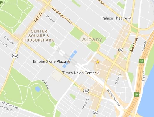
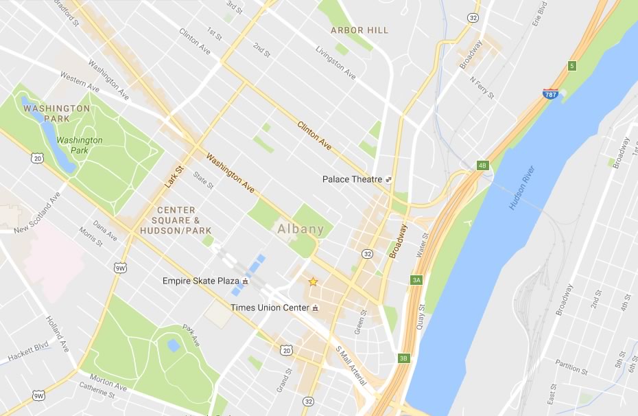
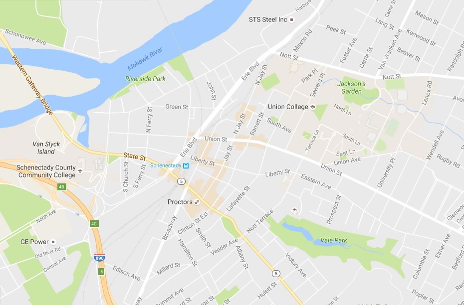
The peach or melon-colored areas are Google's algorithmically-designated "areas of interest" for downtown Albany. (Also: That's either a typo in the place label for the ESP, or someone's having some fun...)
Google recently rolled out a new version of Google Maps and one of the features is an "areas of interest" function that automatically highlights areas that Google thinks would be, well, generally interesting to people. From the official Google Maps blog:
The cleaner canvas also lets us show local information in entirely new ways. As you explore the new map, you'll notice areas shaded in orange representing "areas of interest"--places where there's a lot of activities and things to do. To find an "area of interest" just open Google Maps and look around you. When you've found an orange-shaded area, zoom in to see more details about each venue and tap one for more info. Whether you're looking for a hotel in a hot spot or just trying to determine which way to go after exiting the subway in a new place, "areas of interest" will help you find what you're looking for with just a couple swipes and a zoom.
We determine "areas of interest" with an algorithmic process that allows us to highlight the areas with the highest concentration of restaurants, bars and shops. In high-density areas like NYC, we use a human touch to make sure we're showing the most active areas.
Over at City Lab, Laura Bliss takes a skeptical look at the new feature and wonders whether it might be overlooking areas that are low-income yet otherwise vibrant corridors. (And we'd add: Even though Google's using "an algorithmic process" for this feature, skepticism is still healthy -- just because something is algorithmic doesn't mean it can't be biased or incomplete. (Critiquing algorithms will be a big, recurring issue in the future.)
So, we were curious what this new maps feature "said" about the Capital Region, so we had a look around the virtual area. And two things struck us:
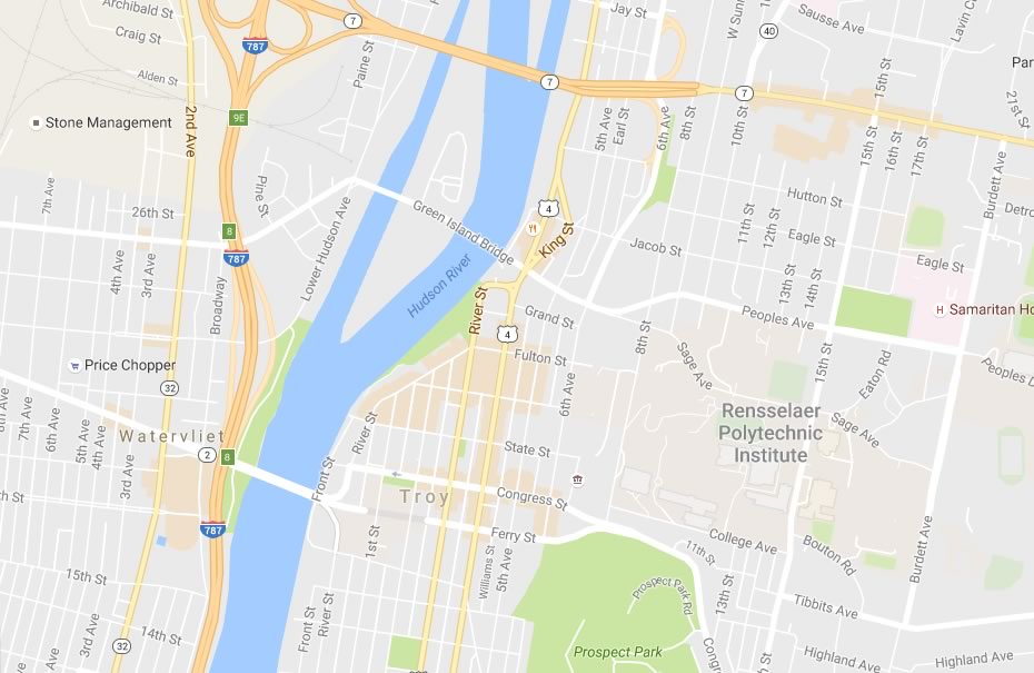
1. It appears to do a relatively OK job of identifying some of the small, neighborhood commercial hot spots, like the area right around the Schuyler Bakery in Watervliet. (There are some exceptions, and you'll no doubt spot some, too.)
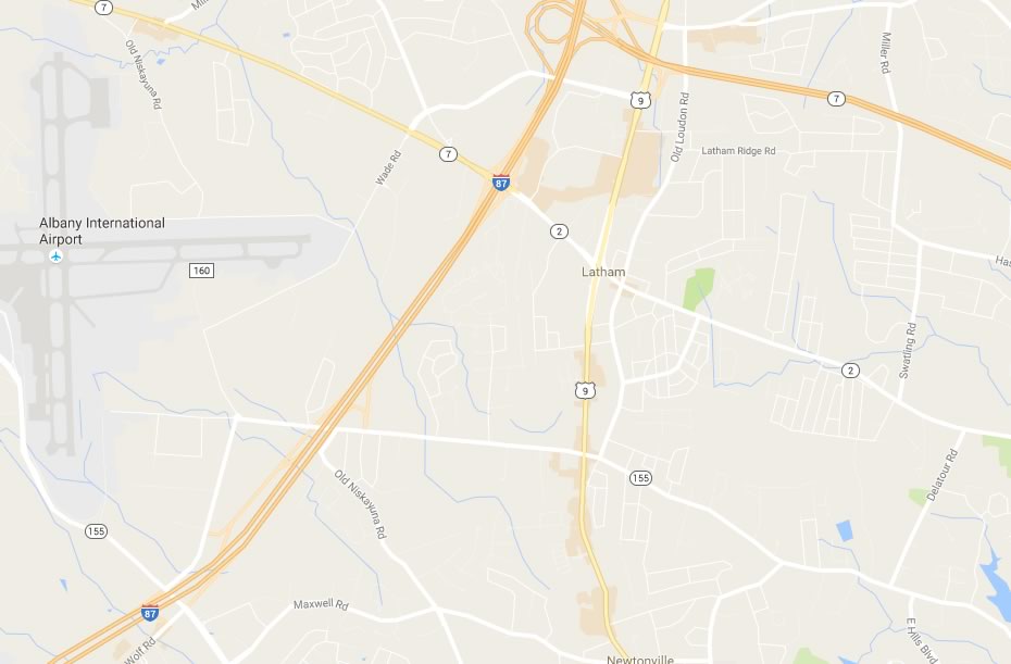
2. If anything, the way the algorithm treats this region appears to be a bit slanted toward denser, urban areas. It actually seems to overlook a lot of stuff in suburban areas, even high-traffic spots like Latham.
Maybe in the future people will be lobbying Google to be considered "of interest." (Though, really, that's not much different from the current state of things.)
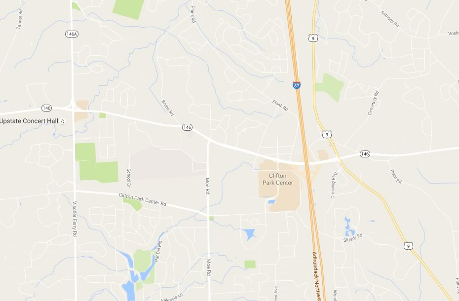
Anyway, we screengrabbed a handful of spots from around the Capital Region for easy comparison of the Google Maps-designated areas of interest.
Look up
The screengrabs are in large format above -- click or scroll all the way up.
____
Earlier on AOA: What "they" say about here
Hi there. Comments have been closed for this item. Still have something to say? Contact us.

Comments
Some pretty weird stuff going on here.
In Albany, what makes the entire block between S. Pearl and Grand that contains nothing but the South Mall Towers Apartments "of interest"? Likewise the parking
lot across Grand St and the private access parking lot under the South Mall Arterial?
In Clifton Park, why is the shopping district off 146 on the west side, mislabeled as Clifton Park Center, of the Northway "of interest", but the very similar shopping and restaurant areas along The Crossings Blvd. and along Rt. 9 are not? (Clifton Park Center is just one part of the larger area with that label.)
Also, it turns out that if you zoom in close enough, many of those "of interest" areas, like the South Mall Towers, turn out to no longer be "of interest."
It's an interesting concept, but clearly needs more work.
... said chezjake on Aug 5, 2016 at 11:40 AM | link
Was there no room on your Albany map for the DelSo area?
... said Nancy on Aug 8, 2016 at 4:31 PM | link
Also, it turns out that if you zoom in close enough, many of those "of interest" areas, like the South Mall Towers, turn out to no longer be "of interest."
Combination of heuristics and GIS. Different features on digital maps are tagged to display at different scales, it's the same reason you see Albany labeled but not Rensselear at certain zoom levels. On a small scale you can see exactly what GMaps is picking up, to use your first example, restaurants and shops near Pearl & Madison. Maybe not ones of interest to you but Google thinks they're of interest to someone (and if you ever walk around there you can see they are clearly of interest to plenty of someones). If anything they missed shading the african american cultural center on that corner.
So, in order to display cleanly and so you can actually see the shaded areas (it's such a light shade that, broken up, small areas easily disappear), there's some kind of heuristic that merges the individual sites together into the "area". I mean, clearly they're not saying "everything on this block is interesting", just that there are several sites of interest in that area. It seems to work well and shows the intent quite obviously as you zoom in and out.
... said -B on Aug 9, 2016 at 8:46 AM | link