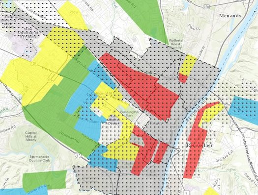
Maps that still echo today

Here's a bit of a follow-up to the piece by Ann Pfau and David Hochfelder -- of 98 Acres in Albany -- from earlier this year about the history of the federal maps that "redlined" the city of Albany (and many other places) during the 1930s. Those maps helped shape lending practices for decades, decisions that contributed to patterns of disinvestment across neighborhoods.
One of the things that's striking about looking at those old maps is how the divisions drawn then still roughly represent sections of the city today.
A mapping project by an org called the National Community Reinvestment Coalition that merges the old federal Home Owners' Loan Corporation maps with modern census data related to income and race makes those patterns even more clear.
That's a clip above from NCRC's interactive map showing the city of Albany. The red and yellow areas were the sections assigned the lowest grades on the 1930s map. The gray areas are tracts in which modern populations are more than 50 percent minorities. And the dotted areas are where the median family income is less than 80 percent the area median.
Here are the maps for Schenectady and Troy.
[via Next City]
... said KGB about Drawing: What's something that brought you joy this year?