The presidential vote, district by district
Of course, such maps show area, not population. Some of those wide spaces between urban areas have relatively few people. Hillary Clinton ended up taking New York State 58-37 over Donald Trump
A link follow-up of sorts to the stuff about how populations are changing around New York State and the urban/rural split...
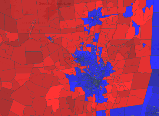
That map above is a clip of how Capital Region election districts voted in the last presidential election. It's from a larger national map by Ryne Rohla at Election Desk that aggregates the results from virtually all of the nation's election precincts.*
One of the things that sticks out when looking over New York State on the map is how stark the urban/rural split was between districts that went for Hillary Clinton versus Donald Trump. That's not all that surprising -- it's not a new pattern, as Rohla's map also shows for 2012. But the pattern appears to have intensified in this past election.
Another interesting bit: The Rohla map also shows which direction districts shifted between 2012 and 2016. And the way things shook out in the Capital Region core is kind of surprising. Even in such Democratic strongholds as the city of Albany, there were districts that shifted toward Trump.
(* We had thought about doing something similar for New York State, but the challenge of pulling together the necessary election data and map files for all 62 counties in the state seemed too daunting. For someone to do this for the entire nation is crazypants dedicated/ambitious.)
Earlier on AOA:
+ Another look at New York State's population change, this time along the urban/rural split
+ Clickable county by county results for 2016 presidential election in New York State
... said KGB about Drawing: What's something that brought you joy this year?