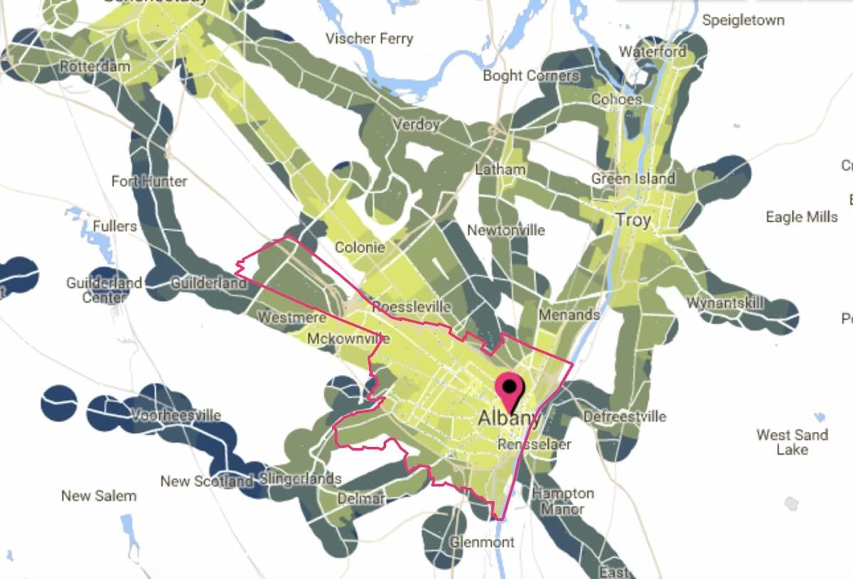
A transit-centric map of the Capital Region

Here's a follow-up of sorts to yesterday's post about the Capital Region's relatively low levels of traffic congestion, commuting, and planning for how to get around in the future.
An org called the Center for Neighborhood Technology has an online app called AllTransit that maps access to transit and jobs for locations.* It also digests all those bits into scores so they can be compared.
Here's the profile for the city of Albany, which scored a 7.8 -- "Very good combination of trips per week and number of jobs accessible enabling many people to take transit to work." (For some comparison, Colonie scores a 4.4 and Bethlehem a 2.5.)
One of the things that's interesting about this tool is the way it sort of creates what we sort of think of as as a topographic map of access-to-transit around the area. There are a handful of really high points -- the hearts of Albany, Schenectady, and Troy primarily -- and things slope downward from there.
*We could have sworn we mentioned this tool before, but couldn't find it while rummaging through the archive. It's probably all the way in the back of the cabinet, unopened, with the expiration date on the jar past.
(Thanks, Jen!)
Earlier:
+ The Capital Region's transit arteries
+ The potential impact of bus rapid transit
+ A brief (alternate) history of the Capital Region's much-admired light rail system
Say Something!
We'd really like you to take part in the conversation here at All Over Albany. But we do have a few rules here. Don't worry, they're easy. The first: be kind. The second: treat everyone else with the same respect you'd like to see in return. Cool? Great, post away. Comments are moderated so it might take a little while for your comment to show up. Thanks for being patient.
Comments
It's almost as if there's a relationship between density and transit. What could it be?
... said Herbert on Feb 7, 2018 at 1:10 PM | link