Six not-boring parking garages
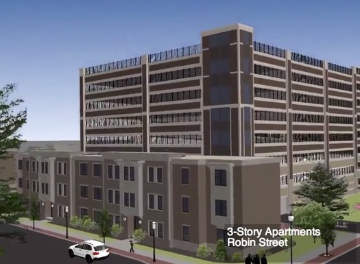
Probably not as creative as it could be.
There's been a lot of focus recently on the proposed parking garage for the Park South redevelopment in Albany. Much of the talk has been about the fact that the garage is, well, enormous relative to structures around it, prompting concerns that it's out of scale. Also: The thing just kind of looks boring.
So we thought we'd look around for not-boring parking garages. Many of the designs we found would be impractical for Park South -- because of setting, cost, or whatever -- but we thought it'd be interesting to see a wide variety of approaches to the problem of making a parking garage that's useful, appropriate to its surroundings, and visually appealing.
Here are six examples from other cities that caught our eye...
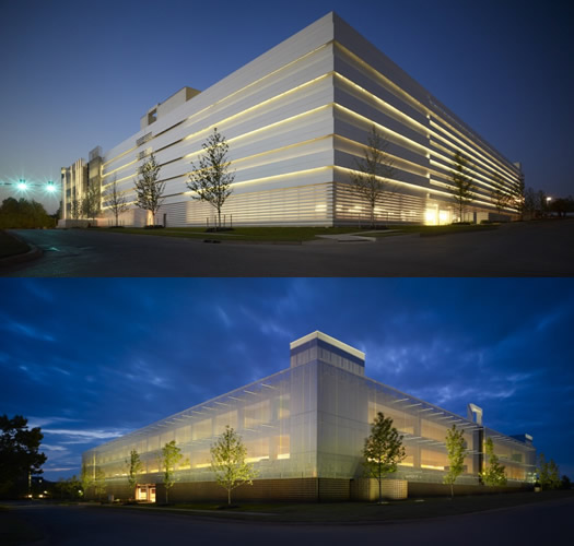
Chesapeake Car Park One and Two - Oklahoma City
Architect: Elliott + Associates Architects
AOA coment: Man, these things are sleek. Between the long, smooth lines and the screens and the white color they look like an Apple device.
More about this project: Elliott + Associates were aiming to "reinvent the parking garage experience" so that the project would move beyond the typical "dark, dirty, low, confusing and oil spotted" experience of a parking garage. [Arch Daily]
photo via Elliott + Associates Architects website
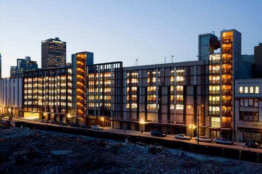
Cordova Parkades - Vancouver
Architect: Henriquez Partners Architects
AOA comment: This garage is a redevelopment completed in 2004 -- it had previously been a parking structure for an old department store -- in a historic urban neighborhood of Vancouver. It's interesting to us how the design looks more like a regular streetscape than a parking garage. From the firm's website:
Sensitive to the area's turn-of-the century surroundings, but due to the lack of 19th-century models of parking structures, Henriquez Partners' design intent was to develop a modern architectural vernacular drawing inspiration from the heritage context. Retail uses at grade are located at the Water Street Parkade to stimulate street-level activity and new office space inserted into the front of the existing structure provides streetscape continuity and "eyes on the street." Stair towers hang from the façade, designed to evoke the neighbourhood's fire escapes, while an intricate lattice of granite and steel inspired by 19th-century train stations screen the parking space.
More about this project: Said architect Gregory Henriquez: "[The garage] was a necessary evil for Gastown ... This will probably be the first and the last parkade that I'm involved with." [The Province]
photo via Henriquez Partners Architects website

West Hollywood Library - West Hollywood, California
Artist: Obey Giant (Shepard Fairey)
AOA comment: There doesn't appear to be much special about the design of this parking garage itself, it's a pretty typical concrete structure. But what caught our eye is the way the garage's flat sides were used as canvases for huge murals through a partnership with the Museum of Contemporary Art, Los Angeles. Albany's had some success with mural projects the last few years, so the idea of incorporating art into a parking structure is something to think about. [LA Weekly]
photo via MoCA LA FB page
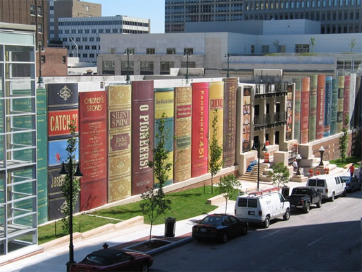
Kansas City Public Library Community Bookshelf - Kansas City
AOA comment: Yep, the facade of this parking garage was designed to look like a bookshelf. As the library's website explains of the "community bookshelf": "The shelf showcases 22 titles reflecting a wide variety of reading interests as suggested by Kansas City readers and then selected by The Kansas City Public Library Board of Trustees." While this wouldn't necessarily be the right approach for a lot of circumstances, we thought this was interesting because of the way it 1) doesn't look at all like a parking garage and 2) creates an engaging streetscape.
So unusual is the parking garage that it prompted a question to Snopes about whether it was actually real.
photo: Kansas City Public Library
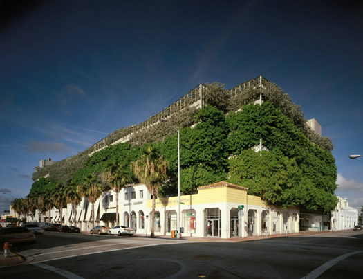
Ballet Valet Parking Garage and Retail Center - Miami Beach
Architect: Arquitectonic
AOA comment: That's actual greenery growing on the parking garage. We thought this was interesting because of the way the greenery makes the parking garage appear more like a natural structure -- maybe an escarpment -- rather than a big rectangle for parking cars. And it's like the retail on the street level is built into the escarpment.
More about this project: Miami has apparently become a global hot spot for interesting parking garages. [Architizer]
photo via Arquitectonic website
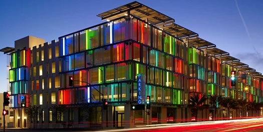
Santa Monica Civic Center - Santa Monica, California
Architect: Moore Ruble Yudell
AOA comment: So fun. It looks like candy. Also: It was one of the first LEED certified parking structures in the US -- and includes solar panels in its design.
More on this project: Said architect James Mary O'Connor: "I went by one night and saw tourists taking pictures of each other in front of the façade ... I thought, well, we've done what we set out to do." [ArchNewsNow]
photo via Moore Ruble Yudell website
____
Lists of interesting parking garages:
+ Flavorwire: The World's 10 Most Beautiful Parking Garages
+ The Coolist: 10 Incredible Parking Garage Designs
+ Popular Mechanics: The World's 18 Strangest Parking Garages
+ LA Weekly: Five Most Beautiful Parking Garages in Los Angeles
+ Web Urbanist: 14 Exemplary Parking Facilities
Hi there. Comments have been closed for this item. Still have something to say? Contact us.
Comments
Lipstick on a pig.
How is that neighborhood even going to handle the traffic that an 800 car structure will bring?
... said Cyril on Dec 5, 2013 at 11:50 AM | link
I'd add to the list one right here in Albany, the parking garage adjacent to the SUNY Central Administration Headquarters (the former D&H building). The facade along Water Street is quite pleasant.
But I think the important thing here is how the structure interacts with the neighborhood. No matter what, walking past a parking garage doesn't feel the same as walking past shops or residences -- there's something bleak about the streetscape, just the same as when we're presented with buildings without any sort of first floor windows, or where the windows are blocked and you can't see in. It feels soulless and uninviting. That neighborhood needs the opposite of that. The original idea seemed to get it right, and do what many other successful cities have done, getting the parking structure off the streetscape.
... said Carl on Dec 5, 2013 at 11:58 AM | link
Great post!! And there are countless other examples out there, as I have personally seen in my travels, which could improve upon the current proposal, by enhancing pedestrian safety/access, incorporating more mix-use elements, and marrying the structure up more appropriately to the neighborhood.
I’m still very disappointed that such prime developable land (almost a quarter of this project) is being dedicated to parking, rather than reinforcing transit oriented development and/or mix-use design. This corner of the city is begging for it as institutions in the area build up and folks look to move in closer to where they work. With that said, I’m not naïve to think that more development can’t go without additional parking sources to accommodate those who can’t practicable utilize public transit.
Therefore, for the life of me, I don’t know why the institutional actors part of this proposed plan, along with other stakeholders in the neighborhood, don’t look to build up from the countless dead zone parking areas that litter this part of the city (a picture is worth a 1000 words: https://maps.google.com/?ll=42.650753,-73.775253&spn=0.010621,0.026071&t=h&z=16). Instead of ripping out more taxable land for parking, why not reinvest in the surface lots that already dominate the area; heck, there is more space occupied by paved lots than the actual buildings folks are commuting to use. I appreciate that varying jurisdictions and institutions control these lots, but they all seem to clamor that parking is vital, so a coordinated and cooperative solution should present itself in how to best reinvest in the current parking infrastructure by slapping down a parking garage.
... said Rich on Dec 5, 2013 at 2:44 PM | link
You need retail or commercial space on the first floor so when walking by it doesn't feel like a garage.
... said Parma Ham on Dec 5, 2013 at 2:49 PM | link
There are some good ideas to consider here. I don't know why Albany always seems to settle for mediocrity.
Get this project right, there's no reason to rush it through.
... said chauncy on Dec 5, 2013 at 3:18 PM | link
Dear Albany, Why oh why, are you still lingering in the past?
Everywhere else in the world, cities are promoting sustainable design and public transit along with cycling and walking.
This project has the opportunity to demonstrate to the world that Albany is for once on or AHEAD of the curve as far as design and city planning. Too bad the folks in charge are more interested in the ribbon cutting with their names on it than actually instituting an innovative plan for the future.
We're the capital of New York for darn sake! The capital. Now set the back ally politics aside and do something amazing for a change.
... said J on Dec 5, 2013 at 3:30 PM | link
As a neighborhood resident within view of this garage, I'm happy that folks are speaking up, but I am optimistic that the sentiment in these blog comments doesn't fall on deaf ears.
If you really want to make a difference, and have a say in the future of this project, please consider writing a note to the City IDA, the agency that is being asked to provide tax incentives to this garage project.
http://albanyida.com/
It takes a moment, but the effort will be worth it - your quality of life and finances will be affected regardless of where you live in the city. Residents should not be asked o provide tax incentives for a project that no one agrees with. Why would anyone pay for something they don't want?!
... said daleyplanit on Dec 6, 2013 at 9:15 AM | link