Campaign Yard Sign Design Election 2014, Part II
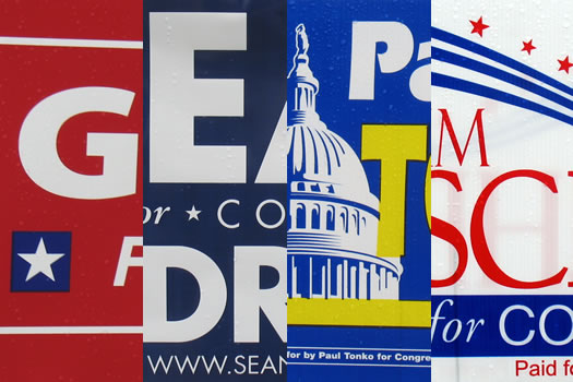
Election Day is Tuesday, so it's time to pull the lever for part two of Campaign Yard Sign Election 2014.
The first half of the design election included spleen throbbing induced by questionable typography.
Will the next batch of campaign signs go over better?
The designers
The two designers critiquing this year's signs:
Caroline Corrigan is an Albany based creative specializing in print design and branding for small businesses and makers. She also is the co-owner of Fort Orange General Store, an independent lifestyle and home goods shop on Delaware Avenue in Albany.
Doug Bartow is the principal and design director at Troy-based firm id29. Before co-founding id29, he was the design director at MASS MoCA for eight years.
We asked Caroline and Doug to critique the signs -- not the candidates -- and pick their design winner in each race.
19th Congressional District
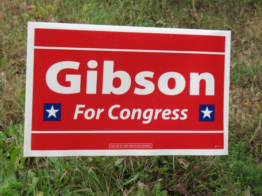
Caroline: This is a good effort, maybe has the opposite problem of Sean Eldrigde's sign. The space is used well but the lines used to fill the blank space tell me that maybe they could have just enlarged his name a little bit. It's good, though.
Doug: Unlike SEAN Eldridge, incumbent Congressman Chris Gibson doesn't need to remind you of his first name, nor his web address. He's a seated Congressman, and he'll choose a relatively obscure typeface in Akagi for his yard sign -- maybe throw in a couple of blue and white stars to remind viewers of his military record. And red. A lot of red.
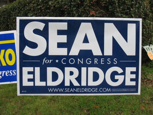
Caroline: This isn't horrible, but the whole thing feels a bit claustrophobic. Figuring out what to do with the difference in the length between the first and last name can certainly be a design challenge, but I think more breathing room would help. I like the simplicity of the white on navy, though.
Doug: No one can accuse Sean Eldridge of not getting his campaign money's worth at the sign shop with this design. The messaging, set in various weights of Futura, is scaled to fill almost all available space on the sign. This design approach causes the viewer to read "Sean" first, followed by "Eldridge" and then "for Congress." Leading with a first name makes this sign a bit more personal than some of the others. Utilizing the typeface family Futura, however -- which was designed using simple geometry and based upon utopian efficiency -- is the antithesis of personal.
Design winner:
Caroline: In the name of simplicity, the Gibson sign gets my vote.
Doug: Eldridge by a nose.
20th Congressional District
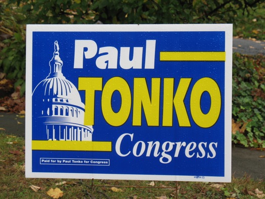
Caroline: This sign could use some work as well, it's not super fresh looking. The little cut-outs in "Paul" seem a little dated, and there are a few too many typefaces being used. I think the Capitol building graphic is helpful in reminding non-political people what a Congressperson does, and that they are important, but it doesn't really aid the design in being attractive or readable.
Doug: Here's something a bit different: white and yellow on a field of blue with an illustration of the U.S. Capitol Dome. Throw in the disco-looking typeface ITC Eras-bold from 1976, and you've got quite a mess on your hands. At least it's a yellow and blue mess, and will stand out a bit vs. the sea of red, white and blue currently scattered all over our roadsides.
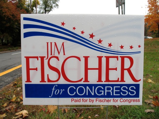
Caroline: The stars-and-stripes landscape used here is funny, like a little roller coaster for your eyes. I think perhaps that element could have been taken down a notch or two to make room for his name, in which the "Jim" is narrowly squished into a tight space. Kudos for trying something interesting, but it falls a little short in terms of taste.
Doug: If I were teaching a class on political yard sign design, and needed an example of all the things not to do to make an effective composition, I might use this as my Holy Grail. Neither the elements nor layout make any sense here, and the typeface selection is as haphazard as those randomly-sized stars floating on the disappearing blue wave.
Design winner:
Caroline: Feeling neutral here, I think it's a tie.
Doug: Tonko by a finial.
Assembly 107th
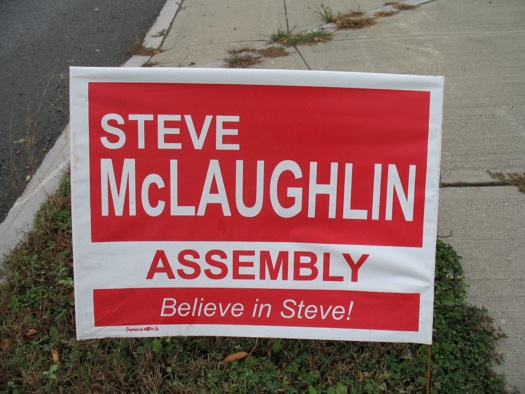
Caroline: It almost looks like the same designer worked on both of these signs, but is clearly voting for Steve.
Doug: Things are getting worse here, fast. Arial-bold is one of the ugliest typefaces in existence. Pro tip: taking Arial-bold and anamorphically stretching the letterforms to fill a space only compounds that problem. Now my thyroid gland is acting up...
Design winner:
Caroline: The "Believe in Steve" made me giggle and wins just because they turned an otherwise uninspired political sign into poetry.
Doug: All that is evil in the world.
Rensselaer County DA
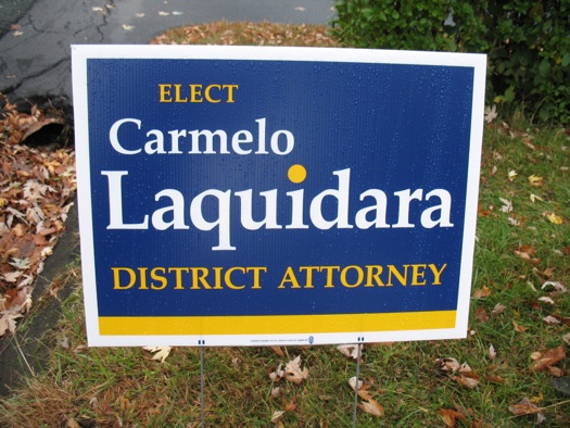
Caroline: I want to like Laquidara's sign, but the scale of all of the elements are weird and are all a little too similar. It seems unfinished. I like the grounding yellow bar and typeface used, but the oversized dot on the '"i" and the empty space in the upper right corner are distracting.
Doug: This sign has a blue and yellow palette very similar to Paul Tonko's -- is this a Democratic thing? Featuring all-caps and mixed case Palatino-bold (typeface), with a curious enlarged yellow dot on the 'i' signifying nothing at all, this design is making me sleepier the longer I look at it.
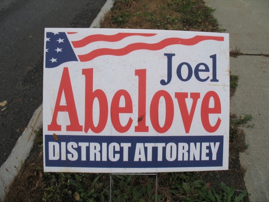
Caroline: The space is used well, but the design could stand to be a little modernized. His name seems like it might be a little stretched, but I can't tell, which isn't a great thing.
Doug: And we have our first stars and stripes with Joel Abelove's sign for Rensselaer County DA. The name is set in the classic typeface Century Oldstyle--another Morris Benton masterpiece. Unfortunately, the designer decided to anamorphically scale "Abelove" to get it to fill all the available space. This affects legibility while resoundingly screaming "amateur hour." If that wasn't enough of a typographic faux pas for you, the words "DISTRICT ATTORNEY" are set in the typeface Impact, and knocked out of of a dark background -- just like your standard internet meme. BwaHaaHaaa.
Design winner:
Caroline: From a formal standpoint, I think Abelove is probably the winner over Laquidara, even though I'm not crazy about his sign.
Doug: Mistrial.
____
Many thanks to the Caroline Corrigan and Doug Bartow!
Earlier on AOA:
+ Campaign Yard Sign Design Election 2014, Part I
+ Political yard sign design primary 2012, part I
+ Political yard sign design primary 2012, part II
Hi there. Comments have been closed for this item. Still have something to say? Contact us.
Comments
Wow, these are especially bad.
Doug's link to the Impact font memes made me wish that a candidate would actually embrace that style - and make funny campaign signs to boot. I'd vote for him/her!
... said Paul on Nov 3, 2014 at 12:32 PM | link
First, Caroline, what does it even mean to "modernize" a political yard sign?!?
Second, I want my time back from reading this article.
This was hands down the worst thing I read regarding elections in my life. I find it easier to understand now why journalism is dying.
... said Justin on Nov 3, 2014 at 1:01 PM | link
Wow - can we do a piece where we analyze bad comments? Justin apparently clicked on the link, read the whole thing and even formulated a multi-part comment (and question!) DESPITE not enjoying it one little bit. He seems like the kinda guy who drives in the far right lane but then complains about how slow traffic is moving.
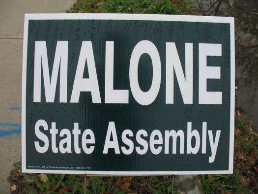
Malone's sign gave me a laugh b/c you can just FEEL the lack-of-enthusiasm. "Fine, I'll do it!" On the other hand, maybe Phil Malone is just such a no-nonsense kinda guy that he vetoed the use of any designs, decals or slogans that weren't 100% VITAL. Ahh, I'm torn!
... said Sean on Nov 3, 2014 at 2:28 PM | link
YOU need to see the Delaware State TREASURERs Race
:Ken SIMPLER
Sign says
"" Keep IT SIMPLER ""
rsvp, if you have a snarky response.
... said Pau; on Nov 3, 2014 at 6:19 PM | link
I clicked on this link expecting an in-depth discussion of graphic design re: lawn signs....and that's exactly what it was!
Great post, thanks AOA!
Also, a top tip for those interested in running for office - modern campaign research says - lawn signs don't work! Don't blow your money on them, because they have generally little impact on voters. They don't convey a message and they don't actually ask for a vote. The most they can do is indicate a specific household's affinity (or how prudently an opponent is spending their war chest).
... said a different justin on Nov 4, 2014 at 10:05 AM | link