How we make those maps
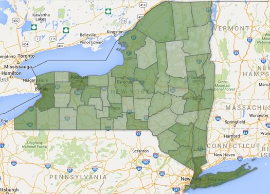
You can make a map like this. (Really.)
We like maps. And we like to make clickable maps to post here on AOA. Maps about patterns in Census data. Maps about election results. Maps about suggestions you've offered. (We might like all of this a little too much.)
Many of you also seem to like maps. And some of you have been curious about how we make the maps for AOA.
So here's how we do that.
Behind the scenes, two different types of maps
There are basically two types of clickable maps that we publish on AOA -- and they're different in how they come together behind the scenes.
Maps built in our CMS
The first type of map -- like the Capital Region Recommended Mechanics Map -- is built right out of our content management system (it's the thing on our server that allows us to publish pages and take comments and stuff like that). We type stuff into entry fields, assign them to a map category, and with the assistance of the Google Maps API and some javascript, a map appears on our website.
These maps are... OK. We built the functionality into the site from just about the beginning and it works, which is kind of amazing considering we didn't really know what we were doing. That said, the format isn't very flexible and there are a lot of things we'd do differently now. As a result, we don't use these maps very often. So, um, we're not really going to talk about them.
Maps built outside our CMS
Most of the maps that appear on AOA -- like this elections result map -- are built outside our CMS. We then publish them by pasting in an embed code. To construct these maps we use some (more or less) free tools -- such as spreadsheets programs and Google Fusion Tables -- that are available to everyone.
And those maps are what we're going to focus on. This will be a relatively quick overview, just enough to get you started making a map with those tools.
How to make these maps
At a very basic level you need three things to make these sorts of clickable maps:
+ Information/data/numbers of some sort
+ Map lines or points
+ A thing (technical term) to blend that stuff together into a map and present it
Probably the easiest way to explain this process is a quick walk through of a simple project.
Info/data/numbers
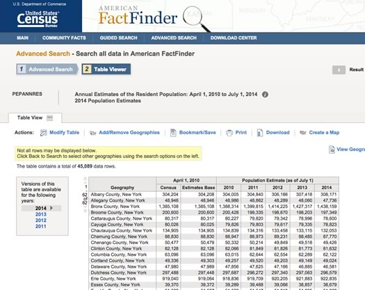
OK, let's start with the info, and we'll pick something simple: New York State county populations. To get that info, we head on over to the Census Bureau's website -- we prefer to use the American Factfinder tool -- and we'll download that in the form of a comma separated value file (csv).
Of course, you can use whatever sort of info that you'd like. You just to need to have it organized in some way that you can match the info to an area name or place name or address in a spreadsheet. So, you could have number of votes cast per city ward, or the names of a bunch of landmarks matched with their street addresses, whatever.
Now that we have the CSV of the county population numbers, we can open the file in a spreadsheet program. Let's use Google Sheets.
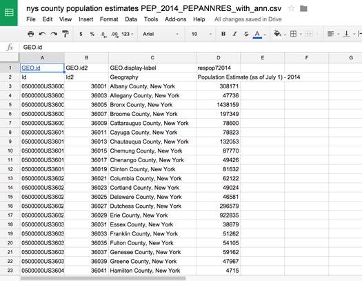
Census data is a whole thing, but very quickly: The first two columns are identifier codes for places (in this case New York State counties), the third column is the county name, and the fourth column is the population estimate. (We'll trim out the first column and the first row because won't need those.)
Matching the info with the map lines or points
This part can get be relatively easy -- or very complicated.
The easiest thing is to associate a piece of information with a street address, because Google Fusion Tables can geocode street addresses for you (that just means it can turn a street address into the geographic info needed to put a point on a map).
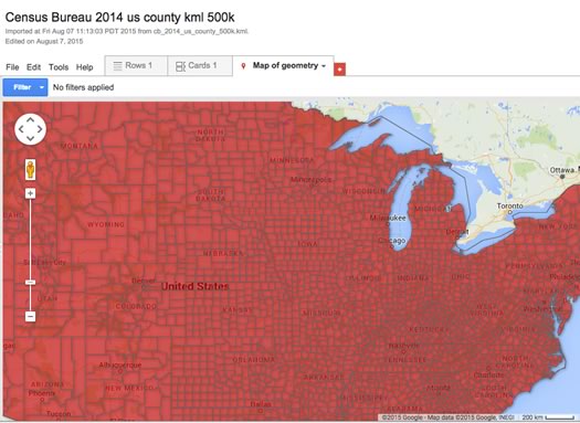
But what we want to do is have a map of New York's counties. So we're going to need some map lines. And for Google Fusion tables (and Google Maps and some other systems), that means you're going to need a kml file. It's basically a file that has instructions for how to draw map lines. It's possible to create these from scratch, but for most relatively basic stuff you'd never want to do that. Because someone else already has.
In this case, we can again go to the Census Bureau which makes kml files available for counties and places such as cities and towns. So we can download the kml file for all the counties in the country. But we don't need all the counties, we just need New York.
And that brings us to Google Fusion Tables, a tool that a lot of people probably haven't used. It's basically a way to store, sort, and display information. And, how about this: It understands kml files. So we can upload the file to a Google Fusion table -- you can do so right from Google Drive (look under "new" and then "more").
The table now has the kml for all the counties in the US. We don't need all that, so we can tell Fusion Tables to filter it for New York counties. And then we can download that filtered set of New York counties as a csv. (Yeah, some of this is a bit tedious. There are probably better ways.)
So next we need to match up the info (population estimates) with the map lines (New York county line kml). We already have that Google spreadsheet with the population numbers. So we can just add the csv we downloaded with the kml to that spreadsheet project.
Now we just have to match things up. The first thing do is to add a column called "geo" to the sheet with population info -- that's where the kml for each county will go.
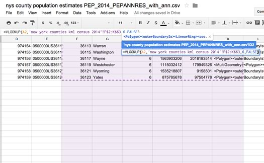
You could copy and paste each county one by one. But... oof. Don't do that. Let's have the spreadsheet do the work for us. How? Well, remember that column with the place id number in the Census Bureau population info? We can use that to automatically match each county with its kml by using the VLOOKUP spreadsheet function. (We won't go into how to that exactly because it's a common spreadsheet function. Basically you're just telling the spreadsheet to look through a bunch of stuff for some key value (either text or a number) and then pull the contents from a cell in that key value's row.)
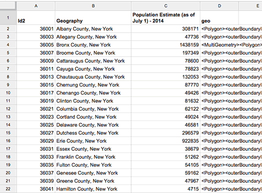
Ta da. County names and population estimates are matched with the kml for drawing the county lines. We're almost there.
Making the map
The thing (again, technical term) that we're using to actually produce the map is Google Fusion Tables. So we need to get the stuff from the spreadsheet into Fusion Tables. It's possible to create a Fusion Table from a Google spreadsheet, but for whatever reason, we've encountered various bugs (or something) when creating maps from those transferred sheets. So, yep, it's time to download yet another csv, this time of county info matched with the kml. (We like to add "with geo" to the title of these csv files so we can remember they have the geo info.)
Then it's time to create a new Fusion Table from the csv. Once you have a new Fusion Table, click on the tab that will say something like "map of (something)." You might have to tell Fusion Tables to use the geo info in the "geo" column. (There's a dialog box for this -- it's easy.) And then... hey, there's a map.
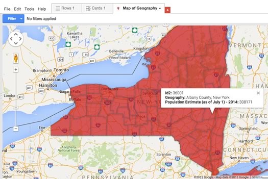
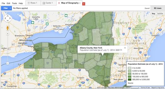
And you should be able to click on each county and a little bubble will pop up with info.
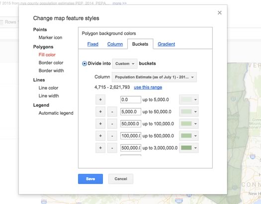
But we can do better -- and without much effort. Fusion Tables will allow you to change the way the map looks based on information in the table. So we can go to "change feature styles" and tell it to adjust the fill color for each county based on its population estimate. You can do this with a gradient. Or you can assign different colors for different ranges (buckets), which is what we'll do. You can even add a legend based on this color coding.
The text in the pop-up info bubbles is also customizable. We don't really want the geographic code for each county, so we can un-check the box for it. And we probably don't need "Geography" before each county name, so we can go to the "custom" tab and clip that from the template for the info bubbles. You can also change the styling with simple HTML. So now our map looks like this:
The last step: Putting it on a website. And this is easy, like embedding a Youtube video. Just click on the map tab, select publish, and follow the prompts. (And be sure to change the privacy setting on the table so it's viewable by the public, otherwise the map won't show up.) Copy the embed code, and then paste into however you put stuff online:
Have a look at the Fusion Table that created the map above -- it's public so you can save a version of it for yourself.
Save time
If you're thinking this all seems kind of complicated, you're not wrong. But you can pick it up with a little bit of effort.
And you can also save time by storing files you're going to use over and over again. So, say you might regularly want to create some sort of New York State county map for work or research or whatever -- once you have that csv of the county line kml, you can use that over and over again. You can even make a sort of template spreadsheet with counties and the their kml -- add new info and you're just a few steps from a map.
Hi there. Comments have been closed for this item. Still have something to say? Contact us.
Comments
Amazing tutorial, gang. Thanks! I've been looking around for a methodology for overlaying historical information and possibly photographs on specific locations, and have been thinking about VisualEyes. This may be helpful.
... said Carl on Sep 18, 2015 at 4:57 PM | link
Great article! If you're trying to make fun, simple maps with rich media, colored pins, notes for events, small business, Facebook, Twitter, etc., there's a cool little site called MapJam. Check out our showcase at http://mapjam.com/showcase
Happy Mapping!
... said Scollay Petry on Sep 18, 2015 at 5:39 PM | link