Items tagged with 'maps'
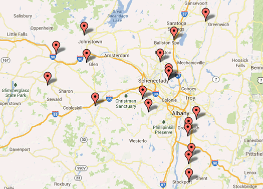
Map quiz: A creek by another name
What's the name?
For the last however many years we've posted a map quiz this time of year -- and here's this year's...
A bunch of creeks and streams in the Capital Region and the Hudson Valley are called "kills" because of the Dutch influence in this area. ("Kill" roughly means "creek" in Dutch.)
So this year's map quiz -- a quick seven multiple choice questions, with maps! -- tests your knowledge of these creeks by another name.
Plus: There's a bonus, clickable map of these many waterways...
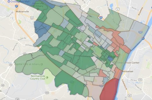
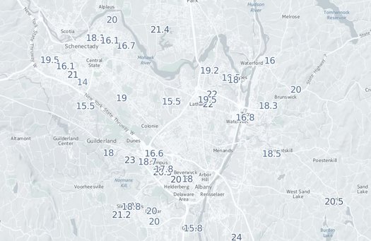
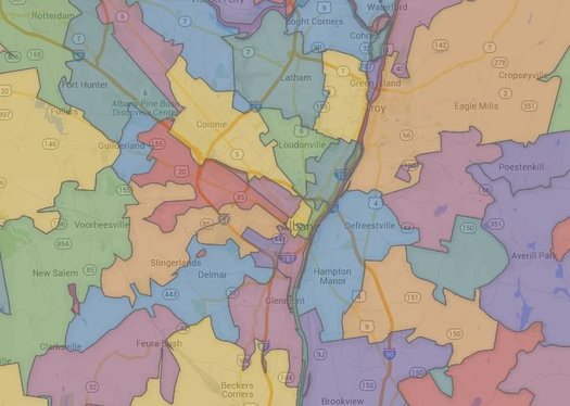
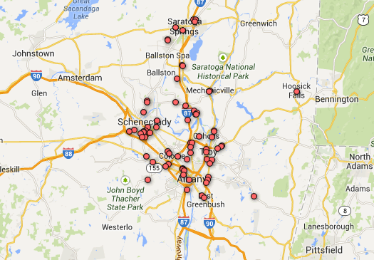
Where the Capital Region's younger adults live
Maybe you saw that new list this week that ranked a ZIP code in Guilderland as the "best" neighborhood in Upstate New York for young adults.
The ranking was the result of some crunching by Buffalo Business First of Census numbers related to population, education, employment, businesses, housing, and income. That link includes an explanation of the methodology.
That a ZIP code in Guilderland would take the top spot in this sort of ranking raised some eyebrows. And we'd argue the list's methodology is basically a way of filtering for upper income people in their 20s and 30s.
Also: "Best" for whom? People in their 20s and 30s are a huge, diverse population group. Using a word like best is probably an overreach.
Anyway, the list got us curious about neighborhoods in the Capital Region that do have a lot of people 40 and under. So we rolled together some of our own clickable maps...
A breakdown of the voting in the Albany Democratic mayoral primary, up close
The Albany mayoral primary, one more time: Here's an up-close geographic breakdown of the voting in the Albany Democratic primary, which was won by Kathy Sheehan. As you know, it is the de facto election for the office because of the large Democratic enrollment in the city.
Above is a clip from a map of individual election districts and unofficial vote counts (that now include absentee ballots).
Are there clickable maps? You know there are clickable maps.
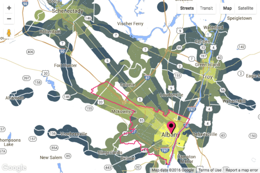
Following the many paths in Saratoga County
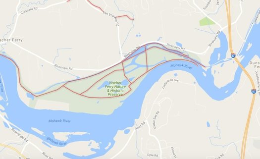
A clip from the map we rolled use the new data.
Check it out: Saratoga PLAN has released a new set of info about the many recreational trails and paths in Saratoga County. Blurbage:
Saratoga County boasts over 280 miles of recreation trails - with new trails added or improved each season. Saratoga PLAN is the keeper of a countywide trails dataset, which was originally compiled in 2011 and was updated during 2016-2017. The updates were made possible due to a network of tireless volunteers, important partners, and two skilled interns, Amy Marshall and Abigail Larkin. ...
Knowing the location, condition, and allowable uses on a given trail is imperative for recreation planning by everyone from the casual or serious user to local and countywide planners. Saratoga county is known for its trail diversity, including the urban Saratoga Greenbelt Trail, the historic Champlain Canalway trail, the nature trails of Moreau Lake State Park, and the more local loops offering enjoyable outdoor experiences in Saratoga PLAN's Coldbrook and Ballston Creek Preserves. Eventually, as new trails are developed, such as at Corinth Reservoir Recreation area, Anchor Diamond Park, or around Lake Bonita in Moreau Lake State Park, they will be mapped and added to the countywide trails dataset.
Saratoga PLAN has made the files available that geographic information systems can use as a sort of recipe to make maps of the trails. You can use an application like Google Earth to view them.
We downloaded info and rolled a map for easy viewing. Let's have a look...
Map: Blizzard snow totals
Here's a clickable map.
Yep, it snowed a lot Tuesday during the blizzard.
How much? Well, it varied a bit depending on location.
So we rolled together a clickable map of snow totals from around New York and much of the Northeast...
What if Albany is upstate, but not "Upstate"?
What are we really talking about when we use the term "Capital Region"? Is it a geographic place? A population of people? A set of economic connections? A culture?
That's one of the questions we were thinking about while looking over a recent attempt by researchers to define megaregions and lay out a "functional economic geography of the United States." The work -- by Garrett Dash Nelson of Dartmouth and Alasdair Rae of the University of Sheffield (UK) -- takes a ton of Census data about commuting patterns and processes it into a series of maps. It's published in PLOS One.
So, let's have a look at those maps for this area, along with a few thoughts about the results.
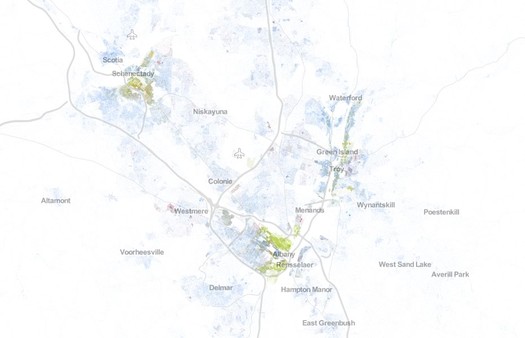
Comparing transit service both within the Capital Region and beyond
Check out the map clip above -- it's from a new site called AllTransit and it shows the number of transit routes within mile for places around the Albany-Schenectady-Troy area. (There's an interactive version at that link.) The brighter the yellow, the higher the number of routes.
AllTransit has all sorts of maps and rankings and data like this for metros all around the country. Here's a whole bunch of potential uses for info, broken out by type of person who might be using it (city residents, business owners, elected officials, and so on).
The maps might first draw your eye, but the rankings and scores are interesting for getting a bit of context about relative levels of transit services both (with)in the Capital Region and elsewhere. For example, the Albany-Schenectady-Troy metro ranks #42 among metros with more than 500k people for AllTransit's Performance Score, "an overall transit score that looks at connectivity, access to jobs, and frequency of service," with a score of 3.39. But, as you might expect, if you look within the metro area, there is a lot of variation. For example: The city of Albany's performance score is 7.8, the city of Schenectady's is 6.3, and areas of Clifton Park range from 1.4 to 0.
[via CityLab]
screengrab from AllTransit
Albany, Troy, and Hudson in high contrast
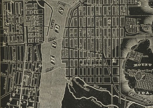
Check out this beautiful old atlas of New York State, originally published in 1838. It was the creation of the cartographer David H. Burr. And it's available online thanks to the digital collection of the New York Public Library.
There's something about the high-contrast black-and-white color scheme and the way various features -- like the Hudson River -- are rendered that we really like.
The atlas includes maps for counties around the states. But the parts that were most interesting to us were the old city maps. We pulled a few -- for Albany, Troy, and Hudson -- and there are after the jump in large format, along with a few quick notes.
Solar continues to grow around New York

More common.
The Capital Region had the second-highest amount of installed solar energy generation capacity in the state as of 2014, according to numbers released by the Cuomo admin Monday. The eight-county region had 51 megawatts of capacity -- up 500 percent since 2011. (The region with the highest total was Long Island, with 96 megawatts.)
For some perspective, a megawatt of installed solar is estimated to be capable of powering about 155 homes a year in New York State.
New York State has a whole had almost 315 megawatts of installed solar capacity as of 2014, according the Cuomo admin. That's up 300 percent since 2011.
A few individual Capital Region counties also ranked highly. Albany County had 13.66 megawatts of installed capacity -- the fifth-highest total among all counties. And Columbia County ranked #1 for installed capacity per capita.
Are there clickable maps? You know there are...
A ZIP code map of New York State
This is just a clip -- the clickable map is after the jump.
As it says on the label, here is a clickable map of ZIP codes (roughly) in New York State.
A while back we had planned to include this map with some discursive post about ZIPs and maps and perceptions of place that was related to the Halfmoon-wants-its-own-ZIP thing, but that post ended up only half baked and unpublished (thankfully -- no one needed to be subjected to that). We were reminded of the map again this week because of the wealthiest ZIP code ranking over at the Biz Review.
Anyway (oh no, here we go...), ZIPs are kind of interesting because of what they started as (a way for the US Postal Service to arrange its routes) and what they've ended up being used for (a way for the rest of us to also identify places). As the ZIP data website ZIP Boundary highlights, a ZIP code doesn't really define an area for the USPS, but rather a collection of delivery points.
And then there are the issues related to the fact that ZIPs are only loosely associated with municipalities -- that's how a place like Crossgates, which is in the town of Guilderland, ends up with a postal address that is Albany (because it's in the 12203 ZIP). Here's an interesting history of ZIPs, again from ZIP Boundary, that touches on that issue.
One of the things that's reinforced for us by looking around the map of Capital Region ZIPs is that the codes aren't necessarily a good way of defining areas (well, unless you're delivering mail). Again, using the 12203 ZIP as an example: it stretches from Washington Park in Albany west along Western Avenue, with lobes that include Guilderland, Bethlehem, and New Scotland -- that's an odd collection to group together.
Right, so... on to the map...
The Capital Region's vehicle arteries
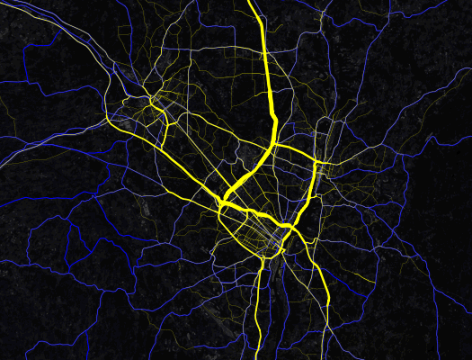
Map gawking: Check out this map of traffic volumes on major roads around the Capital Region. It's like an angiogram of the area's vehicle arteries.
The map is a clip from a national map created by Mapbox using data from the federal Highway Performance Monitoring System and OpenStreetMap. Here's a zoomable version over at the Mapbox site.
The data is limited to roadways, marked in yellow, that are eligible for federal aid. The wider the yellow line, the higher the daily average volume.
The relative volumes probably won't be much of a surprise -- you know, it's not unexpected that I-90 through Albany and I-87 from Albany north to Saratoga County are the most-traveled arteries (each averages more than 100,000 vehicles per day).
But one thing that did strike us about the map is the way it highlights the degree to which the Capital Region sprawls northward much more than any other direction. We've always been a little curious why areas such as, say, southern Rensselaer County and southern Albany County haven't been built up like southern Saratoga County.
[via @omarjpeters]
Earlier on AOA: The busiest Thruway exits
Carbon footprints, by ZIP
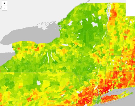
The greener the ZIP, the lighter the carbon footprint.
Check it out: The map above depicts the estimated average annual household carbon footprint in New York State, by ZIP code. It's from the UC Berkeley CoolClimate Network, and is based on data from the network's "CoolClimate Carbon Footprint Calculator."
If you head over that first link, you can use a clickable version of the map, along with two other maps for household energy carbon footprint and transportation carbon footprint.
Poking around the Capital Region, it's kind of what you might expect: the more urban areas of the Capital Region tend to score lower carbon footprints than the suburban areas. One of the main reasons? Transportation.
Here's an example, from the calculator (second link above): The ZIP codes 12203 (mostly the city of Albany) and 12065 (Clifton Park) are tagged as having roughly similar estimated household carbon footprints for home, food, goods, and services. But there's a relatively large gap for transportation -- specifically car fuel. As a result, 12203 is pegged at 41 tons of C02 per year and 12065 at 49.5.
Here's an FAQ about the methodology.
New York State
The thing that really jumped out to us in all this wasn't the Capital Region, but New York State itself. The Empire State stands out on all three national maps, especially the household energy carbon footprint.
One reason: New York State uses very little coal to generate electricity. That's important because electricity from coal has a big carbon footprint. The state's three biggest sources of electricity (in descending order): natural gas, nuclear, hydroelectric.
Also helping: New York State had the second lowest energy consumption per person (as of 2010), according to the US Energy Information Administration (that link just above). The EIA notes New York's ranking was "due in part to its widely used mass transportation systems" (mostly in the NYC area, of course).
[via @AndyArthur]
map source: UC Berkeley CoolClimate Network Average Annual Household Carbon Footprint (2013)
Earlier on AOA: Charting the Capital Region's workday population tide
The trip to New York City, then
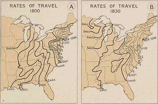
This is total historical/map nerd candy: The 1936 Atlas of the Historical Geography of the United States is now online in an interactive version, courtesy of the Digital Scholarship Lab at the University of Richmond.
That image above is a clip from an atlas page depicting travel times from New York City in 1800 and 1830. Yep, Albany was a three-day trip from NYC in 1800. (Because there was no E-ZPass, yet. Obviously.)
What makes this online presentation of the atlas so great is the way the pages have overlaid with clickable, zoomable present day maps and paired with additional explanation. Regarding the map clipped above:
In 1800 travel by stagecoach was limited to the area bounded by Boston, Bennington, and Albany on the north, Richmond on the south, and the Allegheny Mountains to the west. It required 10 days of sailing to travel from New York City to Charleston and a minimum of 26 to 28 days to reach New Orleans. Buffalo was a 9-day journey via the Hudson-Mohawk route, and the trip over the mountains to Pittsburgh required 10 days. It required 22-25 days to reach Louisville by way of the Ohio and 28-30 days to reach Cairo. In Tennessee and Kentucky travel on horseback was more rapid than water transportation, because of the circuitous courses of the rivers, and several well-defined overland routes such as the Natchez Trail had already developed.
The period between 1800 and 1830 was one of rapid development of water transportation and extension of highways. It marked both the development of the steamboat as a means of transportation and the completion of the Erie Canal. The traveling time from New York to Charleston was reduced to 6 days and to New Orleans to 14 days. To Cleveland was a 10-day and to Detroit a 13-day journey. From Detroit to Chicago was a 6-day trip overland, the much longer trip by water requiring about two weeks.
The atlas and website are filled with interesting bits, many of which include Albany and New York State in some way. Among them: Public Post Roads and Stage Routes 1774; and the De Laet Map of 1630, depicting Nieuw Neder Land and Fort Orange.
The whole thing is definitely worth a look.
[via Quartz]
image: Atlas of the Historical Geography of the United States/Digital Scholarship Lab, University of Richmond
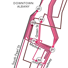
Map quiz: boxed up
For a Friday afternoon, another map quiz.
Can you guess what's responsible for the pattern in the Capital Region map above? (The title of this post contains a hint.)
Here's a larger, zoomable, clickable version, if that helps.
Answer's after the jump.
How New York's deck of counties split on the casino vote
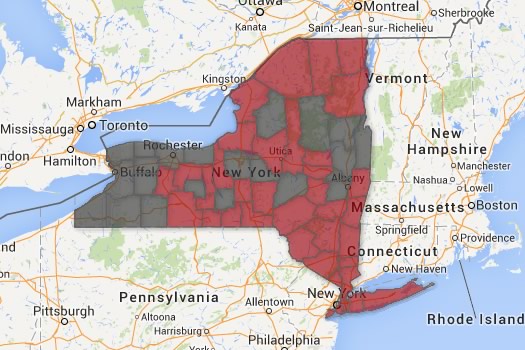
Red = counties in which a majority voted "yes." Black = counties in which a majority voted "no." (Corrected.)
One of the items up for a vote Tuesday was a proposed New York State constitutional amendment that would allow up to seven full casinos around the state, starting upstate. The Cuomo admin has been pushing the idea as economic development, and framed it that way again after the vote. [NYS BOE] [NYT] [Cuomo admin]
The amendment was approved, 57-43. But support around the state was evenly distributed. In fact, majorities in three of the Capital Region's four core counties voted against it -- one of the majority "no" counties was Saratoga, which has a good chance of ending up with a casino. [NYS BOE]
We pulled the unofficial vote tallies on the casino amendment and mapped the results by county. Two clickable maps are after the jump.
1910 Albany on top of now
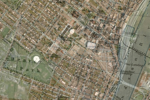
Because we're always interested in an old map... B sent along this superimposed map of Albany he created -- it's a 1910 map laid on top of a current map. He says in an email: "Found this 1910 map that snapped in pretty well. A lot of interesting stuff here, especially the blocks that became the Plaza and the Erie Canal before it became Erie Blvd."
A large-format image of the map is after the jump.
A few things that caught our eye:
+ As B mentions, it's remarkable how the ESP interrupted the flow of streets from the Lark/Washington Park area toward the riverfront.
+ And, hey, there was once a park on the north side of Arbor Hill, up against the Patroon Creek.
This looks like it's the original 1910 map.
(Thanks, B!)
See also: Old map overlays created by Albany Bagel -- 1877 Albany and 1857 Albany Lumber District
October map quiz
Back by popular demand: A map quiz.*
Can you guess what's responsible for the pattern in the Capital Region map above?
Answer's after the jump.
You're bound to come across one, eventually
Quick map puzzle: Can you name the pattern depicted in the map above?
The answer is after the jump, along with a zoomable/clickable map.
Everyone on a map, dot by dot
Albany, Schenectady, and Troy
Worth a look: This "dot map" of the United States -- it plots everyone in the country, color-coded by race and ethnicity, one dot per person, based on 2010 Census data. It was created by Dustin Cable, a researcher and statistician at the Weldon Cooper Center for Public Service at the University of Virginia.
From the explainer for the map:
This map is an American snapshot; it provides an accessible visualization of geographic distribution, population density, and racial diversity of the American people in every neighborhood in the entire country. The map displays 308,745,538 dots, one for each person residing in the United States at the location they were counted during the 2010 Census. Each dot is color-coded by the individual's race and ethnicity. The map is presented in both black and white and full color versions. In the color version, each dot is color-coded by race.
We pulled a few screen grabs from the Capital Region. They're after the jump, along with map we created last year that depicts local neighborhoods by a diversity score.
All of New York State's cities, lined up by size
Did you know you can fit all of Mechanicville in a shoe box? (OK, that might not be technically true.)
From the Annals of Facts of Limited Utility: While editing last week's in-between places feature about Mechanicville and Stillwater, we did some research on the claim that Mechanicville in the smallest city in the state. And based on Census data about geographic size, it's true -- M'ville's land area is just .84 square miles, more than half a square mile smaller than the next city on the list.
Anyway, that got us curious about the size of cities around the state -- which are the biggest, the smallest, how big or small they are relative to each other.
So we pulled the numbers and sorted them for easy scanning. And is there a map? Oh, you know there's a map...
Breweries, wineries, and distilleries of New York
Today's map: The breweries, wineries, and distilleries of New York State.
We created this map based on data recently posted by the state. It includes big breweries and distillers, but also microbreweries, farm wineries, and cider producers. Check it out in large format -- where there's also a legend for the map.
To some extent, this is just sort of map gawkage. But it does highlight certain patterns...
Streetviewing Ironweed
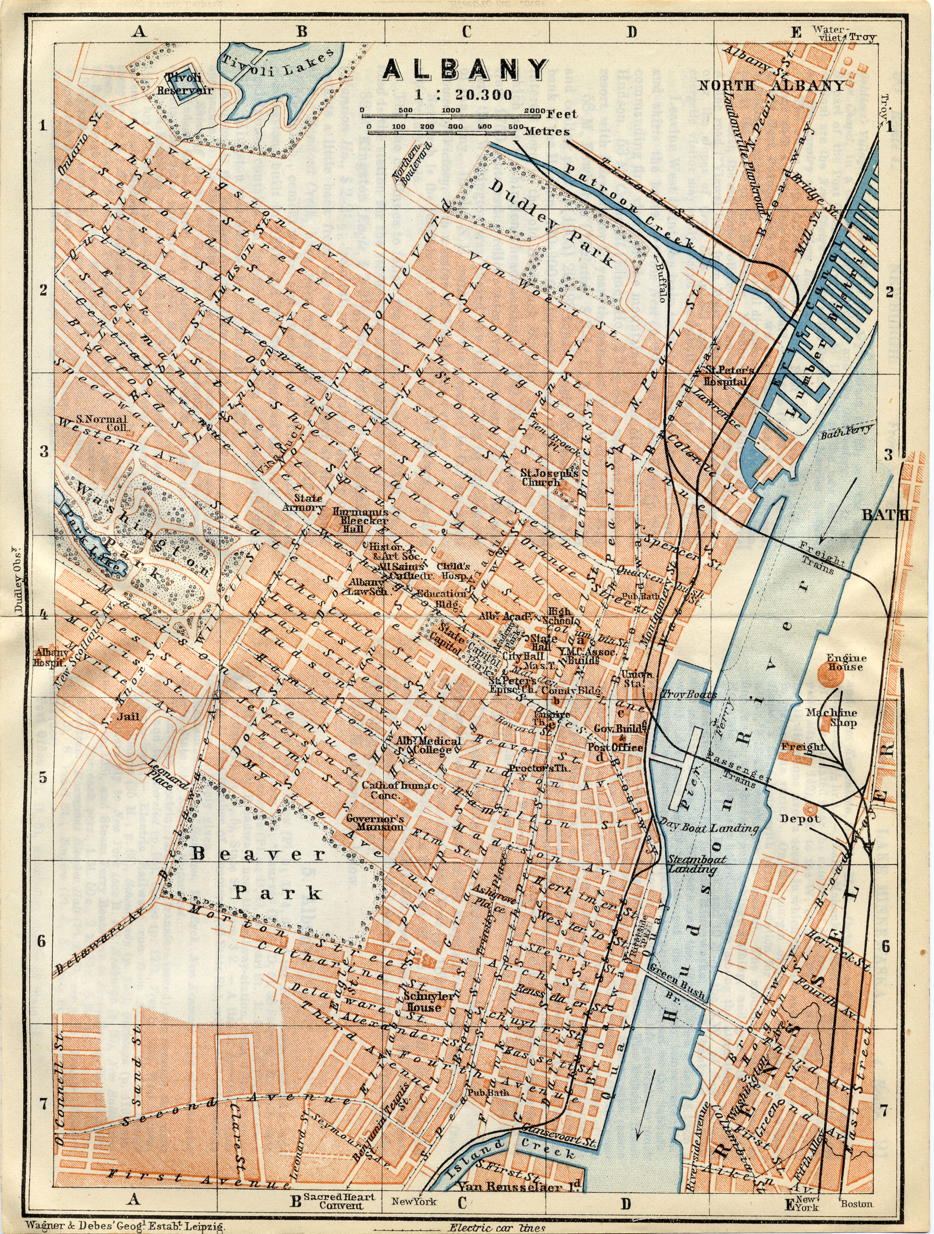
 Fun/literary/nerdy: A map/pictorial-of-what's-there-now of locations in Albany mentioned in William Kennedy's Ironweed, as compiled by artist Dorothy Gambrell at her Very Small Array site.
That's a small clip on the right.
The novel is set during the Depression, so the walk through (streetview through?) makes use of this 1877 (and pre-787) overlay of Albany streets.
[via the mysterious Albany Bagel Co.]
New York State food regions map
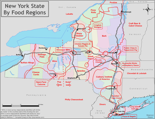
We kind of feel sorry for the "bark" regions of the state.
Check out this food map of New York State created by Shannon Glazer. She's divided the state into regions based on the foods for which they're known. For example: Utica and chicken riggies. She also marks the ever-important pop/soda demarcation.
Here's a large-format version of the map.
Shannon's started a Twitter feed related to the map: @NYS_food_map.
(Thanks, Shannon!)
Earlier on AOA: Martin on candidates for the quintessential Capital Region food.
... said KGB about Drawing: What's something that brought you joy this year?