Items tagged with 'data'
Albany tightened its rules for shoveling snowy sidewalks last winter -- so how'd that work out?

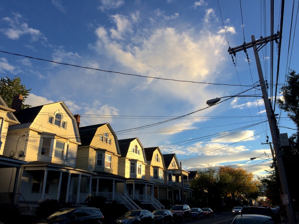
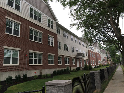
It should look like this.
If winter ever gets its act together and drops more snow on us, there will be sidewalks to shovel.
And shortly after that, Albany will no doubt engage in another round of its annual discussion about the fact that some sidewalks don't get shoveled.
It's an important quality of life issue for everyone in the walkable city, and it's even more important for people who have some sort of disability that makes it hard to get around. (Also: Shoveling is the neighborly thing to do.)
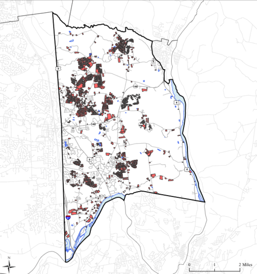
At the start of last winter the city of Albany tightened its rules so that the Department of General Services can now issue violations for unshoveled sidewalks directly after the 24-hour grace period following a snowfall. Ahead of that change we looked at violations the city had issued in previous winters to get a sense of where violations were being handed out, and to what sorts of properties.
Now we've had a whole winter with the new, stricter rules. So, was there a blizzard of violations issued?
Let's have a look.
(Yes, there are graphs and clickable maps, because of course there are.)
Where the Capital Region's younger adults live
Maybe you saw that new list this week that ranked a ZIP code in Guilderland as the "best" neighborhood in Upstate New York for young adults.
The ranking was the result of some crunching by Buffalo Business First of Census numbers related to population, education, employment, businesses, housing, and income. That link includes an explanation of the methodology.
That a ZIP code in Guilderland would take the top spot in this sort of ranking raised some eyebrows. And we'd argue the list's methodology is basically a way of filtering for upper income people in their 20s and 30s.
Also: "Best" for whom? People in their 20s and 30s are a huge, diverse population group. Using a word like best is probably an overreach.
Anyway, the list got us curious about neighborhoods in the Capital Region that do have a lot of people 40 and under. So we rolled together some of our own clickable maps...
Search Albany
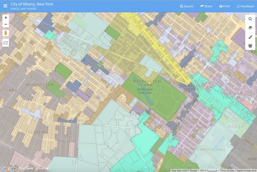
The city's new zoning map as displayed through Search Albany.
The city of Albany unveiled a new online tool -- called Search Albany -- for accessing all sorts of info related to properties around the city Tuesday.
It's basically a map through which you can access details about individual properties -- such as the name of the owner -- as well as neighborhood-level info such as zoning districts and Common Council wards.
The best way to get a feel for it is to just play around with it, so go for it.
But here are also a few quick things about it...
New York State city and town populations 2016
The Capital Region has some of the state's fastest growing towns in terms of population percentage change.
That's one of the bits from new population estimates for cities and towns released by the Census Bureau this week.
Is there a clickable map? You know that there is.
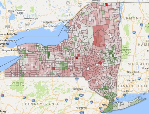
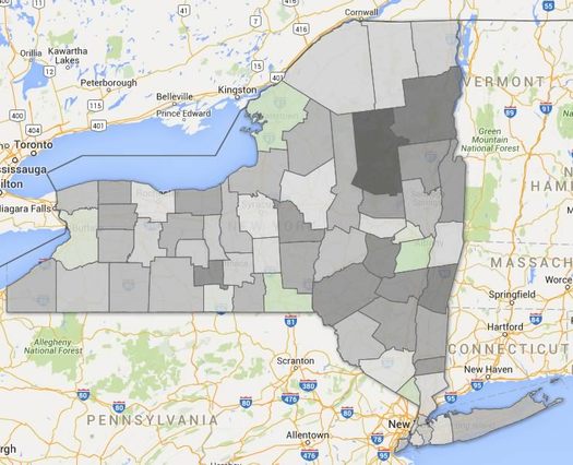
Life expectancy in New York State by county
New York counties by estimated life expectancy. Green is roughly the state average -- yellow below, blue above. (There are two clickable maps after the jump.)
Life expectancy at birth was a little more than 80.36 years in New York State in 2014, according to a new study out this week.
That was good for 6th best in the nation. And it's up 73.19 years in 1980.
Those estimates are from a study published in JAMA Internal Medicine this week looking at how life expectancy varies across counties in United States. And as the researchers reported, there was wide variation -- some 20 years of difference between the high and low ends.
Here's a good interactive map of the numbers. And here are a few articles in the popular press about the overall study -- at FiveThirtyEight and The Atlantic.
New York counties didn't exhibit such a wide range, but there were some differences.
Where the new homes have been built
Parcels in the town of Halfmoon on which new single-family homes were built between 1995 and 2015. / map: Capital District Transportation Committee and the Capital District Regional Planning Commission
The Capital Region county that's the most different from the other three core counties? That's probably Saratoga County. And here's (another) bit toward that case...
Of all the single-family homes built in the Capital Region core between 1995 and 2015, almost half were in Saratoga County.
That's from the Capital District Transportation Committee and the Capital District Regional Planning Commission, which have posted a series of new "community growth profiles" for each of the core's 56 cities and towns:
Between 1995 and 2015, more than 35,111 single family homes were built in the four county Capital District Region on lots totaling 55,928 acres. The majority of single family home growth occurred in Saratoga County with 49% followed by 25% in Albany, 15% in Rensselaer, and 10% in Schenectady. As of 2015, there are 209,730 single family homes and 378,947 housing units overall in the region. And, approximately 214 miles of new roads were built between 2005 and 2015, of which 21% included sidewalks.
The town of Halfmoon is a prime example of the population and housing growth in Saratoga County. Between 1990 and 2015, the town went from 6,125 housing units to 11,060 units, according to its profile.
Another look at New York State's population change, this time along the urban/rural split
There's a clickable map inside, because of course there is.
Here's a bonus track from last week's post about the slow population growth of the Albany metro area -- and the melting populations of many upstate counties.
That map above depicts counties by population density. The deeper the blue, the more people per square mile of land. It's pretty much you'd expect. But we had the numbers leftover so we figured we'd roll the map together.
As we mentioned last week, there's been an urban/rural split in the state over the last handful of years for population growth -- basically, counties with higher population densities have added people, while counties with lower population densities have lost. (With a few notable exceptions)
So we grouped the state's population by county density and it makes this divide very clear -- let's have a look, along with a clickable map...
Capital Region high school graduation rates 2016

The state Department of Education recently released its annual collection of data about high school graduation rates around the state. The four-year statewide graduation rate for 2016 (that is, the 2012 cohort of students) was 79.4 -- up almost 1.5 percentage points from the year before.
As we do every year, we've pulled out the stats from Capital Region school districts.
Sorted stats (including notes and qualifications) after the jump.
Supermarket Showdown 2016

New list, new stores.
It's back: Supermarket Showdown, in which check prices for a basket of 40 items across multiple supermarkets here in the Capital Region.
The showdown has taken a few years off -- the last time we did it was in 2012 -- and this year it returns with a new basket and three new stores.
Without further ado, let's get to it...

The Capital Region's transit arteries
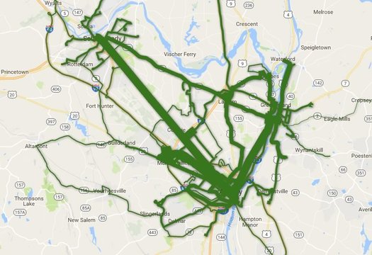
Total ridership per route during the last fiscal year. Is there a clickable, zoomable map inside? You know there is...
Which CDTA bus lines get the most riders?
The news earlier this year that CDTA set another annual ridership record -- and the recent batch of service changes on some of its most popular routes -- got us curious about ridership across the whole CDTA system.
So, of course, we had to make some clickable maps. Let's have a look.
Comparing the latest batch of Capital Region property tax rates
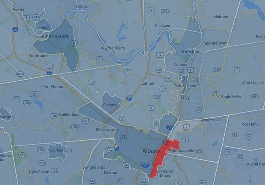
A clip from a map of the Capital Region's various overlapping tax areas -- counties, cities, towns, villages, school district. There's a larger, zoomable version after the jump. (And Rensselaer's marked in red because of missing data.)
The cities of Schenectady and Albany have some of the highest property tax rates in the Capital Region.
Saratoga Springs, Bethlehem, and Niskayuna have the highest estimated monthly payments for a median home.
Those bits are from our latest scan of Capital Region property taxes -- the numbers for the year 2015 are now out.
So, let's have a look.
What's new? Apartments.
The Elefteria on South Allen Street in Albany, one of the recent apartment projects in the Capital Region.
It seems like every month or so there's an announcement of some new apartment project around the Capital Region. And, as it turns out, the numbers are pointing toward a recent shift in what sort of housing gets built around here.
Last year there were permits issued for 3,601 new housing units in the Capital Region's core counties -- and 2,434 of those units (68 percent) were for homes in multi-unit buildings. And as the latest issue of the Capital Region Planning Commission's Capital Region Data points out, it is the first time in three decades the number of multi-unit homes has so drastically outnumbered single-family homes.
Here's a quick look at some of the numbers...
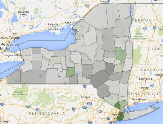
A generational shift
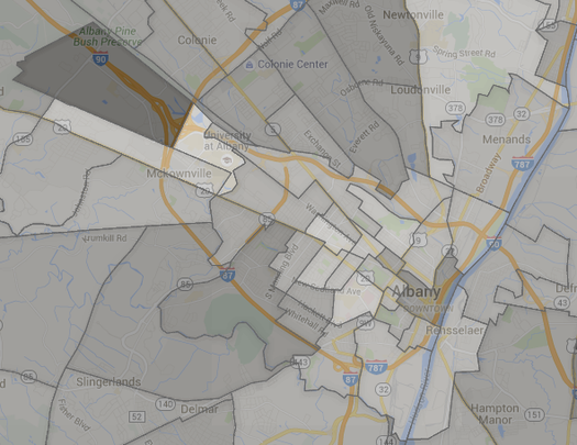
Just a handful of New York counties had lower median ages in 2015 (green) compared to 2010. Albany County was one of them.
Quick: Guess which 5-year age group has the most people of any age group in the Capital Region.
OK, got your answer? Hold onto it for a second.
The Census Bureau recently released new estimates for the populations of counties by age. And those numbers can help us get a sense of the age distribution of people here in the Capital Region -- and answer questions like which age group has the most people.
Plenty of graphs and maps are the jump.
But first, let's answer that question at the top...
A quick look at city and town population changes
There are large, clickable maps after the jump. (Because of course there are.)
The topic of changing population popped up in comments earlier this week, so we figured it'd be interesting to whip together a clickable map of some new numbers for city and town population changes both here in the Capital Region and across the state.
And it turns out the Capital Region is a bit of an outlier.
Let's have a look...
5 bits about jobs in the Capital Region -- and how much they pay

We hear George does this job for free.
Which jobs in the Capital Region pay the most? Which pay the least? Which are the most common? Which are much more common here than other places?
Those are the sorts of questions to which we can an answer from a set of numbers of published by the federal Bureau of Labor Statistics. And, as it happens, the BLS released a new batch of those numbers this week.
And given all the recent discussion about New York State increasing its minimum wage, it seemed like a good time to pick out some bits from the new numbers.
The Capital Region is growing. Slowly.
The deeper the green, the higher the percent population growth between 2010 and 2015. The deeper the gray, the higher percentage of population loss. There's a clickable map after the jump (actually, multiple maps).
The population of the Albany metro area was 881,830 as of last July 1, according to Census Bureau estimates released Thursday. That's up 1,739 people -- 0.2 percent -- compared to the same point in 2014.
The Capital Region is up 11,117 people -- 1.28 percent -- from 2010, according to the estimates. Its population growth (by percent) during that time ranked #260 among the 381 metro areas.
So what makes up that modest growth?
New York's Powerball fever is uneven
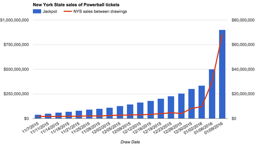
As the jackpot has soared, so too have sales here in New York State. (There's a larger version after the jump.)
Wednesday night someone -- or multiple someones, or maybe no one -- will eleventy zillion dollars in the multi-state Powerball jackpot. OK, not eleventy zillion -- it will only be something like $1.5 billion.
That's an eye-catching number, even if you don't usually pay attention to lottery games. And that's the whole the point -- the org that manages the game changed the rules last year in an attempt to build huge jackpots in order to drive ever larger ticket sales.
And by now you probably know all about how playing the lottery isn't a good investment -- expected return and all that. If you're going to play the Powerball, buying a single ticket just for the conversation value is the way to go.
Anyway, we were curious how Powerball fever was playing out here in New York State. So we got county-by-county numbers from the New York Lottery...
Capital Region high school graduation rates 2015

The state Department of Education released its annual collection of data about high school graduation rates around the state on Monday. The statewide graduation rate for 2015 (that is, the 2011 cohort of students) was 78.1 -- up almost two percentage points from the year before.
As we do every year, we've pulled out the stats from Capital Region school districts.
Sorted stats (including notes and qualifications) after the jump.
New York State is #4 -- again
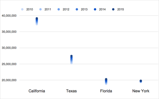
It's not looking good for catching Florida anytime soon.
The Census Bureau released new state population estimates this week and the Empire State was pegged at 19,795,791 people as of July 1, 2015. That's up an estimated 46,933 from the same point in 2014, an increase of .25 percent.
But that small increase wasn't enough for New York to catch back up with Florida, which passed New York for the #3 spot in the national population ranking last year. Florida's population grew an estimated 1.84 percent between July 1, 2014 and July 1, 2015.
And that's the overall story for New York's population -- it's growing, but very slowly, especially compared to California, Texas, and Florida. The Empire State's population is up an estimated 2.02 percent between 2010 and 2015. But over that same period California is up 4.85 percent, Texas is up 8.81 percent, and Florida is up 7.54 percent. (The graph above illustrates the change for each state since 2010.)
The drag on New York's overall population growth is that it's losing a relatively large number of people each year to other states. It lost an estimated 628,672 people between July 1, 2010 and July 1, 2015 to what the Census calls domestic migration.
So, what's propping up New York's population? People coming to the state from outside the United States -- international migration to New York is an estimated +606,667 between 2010 and 2015. And New Yorkers are having babies at a much faster rate than people here are dying -- New York is an estimated +441,603 over that same period for births and deaths.
There are a handful of clickable national maps (and another graph) after the jump. Because of course there is.
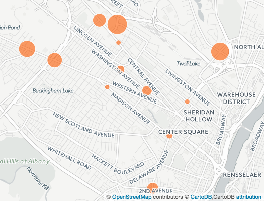
A few quick statistical snapshots of Capital Region neighborhoods
Which Capital Region neighborhoods are the most expensive in which to rent? Which tend to have households with the highest incomes? Which neighborhoods have populations that skew younger or older?
Those are some of the questions for which we can get an answer from new numbers released by the Census Bureau recently. This new data -- the American Community Survey 2010-2014 -- includes estimates for 210 census tracts in the Capital Region core counties. So we can focus not just on a city or town, but sections as small as neighborhoods.
There are a lot of things you can do with these numbers, and we're hoping to dig into them, but we figured we'd start out with putting together a handful of Capital Region maps that look a range of general topics, from income to age to whether people own or rent.
A quick look at how Albany's red light camera system has started off
A map depicting the number of violations per day per intersection. There's a larger, clickable map after the jump.
Updated
The city of Albany released the first batch of numbers related to its new red light camera system this week.
The APD reports that since the cameras started coming online in July, the system flagged 2,197 potential violations. After reviews by officers, the city sent out 1,356 citations. So about 38 percent of the potential violations were screened out by the human review.
As you've probably heard by now, getting tagged by one of the red light cameras (and the officer review) is a $50 violation (like a parking ticket). The legislation authorizing the system allows the city to place cameras at up to 20 intersections. (It's now up to 15 intersections, the latest coming online October 2.)
The city released numbers for each intersection approach being monitored by the cameras, so let's have a closer look at the numbers to see which intersections had the most violations...
Degrees of difference between women and men
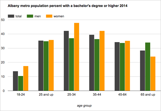
More women than men in the United States had a bachelor's degree or higher in 2014 -- 30.2 percent of women, compared to 29.9 percent of men, according to Census Bureau estimates. And as the bureau pointed out today, it's the first time that's happened nationally since the bureau started tracking the number in 1940.
We were curious about about the numbers for the Capital Region, so we looked 'em up for the Albany-Schenectady-Troy metro area. They're smashed into the chart above.
And here's a bit more...
A snapshot of Capital Region income
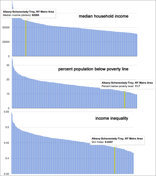
How the Albany-Schenectady-Troy metro compares to the nation's 381 other metro areas.
The Albany metro area continues to have one of the nation's higher median household incomes, and one of the the lower rates of poverty, according to the newest estimates from the Census Bureau.
Household income
The median household income in the Albany metro -- the point at which half the households had more income, and half had less -- was an estimated $62,265 (+/-1,494) in 2014. That's up just a bit from 2013 -- $59,626 (+/-1,981) ($60,593.25 in 2014 dollars). And it ranks 41st among the 381 metropolitan statistical areas the Census tracks.
Poverty rate
The Albany metro area's poverty rate was an estimated 11.7 percent (+/- 0.9). (It was 12.5 percent (+/-1.0) in 2013.) The metro's poverty rate was the 51st lowest among the 381 metros, lower than 87 percent of them. The Capital Region's poverty rate for kids wasn't quite so low -- an estimated 17.1 percent (+/-2), lower than 76 percent of metros.
Income inequality
Another angle on income and poverty is income inequality. And for that the Census Bureau publishes a figure called the Gini index -- a Gini index of 1 means only person has all the income, and 0 means everyone in a group has the same level. The Capital Region's Gini index for 2014 -- an estimated .4357 (+/-0.0119) -- was the 80th lowest (that is, toward the more equal end) among metropolitan areas.
Even if those three measure look relatively good for the Capital Region, there are still some troubling parts to the picture.
Record breaking numbers for Saratoga Race Course 2015 season

At some point large numbers just become... numbers. You know, how often do we ever encounter a million of anything? So, it's easy to see some large figure quoted in a news story and just be like... yeah, sure, whatever.
We were thinking about that today while looking over the numbers for the Saratoga Race Course season that ended Monday. Because it involved some very big numbers.
NYRA reported that the "handle" for this year's season -- that is, the amount of money bet on races -- was $648,272,805, a record. (The previous record was $590,187,876, set in 2012.)
Think about that for a second. That's more than half a billion of dollars that people, both here and elsewhere, put down on horse races over the season's 40 days in Saratoga Springs. When you take a second to think about the total, it's kind of astounding. (By the way: NYRA says almost $50 million was bet on Travers Day races this year.)
Paid attendance for this year's meet was also high: 1,065,625. That's a new seasonal record total, though it comes with an asterisk. The old record -- 1,049,309 -- was set in 2003, the season for which only had 36 days.
Here are a few quick tables and charts with some more recent context for this year's Track numbers...
A bunch of numbers about a bunch of different topics
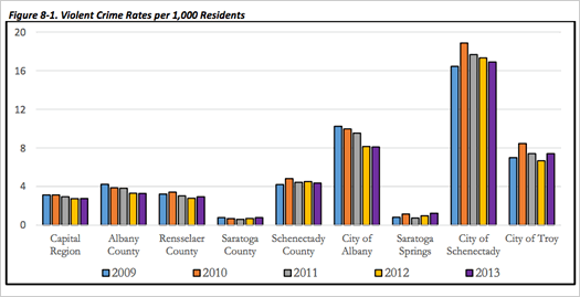
A chart about violent crime from the report.
How many people are here? What's the range of incomes? How are people getting around? What direction are crime rates headed?
Numbers related to those questions -- and many other topics -- are stuffed into the aptly-titled "Capital Region Statistical Report," which was released today by the Capital District Regional Planning Commission.
And it is exactly what it sounds like: a bunch of numbers about a bunch of topics in the Capital Region from a bunch of different sources, all aggregated in one report.
One example is above -- it's a chart from the report about annual violent crimes per 1,000 people in areas of the Capital Region. And it includes this short discussion of the chart:
... said KGB about Drawing: What's something that brought you joy this year?