Items tagged with 'design'
Stuck on Albany
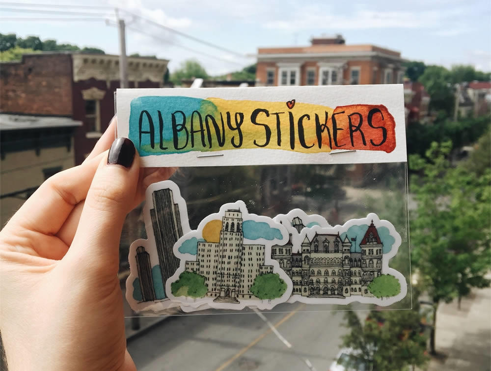
These Albany-themed stickers by local artist Cara Hanley are delightful and they're available via Etsy for $8. Blurbage:
Set of 4 Albany stickers made from my original watercolor paintings. These stickers are made from a durable vinyl with a laminate that protects your stickers from scratching, rain and sunlight.
We'd be happy to get them as a gift, and we bet other people would, too. You know, if you're looking for some fun, small gifts for the upcoming holiday season.
See also: The rest of her Etsy shop, which include a number of local-themed works.
Earlier: Senate House Marigolds
photo via Etsy
Screenprint Biennial 2018
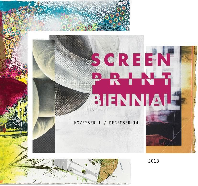
The 2018 Screeprint Biennial will be at the Opalka Gallery on the Sage Albany campus November 1-December 14. Event blurbage:
The Screenprint Biennial 2018 seeks to showcase a range of screenprint-based art applications, from framed, editioned prints to installation, sculpture, video, ephemera, and posters. This exhibition isn't meant to act as a survey or "who's who" of screenprinting, but to assemble artists who utilize adventurous, relevant, and passionate takes on the screenprinted medium. The works chosen are part of screenprint's rich lineage, drawing on the history of this versatile medium, while at the same time pointing to a future where technology, politics, and expression are pushed through mesh by a squeegee onto the world of ideas.
"The work in this year's biennial exhibition continually exceed my expectations in the way so many elements come together to create compelling, important, and timely narratives," says founder and juror Nathan Meltz. "These art pieces also draw upon a depth of expression, and open windows into creative worlds."
From large-scale installations from artists Sheila Goloborotko, Tonja Torgerson, Tatiana Potts, to smaller-scale three-dimensional works by Olivia Fredericks and experimentation with augmented reality from Mark Hosford, the show will expand the definition of the word "screenprint."
In addition to the Opalka Gallery showing off the works of art and design, there will also be a handful of events to go along with the Screeprint Biennial.
And, yep, one of them involves making prints with a two-ton steamroller...
Animated glimpses of Albany
Check out these beautifully-animated, slice-of-life shorts set in Albany. They're by local artist/animator Jordan McClendon.
The first -- "The Plaza" -- is embedded above. The other -- "The Strip" -- is embedded below.
McClendon told us via email: "Inspiration for this work came from my appreciation for the diversity and architecture of this great city. I've walked and driven these streets for years and I thought what better way to show my appreciation of Albany than to use this city as a basis for some creative animated output."
You can head over to his website to see more of his work. And there's info there about how to contact him for freelance projects.
A bike ride and design tour around Albany's Corning Riverfront Park
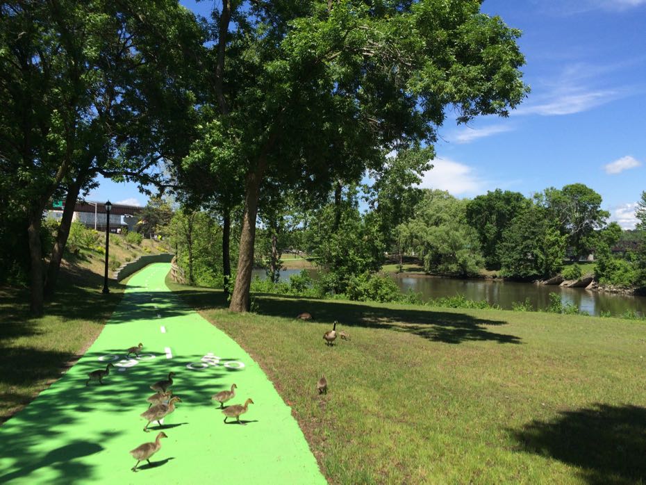
The LocalxDesign series has a bike tour of the Corning Riverfront Park September 12. Blurbage:
We are embarking on a 3 mile bike ride as we explore the park and discuss how the experience of the landscape has changed overtime. From the times of the Albany Basin, through creation of the Preserve, to recent cycling infrastructure improvements and possible future enhancements of the park we hope to learn about history of the space. We are informally partnering with the CDPHP Cycle! and attendees can either bring their own bikes or use the bikeshare. As of now we are not offering any special discounts on the bike rental, but CDTA will assist with making sure we have adequate number of the rental bikes at the Broadway docking station.
The tour will start from in front of the Stacks Espresso Bar at 488 Broadway, loop through the preserve, go by the USS Slater, and return to the starting point.
The meet-up time for the tour is 5:30 pm. It's free to attend, but registration is requested.
LocalXDesign?
LocalXDesign is a monthly series of events focused on design projects in this area. Previous events this year have included tours of downtown Albany murals, the Empire State Plaza, and The Church artists/events space in Troy.
Its founders are Barbara Nazarewicz, a landscape architect, and Liz Podowski King, a landscape designer.
Earlier:
+ Walking the new (very, very, very green) multi-use path along Corning Riverfront Park
+ Connecting Albany's riverfront park
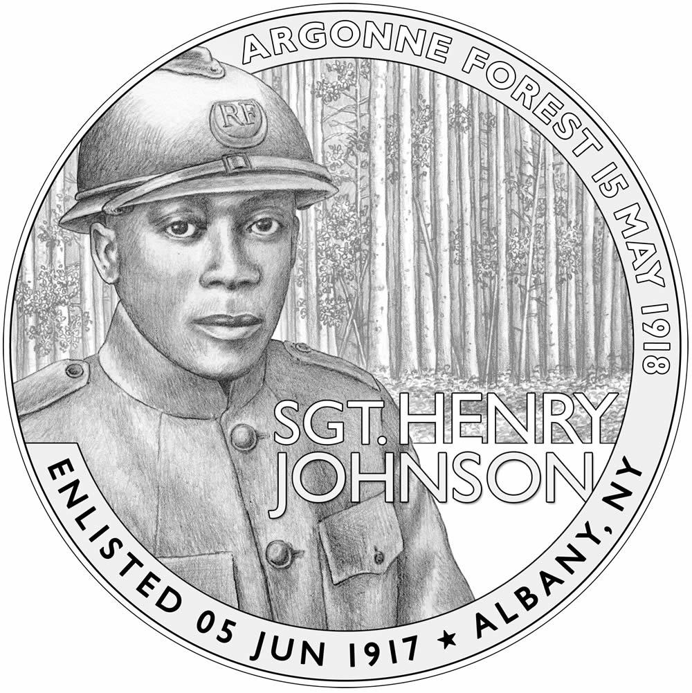
Here's the design of that Henry Johnson commemorative medallion
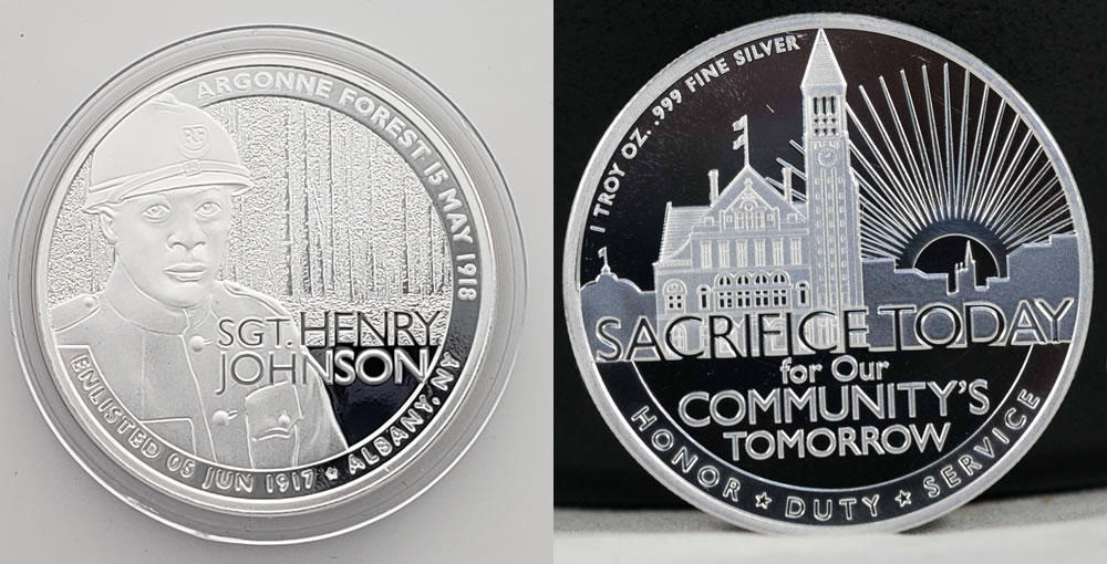
Here's that how that coin-shaped medallion to honor Henry Johnson turned out. It will debut at a free event at The Palace June 27 at 5:30 pm.
The silver medal was created by the local Ferris Coin Co. And the design -- a product of national contest -- is by Chris Costello, who's designed many coins and medals for the US Mint. A quarter he designed honoring the Block Island National Wildlife Refuge in Rhode Island will be released later this year. (Another bit about Costello: He's the creator of the Papyrus typeface.) Costello will be at the Palace event.
Ferris is making 500 of the coins/medals. Ten of those have been set aside for the winners of the city of Albany's Henry Johnson Award for Distinguished Community Service. This year's winner -- Jahkeen Hoke, the founder of the org 4th Family -- received one of the medals last month at the award ceremony.
The company is also selling the coins. They're $29.95 at the Palace event. Two dollars of that will benefit the 369th Veterans Association of Albany.
A medallion to commemorate Henry Johnson
The image above is the design for a new coin-shaped medallion the Ferris Coin Co. is producing to commemorate Henry Johnson. (You might remember the call for entries back in March.) The reverse side, which is still being finalized, will feature Albany City Hall.
The winning design is by Chris Costello, who's designed many coins and medals. A quarter he designed for the US Mint honoring the Block Island National Wildlife Refuge in Rhode Island will be released later this year.*
The Henry Johnson medals will be available in June. Ferris is making 500 of them, and the price will depend on the price of silver. A group of the coins will be set aside for winners of the Henry Johnson Award for Distinguished Community Service. A portion of the proceeds from the sale of the coins will benefit the Albany Veterans of the 369th, which worked to get Henry Johnson recognized with the Medal of Honor.
The pedagogy penguin
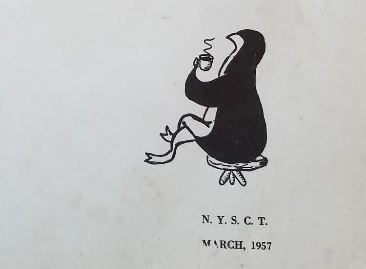
This illustration of the pedguin is from university literary publication, The Penguin. Brian shared it on Twitter this week. We think the pedguin projects quite a sophisticated air as he or she sips tea.
A stray bit that of local history that made us smile this week...
UAlbany's current mascot is a dog, specifically a Great Dane named Damien. But for a few decades last century -- when UAlbany was called the New York State College for Teachers and the State University of New York College of Education at Albany -- the mascot was a penguin.
Or, rather, it was the "Pedguin." From a UAlbany News item:
Then came 1948-49, and someone realized that another name for "teachers" -- "pedagogues" -- could be shortened into a new and catchy sports nickname: "Peds." It was used first in a State College News basketball game write-up on Dec. 3, 1948, and became dominant. Again, however, it was a nickname without a mascot.
That inanimate situation ended on May 13, 1949, when it was announced that the student body had chosen "Pedguin," a penguin-like figure designed by Paul Kirsch '51, as school mascot. In both scholarly and cuddly manifestations -- drawn, sewn (on patches), stuffed and, in late '50s and early '60s basketball games, costumed -- the Pedguin remained the college's mascot until a new university identify cried out for something beyond the symbol of the teacher.
Yes, the pedagogy penguin. Prepare to be schooled!
The school switched over to the Great Dane in 1965 via a contest that asked students for submissions. Belated congrats to Kathy Earle '57 who suggested the Great Dane because of its "proud bearing and imposing stature."
UAlbany timeline
By the way: There's a good timeline of UAlbany history online that tracks the charts the various names of the school and other developments.
Flowers from the Netherlands, then
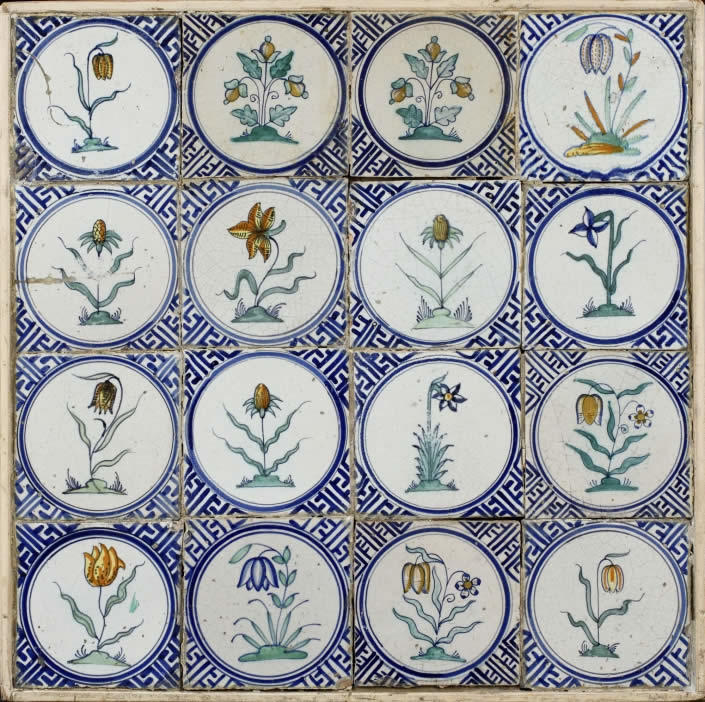
Decorative arts break: The earthenware tiles above are from the collection of the Albany Institute -- they date to around 1625 and they were made in the Netherlands. We love the illustrations of the flowers and the blue-patterned background. If you head over to the Albany Institute's online collections you can zoom in and see all the little details.
These pieces are tin-glazed, which gives them that characteristic shiny white background. The style was hugely popular in the Netherlands around this time -- the country made huge numbers of them. And a specific version of this technique, famously using blue patterns on white, became associated with the Dutch city of Delft. The style of the tiles above is called faience.
These tiles were a gift to the museum from Mabel Brady Garvan. She and her husband -- Francis Patrick Garvan, a prominent attorney and chemical industry official during the first quarter of the 20th century -- were collectors of all sorts of decorative objects. Many of those pieces are in the The Mabel Brady Garvan Collection at Yale.
The Albany Institute has all sorts of pottery and earthenware in its collection, many examples of which are posted in the museum's online collection if you'd like to gawk.
A look around the new Cafe Madison
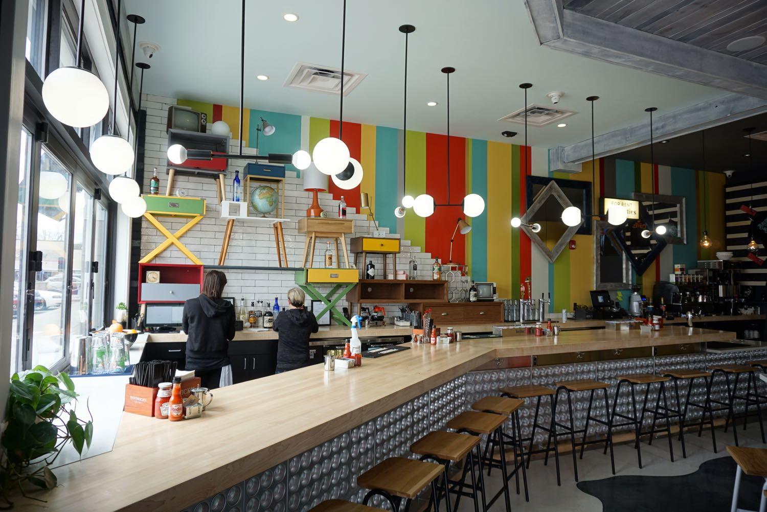
The new Cafe Madison location on Northern Boulevard in Albany opened this week. It's now open 7 am to 3 pm, seven days a week.
It's the second location for the popular breakfast/lunch cafe, a follow-up to its longtime spot on Madison Ave in Pine Hills. The new restaurant occupies one end of the Loudon Plaza strip mall across from Albany Memorial Hospital. It has big windows, a long bar up front, and a brightly decorated interior designed by Jessica Evans. (She also designed Ama Cocina in downtown Albany.)
"This space allows us to do a little more behind the bar, including cold-pressed juices, but it's pretty much same [as the other Cafe Madison]," said Brian Viglucci, the managing partner of BMT Hospitality. The menu is, with the exception of a few additional items, roughly the same as the Madison Ave location. Viglucci said the both spots will eventually have the same menu.
This is the 10th restaurant for the Albany-based BMT, whose holdings also include Junior's (both Albany and North Greenbush), The Point, Madison Pour House, Ama Cocina, Albany Ale & Oyster, Spinner's Pizza, and The Pub.
Here's a look around the new Cafe Madison...
What's an apartment or condo building design you actually like?
In a comments about the Playdium site redev last week, Lauren mentioned Stonehenge near Albany's Buckingham Pond as an example of an apartment complex design she liked. (Here's a pic from when the complex was built in the 1940s.)
Whenever the topic of new building projects comes up, people inevitably end up talking about the exterior design. And that's great. The question of how buildings look and relate to the surrounding context is worth paying attention to. Our environment -- including the built environment -- can affect the way a place works, and how we feel while we're there.
Somewhat less encouraging is that reactions to the designs are usually lukewarm to negative.* Recent example: the proposed residential redevelopment of the Playdium site in Albany's Pine Hills neighborhood.
So, in the spirit of "more like this" instead of "no, not that"...
What's an apartment building that you like the look of? Why?
It could be a local building, it could be one somewhere else. (Ideas from else could be a welcome addition.) It could be new, it could be old.
It'll be interesting to hear what you think.
And If we get enough answers we might be able to pull something together about why buildings are designed the way they are today, and what's possible and/or cost effective for new residential buildings.
____
* Some of the apparent level of dissatisfaction is no doubt due to the fact if people don't like something, they're probably more likely to speak up.
Earlier:
+ What's a recent building that you like? (2014)
+ Six not-boring parking garages (2013)
Ideas for interesting indoor spots for family photos?
 Maclain asks:
Hi - I'm looking for suggestions on locations where I can have indoor family pictures taken in the Albany area. The weather is turning so I'm looking for a place to do a photo shoot for a family pic (not a studio). Anyone have any suggestions? Thanks!
There's something about those staged in-studio family photo sessions that makes everything look like it's from 1980something. So finding some sort of other setting is a fun idea.
It seems like there are probably too considerations here: 1) What's a good place, and 2) What's a place where that's allowed.
Go a suggestion for Maclain and family? Please share! A sentence or two about why you're suggesting a place can be helpful.
A shareable reminder of that shop in Troy
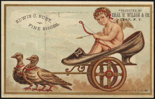
Because... well, who knows. But you know this would have gotten "likes" on the Victorian Facebook.
Memes, sponsored content, Facebook link bait -- all this stuff might seem very modern. But it's probably not a stretch to say that people have pretty much always been into shareable images like this, it's just that now we are all collectively able to manufacture and distribute it at saturation levels.
We were thinking about that while browsing through old trade cards for shops in Troy from the late 19th century. The cards were sort of like modern business cards, but were a form of content unto themselves that people traded and collected.
Some are beautiful. Some are kind of funny. Some are just plain weird. Here's a few of them from Troy...
Interior designer or decorator suggestions?
 Christina emails:
Can you ask your readers to recommend any interior decorators or designers they have worked with? I am looking for some help for my living room, but don't want to commit to buying everything at once, so a focus on someone I can pay to help me with a plan that I can implement over time would be great.
A designer can be an added expense for a home project. But we're often pleasantly surprised by how a talented designer can look at a building/space/place and see solutions, angles, and ideas a non-designer might miss. And if you buy a home that needs a lot of updating, being able to talk over a plan with someone who does this often could be a help.
So, got suggestion for Christina -- whether it's a designer or some other sort of resource? Please share! And a sentence or two about why you're recommending a person/service can be a big help.
Earlier: Help with kitchen renovation design?
photo: Paul Gallo
Paper Is Part of the Picture at the Opalka Gallery
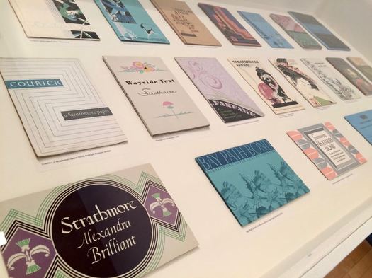
If you have any design nerd interests -- papers, vintage posters, typefaces, the business of design, and so on -- the current exhibit at the Opalka Gallery on the Sage Albany campus is worth a quick stop.
Paper Is Part of the Picture chronicles the evolution of the promotional materials for the 100+ years of the Strathmore Paper Company. Blurbage:
The company, founded in 1892 and now owned by Mohawk, pioneered the notion of paper as an essential visual and tactile aspect of a printed piece, rather than a simple commodity. It did so by embracing artists and designers as collaborators. Strathmore's paper promotions reflect the changing trends in American graphic design across the 20th century from Arts & Crafts to the digital era.
The headquarters of Mohawk Fine Papers is in Cohoes, as you know. The materials in the exhibit are from the Strathmore archive.
There's a curator's talk with Paul Shaw about the exhibit October 26 at 6:30 pm. And on November 3 at 6:30 pm there's a tour with Chris Harrold, VP and creative director at Mohawk. Both are free.
The exhibit is on display through December 15.
Luba Lukova
If you're interested in this exhibit, there's a good chance you'd also be interested in an AIGA Upstate New York event at the Opalka Gallery October 17 with Luba Lukova, creator of "arguably some of the most iconic and indelible imagery in the realm of contemporary poster design."
The talk is at 6:30 pm Tuesday. Tickets are $20 / free for students with ID.
New York State of Design show at the Troy Innovation Garage

Some of the work that will be on display.
The Troy Innovation Garage is hosting New York State of Design, a new show of work by upstate New York designers, this Friday, September 29. It's a curated show organized by the upstate New York chapter of the design professional association AIGA. Blurbage:
Entries for the show spanned a wide range of logos, branding, public awareness campaigns, posters, books, packaging, app design, motion graphics, and typefaces. Most works were created as part of a business strategy, but others were student work, personal, or from the pure joy of creation. ...
Three of the country's most respected designers, Justin Ahren, J. Dontrese Brown, and Debbie Millman, juried the show. Each has selected one piece for their Judge's Choice Award.
There will also be a panel discussion there Friday evening featuring some notable local design pros:
+ Melissa Mangini, managing editor of the Albany Business Review
+ Richard Lovrich, creative director for Proctors
+ Aray M. Till, managing editor of Beekman 1802 Almanac Magazine
+ Sara Tack, creative director of Smith and Jones
The opening night event is 5:30-9 pm during Troy Night Out. The panel discussion starts at 6:30 pm. Awards will be announced at 8 pm. Admission is free.
A way to say "more like this" when it comes to talking about how streets are designed
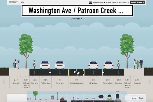
Just a quick example of what the app can do.
One of the difficult aspects of having public discussions about projects like the Madison Ave Road Diet is that it's hard for non planners/engineers to explicitly show what they'd like to see (it's true of building projects, too). And, maybe as a result, the discussion ends up being centered around what people don't want.
So this web app looks like it could be interesting and helpful: ReStreet allows anyone to plan the design of a street, laying out sidewalks, bike lanes, vehicle travel lanes, transit lanes, whatever. And then you can share the design with other people.
That image above is a screengrab of a sample design that we worked up this afternoon for upper Washington Ave in Albany.* The design includes wide sidewalks, protected bike lanes, a single travel lane in each direction, and middle turn lane.
What we like about this app is that it enables members of the public to essentially say "more like this," which seems like a path toward more productive discussion. So go give it a try.
[Via CityLab, which has backstory on the app.]
____
* Why upper Washington Ave? We've been thinking about it because the Capital District Transportation Committee, city of Albany, and UAlbany have been laying the groundwork to study the corridor in order to possibly change the design to better fit the recently lowered speed limit there.
Today's moment of architecture
Today's moment of architecture: One of our favorite walks in Albany is the segment of State Street from Western to Eagle. It's just one great building after another.
And it's not just how the buildings are at street level -- the tops of the buildings are also beautiful and compelling. Even the ones that don't immediately jump out yield interesting interest details when you take a minute to look.
An example is above: This string of five, similarly-styled buildings on State just east of Lark.
Signs of storefronts past
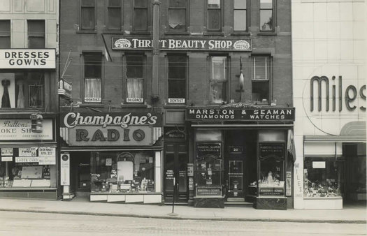
While talking with Schuyler Bull this week about his plans to re-open the Fort Orange General Store downtown, he mentioned hearing stories from his grandmother about how downtown Albany was at one time the place to shop.
And that's apparent when you flip through old photos of the area, like the "commercial streets" group of the Albany Public Library History Collection.
It's interesting to see how many shops were once packed into buildings around downtown Albany. But the thing we often end up gawking at is the old storefront signage. There's a certain style about it that makes today's signage just seem sort of... plain.
So we thought it'd be fun to go through the APL collection of photos and pull out a bunch of examples of downtown Albany storefront signs from the early 20th century...
Today's moment of ornamentation
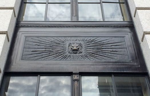
Sure, the Smith Building looks all staid. But up close... lions! With lightning bolts!
The ceiling is moving
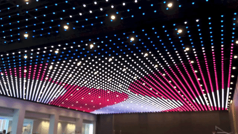
Here's a bonus track from yesterday's Albany Capital Center photo tour.
The second floor of the venue includes a huge ballroom/multi-purpose space -- 22,500 square feet with a 26-foot ceiling and no support columns. And it takes a second to process that you're in such an enormous, uninterrupted indoor space.
Anyway, the feel of the room further amplified by the LED lights that stud the ceiling. They can be programmable to change into millions of different colors while creating patterns that twinkle or move.
That's what the gif above is showing, a pattern from Wednesday that evokes a flapping American flag. It's kind of mesmerizing. (And it really weirds out the autofocus on a phone camera.)
Here's a longer (but still short) video clip if you'd like to zone out a bit more...
Wallpaper and power
Some of the new wall covering. The Schuyler Mansion Twitter stream and blog have more photos.
The Schuyler Mansion recently completed the reproduction and reinstallation 18th century wallpaper -- "Ruins of Rome" -- and the historic site's blog shares the details about how exactly that all happened. The process involved digital image tech and, we suspect, a lot of patience.
But this part struck as particularly interesting. Writes Danielle Funiciello:
Rather than the sparse interior which has greeted visitors for 100 years, walking into the mansion is like now like stepping back in time. Philip Schuyler vision for his home was calculated. Each element was designed not only to impress guests once they arrived at the home, but to encourage wealthy and important guests to come in the first place; thereby creating networking opportunities for the Schuyler family. The size and grandeur of the home was successful - drawing visitors like the Washingtons, the Marquis de Lafayette, the Marquis de Chastellux, Benedict Arnold, and even Benjamin Franklin, who had a letter of introduction written so that he could stay at Schuyler's when travelling through Albany. The "Ruins of Rome" helps historians and museum visitors alike understand the first impression that accomplished this.
Hamilton
The Schuler Mansion is again offering its popular "When Hamilton Called Albany Home" tour in March. It's currently taking reservations for March 2 and March 4. And when March starts, it'll be begin taking reservations for other dates during the month.
And if you go, be sure to scope out all the wallpaper.
Earlier on AOA:
+ "You maintain your empire in spite of all my efforts..."
+ A timeline of Theodosia Burr Alston
photo via Schuyler Mansion Twitter
Talking with Albany artist Elizabeth Zunon about illustrating a legend, drawing on her family's history, and stoking her creativity
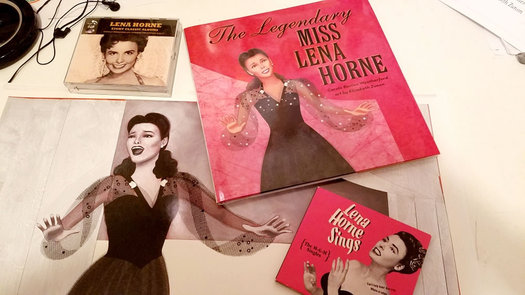
Check it out: A new children's book about Lena Horne -- The Legendary Miss Lena Horne -- was illustrated by Albany artist Elizabeth Zunon.
She's illustrated a handful of children's books. And like her other work, the images in The Legendary Miss Lena Horne are beautiful -- warm and textured, incorporating illustration and collage.
We bounced a few questions to Zunon this week about working on the book, an upcoming project based on her family's history, and local spots where she stokes her creativity.
Leads to fish
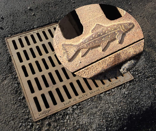
The little fish on this storm sewer grate in Albany caught our eye this week -- it's next to the note about the sewer draining to waterways. (At first we thought it might be a sturgeon, but the head and fin alignment look wrong.)
These little decorative touches on otherwise utilitarian stuff make us smile.
Also: Sturgeon on sewer grates would be pretty great.
Maybe judging a book by its cover isn't so bad...
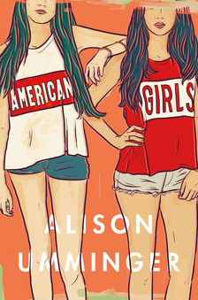 Check it out: A cover by local designer Phil Pascuzzo -- for American Girls by Alison Umminger -- made Paste's list of the 30 best book covers of 2016.
American Girls is YA novel released this past summer. Blurbage:
Anna is a fifteen-year-old girl slouching toward adulthood, and she's had it with her life at home. So Anna "borrows" her stepmom's credit card and runs away to Los Angeles, where her half-sister takes her in. But LA isn't quite the glamorous escape Anna had imagined.
As Anna spends her days on TV and movie sets, she engrosses herself in a project researching the murderous Manson girls--and although the violence in her own life isn't the kind that leaves physical scars, she begins to notice the parallels between herself and the lost girls of LA, and of America, past and present.
Phil Pascuzzo has designed a bunch of book covers -- you've almost certainly seen at least a few of them, even if you didn't recognize them as a PepCo work at the time (his website includes a gallery). He sometimes posts new ones on his Instagram feed.
He's also done a ton of local design work -- band art, event posters, identity for orgs... including a bunch of the special AOA banners, such as the current holiday banner above.
[via @MsMansfield]
Earlier on AOA: The book on Phil Pascuzzo
Creative Every Day book launch
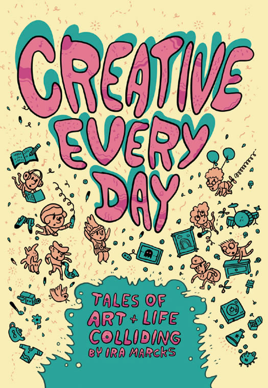
Earlier this year we mentioned Creative Every Day, a series of illustrated mini-biographies of local people created by artist Ira Marcks as a project aimed at inspiring kids to explore careers in the creative economy.
Well, the book of those tiny stories is now finished and it's great -- interesting, beautiful, and fun! You can check out a pdf of the book online at the first link above. We've also clipped a few pages after the jump in case you'd like to take a quick look. (But, really, go check out the whole thing.)
The book's creation was sponsored by the Work Force Development Institute. And Marcks says the institute and Proctors will be distributing the book for free to schools around the region as part of program to help kids learn about how artistic skills can be applied to a wide range of jobs.
There's a party to celebrate the release of Creative Every Day Thursday, October 27 at Troy Kitchen from 6-9 pm. There will be music from Jecco Trio, Sudharsana Srinivasan, Taina Asili, and Jamel Mosely. And everyone who attends will get a free copy of the book.
Screenprint Biennial 2016
The Screenprint Biennial is set to return to Troy this October at sites around the city:
+ The Arts Center of the Capital Region and Collar Works Gallery will have opening receptions for screenprint exhibits October 28. The work of 35 artists from around the world will be on display. The exhibits will be on display through December 23.
+ The Oakwood Community Center will be hosting a temporary site-specific screenprint-based artwork by Ian Cozzens.
+ A symposium October 29 will include artists from around the country talking about trends in screen printing. Also scheduled: a talk by Josh MacPhee, an expert in political graphics.
All events are free and open to the public.
The organizer of the Screenprint Biennial is Nathan Meltz, an artist and RPI faculty member. As he told Lauren ahead of the first biennial in 2014, the idea behind the event is to celebrate the artistic side of the widely-used medium and showcase many of the different paths this artform can take.
Symbolic change
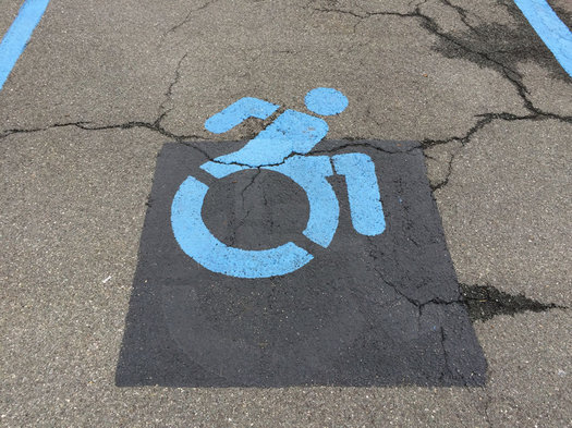
It's been about two years since a change in New York State law required the more-active disability symbol on new state signage. But for whatever reason, we've noticed the new-style symbols popping up a bunch local places this summer.
That pic above is from a Market 32 parking lot earlier this month.
The new version of the symbol started back in 2010 as a form of activism intended to help reshape the perception of people with disabilities -- two designers in Boston ended up making stickers to apply over the old, more passive-looking symbol. And from there it grew into a collaborative design project with other people, and then a widespread shift.
Excelsiorama
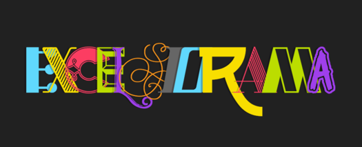
This is fun: A group of upstates designers got together to create a sort of crazy quilt typeface called Excelsiorama. (Because upstate New York.) Blurbage:
While it is a work in progress, it is ready for a variety of wacky uses. The core set of letters, numbers, and punctuation were completed by over 30 collaborators across Upstate NY. Alternates continue to trickle in, adding much appreciated depth to the display face. Contributors snagged glyphs on a first come first served basis, with zero direction and guidance.
The typeface is free to download and free to use. "We'd love to see what you do with it (send a tweet to @AIGAUPSTNY or @finck."
The organizer of the effort is Ithaca-based designer Tyler Finck. And the list of contributors includes a bunch of Capital Region designers, among them Andrew Gregory, Doug Bartow, Christina Sharp and Michael Rivette, Greg Matusic, Krystal Hinckley, and Jared Schafer.
Creative destruction
Maybe you remember a while back Lauren talked with local photographer John Bulmer about his Reclaimed series in which he took photographs of local landmarks and, using Photoshop, imagined what they would like if they were left behind by humans.
Anyway, seeing one of Bulmer's tweets today about a Reclaimed version of the Proctors marquee prompted us to check his website -- and there are a bunch of Reclaimed illustrations that we hadn't seen before, in both Albany and Troy.
Also there: The timelapse video embedded above of Bulmer working one of the photo illustrations. (It's always interesting to use to see how stuff is made.)
The modern house of then -- on many levels
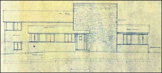
A 1947 Victor Civkin blueprint for the Lafferty House.
The latest batch of recommendations for the the State and National Registers of Historic Places for New York includes a handful of sites around the Capital Region, including the sorts places you'd expect like churches and a rural historic district.
It also includes a site you might not expect: a suburban home in Niskayuna.
The home in question is the James M. and Eleanor Lafferty House, which is in a neighborhood just off Rosendale Road. It's been nominated as a representative of the modern movement. And the home's national register nomination form is an interesting read (including diagrams and photos) -- especially if you're interested in midcentury design.
It's glimpse into both residential architecture of the time and also GE's efforts to create the kitchen "of tomorrow." (No, wait, The kitchen... of tomorrow.)
Design Disruptors at Overit
This could be some quality design nerding: Overit in Albany will be screening the new documentary Design Disruptors Tuesday (July 26) at 6 pm (snacks start at 5:30 pm). A local panel discussion will follow. It's free (though an RSVP is required).
The trailer for the doc is above. Here's some blurbage:
"Design Disruptors" weaves together the inspiring true stories of designers who have gone against the status quo, upending their respective industries by focusing on the end user through the lens of design. The film features expert voices from many of the world's leading companies, including:
+ John Maeda, Design Partner at Kleiner Perkins Caufield and Byers and former President of the Rhode Island School of Design (RISD)
+ Daniel Burka, Design Partner at Google Ventures
+ Frank Yoo, ‎Director of UX and Product Design for Lyft
+ Ryan Donahue, Vice President of Global Design at Zendesk
+ Andy Law, Lead Mobile Product Designer at Netflix
+ Julie Zhuo, Vice President of Product Design at Facebook
+ Katie Dill, Director of Experience Design at Airbnb
+ Tobias Van Schneider, Former Lead Product Designer and Art Director at Spotify
+ Aarron Walter, Vice President of Design Education at InVision and founder of UX practice at MailChimp
After the screening, the local panel of Becca Kennedy (Co-Founder and UX Researcher at Kennason), Dan Romlein (UX Designer at Apprenda), and Taegan Grice (Art Director at Deloitte Digital) will discuss the film and their work.
The trailer very much has an *angels-singing* design *angels singing* vibe to it. (See Khoi Vinn's uneasiness about the trailer.) So it'll be interesting to see if the doc takes up issues like designing for inclusivity and equity and fairness.
Red, white & blue
Check out this handsome, seasonally-appropriate t-shirt created by local designer Andrew Gregory: It's called "Red, White & Blue." (You know, because the ampersand is red, white, and blue...)
The shirt is currently available from Cotton Bureau, in men's and women's sizes, through this Friday. It's $28.
Andrew Gregory? You might know his work under the name Lunchboxbrain.
A continued focus on a-holes
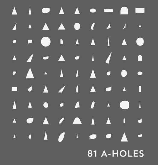
A clip from one of the a-hole wallpapers on Canham's CSA Creative Studio site.
A little more than a year ago we mentioned local designer Curtis Canham's project regarding a-holes.
You know, the negative spaces in the middle of the letter "A" in a typeface.
Canhan had a Kickstarter project going to publish a coffee table book about the topic, and it was successfully funded. Book blurbage:
A-HOLES: A TYPE BOOK is a cleverly-written art book that explores the negative space enclosed by the letter 'A'. While it makes a perfectly fun and cheeky coffee table book, its foundations are firmly rooted in the foundations and facts of typography. Curtis covers topics such as the anatomy of an A-hole, recognizing various typographic families of A-holes, the history of A-holes, and infamous/famous A-holes throughout history while spicing it all up with a healthy dose of humor and perhaps a few borderline puns. Put it all together and you have a refreshing, comedic take on a typically dry, dull topic. You'll never look at type the same way again, and no doubt you'll soon be seeing A-Holes everywhere!
We heard from Canham recently that's he's working with a literary agent to get the book picked up by a publisher for wider distribution. And in the meantime he's continuing his close study of a-holes with an Instagram account dedicated to them.
A place to get a tulip in a bottle -- and an Empire State Plaza bowling set
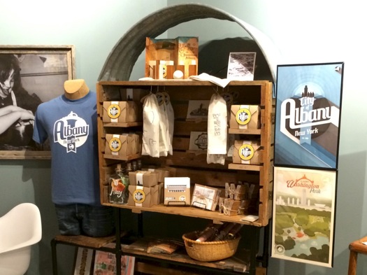
We're always on the lookout for locally-themed cards/souvenirs/gifts, so this caught our eye this week: Cider Belly in downtown Albany has a new display of Albany-themed items, many of them created by designer Mitchell Biernacki under his Daydream Hunter Creations brand.
The display includes postcards, posters, t-shirts, and a few whimsical items -- such as a tulip in a bottle, and an Empire State Plaza bowling set.
Yep, an ESP bowling set.
Touring Olana as a three dimensional artistic composition
Emily sent along this photo from one of the carriage paths as an example -- the lake, meadow, slope, trees, and house were all part of Church's design.
The Olana State Historic Site in Hudson -- the home and studio of Hudson River School painter Frederic Edwin Church -- has a new tour this season, and it highlights an aspect of the site that was new to us: That the area around the beautiful home is itself a designed landscape.
The guided electric vehicle tour follows roughly five miles of the carriage road system on the 250-acre site, surveying the various landscape elements that Church designed.
We heard about the new tour via Emily Lemieux*, who's been leading it. And we emailed her to find a more. Here's a clip from her response:
Frederic Church wasn't just a landscape painter, he was a landscape architect and the entire 250 acres of Olana is a designed landscape, a three dimensional artistic composition. It's like Disney Land for Art History fans.
"Universal Typography" at Opalka Gallery
 Typeface/font nerding is the some of the best nerding so maybe this will be interesting to you (maybe even if you're not a designer): Tim Brown -- the head of typography for Adobe Typekit and Adobe Type -- will be at Opalka Gallery on the Sage Albany campus April 20 for a talk organized by AIGA Upstate New York. Tickets are $10 for non-AIGA members / free for full-time students with ID. (And there are a limited number of tickets.)
Blurbage for the talk titled "Universal Typography":
The web is universal and, in this talk, Tim Brown shows us how to practice typography in a way that is equally universal. Focusing on traditional typographic principles, while also embracing progressive enhancement, Tim explains how fonts, CSS, web-enabled devices, and user contexts coexist. Together, we will reevaluate what it means to successfully set type -- and inform our routine decisions about typefaces, font sizes, and white space.
Typekit is a subscription font service that provides fonts for many, many websites. It, and services like it, have been become a key part of the behind-the-scenes tech that makes the modern web appear the way it does.
The talk at the Opalka Gallery is at 6:30 pm on Wednesday, April 20.
photo: Tim Brown Twitter
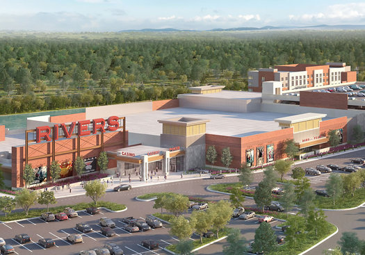
New set of renderings for the Schenectady casino
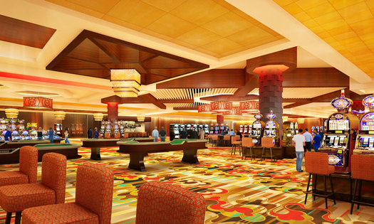
The backers of the Rivers Casino & Resort project at Mohawk Harbor in Schenectady released a new set of renderings for the project today. If you'd like gawk, they're after the jump.
The exterior look of the venue has been a point of discussion over the past year as the design shifted from the sleek look white panels and glass in the original proposal, to a more factory-like red/orange brick, and then after criticism from the public, back to something more like the first design. The exterior renderings released today look like those version 3 rendering from last summer.
Today's package of renderings also includes a few interior scenes. And they look like, well, a casino. There's also a look at the casino's "events center," which very much looks like a convention center ballroom.
The casino is currently projected to open in the first quarter of of 2017. [Biz Review]
The new Apple store at Crossgates
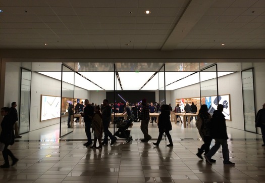
We happened to be at Crossgates Saturday, which happened to be the first day the remodeled Apple store there was open. So we took a few seconds to gawk.
It's kind of striking from the outside, the way the large glass doors at the front rotate open and the light from inside streams out.
Apple has been making over its stores in a process that's now led in part by the company's famous product designer, Jonathan Ive.
Creative Everyday
Here's the rest of the story. / image: Ira Marcks
Check out these charming comic stories about real people and their creative work by Troy-based artist/writer/educator Ira Marcks. Each tiny story in Creative Everyday covers the general arc of the person's work, from when they were a kid to how it's become a part of their life today.
Blurbage:
Ira Marcks is drawing a comic to inspire kids to explore careers in Upstate NY's Creative Economy. The book is called Creative Everyday. With the help of the Workforce Development Institute and Capital Repertory Theatre's 'On The Go' School Tour, the book will be distributed for free to 10,000+ school kids around NY State.
Right now, Ira is collecting TRUE TALES from creative professionals about the triumphs, trials, and tribulations of ART & LIFE colliding.
If you have a story you'd like to share, Marcks has an online form for you to fill out.
New, but also sort of old
We end up talking about architecture and building design around here a lot -- and those discussions often trend toward people talking about things they don't like.
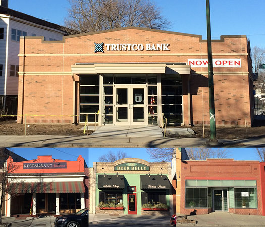
So, here's something we noticed recently that struck us as... good.
TrustCo recently replaced the building for its branch at New Scotland Ave and Ontario Street in Albany's Helderberg neighborhood. And the design of building's front facade echoes the look of facades on the longstanding commercial strip just down New Scotland on the other side of Ontario. See how the parapet* on the roof is a similar style. (Update: Thanks to Daniel N, it sounds like the word we should have used was fascia.)
The image above is the new bank building on top, with a few examples of the facades from the commercial strip below. Here's a larger version if you'd like to see more of the detail.
*We think we're using that term correctly. We're sure someone will (politely) correct us if we're not. (Update: And people have done so! Thank you!)
Today's moment of door
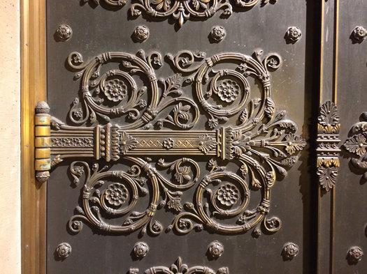
We had to stop for a minute to admire the doors on the front of St. Peter's Church on State Street in Albany. They're like the doors built by dwarves in the side of a mountain.
(They also look a lot like the doors fronting a 200-year-old Episcopal church.)
There's a full-length pic after the jump if you'd like to gawk further.
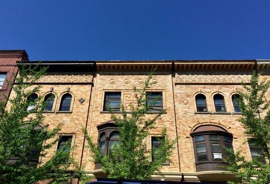
The story of that beautiful, odd, skinny building on State Street in Albany
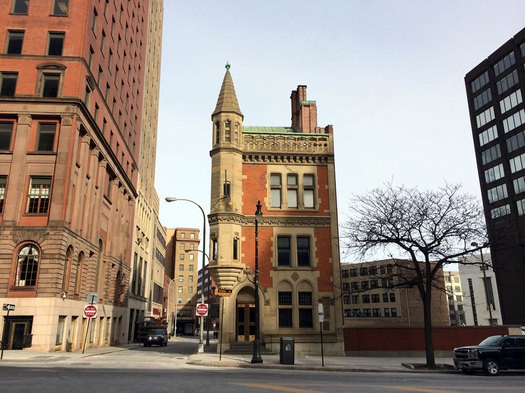
You know 63 State Street. It's that skinny building at the corner of State and James in downtown Albany. It's both beautiful and kind of odd, standing all dressed up by itself there, like it's waiting to meet a group of other fashionably-adorned architecture.
The building has been for sale for a while now, and as the Biz Review reported Thursday, it's going up for auction as part of a package with 69 State Street (the large building just up State Street on the corner with Pearl) -- starting bid $1.5 million.
We've always been curious about 63 State, so here's a quick backstory.
Gather around
EMPAC is often described not just as a collection of performance venues, but also as a research center. And if you've ever wondered what sort of research goes on there (we've been curious) here's one example: a group at EMPAC has created a six-foot-diameter "fire pit" for displaying information to a group of collaborating people.
From the RPI blog The Approach:
The Campfire consists of two main display surfaces, its "wall" and "floor." While they can be largely independent, their shared edge provides a natural interface for various dimensions of visualization, simulation, and interaction. Any traditional two-dimensional images and applications can be placed on the surfaces, but a key innovation is that each of the surfaces has one continuous, potentially shared, dimension. Information can be wrapped around the campfire as in the rings of a tree, the spokes of a wheel, or even in a panoramic view of a real or virtual landscape. The wall can be used to dive into data shown on the floor and vice versa.
The video embedded above provides a short look at how the display in action.
Albany, Troy, and Hudson in high contrast
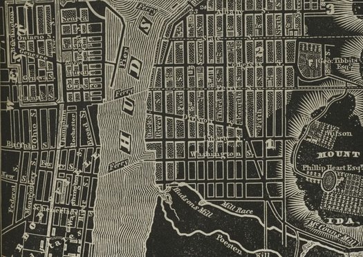
Check out this beautiful old atlas of New York State, originally published in 1838. It was the creation of the cartographer David H. Burr. And it's available online thanks to the digital collection of the New York Public Library.
There's something about the high-contrast black-and-white color scheme and the way various features -- like the Hudson River -- are rendered that we really like.
The atlas includes maps for counties around the states. But the parts that were most interesting to us were the old city maps. We pulled a few -- for Albany, Troy, and Hudson -- and there are after the jump in large format, along with a few quick notes.
That Bob & Ron's neon sign could be yours
The contents of the now-closed Bob & Ron's Fish Fry location on Central Ave in Albany are going up for auction -- including the fish fry's landmark neon sign. (A tip of the hat to Chuck Miller for noticing the sign is part of the collection of items.)
The sign is being sold "as is" and "where is." And the winning bidder must pick it up either January 6 or 7. Also:
LOADING ASSISTANCE WILL NOT BE PROVIDED. PLEASE BE SURE TO BRING ADEQUATE HELP TO LOAD PURCHASES AS WELL AS TOOLS IF NEEDED TO DISASSEMBLE OR MAKE NECESSARY REPAIRS TO LOAD AND/OR REMOVE. THE AUCTION COMPANY IS UNABLE TO PROVIDE TOOLS AND OR EQUIPMENT TO ASSIST WITH LOADING.
Judging from both the pics included on the Collar City Auctions page and a recent drive-by look, the sign could probably use some love. It's looking a little ragged. (Compare to this photo back in 2010. The one above is Google Streetview from 2011.)
The online auction closes January 4 just before noon. There's an onsite preview of the items up for auction December 30 from 9-11 am.
The collection of items from the restaurant includes a bunch of kitchen equipment and restaurant stuff. Also: "Item # 89 -- WALL MOUNT FISH, DOES HAVE DAMAGE."
A majestic image of Thacher Park
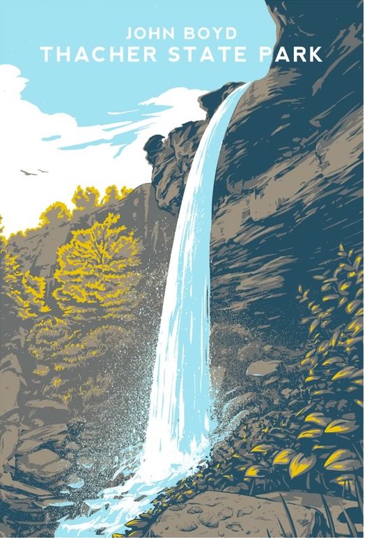
Check out this great Thacher State Park print by Ben Karis-Nix. (We saw him mention it on Twitter.)
It reminds us of those majestic old US National Park posters.
The Thacher Park print is currently available at the Fort Orange General Store in Albany.
Excited raccoon!
 Check it out: The cover for the new book of essays by Jenny Lawson (AKA, The Bloggess) -- Furiously Happy -- was designed by local designer Phil Pascuzzo.
Pascuzzo -- work works under the name PepCo Studio -- has designed a bunch of book covers (he sometimes posts new ones in his Instagram feed). A few years ago he talked with Melissa about how he got into designing book covers, and his design process:
I always try and read the manuscript before starting the design process. Sometimes the book isn't complete so I can only read a partial manuscript or just a synopsis page. Reading the book really helps me to respond emotionally to the design problem. This in turn makes the connection between the potential reader and cover stronger.
In addition to book covers, Pascuzzo's designed all sorts of posters, packaging, and logos (including the early Twitter bird logo). You've almost certainly seen his work locally (even if you haven't realized it) -- recent examples include the Albany Public Library's new logo and the Tulip Festival poster.
Check out these charming Albany postcards
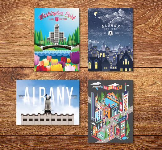
We were in the Fort Orange General Store this past weekend and these Albany postcards caught our eye. We especially like the Albany at night and "flat" Albany postcards. (One of those cards is now on its way to an out-of-town friend.)
The cards are by designer Lee Dixon. And that group image above is via Dixon's Behance page, where you can see more of Dixon's design work.
Proposed design for the Schenectady casino #3

There are larger, uncropped versions after the jump.
Rush Street Gaming -- the company that will be operating Rivers Casino & Resort at Mohawk Harbor in Schenectady -- released a new set of renderings for the casino project today, and says it's submitted the designs to the Schenectady Planning Commission.
A statement that accompanied the new design, from Rush Street Gaming VP of operations Joe Scibetta:
"Today we submitted to the Schenectady Planning Commission an updated design of Rivers Casino. We put forth a tremendous amount of effort and energy to incorporate the feedback we received from city officials, planners and the community. What we are proposing is a world-class facility, much like our other casino projects."
The new design follows some pointed criticism from the public about a design released in June that was a significant aesthetic departure from the design included with the company's proposal to state Gaming Facility Location Facility Board. The first design had been a sleekly modern building clad in glass and white. The second was much less modern and prominently featured brick, which the company said it thought would "reflect the look and feel of the Schenectady community." A designer for the company told the city's planning commission later that month that they had maybe gone "overboard" in changing the look. [Daily Gazette]
Rush Street released two renderings today -- for the front of the facility and the river side. The new design appears to keep the same shape of the project. But the brick has been swapped out for lighter colors and paneling.
Have a look...
State Museum to get large makeover
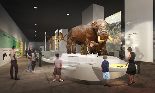
A rendering of the "A State of Change" exhibit, one of a handful of planned new exhibit spaces.
The State Museum announced Monday that it's planning a renovation that will involve 35,000 square feet of new exhibits, as well as more flexible space and updated interactive technology.
The $14 million project is set to be completed in phases over four years. The museum will remain open during the renovation (though various spaces will be closed at times for work).
Here are a few more details, as well as renderings of the planned new exhibits...
Defending the architecture of the ESP
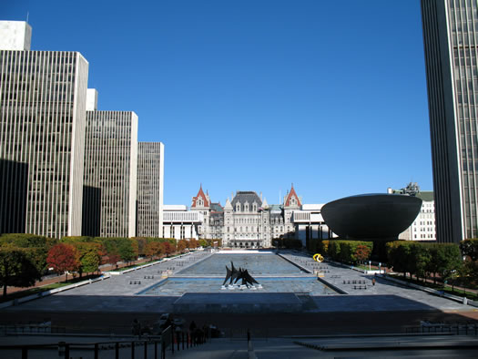
In a T Magazine* feature -- "Seven Leading Architects Defend the World's Most Hated Buildings" -- Annabelle Selldorf defends the Empire State Plaza. A clip lifted from the middle of her (short) defense:
I know that others find it too brutal or forbidding, but I think it's beautiful in its monumentality and starkness. Monumentality always suggests supreme power, and that's scary. I somehow think that if you could populate the Plaza with more gardens, and make it feel more part of everyday life -- which they've tried to do with farmers' markets and using the basin for ice skating -- then it wouldn't feel so hostile.
Two decades ago apparently there was an idea floating about to to convert one of the ESP's reflecting pools into a large lawn -- we posted it about it on AOA last year, and it got a mixed reaction from people. We were thinking about that again during a recent evening walk on the ESP. The reflecting pools do have a grandeur about them, but maybe they're also part of what makes the space feel cold to people.
[via @scottpwaldman]
Earlier on AOA: Loving -- and hating -- the Empire State Plaza
* It's a NYT magazine, but not the NYT Mag.
New look for the Schenectady casino project
If you'd like to just jump to the new renderings, here you go...
Rush Street Gaming -- the company that will be operating Rivers Casino & Resort at Mohawk Harbor, AKA the Schenectady casino -- released new designs for the project Thursday.
It's not surprising that the plans for the casino buildings would change in some way -- that happens frequently on projects both big and small. But the new designs are a significant aesthetic shift, from a sleek exterior that featured white cladding and lots of glass to a new look that prominently features brick.
The press release that accompanied the renderings notes the new plans "detail designs that reflect the look and feel of the Schenectady community." And it includes a quote from Rush Street Gaming CEO Greg Carlin: "We've arrived at a design to complement the City of Schenectady and the Capital Region. We're very proud of this vision and we are looking forward to starting construction." Extended blurbage:
Rivers Casino will be a $300 million gaming facility featuring a 50,000-square-foot gaming floor with 1,150 slot machines and 66 gaming tables. A high-end steakhouse, a "marketplace" with lite fare restaurants, an entertainment lounge, a banquet facility and a spa will also part of the project, as will a 150-room hotel and a parking garage, both to be attached to the gaming facility. Public outdoor open spaces and riverfront walking and biking trails will be part of the project.
The company says the plans have been submitted to the the city of Schenectady Planning Commission for review.
OK, let's have a look at the new renderings, along with some of the designs included in the initial application for comparison...
Because it's park furniture shaped like a tulip
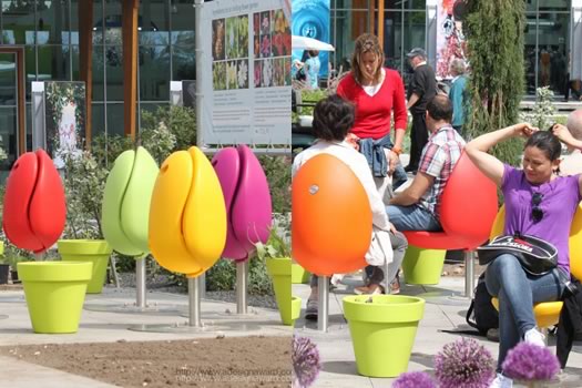
So, some Capital Region park or public space might need these: A Dutch company has designed an outdoor seat that looks like a tulip. The Tulpi seat stays folded up like a tulip bloom when not in use, and then folds down to provide a place to sit.
The company that makes the seat says they're durable, ergonomic, and the fold-up design helps keep dirt and rain off the seats. Brochure blurbage:
The Tulpi is a perfect combination of design, ergonomics and sustainability. The tulip shape of the chair immediately creates an atmospheric scenery that will brighten up public spaces. Tulpi's are loved by kids, especially in parks! They love the bright colors and the fact the Tulpi can rotate 360 degrees.
The chair won a recent design award for street furniture.
There's also a tulip-shaped trash can.
[via CityLab]
photos: Tulpi / Marco Manders
A big group of A-holes
Man, can you believe all these a-holes?
This made us smile: Local designer Curtis Canham has created a book about A-holes.
The negative space in a letter A, of course. (Why? What were you thinking about?)
Canham is currently raising money on Kickstarter to publish the coffee table book. As of this morning, the campaign needs just about $2,500 with 11 days to go. He explains how the book came about in the quick video embedded above. (Pretty sure he was trying to see how many times he could say "a-hole" in that video.)
Here's a sample from the book, which covers the anatomy of a-holes, historic a-holes, and families of a-holes.
The art of gardening
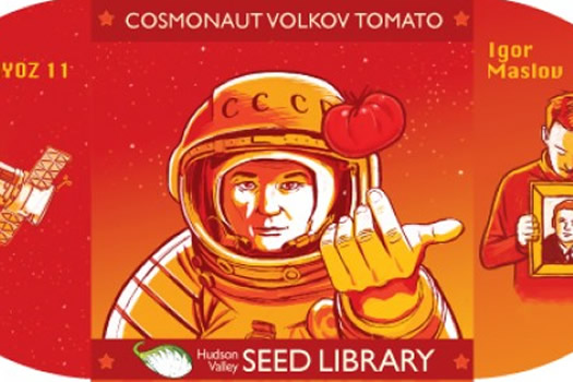
There are a handful of interesting things about the Hudson Valley Seed Library. A few of them:
+ It started at the Gardiner Public Library in Gardiner as a "lending" program for seeds -- people could check out seeds, grow the plants, and then return saved seeds.
+ It's dedicated to "growing, harvesting, and celebrating" heirloom varieties of vegetable, herbs, and flowers -- including many varieties with connections to New York.
But the first interesting thing you'll probably notice about the Hudson Valley Seed Library is that it has beautiful seed packets. The company commissions artists to design the seed packets in a range of media -- here's the page that collects all the designs (there are many) -- and the work really make the packets feel special.
Here are a few examples that caught our eye...
The character in the SUNY Poly CNSE seal?
![]() JES emailed us recently:
JES emailed us recently:
Been noticing the new signs, etc. on the Nano [College] buildings. Do you know what the mythological character is that has been added to those signs?
The character in the logo seal is the god Hermes from Greek mythology.
And why did SUNY Poly CNSE pick Hermes?
A good local graphic designer?
 Sean emails:
A business acquaintance of mine is looking to redesign some logos for their (2) apartment complexes and I was wondering if anyone from your community might be able to recommend someone they've used that has done good work and is local.
There are a lot of designers out there, and if you know of a local one who could be a good fit for this project, by all means please mention that person (bonus points for why you're recommending that person).
But because there are a lot of design options, it can be hard to sort through them. So, got some advice on what to look for in a good designer or design firm? We'd love to hear about that, too.
The Poestenkill Lion
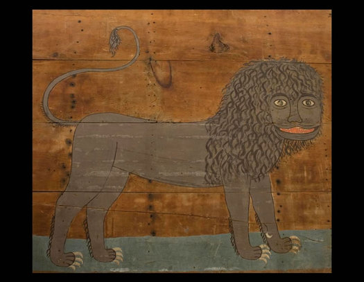
The artwork above -- known as "The Poestenkill Lion" -- is now on display at the Rensselaer County Historical Society. It's a sharp turn of fate for artwork -- it was almost firewood a few years back.
From an RCHS press release:
The lion first came to RCHS in 2011, when long-time RCHS supporters Hughes and Eva Gemmill donated this delightful painting. The painting, which dates to c.1840 and is by an unknown artist, is done on four wide boards, thinly painted with milk paint on unfinished wood.
Discovered a number of years ago during the demolition of a summer kitchen in a house in Poestenkill, the lion was almost lost to history. The dismantled wood was slated to be used as firewood. Thankfully, before these four boards were burnt, the Gemmills noticed a bit of color peeking out from underneath layers of plaster and wallpaper. After some careful removal of the plaster and wallpaper, the complete image of the lion appeared.
The Gemmills did find evidence of at least one other animal. RCHS also has in its collection the small fragments of wood that depict another animal, possibly a leopard, which came from the same space. It is possible that there were more animal figures on other boards that did not survive.
Once the Gemmills had the complete painting of the lion, they hung the four boards over their bed, until they decided to donate the painting to RCHS.
RCHS says the lion is probably based on an illustration from a Bible or maybe the work of Edward Hicks. The artist is unknown.
The historical society got a $2,500 grant this year to restore the work, and sent it to O'Connor Art Conservation in the Berkshires for cleaning and repair.
image: Rensselaer County Historical Society
The wild turkey

Historical illustration of the day, because Thanksgiving week: "The Wild Turkey," from Zoology of New York, published in 1844. Or: The New-York Fauna: comprising detailed descriptions of all the animals hitherto observed within the state of New York, with brief notices of those occasionally found near its borders, and accompanied by appropriate illustrations.
The book was the work of James Ellsworth De Kay, a medical doctor and zoologist with a somewhat colorful backstory, and artist John William Hill. The author and illustrator produced the work for the New York State Geologic Survey.
image via NYPL
Albany Antique Postcard Show
We don't know if this card will pop up at the show, but it seems like a good bet.
The annual Albany Antique Postcard Show is set for December 6 at the Polish Community Center on Washington Ave Ext in Albany. Blurbage:
Over 1 Million Vintage Postcards on display and for sale at the 4th Annual Antique Postcard show held at the Polish Community Center in Albany New York. Dealers from 5 different states will be set up with cards from all over the world. Collectors will come from all over the east coast to look for every subject imaginable. Small towns from all over New York state, over 100 years old. Free appraisals on location.
The company behind this show is Mary L. Martin Ltd. Postcards, which has an interesting backstory -- one that started in Albany. As the story goes, the eponymous Mary Martin was living in Albany during the 1960s when she got interested in postcards via her husband's stamp collecting hobby. Martin started collecting and trading the cards, and that eventually turned into a job for her and later a family business. (Along the way the Martins moved to Maryland.) Mary Martin died in 2001, and the business is now run by Martin's daughter, also named Mary, who grew up in the family business. It has a 10,000-square-foot warehouse in Maryland and claims the world's largest collection of postcards. [Baltimore Sun] [Baltimore Magazine] [Baltimore Sun x2]
The postcard show at the Polish Community Center is from 9:30 am-3 pm on December 6. Admission is $3.
Wide awake, in print again
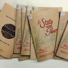 You know that 1916 brochure touting Albany as the "The Wide Awake City" -- the one that sang the city's praises in verse -- that we mentioned earlier this week? Laura Glazer (of Hello Pretty City fame) downloaded it and had the brochure printed.
A batch of them is for sale about the Fort Orange General Store on Delaware Ave in Albany. They're $10 each.
Albany, embroidered
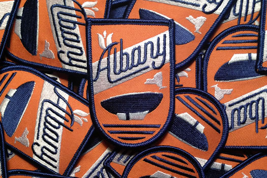
Mitch sent this along and we thought it was fun: It's an Albany patch -- like, the kind of patch you can sew on things. He explained:
Over the course of the past year or two, I've been on an occasional (but ongoing) search for an embroidered Albany souvenir patch. I came to the conclusion that we somehow live in the only city in the entire country that DOESN'T have one of these that can be purchased with 2 clicks of a mouse or a trip to a store.
I decided to take the task on myself. I'm a designer at a local agency, so it sounded fun anyways.
Mitch is selling them online -- they're $6 each.
We asked him if he had any specific applications in mind for the patch. His reply:
Honestly, the only real application I really had in mind for the patch was to put it on MY jacket. I think that part of the beauty of something like this is that everybody can, if they want to, figure out their own application for it. Like I said though, it's really just something that I couldn't believe didn't already exist, especially considering the local pride that Albany residents have.
Campaign Yard Sign Design Election 2014, Part II
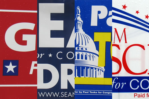
Election Day is Tuesday, so it's time to pull the lever for part two of Campaign Yard Sign Election 2014.
The first half of the design election included spleen throbbing induced by questionable typography.
Will the next batch of campaign signs go over better?
Campaign Yard Sign Design Election 2014, Part I
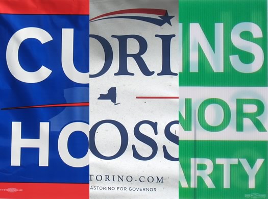
Election Day is next Tuesday, and that means campaign yard sign season is at its peak. Front lawns, street medians, parking lots, and many other spots are now filled with the signs -- they're everywhere.
So we thought it'd be fun to get together a few designers again to critique this year's crop of campaign yard signs as design objects. (Alternately, you might view this as test of how much questionable typography it takes to make a designer's spleen start throbbing -- and we now have an answer.)
Because it's a campaign yard sign bumper crop, we've split the signs into two batches. First up: governor, state Senate, and Schenectady Family Court.
Chip Kidd at Skidmore
Designer/author Chip Kidd will be at Skidmore November 13 for a talk and Q&A.
Kidd is probably best known for this book covers. He's designed a bunch of them, many for famous authors, while working with Knopf since the 1980s. In fact, you probably have a Chip Kidd-designed book cover on your bookshelves right now. Kidd has also written a few novels, a Batman graphic novel, and multiple books about comics.
The Skidmore event starts with a talk titled "! or ?: Let me be perfectly clear. Or mysterious" at 7:30 pm on Thursday, November 13 in Palamountain Hall's Gannett Auditorium. A Q&A with the audience is scheduled for 8:30 pm. And there will be a book signing at 9 pm. It's free and open to the public.
Help with kitchen renovation design?
 M. messages:
We are thinking about doing a kitchen renovation. Got the contractor, got a "look" picked out, but kind of clueless about the actual design process. Has anyone had a good experience with a designer, either through one of those kitchen renovation one stop shops, or an independent person?
We're always a little amazed by how talented designers can look at a situation and see solutions/angles/ideas non-designers might miss. And, sure, hiring one will probably be more expensive. But when you think about how much a kitchen gets used -- and how frustrating a design flaw can be over the years -- it can be worth the extra money.
So, got a suggestion for M.? Please share!
A landscape designer for a backyard makeover?
 ChuckD emails:
It's time we did something about the backyard. But we're not interested in some HGTV thing with all parts sourced from a Big Box DIY store. We're looking for a creative designer/contractor who will design and build a natural backyard space to include replacement of a ratty deck, a rattier wood fence, inclusion of an existing inground pool, two existing happy doggies, and most importantly, an awareness and interest in those gray areas between indoors and out and work it into our passive solar house. Can anyone recommend someone who will think outside The Box and help us realize our ideas? Cuz we're clueless.
Even on a small project there can be a big difference between what the typical person can scratch out on the back of an envelope and what a professional designer can put together. And a landscape designer might be able to lend some helpful expertise on the sort of plants and other features that will make the new backyard easier to maintain over the long run.
So, got a suggestion for Chuck? Please share!
Portraits of Martin Van Buren, in honor of his birthday
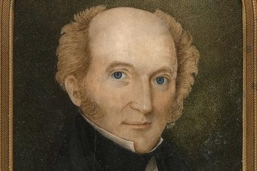
Look at those blue eyes.
This past Thursday was the 231st birthday of Martin Van Buren -- eighth President of the United States, the first president to be born US citizen, and the most famous native of Kinderhook, New York.
Because it was MVB's birthday this week, and it's Friday -- and, you know, just because -- here's a collection of portraits in honor of his 231st. (OK, some of them aren't technically portrait, but they're interesting to look at.)
OK...
Postcards from the past: Albany
Here's a bunch of old postcards of Albany, originating in the same collection from which we pulled the vintage postcards of Troy a few months back.
The postcards are from a Boston Public Library collection. All the postcards are thought to have been printed between 1930-1945.
Some of the cards depict places that no longer exist, though many of the Albany spots have endured, if not necessarily with the same purpose. But even the cards that show buildings that still stand probably present a version of that place that never truly existed -- the backgrounds de-cluttered, the landscaping manicured, the scenes mostly devoid of people. It's the past as it was idealized by someone then.
Wish you were here...
re:albany
Imagined.
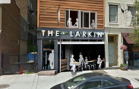
We enjoyed flipping through this project Aaron sent along today: re:albany -- in which he basically re-imagines empty buildings around the city via Photoshop.
The image above is a good example. It's his imagining of what the long-empty Larkin building on Lark Street could be. As explains on the site:
Remember the Larkin? It used to be a great Lark street spot between Eldas and Crisan. ... I like the use of garage doors in bars/restaurants. If it's nice out, you're open to the outdoors. When it's cold, keep it closed and its still a good look. Wood siding on the upper half to balance out the industrial beams of the lower half. Hopefully it doesn't look too much like a wild west saloon.
Sometimes the here-let-me-redesign-that-for-you approach doesn't necessarily play well. But in Aaron's case, it seems to be coming from a good place. As he explained via email:
I believe in small cities. I think they are the key of getting the best of both worlds (character, food, and places as amazing as your closest big city, BUT without all the stress that comes with living there.) So, I wish nothing more than downtown Albany to be a destination, full of shops, restaurants, lofts, and bustling foot traffic. Something similar to what it was back in the day when breweries ruled and packed trolleys ran down the hill. However, the best I can do is give a suggestion and maybe some inspiration to someone who can do something.
His Tumblr has just a few re-imagines so far -- but it sounds like he has more in the works. We hope he keeps at it. (And we hear he's taking suggestions...)
By the way: You might know Aaron from Barons in the Attic.
Postcards from the past: Troy
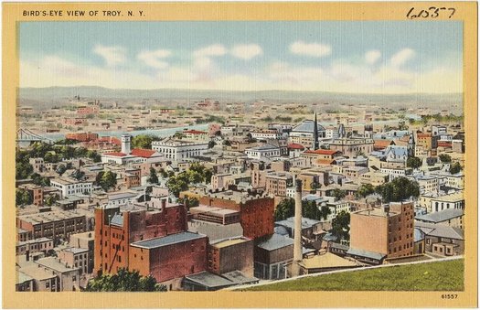
Troy as it was, from one perspective.
We happened upon this collection of old postcards -- including cards from the Capital Region -- from the Boston Public Library not once, but twice this week. And after the second time, we figured we pretty much had to do something with them.
All the postcards are thought to be printed between 1930-1945. Some of the cards depict places that no longer exist. And even the cards that show places still standing probably present a version of that place that never truly existed -- the backgrounds de-cluttered, the landscaping manicured, the scenes mostly devoid of people. It's the past as it was idealized by someone then.
The collection includes postcards from different spots around the area. So we decided it'd be fun to periodically pull a handful from a spot, map the locations depicted, and match them with the current streetview.
First up: Troy.
No ordinary illustrations
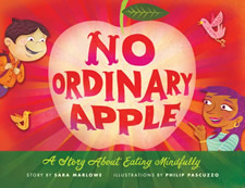 Check it out: Talented local designer Phil Pascuzzo has illustrated a children's book -- No Ordinary Apple, by Sara Marlowe. It's about "mindful" eating (and an apple). Blurbage:
On an otherwise ordinary day, Elliot discovers something extraordinary: the power of mindfulness. When he asks his neighbor Carmen for a snack, he's at first disappointed when she hands him an apple--he wanted candy! But when encouraged to carefully and attentively look, feel, smell, taste, and even listen to the apple, Elliot discovers that this apple is not ordinary at all.
Lushly and humorously illustrated, No Ordinary Apple makes a traditional technique for training mindfulness a fun and enjoyable way for children to learn to slow down and appreciate even the simplest things.
"Lush" and "humorous" are good words to describe Phil's style -- his work is often colorful and witty. You've no doubt seen his work -- he's designed a bunch of book covers, as well a version of the Twitter bird.
Phil has designed a bunch of book covers, show posters, and even a version of Twitter's famous bird. (He also designed the AOA holiday banner this past December.)
Earlier on AOA: The book on Phil Pascuzzo
Swissted at the Arts Center
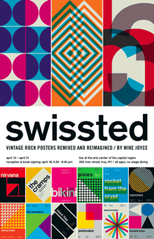 This could be worth a stop: Swissted, in which Troy native -- and now NYC-based -- graphic designer Mike Joyce mashes up punk rock and Swiss modernism, will open at the Arts Center of the Capital Region on Saturday (April 13). From the blurbage:
Drawing from his love of punk rock and Swiss modernism, two movements that have almost nothing to do with one another, Mike has redesigned vintage punk,hardcore, new wave, goth, grunge, and indie rock show flyers into International Typographic Style posters. Every single one of the shows represented actually happened.
Joyce's Stereotype Design studio has worked with a bunch of music clients, including Iggy Pop, Katy Perry, The Stooges, The Strokes, Maroon 5, Natalie Merchant, The Lemonheads, Morphine, Heart, and Aretha Franklin.
The Swissted exhibit will be up at the Arts Center April 13-21. On April 18, Joyce will be there for a reception and book signing from 6:30-8:30 pm.
Yep, the Arts Center advertises on AOA.
Currier and Ives exhibit at Albany Institute
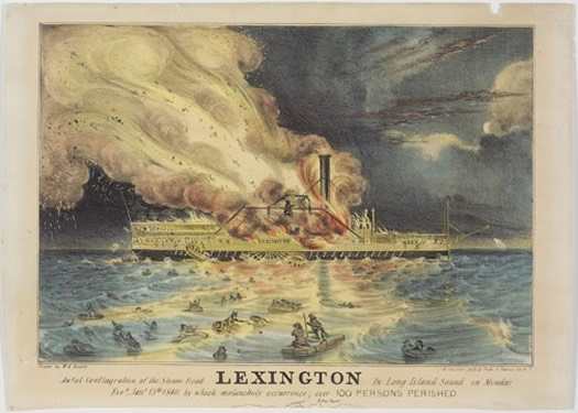
"Awful Conflagration of the Steam Boat Lexington," a lithograph printed by Nathaniel Currier. The Lexington was a luxury steam ship that caught fire and sunk in 1840.
Opening this Saturday (February 9) at the Albany Institute of History and Art: The Legacy of Currier & Ives, an exhibit that includes 64 prints from the famous 19th century printing and publishing firm. Blurbage:
The exhibition, organized around five themes of Identity, Progress, Home, Success, and Artist, introduces the visitor to the firm of Currier & Ives and illustrates, through interpretive and educational materials, how their imagery became ingrained in the national consciousness. During the seventy-two years that Currier & Ives operated (1834-1907) the firm produced more than 8,000 lithographs. Their colorful prints, which hung in homes and public buildings across America, gave testimony to the events and ideas that shaped national history, its progress, and art. Currier and Ives worked with several prominent artists like Eastman Johnson, Arthur Fitzwilliam Tait, and George Henry Durrie, whose designs are represented in the exhibition along with others.
The story behind the firm Currier and Ives is interesting -- it specialized in identifying images that would be popular and then producing them inexpensively. We bet Nathaniel Currier and James Merritt Ives would have been all over the web if they were operating today (CurrierIvesFeed?).
The Albany Institute exhibit runs through June 15. It could make a pretty good double bill with the also-currently-open Making of the Hudson River School exhibit.
The Albany Institute advertises on AOA.
image: "Awful Conflagration of the Steam Boat Lexington," from the Michele and Donald D'Amour Museum of Fine Arts, Springfield, Massachusetts
Mohawk Show
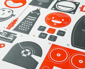 Design gawking: the Mohawk Show -- an exhibit of work from a design competition sponsored by the Cohoes-based Mohawk Fine Papers -- will be on display at the Foundry in Cohoes January 31.
The touring show highlights "higher thinking in graphic design, excellence in print production" -- and not surprisingly given the sponsor -- "appropriate paper choice." The exhibit has already made a handful stops around the country, and after Cohoes it's headed for Europe.
The exhibit will be on display from 6-9 pm. It's free.
image: Neal Whittington / Present & Correct / Mohawk Fine Papers
Milton Glaser exhibit at Opalka Gallery
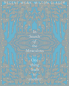 Opening this week at Sage's Opalka Gallery: "Milton Glaser: In Search of the Miraculous: One Thing Leads to Another" -- a collection of recent work by the famous designer. There's a reception for the exhibit this Friday (November 2), from 5-9 pm.
Glaser has created many designs you'd probably recognize -- maybe most notably the I (heart) NY logo (which he created pro bono for the state, in the back of a taxi).
On November 14, there will be a screening of a documentary about Glaser, To Inform and Delight. The doc's director, Wendy Keys, will also be there. The screening is at 6 pm -- it's $5.
The Opalka Gallery is on the Sage Albany campus, at New Scotland Ave/Woodlawn Ave/S Lake Ave. It's open Monday-Friday 10 am-8 pm, and Sunday noon-4 pm.
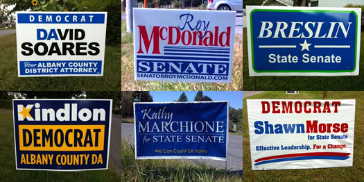
Good design leads to electoral success?
Winning design?
Observation: the results of our campaign yard sign design primary matched up surprisingly well with what actually happened in last week's primaries.
Here's the breakdown...
Political yard sign design primary, part II
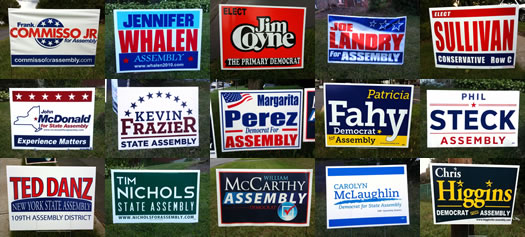
Oh, the polarizing typefaces.
Yesterday we started our political yard sign design primary with a look at signs for Albany County DA, and a few local state Senate races. Today, we move onto a handful of local Assembly races. And there a lot of signs. So let's get to it.
As in part one, we got a trio of accomplished local designers to critique signs. Here are the results...
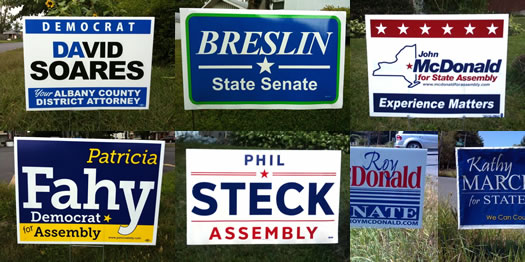
Political yard sign design primary, part I
In this primary, your stance on kerning can make all the difference.
The primary elections for state and local offices is this Thursday. And that means lawns, medians, parking lots, and other spots all over the Capital Region are currently adorned with political signs. So. Many. Political signs.
You can't help not seeing them. They're everywhere. So we thought it'd be fun to look at the signs a little differently, a little more fundamentally -- as design objects. And we got a trio of accomplished local designers to critique the design of signs from a handful of local races.
Because of the vast herds of signs this year, we've broken the design primary up into two days.
Today: design primary results from races for Albany County DA, State Senate 43rd, and State Senate 44th...
I (something) NY
The state's tourism arm introduced a new advertising campaign today that plays off the iconic I (heart) NY design. It replaces the heart with other images that are supposed to represent fun things from around the state: pizza, the track in Saratoga, Finger Lakes wine, and so on.
One of the TV spots for the campaign is embedded above. The ads will be shown around the state, as well as in markets such as Hartford, Philadelphia, Toronto, and Montreal.
The Cuomo admin press release says the tourism arm will also be collecting submissions from the public for the logo, which will then be displayed online.
About the original logo...
The original
The logo has been appropriated/re-mixed/ripped off almost everywhere. A few years back the state hired an anti-counterfeiting firm to crackdown on unlicensed uses. [I Love NY]
Update: Glaser's apparently not a fan of the update: "I saw one that said, 'I Pizza NY.' I don't get it." [NY Post via @thomaskaplan]
Rock on, lunchboxbrain
 Check it out: one of local designer Andrew Gregory's t-shirts is for sale at the Gap.
Andrew, who lives in Rensselaer, does design work under the name lunchboxbrain. His design ended up at the Gap through a partnership with Threadless. From his blog:
Rock On was originally designed for a community challenge - Threadless Loves Minimalism II. Most of my tee designs are fairly simple and I thought that the design was a great fit for the challenge. While it didn't win that challenge, I knew it was a strong design and had even considered printing it myself. Two months after I submitted the design, I received an email from Threadless stating that my tee was under consideration for inclusion in the Threadless + Gap line. A few months later, I got the word that Rock On had made the final cut. Needless to say, I was relieved, thrilled and humbled by the news.
He's giving one of the shirts away on his lunchboxbrain Facebook page.
Back in 2010, one of Andrew's t-shirts was featured on Woot!, the deal a day site. Here are more of his shirt designs that are currently available.
A typeface that says Albany
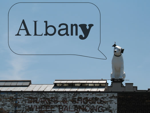
This caught our eye this week: there's an effort in Chattanooga, Tennessee to develop a signature typeface for the city. The effort is organize enough that it's produced a video explaining how the typeface could help the city market itself, and there's a Kickstarter project aiming to fund it.
This got us thinking about what an Albany typeface might look like. It'd be an interesting challenge -- finding a way to acknowledge the city's long history, but also working in the fact that city's most prominent architecture (the ESP) is more modern.
Or maybe even more fun: a collection of Capital Region typefaces -- for Albany, Troy, Saratoga, and Schenectady -- that could be used on signage and other related materials. It'd help reinforce the idea that each of those places is different, with their own unique feel.
[via TMN]
Michael Bierut at St. Rose
 Noted designer Michael Bierut will be giving a talk at St. Rose September 30. Opening a few days before that at the school's Esther Massry Gallery: "Michael Bierut 30 Years 90 Notebooks." From the blurbage:
In this exhibition of work stretching over three decades, Bierut has recorded his work and thoughts in a series of identical notebooks dating back to 1982. Today there are more than 90 such notebooks. The exhibit presents a selection of completed pieces that are juxtaposed with an assortment of Bierut's notebooks. Viewers can make connections between original, very rough sketches and finished work and gain insight into the design process as a result.
Bierut is a partner at the famed design firm Pentagram. He's worked with a long list of well-known clients (example: The Atlantic redesign, the New York Times building sign, the Saks shopping bag.). He co-founded Design Observer. And In 2006 he received the AIGA Medal, the highest award in the design field.
Embedded after the jump is video of Bierut talking about his notebooks.
photo: Christian Witkin
Troy, can you dig it?
 Troy-based illustrator Owen Sherwood emailed this week to let us know that he has a Troy design entered in the "Threadless Loves Your City" t-shirt contest. As his blurb reads on his entry at the Threadless site:
Troy, NY is not only my Hometown but the long time home and final resting place of Mr. Samuel Wilson... Also know as the one and only Uncle Sam! Like that famous historical figure, us Trojans we love our fish-fry, vibrant art scene and tiny hot dogs. We ride bikes and think we're hipper than Bushwick. We may be small but we're tough. With Uncle Sam for our role model, we are strong yet sensitive, thoughtful yet gnarly and most importantly, welcoming to all newbies. Join the Trojan Army! Vote For the best little city in New York! Vote for TROY!!! CAN YOU DIG IT!!! (Did I sound like Breaveheart, I was going for Braveheart)
And, as he said to us in the email: "Help me put Troy on the map... Or at least on a shirt!" Voting ends next Wednesday (August 24).
Earlier on AOA:
+ "Rub me on your butt!"
+ Woot! Andrew Gregory!
Blast from the past
All aboard! Next stop... the future.
We came across this photo today while getting Carl's piece about the Livingston Ave Bridge together. It's a locomotive from the old New York Central railroad -- the railroad organized by Erastus Corning (the great grandfather of the longtime mayor of Albany).
We love the sleek vintage futurism of the locomotive's design. It looks like a rocket ship from an old Flash Gordon flick.
The engines were designed by Henry Dreyfuss, one of the celebrity industrial designers of the 1930s and 40s. Among Dreyfuss' many notable designs is the classic "Lucy" telephone.
This streamlined engine design (the "Hudson") went into service in 1938 after being manufactured in New York Central's huge West Albany yard (the engine under the hood was produced by Alco in Schenectady). The stylish locomotives powered the famous 20th Century Limited line.
If/when New York ever gets high-speed rail, we kind of hope the engines look this.
photo: Robert Yarnall Richie via Southern Methodist University, Central University Libraries, DeGolyer Library
Get the Message at Albany Institute
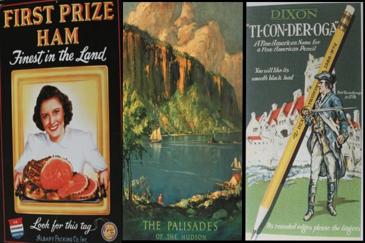
A few of the images from Graphic Design: Get the Message.
The Graphic Design: Get the Message exhibit at the Albany Institute of History and Art is definitely worth a visit for design nerds, it will also be interesting to anyone who's a critical consumer of media -- or just curious about the images we see every day.
Stay a little while and you'll see it's also about world history, innovation, how far we've come as a country, and how we absorb information...
How Phantogram's music looks
Here's something to look at. It's a video for the Phantogram song "Make a Fist" by greater Capital Region locals The Ravacon Collective. It's like something from a turbulent dream. We like it. (Though we're glad to be experiencing it awake).
Ravacon created a dozen different visuals for Phantogram to play during their national tour this year. You can see how the visuals were used from this concert clip shot at a show in Louisville back in September.
There's one more after the jump, video for the Phantogram song "Running from the Cops."
Making the Twitter bird more "human"
 There's an interesting interview with local designer Phil Pascuzzo at design:related about his work on the now ubiquitous Twitter logo and his ongoing relationship with the company. A snip:
[Twitter co-founder] Biz [Stone] had sent over the bird mark that he designed, which Twitter was using at the time. I think he said something to the effect of "can you redesign this logo and add some Phil-style." Being a Twitter newbie, I did some research and asked friends that used this communication tool so that I had a better idea of what the product was. Giving the mark more life and vibrance really made sense at this point. Like most projects, I began by doodling in my lined notebook and quickly came up with something I liked. From there I worked in Illustrator to execute the mark in a polished way.
There's a lot more in the interview, which also includes some great design eye candy.
The site for Phil's studio -- Pepco -- has a bunch of examples of his work, including many of the book covers he's designed.
And check it out: Phil's also the drummer for Scientific Maps.
[via @id29]
Earlier on AOA:
+ A little bird told us
+ The book on Phil Pascuzzo
Felt & Wire
 Despite (or, perhaps, because of) pushing pixels all day, we're total suckers for great paper products -- stationery, cards, tags, whatever.
So there was some smiling when we came across the Felt & Twine Shop recently. It's a designer-curated online shop of printed goods run by Cohoes-based Mohawk Fine Papers. There's also a blog.
It's not as expansive as Etsy (what is?), but it made from some happy browsing.
Earlier on AOA:
+ "I Love New York" by CAPow!
+ Lori Hansen's vintage letterpress
+ Paper Dolls
+ Susan Merrick
photo: M-square Press postcard
A photo tour of EMPAC
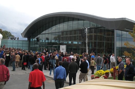
The scene at today's opening.
RPI cut the ribbon on EMPAC today. And you know what? It's pretty cool. There's nothing else like it in the Capital Region. Heck, there's probably nothing else like it in the world right now. You should definitely check it out.
A lot of people have already written about all the crazy artistic and technological potential at this place, so we'll leave that to them. We did take a tour today, though.
Here are a bunch of pics...
... said KGB about Drawing: What's something that brought you joy this year?