Items tagged with 'data'
Albany tightened its rules for shoveling snowy sidewalks last winter -- so how'd that work out?
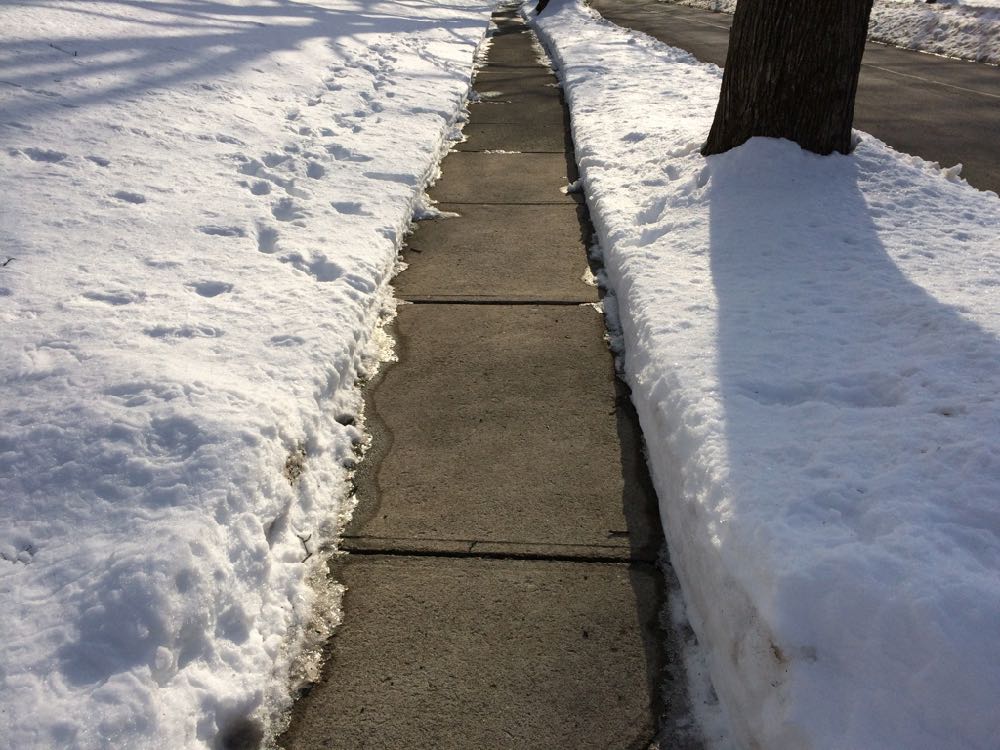
It should look like this.
If winter ever gets its act together and drops more snow on us, there will be sidewalks to shovel.
And shortly after that, Albany will no doubt engage in another round of its annual discussion about the fact that some sidewalks don't get shoveled.
It's an important quality of life issue for everyone in the walkable city, and it's even more important for people who have some sort of disability that makes it hard to get around. (Also: Shoveling is the neighborly thing to do.)
At the start of last winter the city of Albany tightened its rules so that the Department of General Services can now issue violations for unshoveled sidewalks directly after the 24-hour grace period following a snowfall. Ahead of that change we looked at violations the city had issued in previous winters to get a sense of where violations were being handed out, and to what sorts of properties.
Now we've had a whole winter with the new, stricter rules. So, was there a blizzard of violations issued?
Let's have a look.
(Yes, there are graphs and clickable maps, because of course there are.)
Where the Capital Region's younger adults live
Maybe you saw that new list this week that ranked a ZIP code in Guilderland as the "best" neighborhood in Upstate New York for young adults.
The ranking was the result of some crunching by Buffalo Business First of Census numbers related to population, education, employment, businesses, housing, and income. That link includes an explanation of the methodology.
That a ZIP code in Guilderland would take the top spot in this sort of ranking raised some eyebrows. And we'd argue the list's methodology is basically a way of filtering for upper income people in their 20s and 30s.
Also: "Best" for whom? People in their 20s and 30s are a huge, diverse population group. Using a word like best is probably an overreach.
Anyway, the list got us curious about neighborhoods in the Capital Region that do have a lot of people 40 and under. So we rolled together some of our own clickable maps...
Search Albany
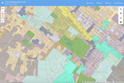
The city's new zoning map as displayed through Search Albany.
The city of Albany unveiled a new online tool -- called Search Albany -- for accessing all sorts of info related to properties around the city Tuesday.
It's basically a map through which you can access details about individual properties -- such as the name of the owner -- as well as neighborhood-level info such as zoning districts and Common Council wards.
The best way to get a feel for it is to just play around with it, so go for it.
But here are also a few quick things about it...
New York State city and town populations 2016
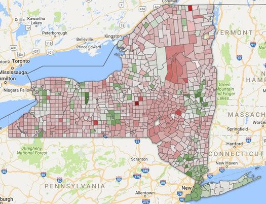
The Capital Region has some of the state's fastest growing towns in terms of population percentage change.
That's one of the bits from new population estimates for cities and towns released by the Census Bureau this week.
Is there a clickable map? You know that there is.
Life expectancy in New York State by county
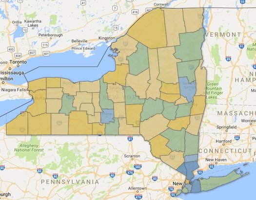
New York counties by estimated life expectancy. Green is roughly the state average -- yellow below, blue above. (There are two clickable maps after the jump.)
Life expectancy at birth was a little more than 80.36 years in New York State in 2014, according to a new study out this week.
That was good for 6th best in the nation. And it's up 73.19 years in 1980.
Those estimates are from a study published in JAMA Internal Medicine this week looking at how life expectancy varies across counties in United States. And as the researchers reported, there was wide variation -- some 20 years of difference between the high and low ends.
Here's a good interactive map of the numbers. And here are a few articles in the popular press about the overall study -- at FiveThirtyEight and The Atlantic.
New York counties didn't exhibit such a wide range, but there were some differences.
Where the new homes have been built
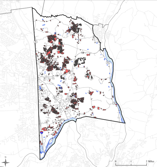
Parcels in the town of Halfmoon on which new single-family homes were built between 1995 and 2015. / map: Capital District Transportation Committee and the Capital District Regional Planning Commission
The Capital Region county that's the most different from the other three core counties? That's probably Saratoga County. And here's (another) bit toward that case...
Of all the single-family homes built in the Capital Region core between 1995 and 2015, almost half were in Saratoga County.
That's from the Capital District Transportation Committee and the Capital District Regional Planning Commission, which have posted a series of new "community growth profiles" for each of the core's 56 cities and towns:
Between 1995 and 2015, more than 35,111 single family homes were built in the four county Capital District Region on lots totaling 55,928 acres. The majority of single family home growth occurred in Saratoga County with 49% followed by 25% in Albany, 15% in Rensselaer, and 10% in Schenectady. As of 2015, there are 209,730 single family homes and 378,947 housing units overall in the region. And, approximately 214 miles of new roads were built between 2005 and 2015, of which 21% included sidewalks.
The town of Halfmoon is a prime example of the population and housing growth in Saratoga County. Between 1990 and 2015, the town went from 6,125 housing units to 11,060 units, according to its profile.
Another look at New York State's population change, this time along the urban/rural split
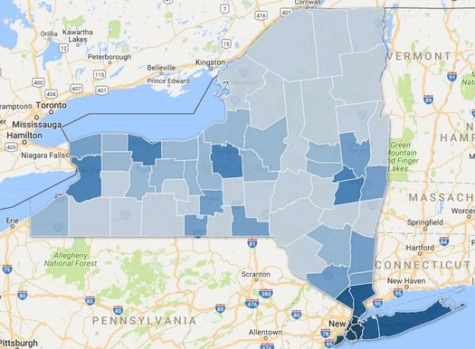
There's a clickable map inside, because of course there is.
Here's a bonus track from last week's post about the slow population growth of the Albany metro area -- and the melting populations of many upstate counties.
That map above depicts counties by population density. The deeper the blue, the more people per square mile of land. It's pretty much you'd expect. But we had the numbers leftover so we figured we'd roll the map together.
As we mentioned last week, there's been an urban/rural split in the state over the last handful of years for population growth -- basically, counties with higher population densities have added people, while counties with lower population densities have lost. (With a few notable exceptions)
So we grouped the state's population by county density and it makes this divide very clear -- let's have a look, along with a clickable map...
Capital Region high school graduation rates 2016

The state Department of Education recently released its annual collection of data about high school graduation rates around the state. The four-year statewide graduation rate for 2016 (that is, the 2012 cohort of students) was 79.4 -- up almost 1.5 percentage points from the year before.
As we do every year, we've pulled out the stats from Capital Region school districts.
Sorted stats (including notes and qualifications) after the jump.
Supermarket Showdown 2016

New list, new stores.
It's back: Supermarket Showdown, in which check prices for a basket of 40 items across multiple supermarkets here in the Capital Region.
The showdown has taken a few years off -- the last time we did it was in 2012 -- and this year it returns with a new basket and three new stores.
Without further ado, let's get to it...
The Capital Region's transit arteries
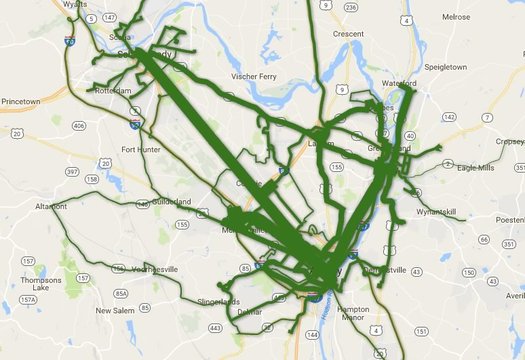
Total ridership per route during the last fiscal year. Is there a clickable, zoomable map inside? You know there is...
Which CDTA bus lines get the most riders?
The news earlier this year that CDTA set another annual ridership record -- and the recent batch of service changes on some of its most popular routes -- got us curious about ridership across the whole CDTA system.
So, of course, we had to make some clickable maps. Let's have a look.
Comparing the latest batch of Capital Region property tax rates
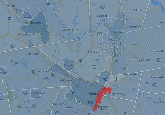
A clip from a map of the Capital Region's various overlapping tax areas -- counties, cities, towns, villages, school district. There's a larger, zoomable version after the jump. (And Rensselaer's marked in red because of missing data.)
The cities of Schenectady and Albany have some of the highest property tax rates in the Capital Region.
Saratoga Springs, Bethlehem, and Niskayuna have the highest estimated monthly payments for a median home.
Those bits are from our latest scan of Capital Region property taxes -- the numbers for the year 2015 are now out.
So, let's have a look.
What's new? Apartments.
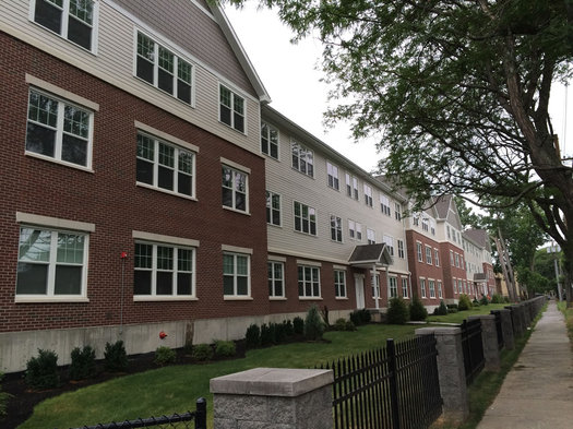
The Elefteria on South Allen Street in Albany, one of the recent apartment projects in the Capital Region.
It seems like every month or so there's an announcement of some new apartment project around the Capital Region. And, as it turns out, the numbers are pointing toward a recent shift in what sort of housing gets built around here.
Last year there were permits issued for 3,601 new housing units in the Capital Region's core counties -- and 2,434 of those units (68 percent) were for homes in multi-unit buildings. And as the latest issue of the Capital Region Planning Commission's Capital Region Data points out, it is the first time in three decades the number of multi-unit homes has so drastically outnumbered single-family homes.
Here's a quick look at some of the numbers...
A generational shift
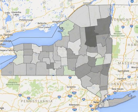
Just a handful of New York counties had lower median ages in 2015 (green) compared to 2010. Albany County was one of them.
Quick: Guess which 5-year age group has the most people of any age group in the Capital Region.
OK, got your answer? Hold onto it for a second.
The Census Bureau recently released new estimates for the populations of counties by age. And those numbers can help us get a sense of the age distribution of people here in the Capital Region -- and answer questions like which age group has the most people.
Plenty of graphs and maps are the jump.
But first, let's answer that question at the top...
A quick look at city and town population changes
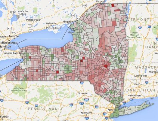
There are large, clickable maps after the jump. (Because of course there are.)
The topic of changing population popped up in comments earlier this week, so we figured it'd be interesting to whip together a clickable map of some new numbers for city and town population changes both here in the Capital Region and across the state.
And it turns out the Capital Region is a bit of an outlier.
Let's have a look...
5 bits about jobs in the Capital Region -- and how much they pay

We hear George does this job for free.
Which jobs in the Capital Region pay the most? Which pay the least? Which are the most common? Which are much more common here than other places?
Those are the sorts of questions to which we can an answer from a set of numbers of published by the federal Bureau of Labor Statistics. And, as it happens, the BLS released a new batch of those numbers this week.
And given all the recent discussion about New York State increasing its minimum wage, it seemed like a good time to pick out some bits from the new numbers.
The Capital Region is growing. Slowly.
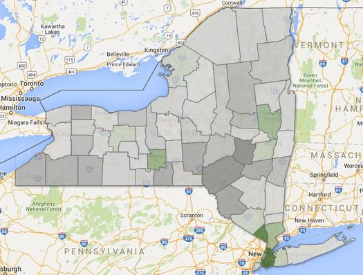
The deeper the green, the higher the percent population growth between 2010 and 2015. The deeper the gray, the higher percentage of population loss. There's a clickable map after the jump (actually, multiple maps).
The population of the Albany metro area was 881,830 as of last July 1, according to Census Bureau estimates released Thursday. That's up 1,739 people -- 0.2 percent -- compared to the same point in 2014.
The Capital Region is up 11,117 people -- 1.28 percent -- from 2010, according to the estimates. Its population growth (by percent) during that time ranked #260 among the 381 metro areas.
So what makes up that modest growth?
New York's Powerball fever is uneven
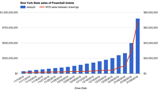
As the jackpot has soared, so too have sales here in New York State. (There's a larger version after the jump.)
Wednesday night someone -- or multiple someones, or maybe no one -- will eleventy zillion dollars in the multi-state Powerball jackpot. OK, not eleventy zillion -- it will only be something like $1.5 billion.
That's an eye-catching number, even if you don't usually pay attention to lottery games. And that's the whole the point -- the org that manages the game changed the rules last year in an attempt to build huge jackpots in order to drive ever larger ticket sales.
And by now you probably know all about how playing the lottery isn't a good investment -- expected return and all that. If you're going to play the Powerball, buying a single ticket just for the conversation value is the way to go.
Anyway, we were curious how Powerball fever was playing out here in New York State. So we got county-by-county numbers from the New York Lottery...
Capital Region high school graduation rates 2015
The state Department of Education released its annual collection of data about high school graduation rates around the state on Monday. The statewide graduation rate for 2015 (that is, the 2011 cohort of students) was 78.1 -- up almost two percentage points from the year before.
As we do every year, we've pulled out the stats from Capital Region school districts.
Sorted stats (including notes and qualifications) after the jump.
New York State is #4 -- again
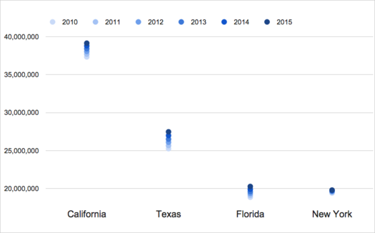
It's not looking good for catching Florida anytime soon.
The Census Bureau released new state population estimates this week and the Empire State was pegged at 19,795,791 people as of July 1, 2015. That's up an estimated 46,933 from the same point in 2014, an increase of .25 percent.
But that small increase wasn't enough for New York to catch back up with Florida, which passed New York for the #3 spot in the national population ranking last year. Florida's population grew an estimated 1.84 percent between July 1, 2014 and July 1, 2015.
And that's the overall story for New York's population -- it's growing, but very slowly, especially compared to California, Texas, and Florida. The Empire State's population is up an estimated 2.02 percent between 2010 and 2015. But over that same period California is up 4.85 percent, Texas is up 8.81 percent, and Florida is up 7.54 percent. (The graph above illustrates the change for each state since 2010.)
The drag on New York's overall population growth is that it's losing a relatively large number of people each year to other states. It lost an estimated 628,672 people between July 1, 2010 and July 1, 2015 to what the Census calls domestic migration.
So, what's propping up New York's population? People coming to the state from outside the United States -- international migration to New York is an estimated +606,667 between 2010 and 2015. And New Yorkers are having babies at a much faster rate than people here are dying -- New York is an estimated +441,603 over that same period for births and deaths.
There are a handful of clickable national maps (and another graph) after the jump. Because of course there is.
A few quick statistical snapshots of Capital Region neighborhoods
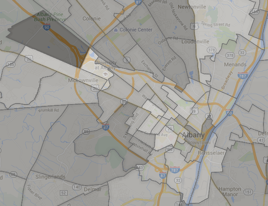
Which Capital Region neighborhoods are the most expensive in which to rent? Which tend to have households with the highest incomes? Which neighborhoods have populations that skew younger or older?
Those are some of the questions for which we can get an answer from new numbers released by the Census Bureau recently. This new data -- the American Community Survey 2010-2014 -- includes estimates for 210 census tracts in the Capital Region core counties. So we can focus not just on a city or town, but sections as small as neighborhoods.
There are a lot of things you can do with these numbers, and we're hoping to dig into them, but we figured we'd start out with putting together a handful of Capital Region maps that look a range of general topics, from income to age to whether people own or rent.
A quick look at how Albany's red light camera system has started off
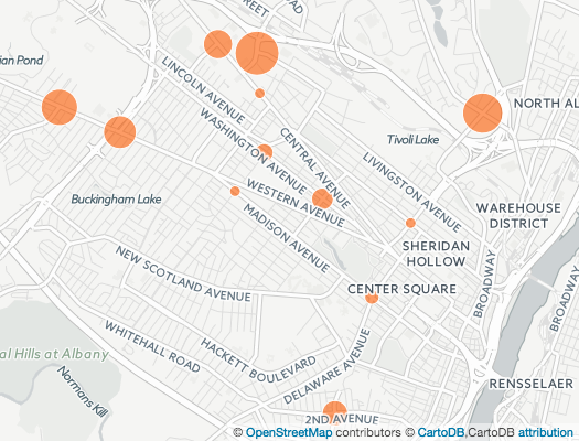
A map depicting the number of violations per day per intersection. There's a larger, clickable map after the jump.
Updated
The city of Albany released the first batch of numbers related to its new red light camera system this week.
The APD reports that since the cameras started coming online in July, the system flagged 2,197 potential violations. After reviews by officers, the city sent out 1,356 citations. So about 38 percent of the potential violations were screened out by the human review.
As you've probably heard by now, getting tagged by one of the red light cameras (and the officer review) is a $50 violation (like a parking ticket). The legislation authorizing the system allows the city to place cameras at up to 20 intersections. (It's now up to 15 intersections, the latest coming online October 2.)
The city released numbers for each intersection approach being monitored by the cameras, so let's have a closer look at the numbers to see which intersections had the most violations...
Degrees of difference between women and men
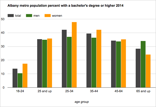
More women than men in the United States had a bachelor's degree or higher in 2014 -- 30.2 percent of women, compared to 29.9 percent of men, according to Census Bureau estimates. And as the bureau pointed out today, it's the first time that's happened nationally since the bureau started tracking the number in 1940.
We were curious about about the numbers for the Capital Region, so we looked 'em up for the Albany-Schenectady-Troy metro area. They're smashed into the chart above.
And here's a bit more...
A snapshot of Capital Region income
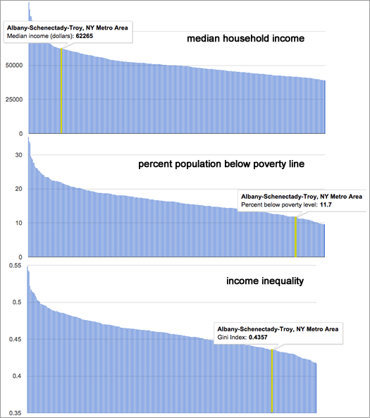
How the Albany-Schenectady-Troy metro compares to the nation's 381 other metro areas.
The Albany metro area continues to have one of the nation's higher median household incomes, and one of the the lower rates of poverty, according to the newest estimates from the Census Bureau.
Household income
The median household income in the Albany metro -- the point at which half the households had more income, and half had less -- was an estimated $62,265 (+/-1,494) in 2014. That's up just a bit from 2013 -- $59,626 (+/-1,981) ($60,593.25 in 2014 dollars). And it ranks 41st among the 381 metropolitan statistical areas the Census tracks.
Poverty rate
The Albany metro area's poverty rate was an estimated 11.7 percent (+/- 0.9). (It was 12.5 percent (+/-1.0) in 2013.) The metro's poverty rate was the 51st lowest among the 381 metros, lower than 87 percent of them. The Capital Region's poverty rate for kids wasn't quite so low -- an estimated 17.1 percent (+/-2), lower than 76 percent of metros.
Income inequality
Another angle on income and poverty is income inequality. And for that the Census Bureau publishes a figure called the Gini index -- a Gini index of 1 means only person has all the income, and 0 means everyone in a group has the same level. The Capital Region's Gini index for 2014 -- an estimated .4357 (+/-0.0119) -- was the 80th lowest (that is, toward the more equal end) among metropolitan areas.
Even if those three measure look relatively good for the Capital Region, there are still some troubling parts to the picture.
Record breaking numbers for Saratoga Race Course 2015 season

At some point large numbers just become... numbers. You know, how often do we ever encounter a million of anything? So, it's easy to see some large figure quoted in a news story and just be like... yeah, sure, whatever.
We were thinking about that today while looking over the numbers for the Saratoga Race Course season that ended Monday. Because it involved some very big numbers.
NYRA reported that the "handle" for this year's season -- that is, the amount of money bet on races -- was $648,272,805, a record. (The previous record was $590,187,876, set in 2012.)
Think about that for a second. That's more than half a billion of dollars that people, both here and elsewhere, put down on horse races over the season's 40 days in Saratoga Springs. When you take a second to think about the total, it's kind of astounding. (By the way: NYRA says almost $50 million was bet on Travers Day races this year.)
Paid attendance for this year's meet was also high: 1,065,625. That's a new seasonal record total, though it comes with an asterisk. The old record -- 1,049,309 -- was set in 2003, the season for which only had 36 days.
Here are a few quick tables and charts with some more recent context for this year's Track numbers...
A bunch of numbers about a bunch of different topics
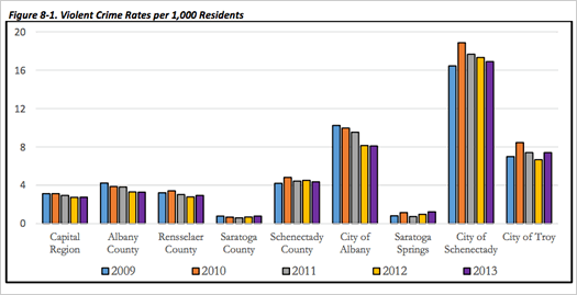
A chart about violent crime from the report.
How many people are here? What's the range of incomes? How are people getting around? What direction are crime rates headed?
Numbers related to those questions -- and many other topics -- are stuffed into the aptly-titled "Capital Region Statistical Report," which was released today by the Capital District Regional Planning Commission.
And it is exactly what it sounds like: a bunch of numbers about a bunch of topics in the Capital Region from a bunch of different sources, all aggregated in one report.
One example is above -- it's a chart from the report about annual violent crimes per 1,000 people in areas of the Capital Region. And it includes this short discussion of the chart:
Where the commuters are from
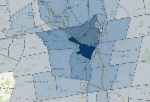
The city of Albany draws commuters from a wide area.
Each weekday in the Capital Region a large tide of people wash into the area's urban centers for their work days, and then stream back home. So large is this tide for the city of Albany that its daytime population during the week rises by 2/3.
So, where do all these people come from? Well, thanks to some recently released Census data, we can some sense of an answer to that question. And to extend the water metaphor a bit further, we can map out the "commuter sheds" that drain into each of the Capital Region's urban centers each weekday.
So let's have a look.
Monthly house payments by Capital Region place
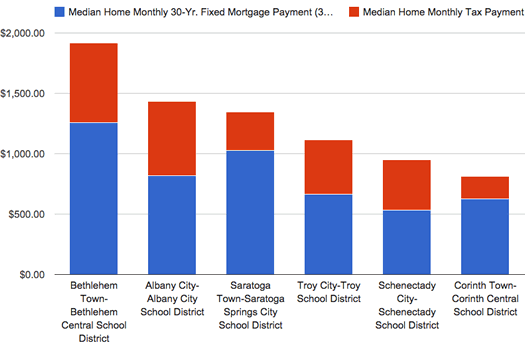
A handful of places pulled from the list -- the highest (Bethlehem-Bethlehem Central), the lowest (Corinth town-Corinth Central), and a few in between.
Some follow-up on that post a few weeks back about comparing Capital Region property tax rates: Matt emailed us hoping we could send along the numbers because he was curious about the monthly payments -- mortgage + taxes -- for the median home in each municipality around the area. That sounded interesting to us, so we bounced a spreadsheet back and forth and came up with a different look at the topic.
The results aren't exactly surprising, but it does highlight some things differently.
For example: The city of Schenectady tops the chart for property tax rate (per $1k value). But looking at the monthly payment for the median house there, Schenectady is way, way at the bottom of the list at just about $919 (of which about 45 percent is property taxes).
Based on the monthly payment figure, we were also able to make a rough guess at about how much a household would have to make each year to afford the median house in each place. Example: Bethlehem, in the Bethlehem Central School District, topped the list at about $82k. (Caveats? You bet. They're explained inside.)
OK, let's have a look at the whole (new) list...
Comparing Capital Region property tax rates
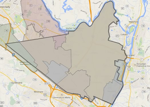
This map doesn't really show anything beyond how complicated listing tax rates can become. As you know, the bold-outlined area is the town of Colonie. Each of the sections within the town depicted above have a different entry in the tax rate listing because of some different combination of town, village, or school district.
The cities of Schenectady and Albany have the highest property tax rates in the Capital Region, according to numbers shared this week by the Empire Center.
The tax rates are for 2013 and include county, city/town, village, and school district taxes. The think tank also figured median tax rates by region around the state. And in that category, the Capital Region did well -- it had the state's lowest median at $24.68 per $1,000 of value. (The Empire Center didn't include New York City or Nassau County on Long Island in that review.)
As has been highlighted in years past, there's wide variation in tax rates around the Capital Region.
Here's the whole list, sorted and ranked...
Not in the driver's seat

An increasingly uncommon spot?
A theme that's popped up often in recent years among developers, planners, cultural observers, whoever: more people -- younger adults (the Millenials), especially -- don't like to drive. You see it mentioned in national articles, and we've had developers and planners mention it to us locally.
We had that idea in mind this week when we came across some numbers about vehicle use over the last few decades, both nationally and here in New York State. One thing led to another and we ended up calculating driver's licenses per capita for counties around the state. (Because of course.)
A few interesting bits floated by along the way. Among them: Of New York State counties that are not part of New York City, Albany County has one of the lowest levels of driver's licenses per capita in the state -- and the rates for all of the Capital Region core counties in 2013 were down compared to 2007.
Here are a few quick graphs, and a few thoughts.
Is Albany getting the short end of the stick?
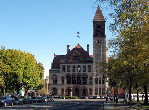
The amount of aid the state distributes to cities might sound like a topic straight out of Snoresville, but it's an important -- and recurring -- topic related to Albany's finances. And Albany's finances are related to all sorts of other topics that do get a lot more attention: stuff like taxes and new development.
For years, Albany leaders have argued that city gets hosed on the amount of municipal aid the city gets from the state, especially compared to other large upstate cities. And, in the annual tradition, Kathy Sheehan has been raising this point again as the machinery of the state government budget process starts whirring. Over at the Times Union, JCE recently had an article detailing some of the mayor's arguments that Albany should be getting more from the state.
The longtime argument in favor of Albany getting more state aid has essentially boiled down to this point: When compared to other large upstate cities, Albany gets much less in aid per capita.
So, with the topic in circulation again, we figured it'd be interesting to look at exactly that -- how much the capital city is getting per capita versus other cities.
The Empire State is now #4
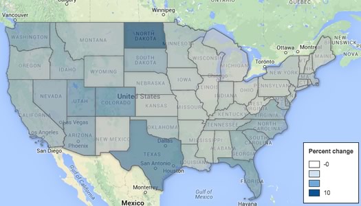
States by percentage population change between 2010 and 2014, according to Census Bureau estimates. Here's a clickable version of the map.
New York has slipped to #4 in the national population rankings, according to new Census Bureau estimates for 2014 out today. Florida edged past New York to take the #3 spot behind California and Texas.
It's not that New York lost population, it's just that didn't grow as fast as Florida (and many other states). The Census Bureau estimates the Empire State had 19,746,227 residents as of this past July. That's up about 50,000 residents from the year before (about .2 percent). In that same time Florida is up approximately 293,000 residents (about 1.5 percent). The difference between New York and Florida is now about 147,000 in the Sunshine State's favor.
Zooming out a bit and looking at the numbers since 2010 highlights some of the trends. The nation's total population grew an estimated 3.3 percent between 2010 and 2014. But New York's population grew 1.9 percent (roughly 368k people) -- and Florida was up 5.8 percent (roughly 1 million people). The Empire State ranked just 31st in the country for population gain.
So, what's contributing to these totals?
Capital Region high school graduation rates 2014
The state Department of Education released its annual collection of data about high school graduation rates around the state on Thursday. The statewide graduation rate for 2014 (that is, the 2010 cohort of students) was 76.4 -- up a little more than a percentage point from the year before.
As we do every year, we've pulled out the stats from Capital Region school districts.
Sorted stats (including notes and qualifications) after the jump.
The busiest Thruway exits
Very busy.
Holiday travel around Thanksgiving got us curious about the busiest Thruway exits.
So we looked it up.
And it turns out one of the exits here in the Capital Region is the busiest toll exit on the Thruway. Exit 24 -- at I-90 and I-87 -- averaged more than 26 million Thruway vehicle entrances and exits between 2008 and 2013. In fact, it was wayyyy ahead of the #2 exit.
Are there rankings? Is there a clickable map? As if you have to ask...
On the road to Albany red light cameras
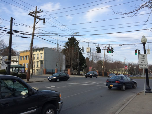
Among intersections that are candidates for red light cameras, Henry Johnson Blvd and Livingston was identified as having the highest number of crashes over a three year period.
Now that red light cameras have been approved for Albany, where will they be set up?
The Albany Police Department is currently sifting through traffic accident and ticket data as it prepares a list of 20 proposed red light camera intersections around the city. APD assistant chief Brendan Cox says the department is hoping to have the list ready by the end of December. Along the way, Cox says APD wants to share what it's learning about intersection crashes and tickets, as well as get public input about potential camera sites.
That was one of the aims of public information session about the program Tuesday afternoon. (There was another session scheduled for Tuesday evening at Albany High School.) Cox shared some preliminary data -- including a list of intersections that are among the sites currently up for consideration.
So, let's have a look.
Map: Foreclosed properties for sale in Troy
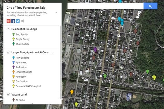
A screengrab of the map.
The city of Troy currently has more than 140 foreclosed properties up for potential sale. The city is accepting sealed bids on the properties -- many of which are vacant land -- between now and December 19.
Here's the list of properties as a pdf. But here's a better way to browse them: a clickable map of the properties along with some of their associated information. (We've also embedded the map after the jump.)
The map is the creation of Anasha Cummings, who was prompted to make it because, as he said to us in an email, "I don't think a PDF on a website is a good way to browse for properties you might want to buy."
Cummings says he's currently in the process of filling in some of the holes in the list (some properties don't have exact addresses) and matching up the properties with more information about them from the city's real property database (important info like square footage, even a photo).
This situation highlights an issue that's frustrated us for a long time: local municipalities often post information/data in ways that make it hard to find or use.
How the Albany metro area accesses the internet
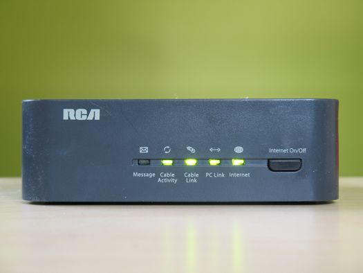
Common.
Roughly 3/4 of households in the Albany metro area have a broadband internet subscription. But almost 20 percent of households don't have any internet access at all.
Those are a few bits from a recent Census Bureau release of data about internet access around the country. Last year was the first time the Census collected this sort of information. So we thought we'd have a look.
Capital Region neighborhoods with the most trick-or-treaters

Well, potential trick-or-treaters.
After a recent conversation about popular trick-or-treat neighborhoods, we were curious about which Capital Region neighborhoods have the most trick-or-treaters.
And while we can't really say without some sort of trick-or-treater census, there are numbers are which neighborhoods have the most potential trick-or-treaters.
So we looked it up. Is there an orange map? You know there's an orange map.
Poking at some numbers for New York school districts, graduation rates, and income
Two things (indirectly) prompted this post:
1. The discussion around that Miss Pearl question about moving out of Albany for the school district.
2. Another one of those school district rankings.
If anything, both of those items highlighted for us our desire to better understand what people are talking about when they talk about "the schools" -- and how factors such as income and poverty fit in.
So we pulled a whole bunch of numbers on New York State school districts -- specifically graduation rates, household income, and poverty rates -- and did some sifting. And we came across a few things we expected -- and few things we didn't.
TOP2014: Crunching the numbers

Corrected to include numbers from the 2013 final.
The the 2014 Tournament of Pizza, sponsored by Keeler Mini -- the Tournament of Pizza to end all Tournaments of Pizza -- is almost finished. One last clash of champions remains for this Saturday.
That means it's time for some number crunching. And there are a bunch of numbers now that we have six years of scores in the modern 100-point-scale era of the TOP.
Absolutely true place rankings

George V says they'll sound even more convincing if you read them with a British accent.
You might have seen that ranking of "The 10 Most Exciting Places In New York" that was circulating Monday. It ranked Ithaca ahead of New York City. And Albany ranked #4 -- just behind Port Chester. There was much twittering. (Skeptical? Yes, we were, too. We would have guessed Albany would have ranked higher. Obviously.)
The ranking was compiled by a real estate website that seems to specialize in this sort of shareable(!), social(!) content.
Inspired by this ranking -- and in the spirit of using ironclad methodology and data (DATA!) to tease out the fundamental truths of the place we live -- we've pulled together some other interesting rankings...
Capital Region high school graduation rates 2013
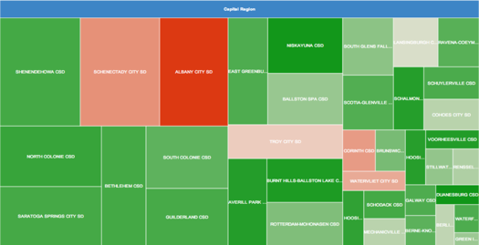
A "tree map" of how each Capital Region school district's high school class fit into the region's overall cohort. (Don't squint, there's a larger version after the jump.)
Corrected.
The state Department of Education recently released its annual collection of data about high school graduation rates around the state. The statewide graduation rate for 2013 (that is, the 2009 cohort of students) was 74.9 percent, up slightly from the year before. (That counts kids who finished up by June 2013).
As we do every year, we've pulled out the stats from Capital Region school districts.
Sorted stats (including notes and qualifications) after the jump.
New York popular baby names 2013

New York State has many little Sophias, Isabellas, Jacobs, and Michaels -- and that doesn't appear to be changing anytime soon. But which names will soon be popping up more frequently at kids birthday parties?
Every year the Social Security Administration publishes a list of the 100 most popular baby names for each state from the previous year. The lists for 2013 were released this week, so we pulled the results for New York State.
And here they are, the 100 most popular female and male baby names, along with which names are rising -- and falling -- quickly in popularity.
How people get to work in the Capital Region

The way to get to work? Not for many, but it is for some people.
This Friday, May 16 is Bike to Work Day, which seemed like a good excuse to take a look at how people get to work in the Capital Region. And, thanks to the Census Bureau, there are some numbers that can give us some sense of that.
So, let's have a look -- at how people get to work, how long it takes them, and when they leave...
A look at airfare prices out of Albany

How high? It depends on how you measure.
The Albany airport ranked #17 in the nation for highest average domestic roundtrip airfare among the top 100 busiest airports during the fourth quarter of 2013, according to numbers recently released by the federal government. The average fare out of ALB: $434.60. The national average was $381.05.
But, like most numbers, that average airfare figure only tells one part of the story. So let's take off with a few more numbers and see if we can get a better sense of how airfare from Albany compares...
openAlbany
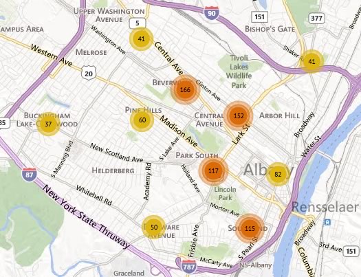
A screengrab from a crime map at openAlbany.
The city of Albany unveiled a new website today -- called openAlbany -- for sharing municipality data with the public -- stuff like crime reports, parking tickets, and city employee salaries.
Said mayor Kathy Sheehan today at a press conference about the reasons for putting together the site: "The first is that we spend a great deal of time responding to information and FOIA requests, so now we can just steer the community to Open Albany and it will be there. Also we know there are a lot of people -- who are a lot more tech savvy than me -- that know how to use this date to make maps and organize it in a way that will be helpful."
We've been banging the drum (softly) for something like this for years. And we gotta say, after poking around openAlbany today, it appears to be an encouraging start.
A few that caught our eye on the first pass...
The Capital Region's "most Irish" cities and towns
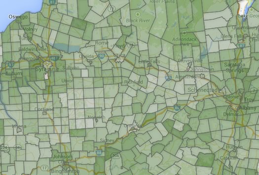
Lots of green.
Today is St. Patrick's Day, both a Catholic religious holiday and a holiday for people celebrating their Irish heritage. (Or, you know, just celebrating a good excuse to get together with friends.)
As it happens, this part of the country -- both the Northeast and Upstate New York -- have some of the highest percentages in the US of people claiming Irish ancestry. This Trulia map from last year, which maps by county, illustrates that well. So we though it'd be fun to map New York State cities and towns by percent of people claiming Irish heritage, based on Census data.
Maps, and a chart or two, a few facts for conversation over corned beef and cabbage...
Where people moved to/from when moving from/to the Capital Region
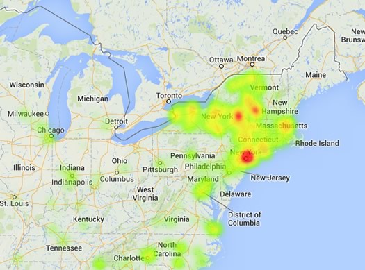
A clip from a "heat map" of where people from the Capital Region moved, according to Census Bureau estimates recently released.
Updated with better maps.
You know how people often talk about moving from the Capital Region to someplace warm? Well, according to recently released Census Bureau estimates about migration flows, the most popular state to move to from the Capital Region is Florida.
But Florida is also one of the states people most frequently move from to the Capital Region, too.
That, and whole bunch of other bits we turned up while going through the numbers this week, after the jump.
And you know there are charts and maps. Of course.
Capital Region median home prices 2013
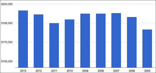
Capital Region median home sale price 2013-2005.
The Capital Region housing market approached its pre-recession level in 2013, according to data out today from the Greater Capital Association of Realtors.
The median price for homes sold in the Capital Region was $195,000 in 2013, up more than 1.5 percent compared to the year before according to GCAR's numbers. And it's the first time the median sale price has risen above the pre-recession crest of $193,000 in 2007.*
The local market also posted 9221 closed sales in 2013, up almost 12 percent from the total in 2012. GCAR says 2013's total was the highest since 2007.
Another sign of a rising tide in the housing market: The average number of days it took to sell a house was 90 in 2013, the lowest number since 2008, according to GCAR. (That figure was 98 days in 2012, and 102 in 2011.)
(* That's not accounting for inflation. Depending on how you account for inflation, the price would have had to be around $216,000 to equal the 2007 mark.)
A more detailed look at the numbers is after the jump.
Household income and poverty rates in New York State -- and how Saratoga is different from the rest of the Capital Region
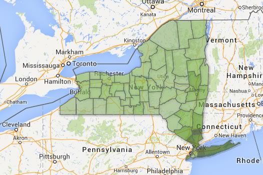
Estimated household income by county. Don't squint -- there are better maps after the jump.
Map(s) of the day: New York State counties by median household income and percent of people living in poverty.
The Census Bureau released new income and poverty estimates -- for the year 2012 -- this month. So we put together maps of New York State based on the data.
Three large-format, clickable maps are post jump -- along with a few observations.
Checking out the Troy crime map
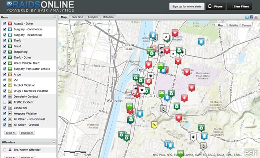
A screengrab from this afternoon.
The Troy Police Department unveiled a new online crime map for the public today. From the press release:
With the exception of crimes related to domestic incidents and sexual assaults, all reported crime in our city will be mapped with a built in 72 hour posting delay. The delay is designed to give Investigators a "first look" at an incident and apply any limitations they see fit specifically relevant to their investigation. Once mapped, the information remains embedded in the mapping, subject to numerous choices the user can make; eg. date range, type of crime, etc. Previously noted exceptions to the mapping will always be subject to inclusion should a public safety need to post the incident be evident.
This is a good step, as we've said a bunch of times before, it'd be great to see other local municipalities head in this direction.
A few more quick thoughts:
All of New York State's cities, lined up by size
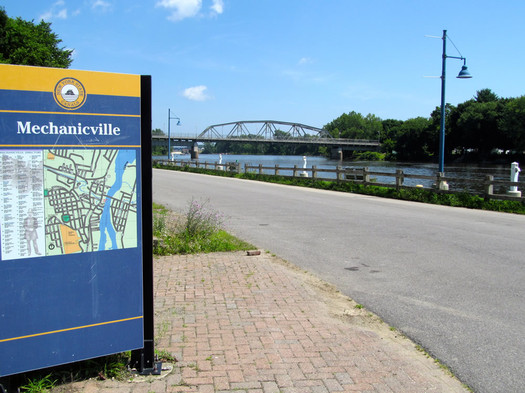
Did you know you can fit all of Mechanicville in a shoe box? (OK, that might not be technically true.)
From the Annals of Facts of Limited Utility: While editing last week's in-between places feature about Mechanicville and Stillwater, we did some research on the claim that Mechanicville in the smallest city in the state. And based on Census data about geographic size, it's true -- M'ville's land area is just .84 square miles, more than half a square mile smaller than the next city on the list.
Anyway, that got us curious about the size of cities around the state -- which are the biggest, the smallest, how big or small they are relative to each other.
So we pulled the numbers and sorted them for easy scanning. And is there a map? Oh, you know there's a map...
A shift in the job market?
Check out the Capital Region's unemployment rate over the first half of this year, in the table above. (The state Department of Labor released June's numbers this week.)
The state's numbers for metro areas are not seasonally adjusted, so the best comparison for a month is the same month the year before (or before that and so on). After a small increase in January, each month since has registered a bigger decline from its counterpart the year before
Six months isn't necessarily a lot of a time, but it looks like an encouraging trend. And maybe it is. Another way of looking at the situation is to count how many people are employed, as opposed to unemployed.* We've put together those numbers for the Capital Region over the same period in a table after the jump. The picture from that angle is not quite as bright, though June did register a nice increase.
One (another) thing that would be interesting to know: How the pay of these new jobs compares to that of the jobs people previously had.
Saratoga County: It tied Tompkins County (Ithaca) for lowest unemployment rate in the state in June, at 5.7 percent.
New York State: The state's unemployment rate was 7.5 percent in June, the lowest mark since February 2009. It was down from 7.6 in May, and 8.7 in June 2012. (Statewide rates are seasonally adjusted.) The state added 93,800 non-farm jobs between June 2012 and June 2013, an increase of 1.1 percent.
Temperature vs. power
There's been a lot of talk this week about how the heat wave is putting a strain on the state's power grid. The org that oversees the state's grid predicted that cranking up all those air conditioners would push the state's electricity usage up to or beyond the all-time record. And on Thursday Andrew Cuomo was urging New Yorkers to conserve energy so as to lessen the chances of power outages.
Update: The state's electricity demand broke the record Friday, NYISO reported late that afternoon.
All that talk got us curious about the relationship between temperatures outside and power usage. So we pulled the data for both daily max temps and max "load" on the state's power grid. There's a graph above -- but don't squint, there's a large format version after the jump (along with some notes).
Charting the Capital Region's workday population tide
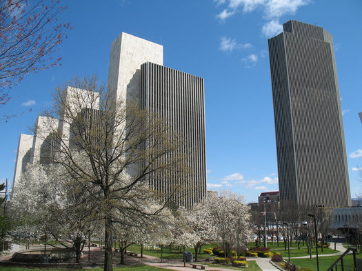
That is a lot of office space...
Most of the time when we talk about "population" it's in reference to how many people live in a place. But that doesn't necessarily give the best sense of how many people frequent that city/town/village.
For example: the city of Albany's population on weekdays increases almost 67 percent during weekdays, according to Census Bureau estimates.
So, to get a better sense of how the population "tide" drifts around the Capital Region on a weekday, we thought it'd be interesting to pull daytime population numbers for cities, towns, and villages around the Capital Region -- and then rank and map them.
Capital Region high school graduation rates 2012
 The state Department of Education released its annual collection of data about high school graduation rates around the state on Monday. The statewide graduation rate for the 2008 cohort of students was 74 percent, the same as the year before. (That counts kids who finished up by June 2012. The rate was almost 77 percent if students finished by August 2012 are included). And as NYSED notes, this was the first cohort in which the "local diploma" option was not available to general education students, requiring them to graduate with a more rigorous Regents diploma.
We pulled out the stats from Capital Region school districts. As in years past, there continues to be a sobering gap in graduation rates among some school districts and groups of students.
Sorted stats (including notes and qualifications) after the jump.
Albany is average. Really?
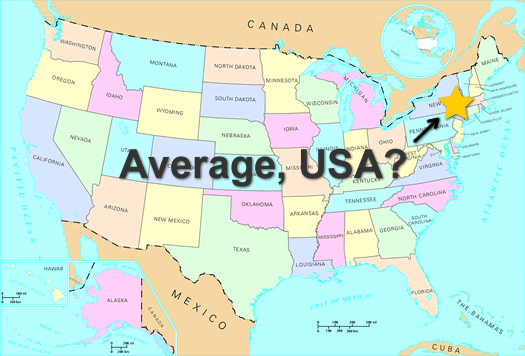
We saw today this assertion that the Albany metro is the "most average city in America." And our first thought was: "Really?"
That claim is based on market research on how metros compare/contrast to the whole United States "on age, marital status, home ownership and estimated income." And Albany was at the top of the list.
But. Those rankings are from... 2004 -- which is like a whole other decade (actually, it is a whole other decade). Considering how much the United States has change demographically during the last 10 years or so, we kind of doubted that Albany could still hold the claim to being unusually average (an odd claim).
Here's the thing, though: We're not going to run the numbers for every metro in the country (yes, we're missing out on quality time with spreadsheets). But we did run them to see how the Albany of now compares to the rest of the United States of now. You can make your own judgement about whether it's a good representative for the whole.
A slight case of congestion
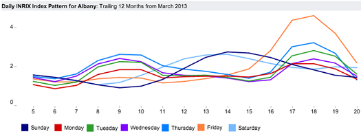
Congestion patterns by day in the Albany metro, according to INRIX.
We've said this before, and we'll say it again: The Capital Region doesn't have traffic.
OK, sure, it has traffic. It has cars that go on roads and sometimes they have to slow down. Sometimes -- gasp! -- they even stop. But compared to most other larger metropolitan areas -- what passes for traffic here is nothing.
The annual INRIX Traffic Scorecard continues to provide evidence on this account. The congestion monitoring company's latest annual report, for the year ending in March, is out this week.
The Albany metro's national rank: #74.
INRIX figures traffic and congestion in this area caused a typical commuter to "waste" 3.6 hours over the course of the year. That's roughly 29 seconds per commuting trip.
That's down a bit from the previous year, in which INRIX figured the average commuter was caught for 4.6 hours.
To put this in some perspective, here are the figures for the top 5 most congested metros in the INRIX rankings (metro - hours per year):
1. Los Angeles - 60.3 hours
2. Honolulu - 51.1 hours
3. San Francisco - 49.7 hours
4. Austin - 38.7 hours
5. New York - 51.5 hours
Stick that in your breakfast taco, Austin.
Obviously, those metros are larger, so it's natural they'd be more congested. And Albany would probably be willing to trade some increases in congestion for some of the stuff those places have. But, hey, we'll think about that while we're relaxing at home after a short commute home.
Here's an explainer on the methodology.
Bonus commuting fact: The average commute time in the Albany metro area was 22.2 minutes in 2010, according to Census Bureau estimates. That was less than the national average (25.4). And it ranked 276th in the nation.
graph: INRIX
Capital Region's most popular baby names

Updated
Because we were thinking about birthdays this week, we thought it'd be fun to look at Capital Region baby names. (A name is one of the first birth day presents you ever get.)
So we pulled together the numbers for the past handful of years for the four core counties of the Capital Region.
And away we go...
Zooming out on Capital Region unemployment
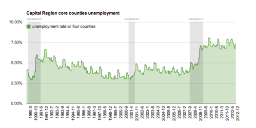
Don't squint. Here's a large-format version.
The state Department of Labor released unemployment data today for areas around the state -- and they were remarkably familiar, in a bad way.
The Albany-Schenectady-Troy metro area's unemployment rate was 8.4 percent in January. That was up from 8.2 percent in January 2012 -- though DOL reported there were about 2,000 more people employed this past January compared to the previous January. (The local area unemployment data isn't seasonally adjusted, so the best comparison is the same month the year before.)
Compared to the rest of the state, the Albany metro isn't doing so badly. It had basically the third lowest rate in the state, behind Ithaca (6.7) and the NYC suburbs/Long Island (7.9). Among the areas at the other end of the spectrum: Elmira (10.5), Glens Falls (10.3), and Utica/Rome (10.2). (The metro and county breakdown is post jump.)
The state's overall unemployment rate was 8.4 percent in January, the same as it was in January 2012. And it was up from 8.2 percent in December. (The statewide rate is seasonally adjusted, so month-to-month comparisons are OK.) The national unemployment rate was 7.9 percent.
A wider perspective
OK, the Albany metro's rate -- 8.4 percent -- seems high. How high? To put it in perspective, we pulled the unemployment data for the Capital Region's four core counties for 1990-2012. Large-format chartage is post jump.
Checking out open.ny.gov
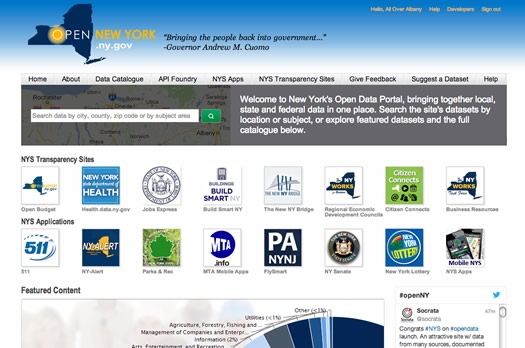
The Cuomo admin today announced the launch of open.ny.gov -- a sort of one-stop, online shop for public data in the state. Blurbage:
"Open data" refers to data that is free from restrictions and can be released in a format that can be retrieved, downloaded, indexed, and searched by commonly used web search applications. Open.ny.gov provides unprecedented "open data" access and transparency to the wealth of information collected and maintained by our state and local governments. It allows researchers, citizens, business, and the tech community direct, centralized access to high-value government data to search, explore, download, and share.
Among the first of a small group of local municipalities to participate (at least in a limited way): the city of Albany.
We have to admit that when we saw the press release, we didn't have high hopes. You know, it sounded good -- but stuff like this often falls flat.
But after checking it out this afternoon, there might be something to this...
Another look at Capital Region income distribution
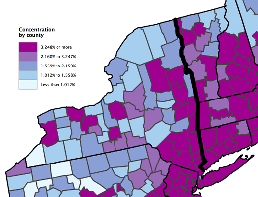
Clipped from a Census Bureau map of the concentration of high-income households by county.
Updated
The Census Bureau released a breakdown of high-income households this week. It defined "high income" as households with income in the top 5 percent of the nation -- $191,469 and higher.
The report only ranked the top-50 largest metro areas (by population), so the Albany metro didn't get its percentage of high-income households listed. But the Washington Post has the county-by-county data, along with an interactive map -- five percent of households in Albany and Saratoga counties are in the high-income category, four percent in Schenectady County, and three percent in Rensselaer County. (WP has more info.)
And by the way: the lower limit for the top five percent of households by income in the Albany metro area is $184,514.
Anyway, we thought this would be a good time to look at income distribution in this area again. We did that in 2011, and there's some updated data now. And we've also pulled together some other numbers that we hope will provide a bit more context.
And, yep, if you just want to see where your household ranks -- there's a quick chart to do that, too...
Car crashes, snow, crime, and public data
A clip from a map of vacant -- and no-longer-vacant -- properties in Albany, created by Tim Varney last year. See below.
Lots of interesting bits in this Daily Gazette article by Kathleen Moore about how police in Albany and Schenectady are using data*. Here's a clip, about how Schenectady police have been paying closer attention to car crashes:
By tracking car accidents last fall, Schenectady police pinpointed patrols in the Mont Pleasant neighborhood and saw certain crimes plummet by 12 percent in the last quarter of 2012. They are using the same system to respond proactively to crime throughout the city, in hopes of getting similar results everywhere.
Maps of crashes, drunken-driving arrests and other traffic violations are overlaid with maps of crime reports. Police patrols are sent to the hotspots -- locations where traffic problems and crime are high.
"What we know is, the driver that's risky enough to drive drunk ... is often risky enough to take other risks," said federal Highway Safety Specialist Shannon Purdy. "A lot of criminals are caught at seatbelt checks."
A section about the Albany police department mentions how the APD is using weather forecasts to adjust patrols.
Also: Schenectady mayor Gary McCarthy is working with UAlbany's Center for Technology in Government to build a platform that would allow city departments to share code enforcement data (say, about code enforcement), and share it with Albany and Troy.
More, please
That common platform is a good idea. And it's worth pushing even further: Why not created a Capital District consortium for publishing and sharing public data? The org could help develop tools, set common formats, and provide a clearinghouse for sets of public data. It would open the way for more orgs and people to get involved, and even maybe set the stage for new businesses. (NYC is already doing something along these lines.)
Sure, there are obstacles: time, money, attention. And civil liberties issues will probably crop up along the way. But having meaningful access** to data generated by your government is becoming a 21st century civil right.
____
* Yep, it's a Gazette article, but we have a feeling that link will work for you.
** A pdf that you have to file FOIL for is not meaningful access. It's a start, but we do a lot better.
Earlier on AOA:
+ A future timeline of Watson at RPI
+ Map: vacant -- and no-longer vacant -- buildings in Albany -- created by Tim Varney from data published in a city report last year
Capital Region median home prices 2012
 The number of homes sold in the Capital Region took a big jump in 2012 compared to the year before, according to stats out this week from the Greater Capital Region Association of Realtors. The number of closed sales across the region increased 15 percent, the first increase in years.
Median prices were also up, but the increase was smaller. The median price across the region was up 4 percent, to $192,000.
Here's GCAR's report for 2012. The average number of days it took for a house to sell last year was 98, down from 102 in 2011. And this past December, "inventory" -- the number of homes for sale -- hit its lowest point since 2008, as did "months of inventory."
GCAR also provides breakouts for individual counties and a group of cities/towns. We've collected those 2012 numbers in an quick-scan table post jump.
Old-school New Yorkers
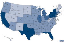 Demographic fact of the day: New York State had 4,605 centenarians in 2010, according to the Census Bureau. That was the second highest total in the country, behind California (5,921), and ahead of Florida (4,090).
As you'd expect, the states with the largest populations tended to have the most people over age 100. But looking at states (and DC) by the number of centenarians per 10,000 people, New York ranks 7th with 2.38 per 10,000. California is way back in the pack with just 1.59 per 10,000. And Florida's at 2.18.
The states with the most centenarians per 10,000: North Dakota (3.29 per 10,000), followed by South Dakota (2.95), Iowa (2.78), Nebraska (2.74), and Connecticut (2.60).
Post jump: a Census map of the state's by total centenarians, and per 10,000.
[via Gannett Albany Watch]
New York is among the least obese states
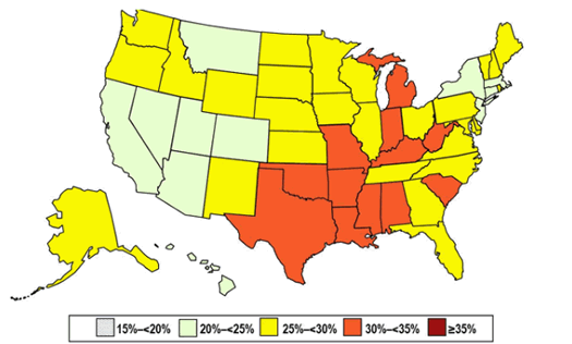
Prevalence of adult obesity by state in 2011, according to the CDC. (see notes below) Arkansas is now the buckle of the Butter Belt.
New York State ranks 42nd in the nation for the prevalence of adult obesity, according to the Centers for Disease Control and Prevention. (It's tied with Connecticut and Nevada for that spot.)
The CDC figures that 24.5 percent of adults in New York were obese last year.* Nationwide about 35.7 percent of adults are obese. State-by-state rankings are post jump.
The CDC defines obese as a person having a body mass index of 30 or higher. A healthy weight is considered to be in the 18.5 to 24.9 BMI range.
While New York is in relatively good shape -- it shouldn't exactly be patting itself on the back (unless that counts as exercise). Only 10-14 percent of adults in the state were obese 20 years ago.**
* Data are from the CDC's Behavioral Risk Factor Surveillance System (BRFSS) which relies on self-reported data from phone surveys.
** The CDC changed some of the ways it collects the BRFSS data, so the 2011 figures are necessarily comparable to the 2010-and-before numbers.
The ___est neighborhoods in the Capital Region
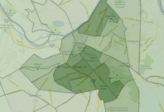
Schenectady leads the Capital Region in racial diversity. (The deeper the shade of green, the more diverse the neighborhood.)
Location. Location. Location.
It's a cliche, but it doesn't make it any less true: location is among the most important factors in real estate. It can significantly affect the value of a house -- and significantly affect how much you like living there.
Of course, physical factors like roads, trees, and access to services are a big part of location. But so are the people in your neighborhood.
To get a better sense of some general demographic characteristics about Capital Region neighborhoods -- age, ethnic diversity, income, education, and so on -- we pulled data for all 210 Census tracts in the four county area.
Here are some of the ____-est neighborhoods...
Capital Region high school graduation rates 2011
 The state Department of Education released data Monday about high school graduation rates. The statewide graduation rate for the 2007 cohort of students was 74 percent (that counts kids who finished up by June 2011).
We pulled out the stats from Capital Region school districts. As in years past, some of the results are sobering and frustrating.
Sorted stats (including notes and qualifications) after the jump.
Most popular baby names New York 2011
 As it does every year, the Social Security Administration today released
So we pulled the list -- the 100 most popular names for boys and girls born in New York State last year are after the jump. We also looked at how the top 10 names this year ranked during the last few years.
One name in particular has skyrocketed in popularity...
Capital Region property tax rates
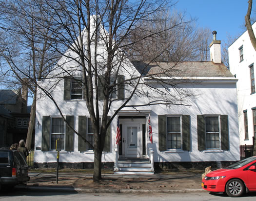
Schenectady has the highest property tax rate in the Capital Region, according to the Empire Center report. The property taxes on this house -- the "oldest" house in Schenectady -- assessed at $247,600 in 2010: $10,078. [Zillow]
The Capital Region has the lowest median effective property tax rate in the state, according to a report from the Empire Center. This area's median rate was $23.14 per $1000 last year. Western New York had the highest rate at $35.58 per $1000.
The Empire Center's analysis did not include New York City or Nassau County, which it says impose rates in a way that makes them hard to compare. And in this case, the Capital Region extends beyond the four core counties to also includes counties such as Warren, Washington, and Greene.
Within the Capital Region's core there are wide differences. The effective total property tax rate in the city of Schenectady is $40.75 per $1,000 of property value. In the town of Edinburgh it's $7.70 per $1,000.
We pulled all the numbers for municipalities in the Capital Region's core. They're sorted after the jump.
New York State's teen birth rate continues to drop
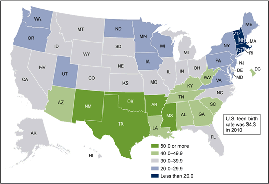
Teen birth rates across the nation in 2010. (Here's a state-by-state table.)
Updated Thursday morning
New York State has one of the lower teen birth rates in the nation, according to numbers out this week from the National Center for Health Statistics.
The Empire State's rate was 22.6 births per 1000 women ages 15-19 in 2010. Only eight states had lower rates (check out the map above). The national average was 34.3. The lowest state was New Hampshire (15.7), the highest Mississippi (55.0).
Teen birth rates have been dropping across the country since the early 1990s. Some perspective: New York State's rate was 45.5 in 1991 -- it's dropped almost every year since (source).
Nationally, he NCHS says "fewer babies were born to teenagers in 2010 than in any year since 1946." And the national rate is the lowest it's been in the seven decades that reliable numbers are available.
So, why's this happening? From the report:
The impact of strong pregnancy prevention messages directed to teenagers has been credited with the birth rate declines (9-11). Recently released data from the National Survey of Family Growth, conducted by the Centers for Disease Control and Prevention's (CDC) National Center for Health Statistics (NCHS), have shown increased use of contraception at first initiation of sex and use of dual methods of contraception (that is, condoms and hormonal methods) among sexually active female and male teenagers. These trends may have contributed to the recent birth rate declines (12).
Curious about the Capital Region, we looked up the rates for the local core counties...
Capital Region rents
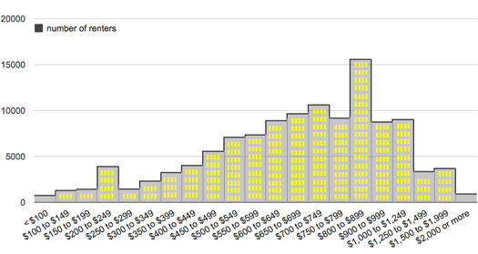
The distribution of rent prices in the Albany-Schenectady-Troy metro area in 2010, according to Census Bureau estimate. Here's a larger version.
After seeing that the Capital Region had one of the lowest apartment vacancy rates in the nation last year, we were curious about rents here -- how they're distributed and how they stack up against other metro areas. [Biz Review]
Bring on the charts and graphs...
Capital Region median home prices 2011
 The median sale price of single family homes in the Capital Region was basically flat in 2011 compared to 2010, according to numbers from the Greater Capital Association of Realtors.
The median price for sale price for a home in the greater Capital Region was $186,032 in 2011. It was $203,511 in the Capital Region's four core counties. Both of those medians were down about 1 percent from 2010.
GCAR (as it's known) recently posted its annual market report for 2011. It includes stats for individual counties, cities, and towns in the Capital Region -- we've broken those out into a table after the jump.
While prices were basically flat for the region as a whole, the average time it took to sell a house increased. GCAR says the average number of days on the market until sale was 101 days in 2011, up from 92 in 2012. (For some perspective, the average was 79 days in 2007. It's been rising each year since.)
Onto the table...
The best November ever?

Something's missing from picture. Oh, right, cold. And snow.
As far as the weather goes, this is one of the best Novembers we can remember in some time -- warm, with only a few traces of snow.
Or, to put it another way: It was 63 today! And 60 yesterday!
Curious about how unusual this warm November is, we looked up the temperature data.
Are there charts and graphs? Oh, you know there are charts and graphs...
Pot prices around New York State
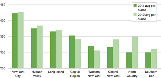
This is all really hazy, so, you know, grain of salt and all that. Dude.
About a year ago we pulled data on marijuana prices in New York State from a site called Price of Weed. Yep, it's pretty much what it sounds like -- it's a crowdsourced database of pot prices.
We came across some research recently on these prices, so we figured it was a good time to light this topic back up.
Let's roll the numbers. Here are pot prices from around New York State, broken out by region...
Capital Region income distribution
 With all the talk about 99 percents and 1 percents, we were curious about the income distribution in the Capital Region.
So, we looked up the data. Let's go to the charts, graphs, and discussion...
(You know you want to see where you rank.)
August 2011: historically wet
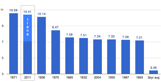
The top 10 wettest Augusts on record in Albany since 1826.
August 2011 was one of the wettest Augusts (by total precipitation) on record in Albany. In fact, this past August ranked #2 all time (or, at least, going back to 1826).
The rain from Irene made up a good a portion of that total. The NWS reported 4.69 inches of rain in Albany on August 28. Even without Irene, the month would have been unusually wet -- though not in the top 10.
Of course, your Irene total probably varies depending on where you were measuring. The NWS precipitation map reports heavier rainfall to the south -- especially in parts of central/south Greene County (probably one of the reasons the flooding was so bad there).
The map might even underestimate a bit -- its total for much of Albany County seems a bit low compared to the official report. And the Gazette reported this week that a rainfall total of 13.3 inches was recorded in East Durham (northern Greene County).
The rainfall map is after the jump.
(Thanks, Justin)
Capital Region elementary school test scores 2011
 The state Education Department released results from the English and math proficiency tests for grades 3-8 this week. NYSED reports that, on average, scores are down slightly for English and about the same for math.
The state also makes the test score data available by school district, so we pulled out the results for Capital Region districts. A compact, easy-skim version is after the jump -- along with expanded presentations of the data -- after the jump...
Leaving New York
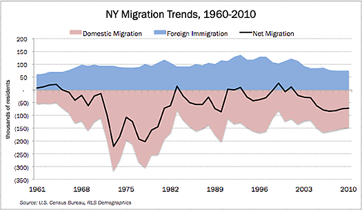
New York State lost a net of 1.6 million residents to other states over the last decade, according to an analysis of Census data by the Empire Center. Among the report's findings:
+ Since 1960, New York has lost 7.3 million residents to the rest of the country. This was partially offset by an influx of 4.8 million foreign immigrants, resulting in a net decline of 2.5 million residents.
+ New York's average annual domestic migration loss - the difference between people moving in from other states and out to other states -- jumped from about 60,000 people in the 1960s to an all-time high of nearly 237,000 in the 1970s. The state's domestic migration outflows have averaged between 130,000 and 160,000 a year since 1980.
+ For a second consecutive decade, New York's net population loss due to domestic migration was the highest of any state as a percentage of population.
+ New York's net migration loss - the sum of domestic and foreign migration - increased over the last decade to its highest level since the 1970s. Thirteen states had negative net migration between 2000 and 2010, and only three (Illinois, Louisiana and Michigan) lost a bigger share of their populations to migration than New York.
The chart above is from the report. The black line tracks net migration -- the loss of people to other states has been ongoing trend for the last 50 years.
The report also breaks out migration numbers for counties. Totals for the Capital Region are after the jump.
So where's everyone going? A Pew study asked that question a few years back. The top three states for New Yorkers migrating elsewhere: Florida, New Jersey and Pennsylvania.
chart: Empire Center
Capital Region high school graduation rates 2010
 The state Department of Education released data today about high school graduation rates. The statewide graduation rate for the 2006 cohort of students was 73.4 percent (that counts kids who finished up by June 2010).
We pulled out the stats from Capital Region school districts. As in years past, some of the results are frustrating.
Sorted stats (including notes and qualifications) after the jump.
SUNY's economic impact on the Capital District

Impact of a walk-through fountain: priceless.
The SUNY system has a $1.3 billion annual economic impact on the Capital District, according to an analysis done by Rockefeller Institute at UAlbany and the University at Buffalo Regional Institute. It figures the SUNY system has a $19.8 billion impact on the state as a whole.
Here's a handful of facts, figures and bits for the Capital District that we pulled out of the report, in a few cases matched up with outside data...
Capital Region age distribution
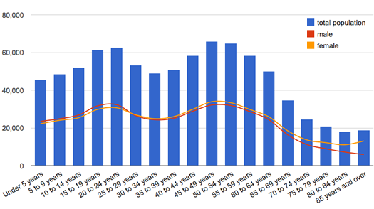
Boom. Echo boom.
The Census Bureau reported today that the median age of people in New York State is 38. (That is, half the people here are older than that, half are younger.) That's up from 35.9 in the 2000 Census.
Here are the median ages for the four core counties of the Capital Region (and medians from a decade ago):
Albany: 38.5 (36.8)
Rensselaer: 39.2 (36.7)
Saratoga 40.8 (36.9)
Schenectady: 39.8 (38.6)
The graph above is the age distribution for the Capital Region.
After the jump: the median ages for a handful of Capital Region cities and towns. Also: everyone's favorite game -- can you guess the local municipality by its age distribution?
Most popular baby names in New York 2010
 As it does every year, the Social Security Administration today released a list of the most popular baby names in 2010, sorted by state.
So we pulled the list -- the 100 most popular names for boys and girls born in New York last year are after the jump. We also looked at the top 10 names this year ranked during the last few years...
Supermarket Showdown IV

As the "stealth downsizing" of products continues to cover up price increases, brands are starting to point out when they haven't changed sizes.
It's Supermarket Week on AOA -- a whole week of stuff about grocery shopping. Because we all have to eat.
AOA's annual comparison of local supermarket chain prices is back. Walmart is the three-time defending champ.
Can Hannaford or Price Chopper close the gap this year?
Capital Region 2010 census population totals
The Census Bureau released 2010 populations totals for places in New York State Thursday afternoon.
The population of the Capital Region's four core counties was up more than five percent since the last census in 2000, which made this area an outlier for upstate. Breakouts for the individual local counties are above (breakouts for all the cities and towns in the Capital Region are after the jump).
New York State's population was up about two percent, as was New York City's population. Officials there are already arguing there was an undercount.
Breakouts for Capital Region cities and towns -- as well as a few notes -- after the jump.
New York is third most populous state again, but it's losing two Congressional seats
There's a bigger version of this interactive display embedded in wide screen after the jump.
New York State had 19,378,102 residents on April 1, 2010, according to data released by the Census Bureau today. That ranks the Empire State third overall among states for population.
New York was the third most-populous state during the 2000 decennial census, too. The state's population has grown by 401,645 people since then. But its slice of the nation's overall population declined in that time. In 2000, New York counted as 7 percent of the US population -- now it's 6 percent.
And, as expected, New York is losing two Congressional seats. After re-apportionment, the state will have 27 members of the US House. (A House seat will represent about 710,767 people this time around.)
The total national population was counted at 308,745,538. That's up 9.7 percent since 2000.
Tables with number candy are after the jump.
Adding jobs one place, losing them another
New York State added more than 40,000 private sector jobs last month -- the biggest such increase since 2005, according to the state Department of Labor. Good news!
Here's the thing, though: the state lost 37,000 public sector jobs compared to the same month a year ago. The large majority of those jobs were at the local level. And with stimulus money drying up, you have to figure governments will keep cutting.
The Capital Region added 2,800 private sector jobs in October, compared to October 2009. But public sector losses put the overall change at -1,900. There are still roughly 30,000 unemployed people in this area.
Record year for Amtrak

Popular.
Amtrak announced this week that ridership was up 5.7 percent during the fiscal year that just ended compared to the year before. The rail org had a record 28,716,857 passengers.
Here are how some of the routes that pass through the Capital Region fared (rimshot):
The Empire Service gets a lot of traffic -- not just for here, but overall. In fact, it's the fifth most traveled non-Northeast Corridor route in Amtrak's system.
We're big fans of riding the train regionally -- it's our favorite way to get to NYC from Albany. Amtrak says it has a 65 percent share of the air-rail market between Washington and New York and a 52 percent share for air-rail travel between New York and Boston. The Northeast Corridor line had more than 7.1 million passengers last fiscal year.
By the way: Amtrak reports ridership is up 37 percent since FY2000.
Earlier on AOA:
+ The slow line to high-speed rail
+ The best way to get from Albany to NYC?
Capital Region unemployment rate stuck
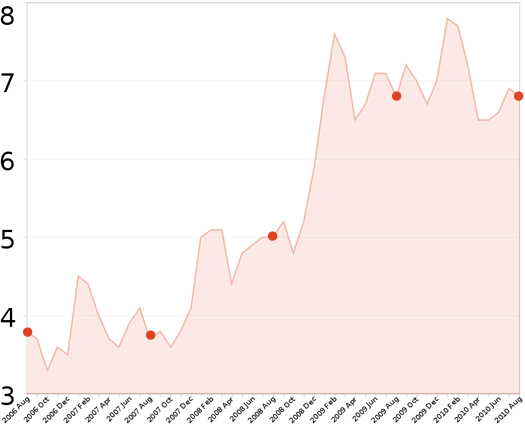
The dots mark the last five Augusts.
The Capital Region's unemployment rate was 6.8 percent in August, according to the state Department of Labor. It was 6.9 percent in July and 6.8 percent in August 2009. (August to August is the best comparison because the local unemployment rate is not seasonally adjusted.)
There are more than 31,000 people unemployed in the Capital Region.
New York State's overall unemployment rate in August was 8.2. It was 8.4 in July and 8.6 in August 2009 (seasonally adjusted, so if you'd like to compare different months against each other, compare away).
The situation isn't good here, but it's better than the nation as a whole. The national unemployment rate in August was 9.5 percent -- about the same as a year ago.
Breakouts for individual Capital Region counties after the jump.
Related: The US Census Bureau released numbers of on the poverty rate today. It estimates New York State's rate in 2009 at almost 16 percent. That national poverty rate was 14.3 percent -- the highest since 1994.
Capital Region elementary school test scores
 The state Education Department released results from the English and math proficiency tests for grades 3-8 this week.
So, we pulled out the results for Capital Region school districts. A compact, easy-skim version is after the jump -- with links to more detail. (If you want a school-by-school breakdown, NYSED makes that available, too.)
On to the data, some of which are sobering...
New York's least-smoky counties
The Capital Region's four core counties have some of the lowest adult smoking rates in the state, according to data distributed by the state health department today.
The full rankings are after the jump. Among Capital Region counties, Albany County had the lowest smoking rate at 16.5 percent.
We were also curious about how smoking rates might associate with income -- so we whipped the two sets together. The result is also in there.
Eww: The DOH released this data as part of push to get people to stop smoking. Part of the campaign: two new TV spots of which a DOH officials says: "Some viewers may complain the ads are too graphic or emotional..." The one embedded above is pretty gross. Here's the other.
Capital Region June unemployment rate better than last year
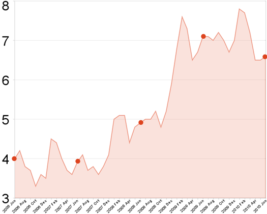
The dots mark the unemployment rate for the last five Junes.
The Capital Region's unemployment rate was 6.6 percent in June, according to the state Department of Labor. It was 6.5 percent in May and 7.1 percent in June 2009. (June to June is the best comparison because the local unemployment rate is not seasonally adjusted.)
There are more than 30,000 people unemployed in the Capital Region.
New York State's overall unemployment rate in June was 8.2. The state's rate was 8.3 in May and 8.6 in June 2009 (seasonally adjusted, so if you'd like to compare different months against each other, compare away).
The national unemployment rate in June was 9.5 percent.
Breakouts for individual Capital Region counties after the jump. Every county showed a decrease in the unemployment rate compared to June 2009.
The Capital Region's economy is performing relatively well
 The Albany metro area was among the 21 economically strongest performing large metro areas through the first quarter of 2010, according to the Brookings Institution.
The report bases the rankings on a handful of categories: employment, unemployment, output, home prices, and foreclosure rates.
The Albany metro area scored well for foreclosed properties and both employment and unemployment -- and relatively well for housing prices (the ranks, with the associated data, are after the jump).
Of course, all these rankings are relative to other metro areas. The overall picture is not great. The Brookings report describes the current national situation as "a jobless and increasingly fragile recovery."
New York is not the volunteer state
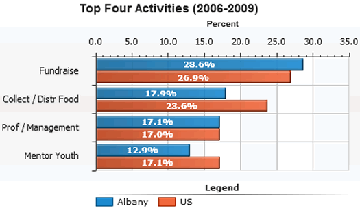
The top four volunteer activities in this metro area.
From a report called Volunteering in America, based on averages from 2006-2009:
The Albany metro area has 200,000 volunteers
27.1% of residents volunteer - ranking them 44th among the 75 Mid-size cities
34.7 hours per resident - ranking them 44th within the 75 Mid-size cities
$532.2 million of service contributed here
Here's the full rundown for this metro area.
The report includes a list of "community factors that may influence Albany's volunteer rate" -- but in Albany's case they would seem to indicate that more people in this area would be volunteering.
New York State did terribly in the rankings -- 51st among all states (and DC) for percentage of people who volunteer. NYC probably accounts for a lot of that -- it's volunteer rate was 50th among 51 large cities.
Here are the national rankings.
The federal government produced the report based on data collected by the Census Bureau.
[via the TU's Chris Churchill]
Earlier on AOA:
+ From 2008: Know of a great place to volunteer?
graph: Volunteering in America
The Capital Region's unemployment rate is a little better. Sort of. Maybe.
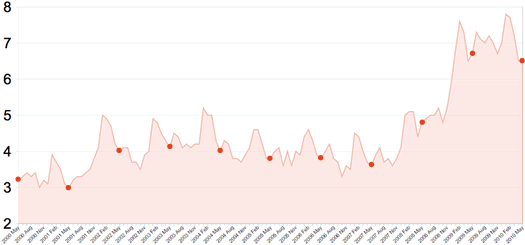
The dots mark the Capital Region unemployment rate for each May since 2000. It's easier to read big.
The Capital Region's unemployment rate was 6.5 percent in May, according to the state Department of Labor. It was 6.5 percent in April and 6.7 percent in May 2009. (May to May is the best comparison because the local unemployment rate is not seasonally adjusted.)
The labor department reports the number of non-farm jobs in the Capital Region last month was down 2,500 compared to May 2009. There are still almost 30,000 people unemployed in the Capital Region.
New York State's overall unemployment rate in May was 8.3 -- the lowest rate since April 2009. The state's rate was 8.4 this past April and 8.4 in May 2009 (seasonally adjusted). But the labor department says the number of non-farm jobs in the state last month was down 22,700 compared to May 2009.
So, what's up here? There are fewer jobs compared to this time year -- but the unemployment rate is down (slightly)?
Most popular baby names in New York 2009
 As it does every year, the Social Security Administration recently released a list of the most popular baby names in 2009. You can break the list out by state, which is exactly what we did.
The list of the most 100 popular names for boys and girls born in New York last year is after the jump.
Listomania
A list of lists: from beer to frowns to development to on-time arrivals.
Updated June 8, 2010
Everybody loves a good list. And it seems like every month or so, the Capital Region or New York State (or something around here) ends being ranked on some sort of list.
We got thinking about this recently -- and came to the only logical conclusion: there needs to be a list of lists.
And here it is.
Surge of home sales near the deadline
Updated: We've noticed a few discrepancies between these numbers and those being reported elsewhere. We're checking to figure out what's up. The general trends still hold true, though.
So, it looks like the federal first-time homebuyer credit prompted a bunch of people to buy a house in the Capital Region.
The Greater Capital Association of Realtors reported today in its monthly stats release that pending sales in April were up almost 46 percent compared the same month the year before (and 24 percent from two years ago). And the number of closed sales was up 14.5 percent. (Buyers just needed to have a contract to qualify for the credit.)
New York continues to add jobs
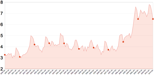
The dots mark the unemployment rate for each April since 2000. It's easier to read large.
The Capital Region's unemployment rate was 6.5 percent in April, according to the state Department of Labor. It was 7.2 percent in March and 6.5 percent in April 2009. (April to April is the best comparison because the local unemployment rate is not seasonally adjusted.)
The labor department reports the Capital Region added more than 4,000 jobs last month. There were almost 30,000 people unemployed in the Capital Region.
New York State's overall unemployment rate was 8.4 -- that's lowest rate since May 2009. The state's rate was 8.6 in March and 8.1 in April 2009 (seasonally adjusted). The labor department says the state added jobs for the fourth straight month.
That unemployment rate for the entire United States was 9.9 percent in April.
Breakouts for individual Capital Region counties are after the jump.
How much sushi is too much?

A plate from Mr. Fuji in Clifton Park.
Local sushi list updated Wednesday at noon.
After yesterday's post about the new Mr. Fuji going into Stuyvesant Plaza, a few people commented on the abundance of sushi places in the Capital Region now. And we had the same thought (thus, the headline "Yet another sushi place").
So, it seems like there are a lot of sushi places. But how many is "a lot"? Or, for that matter, too many?
Well, there are a few ways to answer that question. One of them is to compare the Capital Region's number of sushi places per capita versus that of other cities.
And that's exactly what we did.
At the pump
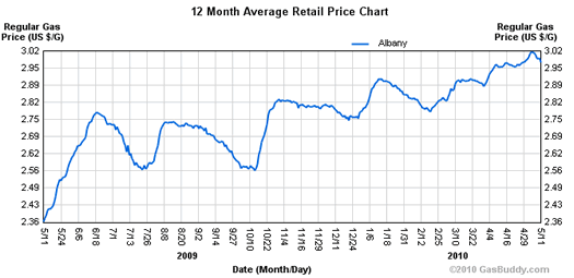
The chart above is from AlbanyGasPrices.com, the crowd-sourced gas prices site. It tracks the average price for a gallon of regular gasoline in the Albany area over the past year. The price has backed off during the last week or so, but it's still just about at the high for the last year.
If you go to the Albany Gas Prices site, you can graph the price against the national average (it tracks pretty closely) and crude oil prices -- and over different time spans, too.
AAA also tracks this data for the metro area, but without the graphs (and who doesn't love a graph).
The federal Energy Information Administration forecasted today that average gasoline prices will increase about four percent over the next year.
[prompted by a tweet from @AndyArthur]
Earlier on AOA:
+ From 2008: Gas hits four dollars and everyone's squeezed
+ How many gallons per mile?
+ Save money on gas... at Price Chopper?
graph: Albany Gas Prices
Projected Capital Region school district per-pupil spending
 The Empire Center released a rundown of projected school budgets across the state for 2010-2011, along with project per-pupil spending.* The think tank reports that the Capital Region has lowest projected increase in per-pupil spending at 1.1 percent.
We pulled out the numbers for the Capital Region (the data are embedded after the jump). The tiny Menands school district (enrollment 230) topped the list of highest per-pupil spending at $32,956.00. The Mohonasen school district (Rotterdam) was the lowest at $13,993.00.
Ballston Spa had the highest per-pupil spending increase at 6.4 percent. The Brunswick school district had the biggest decrease at -7.7 percent (followed by Albany at -3.7 percent).
Earlier on AOA:
+ Capital Region high school graduation rates 2009
+ Capital Region school spending
Our humans are relatively well developed
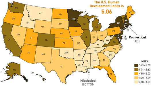
New York's in the top 7.
The American Human Development Project released its annual "Measure of America" report today. The survey ranks states and congressional districts according to a "human development index," which is based on factors such as life-expectancy, education and income.
As it happens, New York scores pretty well in the index -- it ranks #7 overall (Connecticut was #1) and the New York 14th Congressional District (Manhattan and Queens) ranked #1 among all congressional districts.
Here in the Capital Region, the NY 21st (Paul Tonko) ranked #148 nationally, and the NY 20th (Scott Murphy) #162. That's better than a little more than 60 percent of all the congressional districts.
The stat-by-stat breakdown for the two districts is after the jump.
By the way: According to the report, Asian-Americans in New Jersey live better than any other group in the nation.
A few more jobs
The Capital Region's unemployment rate was 7.2 percent last month, according to numbers out from the state Department of Labor today. That's down a bit from February (7.7 percent) and about the same as March of 2009 (7.1 percent). The labor department figures the area added 2,700 jobs last month -- but it's still 6,700 jobs behind where it was in March 2009.
There are almost 33,000 unemployed people in the Capital Region.
A county-by-county breakdown is after the jump. As you'll see, Albany and Saratoga counties aren't doing all that badly (relatively). Schoharie County, which the DOL includes in the Capital Region, is hurting.
New York State's unemployment rate was 8.8 in March (9.2 in February | 8.2 in March 2009). The national unemployment rate was 10.2 (10.4 in February | 9.0 in March 2009).
Numbers for the Capital Region are not seasonally adjusted (so the best comparison is the month from the year before). State and national numbers are seasonally adjusted.
Supermarket Showdown III

Three-peat?
AOA's annual comparison of local supermarket chain prices is back. Walmart is the two-time defending champ -- and it hasn't even been close.
Can Hannaford or Price Chopper close the gap this year?
Not any worse
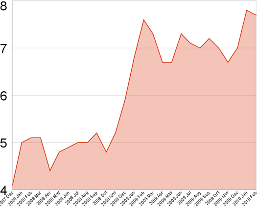
It's something.
What now counts as good news: the Capital Region's unemployment rate didn't get any worse last month.
The state Department of Labor reported today that the area's unemployment rate was 7.7 percent in February. It was 7.8 percent in January and 7.2 percent a year ago. *
The labor department figures there were about 4,700 more jobs in the Capital Region last month, compared to January. That's down almost 10k jobs from February 2009.
There were more than 35,000 unemployed people in the Capital Region last month.
Statewide, the unemployment rate was 8.8 percent (7.8 percent outside NYC). That's the same as January. It was 7.5 percent in February 2009. The national unemployment rate was 9.7 percent. **
A labor department official noted in the press release accompanying the numbers that "following previous recessions, it has taken the state about five years, on average, to regain all of the jobs lost during a downturn."
A county-by-county breakdown for the Capital Region is after the jump.
Also: For a different angle on the unemployment situation, here's tcrpmg's recent experience at a few job fairs.
Census participation rates
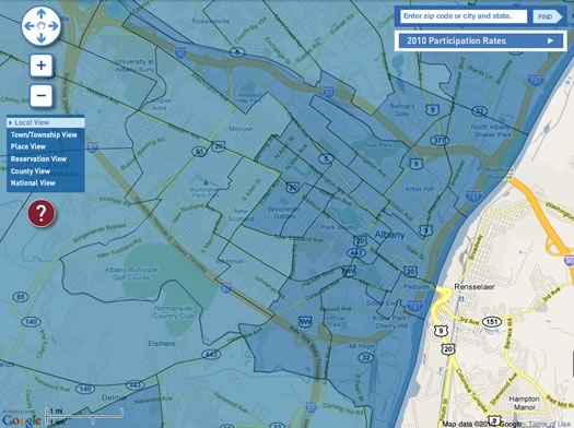
You know, for when you need to talk smack about another census tract. Or not.
The Census Bureau is posting daily updates about "participation" rates -- by county, city and even individual census tracts.
It's still early in the collection process, but differences are already starting to show up. For example: the tract that includes the Park South neighborhood in Albany has an 8 percent participation rate (its final rate was 53 percent in 2000). The adjacent track that includes the Helderberg neighborhood is at 25 percent (82 percent in 2000).
As it happens, that Park South tract is considered a one of the hardest to count tracts in the nation.
You can explore the rates on maps or side-by-side text comparisons.
How the Census Bureau's calculating the rates:
The Mail Participation Rate is the percentage of forms mailed back by households that received them. The Census Bureau developed this new measure in 2010, in part because of the current economy and higher rates of vacant housing. The rate excludes households whose forms were returned to us by the U.S. Postal Service as "undeliverable," strongly suggesting the house was vacant. We will still follow up on all these housing units to ensure everyone is counted.
New York State's participation rate is 18 percent so far. The national participation rate is 20 percent. The place with the highest participation rate is Leighton, Iowa at 75 percent.
(Thanks, Fred!)
map grab: US Census Bureau
Home sales spring forward
Here are the February median home sales prices for the four core counties of the Capital Region, as reported by GCAR.
Both sales prices and the number of closed sales were up compared to February 2009. Prices were more or less the same compared to January 2010 -- except in Rensselaer County where they were up about 9 percent (these monthly snapshots of the market should be taken a few grains of salt because of smaller pool of data).
The "months supply of inventory" (the number of active listings available to the average monthly pending sales for the last twelve months) for the Greater Capital Region (which includes Schoharie and Washington counties) was 9.7 -- which is still pretty high when compared to five years ago (page 10).
It'll be interesting to see how things shake out as we head into the prime home buying season. We've noticed "for sale" signs popping up all over the last few weeks.
Earlier on AOA:
+ Median home prices by city for 2010
+ Our housing market is overvalued?
+ Lots of houses
Saratoga County is healthy
A new set of county-by-county health rankings out this week pegs Saratoga as the second "healthiest" county in New York State.
Here are how the Capital Region counties stack up in the New York rankings, as compiled by the Robert Wood Johnson Foundation and the University of Wisconsin:
There are 62 counties in New York.
In this case, health outcomes refers to mortality (specifically premature death) and morbidity (people in poor physical health). Each county has its own page, which lists the the stats that contribute to the rankings.
Here are a few things that caught our eye when looking through the details for the Capital Region...
New York's still #3
 New York is still the country's third most populous state, according to new estimates out from the Census Bureau (it's the last estimate before next year's census).
The Empire State was estimated to have 19,541,453 people in July 2009. That's .4 percent more than July 2008.
The bureau reports that population growth in many Sun Belt states slowed considerably during the past year (a demographer says the recession probably played role in the slowdown). That helped keep Florida behind New York at #4. The top two continued to be California and Texas.
The breakdown on New York's population growth last year (births, deaths, migration) is after the jump.
Earlier on AOA: Where's everybody going?
Lots of houses
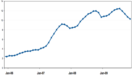
The Capital Region's supply of homes for sale, as measured by "months of inventory."
We were skimming through the latest package of Capital Region home sales stats from the Greater Capital Association of Realtors when the above graph caught our eye. It depicts the trend in "inventory" in the Capital Region.
Turning of the tide?
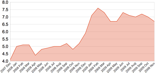
The Capital Region unemployment rate since the start of the recession.
The New York State Department of Labor today reported that the Capital Region's unemployment rate was 6.7 percent in November, down .3 percent compared to October. The rate was 5.3 percent in November 2008.*
The number that caught our eye this month was the raw number of people employed. The labor department reports that 419,900 people were employed in the Capital Region in November -- that's almost 11,000 fewer people with jobs than a year ago.
The state unemployment rate was 8.4 percent in November, down .3 percent from October (it was 6.1 percent in November 2008.) The national unemployment rate was 9.4 percent - down .1 percent from October (it was 6.5 percent a year ago).
* Capital Region data is not seasonally adjusted.
Are things getting better or worse?
The Siena Research Institute released an interesting poll today, a Capital Region "survey of social needs." The poll was intended to gauge how people in the Capital Region perceive the importance/severity of a bunch of social problems.
For example, the poll asked, "In general do you think the overall quality of life for most people in the Capital region has improved, stayed about the same or gotten worse over the last year?" Fifty-one percent of the respondents said things had "gotten worse."
Here are a few other results that caught our eye...
Sideways
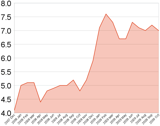
The Capital Region's unemployment rate since the start of the recession.
The Capital Region's unemployment rate was 7 percent in October, according to NYS Department of Labor data released today. That's up from 4.9 percent during the same period last year. It's basically unchanged from last month.
The labor department reports that the number of nonfarm jobs has decreased by 12,100 (2.7 percent) and the number of private sector jobs has decreased by 9,200 (2.7 percent) in the region over the last year.
The Capital Region is still doing better than both the state and country as a whole. The overall unemployment rate for New York State was 9 percent in October (8 percent everywhere except NYC) and 10.2 percent for the US.
We've updated our 10-year graph of Capital Region unemployment -- it really gives you perspective on how unusual the current labor market is.
The federal government reported last month that the national economy has begun growing again (well, GDP has).
Job growth often lags GDP growth, though. During the last national recession, the Capital Region's unemployment rate didn't start falling until three months after the recession ended. The state labor department reported that NYS lost 15,300 non-farm jobs last month.
Capital Region school spending
The Albany school district spent $22,628.36 per pupil in 2007-2008.
The Empire Center has added a school districts component to its SeeThroughNY web site/databse. From the site description:
This searchable database includes spending, debt and revenue levels of counties, cities, towns, villages and school districts throughout the Empire State, excluding only New York City. You can use this search form to find useful data for any single government or school district, to create categorical rankings statewide or by region, and to compare several entities to one another.
So we exported the school district data from the site and pulled all the entries for Capital Region districts. A chart is after the jump, along with a few quick notes and observations.
Capital Region job market still scuffling
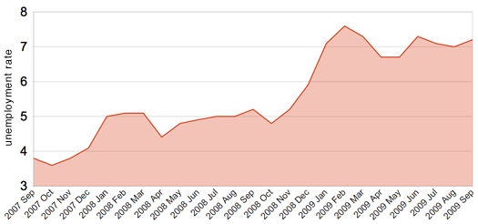
The last two years.
The Capital Region's unemployment rate was 7.2 percent last month, according to the state Department of Labor. That's up .2 percent from August -- and 2.1 percent from September 2008.
It's still better than both the state and the nation. The state's seasonally adjusted unemployment rate was 8.9 percent in September -- the same as August. The national rate was at 9.8 percent last month.
Earlier on AOA: A chart putting the Capital Region unemployment rate in a 10 year context (not good)
Chart data for the last two months from the NYS Department of Labor. Data for the other months is from the federal Bureau of Labor Statistics. The numbers are not seasonally adjusted.
On time, most of the time

A few interesting local bits from a Brookings Institution report out this week about air travel delays:
Arrivals
ALB was on pace for about 1.3 million arriving passengers this year. That's down more than 5 percent from last year and almost 6 percent from five years ago. But it's up 42 percent from 10 years ago.
On time
Arrivals at ALB were on pace this year to be on time 78.5 percent of the time. That ranks #54 among the top 100 metros. And it was just about even with the national average (78.9 percent)
Delays
The average time of delay for a late arrival was on track to be 54.2 minutes this year -- that ranks 37th best among the top 100 metros.
Brookings also figured out the top 10 air corridors linking to the Capital Region. That list is after the jump...
Where the federal recovery money is going
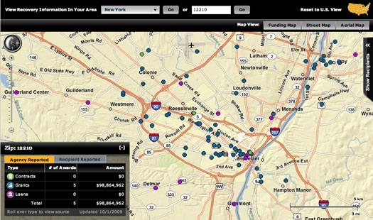
A screengrab from the Recovery.gov
Check it out: Recovery.gov -- the federal government's web site for "providing easy access to data related to Recovery Act spending" -- has a map function that lets you see where stimulus money is going locally.
As it happens, recovery money has ended up in a lot of spots in the Capital Region. Some of the places you'd probably expect -- some you might not. A few examples from dots on the map:
- HVCC - $3.3 million in grants through the Department of Education
- Web development firm Twin Technologies - a $700,000 loan from the Small Business Administration as part of a program that provides small businesses with financing they couldn't obtain in the private marketplace.
- Arizona Pizza in Clifton Park - a $950,000 loan from that same SBA program.
New York State's reported recovery money total is now more than $13 billion, according to the site.
(Thanks, Stephen!)
screengrab: Recovery.gov
Albany mayoral race: campaign expenditures

Apparently they're both fans of Dale Miller.
As promised, here are the sortable lists of expenditures for the campaigns of Jerry Jennings and Corey Ellis. If you see anything interesting or notable, please share in the comments.
We posted sortable lists of campaign contributors yesterday. (JVG noticed that DiCarlo's (the strip club) had made a contribution.)
We were able to break out these lists thanks to a package of campaign finance data put together by NYPIRG. That package, which includes data for candidates from Albany County, is available for download (it's an xls file). Thanks to NYPIRG for its help.
We've also put together a few notes based on the lists. They're also after the jump.
To the data...
Albany mayoral race: who's donating

Corey Ellis and Jerry Jennings
Thanks to to a major helping hand from NYPIRG, we've broken out the campaign contributors for the two leading candidates in the Albany mayoral race. Sortable lists after the jump.
Tomorrow we'll post lists of campaign expenditures.
NYPIRG provided AOA with a spreadsheet listing all the campaign contributions and expenditures for Albany County during the first half of 2009. If you'd like to check out that spreadsheet, we've posted it for downloading (it's an xls file).
Thanks to NYPIRG spreadsheet savant Bill Mahoney for his help.
On to the lists...
To the suburbs
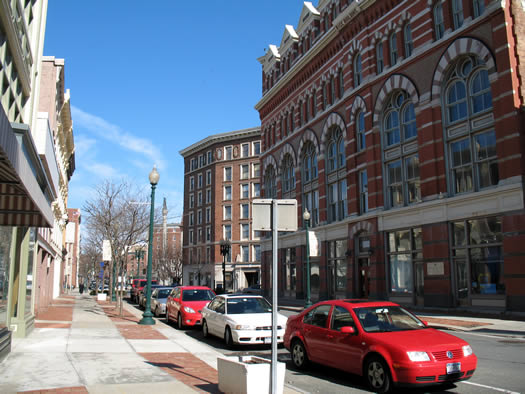
Where did they go?
The Census Bureau recently released its breakdown of population estimates for 2008. And while it's interesting to see the bureau's best guess about how many people are living in a place right now (well, recently), we figured it'd be more interesting too look at the longer trends.
So we looked up the population stats over the last two decades for a bunch of Capital Region cities and towns.
To the data!
Capital Region high school graduation rates

Albany High School has some room for improvement
The state Department of Education released data about high school graduation rates this week.
We picked through the data to pull out the relevant info about Capital Region schools. Some of the numbers are a little shocking.
The Mohawk's ups and downs
 Summer's comment about the Mohawk this morning prompted us to go looking for info about the river's water levels. And, as it turns out, there's a bunch of data posted on online -- something to keep in mind if you're a boater, fisherperson or other river user of some sort.
The US Geological Survey posts some pretty simple river level graphs created from data taken at a station in Cohoes. And the National Weather Service uses that data to create a whole bunch of graphs, charts and forecasts for points in Schenectady and Cohoes.
Bonus river data: the USGS service that tracks the Mohawk also tracks rivers and streams all over the state. As you might expect, this list includes the Hudson (here's the reading near Green Island) -- but also smaller streams such as the Normanskill.
Mohawk graph: National Weather Service
Michael and Isabella are so popular
 The most popular names for babies born in New York State last year were Michael (for boys) and Isabella (for girls), according to data from the Social Security Administration. Those names also topped last year's list.
The 10 ten names in 2008 for each gender are after the jump.
Where's everybody going?
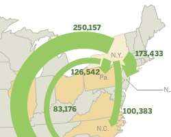 According to an analysis by the Pew Research Center, New York was ranked third among states with the most number of residents migrating to other states between 2005-2007.
In a twist (at least to us), it wasn't necessarily the Sun Belt that was sucking away New York residents. Sure, Florida was the #1 destination for former New Yorkers (hello, retirement!), but it was followed by New Jersey and Pennsylvania. North Carolina and Georgia rounded out the top five.
Also: New York ranked #8 among states with the most number of people moving into it. A lot of this probably just has to do with New York's relatively large population. But if you look at the percentage of the current state population that was born in another state (a measure of whether a state's "a magnet," as Pew describes it), New York ranks dead last.
[via]
map: Pew Research Center
New York is for neurotics
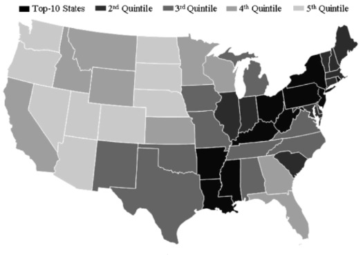
Hey, look, we're at the tip of the "anxiety, anger and guilt" belt.
A few months ago we posted a map that identified the NY/CT/MA area as a hot spot for neuroticism. Well, there's new research out this week that not only confirms that map, it conveniently ranks just how neurotic people in New York are (among other things) compared to people in other states.
Here's how New York stacks up against other states on each of the "Big Five" personality traits...
A (young) single guy isn't so hard to find here
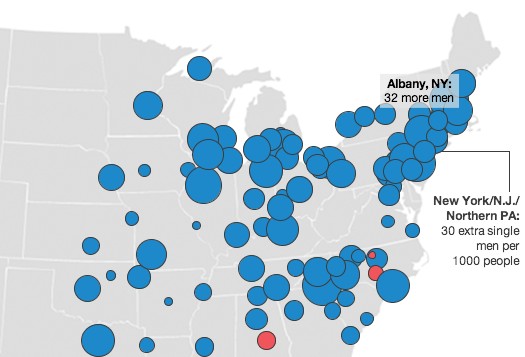
The relative numbers of single men and women 25-34 in the Northeast.
A while back, prompted by a map we saw, we looked at the relative numbers of single women to single men in the Capital Region. The bottom line was that things didn't look so great for single ladies looking for a guy here.
But, wait! There's a new, probably better, interpretation of the data. And things are looking up for the ladies!
Capital Region houses by the square foot
This house in Albany is currently listed at $399,000 -- that's $200/square foot.
Pretty much whenever you hear people talk about how much a house costs, the figure used is the total sale price. And that makes a lot of sense -- that's how much someone's going to be spending.
But another way to think about housing prices is the amount people are paying per square foot. When you break it down that way, it's a little easier to make comparisons between different houses and locations.
In fact, real estate agents do this all time. Sure, you won't usually see it on a house listing, but ask an agent and they'll almost always be able to tell you what a house's price is per square foot and what the average per-square-foot price is for the neighborhood.
We were kind of curious about how the different cities around the Capital Region stack up on per-square-foot house prices. And as it happens, Trulia -- a real estate site -- makes it easy to find out.
Here are how the towns rank, highest to lowest.
Capital Region high school graduation rates
The New York State Education Department released graduation rates for the 2003 "cohort" of high school students (cohort refers to all the students who started high school that year) as of August 2007.
The school district with the highest graduation rate in the Capital Region was Vorheesville at 97 percent. The lowest was Rensselaer at 53 percent.
Rates from all the local school districts after the jump.


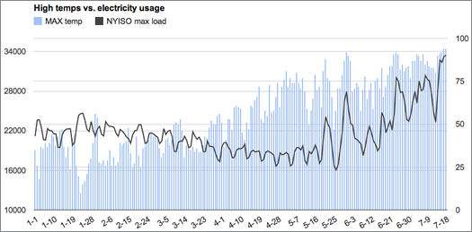
... said KGB about Drawing: What's something that brought you joy this year?